


Gerrit Ansmann is a physicist from Germany, who worked on the freely available blackletter font Unifraktur Maguntia, which now has a large character set and makes extensive use of smart font technologies such as OpenType. In this interview he gives us some background information about this project.

As a physicist, what fascinates you about typography and type design? And what was your motivation to create such a feature-rich blackletter font?
I always had an interest in computer graphics, which was intensified when it became useful for creating scientific illustrations and when Bézier curves, splines and similar were part of my elective numerics courses. Moreover, type design is an appealing art form to me due to its mathematical nature. But that’s not what actually lead me to working on blackletter fonts.
As a physicist, I naturally belong to the target audience of roleplaying games, and my roleplaying game of choice was Call of Cthulhu, whose main arena is our world in the 1920s and which features a lot of investigations. Thus people like me who want to create scenarios for this game often need to create fictive newspaper clippings and similar from that period and older. Being somewhat perfectionistic, I learnt a bit about blackletter typesetting and produced texts reproducing historical typesetting, in particular the long s and blackletter ligatures.
Unfortunately, most blackletter fonts that allowed for such an authentic typesetting did not support Unicode or OpenType, and so I had to find out where special characters were located for each font and manually insert them into the texts. Unifraktur Maguntia was an exception to this, but—like most blackletter fonts—was based on a dissatisfying digitalisation, e.g., words like Luftfahrt featured bars of f and t at three different heights, and the J and I were just scaled versions of each other. As the font was open, I began with fixing some prominent issues, discovered more issues, fixed them, decided to throw away everything and to re-digitialise the historic source, and so on. In the beginning, my motivation was that I could eventually create a brief guideline for historic blackletter typesetting, which would not require the user to use some esoterically placed special characters, but rely on OpenType features or similar.
Soon, another motivation arose: Almost all creators of blackletter fonts seemed to go for quantity rather than quality, and I wanted the world to have at least one good and free blackletter font that allowed to do everything that one could reasonably want to do with it.
On which historical sources is the font based? How much of it is kept close to the original(s) and how much was reinterpreted or created new?
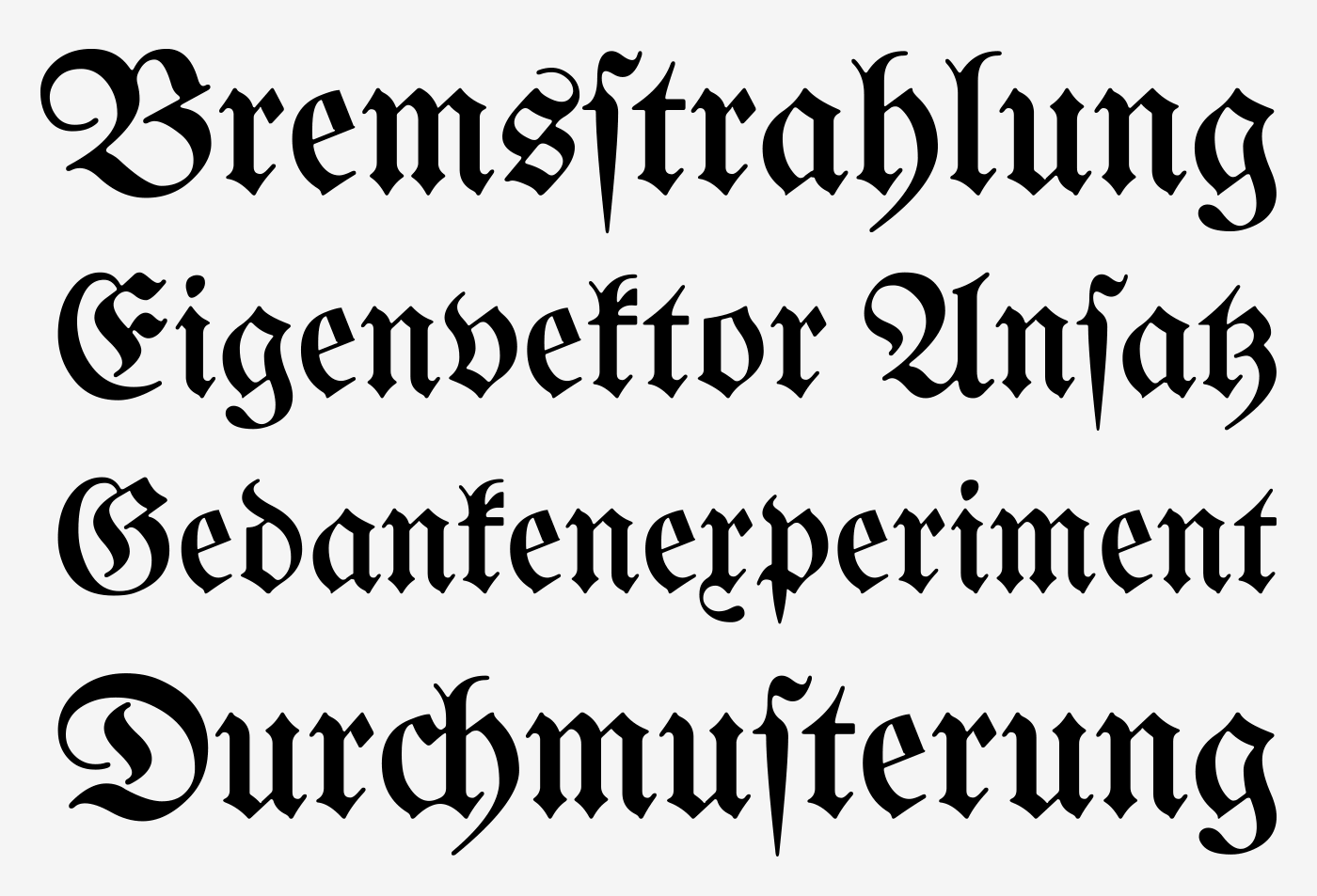
The primary historical source is Mainzer Fraktur by Carl Albert Fahrenwaldt from 1901. It provides most letters (and ligatures) of the standard German alphabet, except J, Ä, Ö, and Ü, which were only beginning to emerge for blackletter typsetting when it was created. From the few remaining glyphs of the original typeface, I adapted a few and redesigned the others—in particular the numerals and some basic punctuation characters—as their style was roman and not blackletter. For reasons that still elude me, this was typical for historic blackletter fonts, which is why I later added numerals in the style of roman typefaces as an alternative.


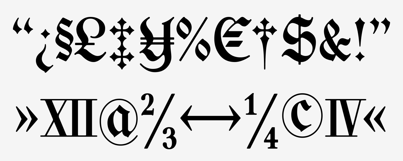
All other elements were newly designed, based on the existing glyphs, if possible, and inspired by the original Maguntia and other blackletter typefaces. This redesign includes the modern variants, numerals, diacritical marks, and several special characters.
Legibility vs. Tradition: Is the font made for traditional and/or modern blackletter typesetting and how do you deal with the legibility problems of today’s readers regarding Fraktur fonts?
On the one hand, many glyphs and features only exist for the purpose of reproducing historical typesetting—allowing a user to render an equivalent to every fraktur text is one of the main goals I was striving at. On the other hand, I created modern variants of ten letters that are typically misread by readers unfamiliar with blackletter as well as a round s without a swash for use in the beginning or middle of a word, where historically a long s was used in most cases. However, when creating the modern variants, I tried to adhere to the design principles of the original typeface and therefore, for example, I did not create a modern T (as I could not come up with a satisfying design) and the modern N is still very far from a roman-type N. So the modern variants are a trade-off between readability and preserving the blackletter style, hopefully a good one.

A paragraph using the traditional and modernized glyph designs
Traditionalists want to keep blackletter designs and their typesetting rules for German to stay the way they were in the first half of the 20th century, while others would argue that modernizations are a good way to keep the blackletter style alive. What is your opinion on modernized blackletter designs and typesetting rules?
I do not think that anybody should design or use a certain typeface just to keep some style alive. Use a typeface if it fits your needs; design one, if you enjoy the process or if you think that somebody else needs it—in which case it would be this need that would be actually keeping the style alive.
That being said, I think that both, modernised and traditional approaches, have their place: If you just want the typeface to say “traditional” or “German”, and readability is a valid concern, modernisations are fine; if you want the typeface to say “historical” or “old”, and you can trust your audience to decypher the text in a reasonable time, use the long s, the traditional letter forms, ligatures, and so on. However, I have no sympathy for pointlessly bizarre mixtures or failed attempts at being historical that could have been avoided with one minute of Internet research. The most common of these mistakes is plainly replacing every s with a long one, but there are also things like the new Warsteiner logo, whose t looks like a blackletter k, if anything, but neither like a blackletter nor a roman t.
Today, Fraktur fonts are rarely used for typesetting German and when they are, there is often an intentional or unintentional connotation with Nazi Germany. Is that something we can even overcome? What uses do you have in mind for Unifraktur Maguntia or how would you like to see it used?
In my experience, fraktur has its niches in Germany where it isn’t automatically associated with Nazis, for example in the contexts of tradition, history, or ceremony. Outside Germany, it can have similar niches, in particular in countries who used fraktur historically—e.g., I observed a considerable amount of fraktur in Prague. For the rest of the world, there are at least some people to whom fraktur just says “German” (which alone unfortunately makes for a Nazi connotation), but again the context and also the location is crucial. However, for other uses, I do not think we will or need to overcome a certain Nazi connotation—for instance, “historical” or “old” are not labels that one would normally see attached to one’s political views. Ironically and hopefully much to the Nazis’ dismay, one of the Maguntia’s features is a wide support of “international” characters and thus the capability of writing names of non-German origin in blackletter, e.g., for the needs of a German folklore society—I would really enjoy seeing the Maguntia being used to write the name of, say, a carnival princess of Turkish origin.
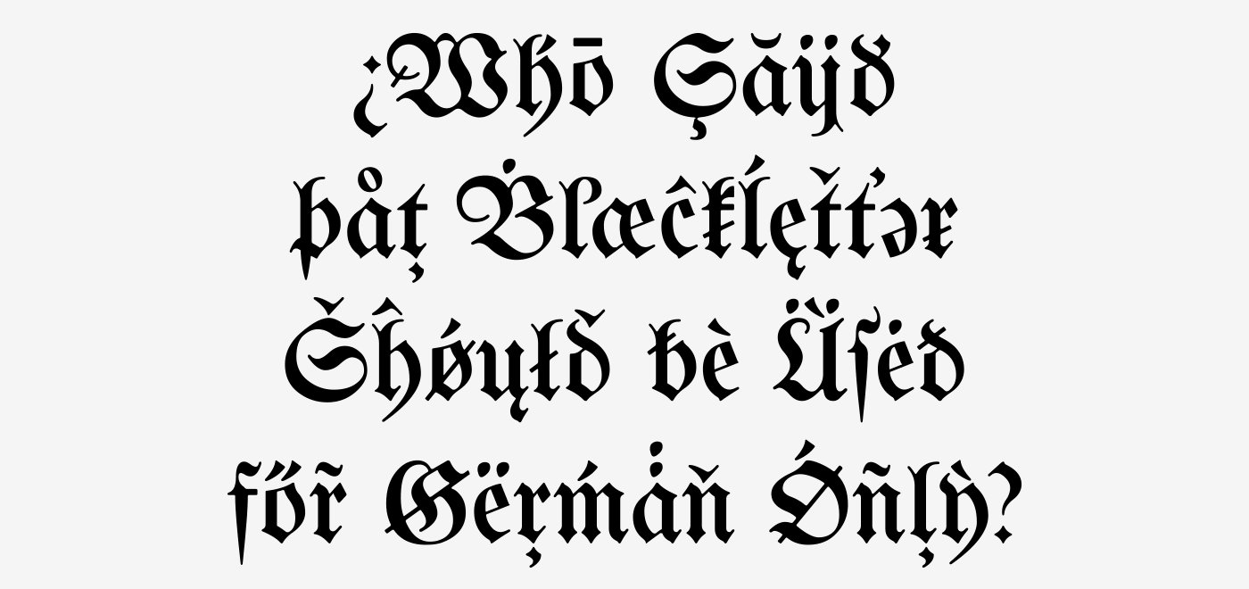
Also, many features and glyphs are not aimed at reproducing historical German typesetting but that of other languages such as Latvian, Czech, Slovak, and Sorbian. That being said, I did not focus on a single type of application, but rather hope that the Maguntia gives users the freedom to do what they want for their application—be it creating a menu for an Austrian restaurant in Portugal, a facsimile of some historic text, the Polish translation of Asterix and the Goths, or even a political cartoon.
Can you highlight some of the smartfont features of Unifraktur Maguntia?
The smartest feature is arguably the heuristics for the long s which uses the surrounding letters to decide whether an s is long or round and changes it accordingly. This isn’t perfect, but if you aren’t happy with the results, you can correct them with a zero-width non-joiner and still leave the majority of the work to the automatism. I should mention there are fonts out there that go further and implemented an entire dictionary (which are however not free and do not work in all applications). A similar automatism is implemented for the round r, a variant that can be found in very old typesetting.

We also separately implemented the two types of ligatures distinguished by historical blackletter typesetting—required and typographical ones—, which facilitates the implementation of letterspacing, which dissolved the latter type of ligatures but not the former.
Mainly for modern typesetting, I implemented a feature that removes the—in my opinion disturbing—swashes from round s that do not occur at the end of the word.
The majority of the remaining features are not that smart, i.e., just simple substitutions, in particular the aforementioned modern forms, historic variants, and four kinds of numerals: blackletter and roman as well as proportional and monospace.
In which apps and situations will the font work? What are the requirements and where are the limits?
Little surprisingly, a program that fully supports OpenType with feature selection is the best and allows you to quickly tune the font to your needs. If you have OpenType, but cannot or do not want to select features, there are ready-to-use variants which correspond to the activation of certain feature sets and try to emulate German historic typesetting at a specific time or cater modern readers, respectively. If possible those features are hard-coded and thus work, if there is no OpenType support at all. As a last resort, all special characters can be accessed through Unicode’s Private Use Area.

On another note, if you go to small resolutions, you will notice that hinting technology isn’t really made for most blackletter typefaces. I put some effort in this direction, harmonising line widths, positions, and manually marking a lot of stems, but I am not willing to perform hinting on the bitmap level.

Recommended Comments