


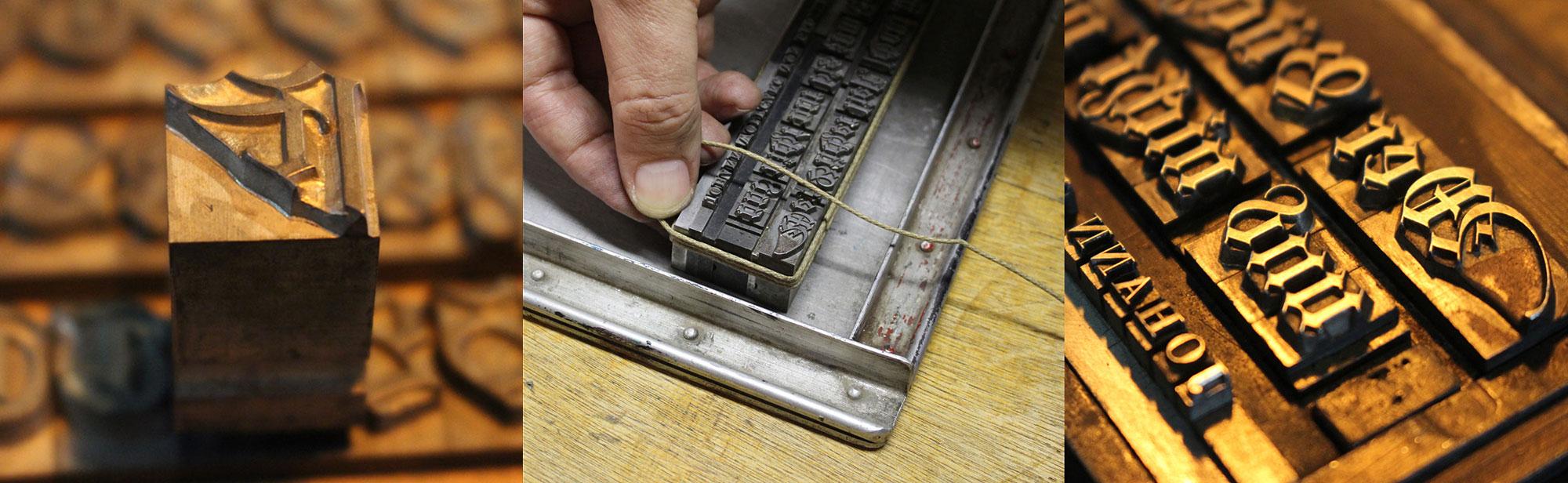
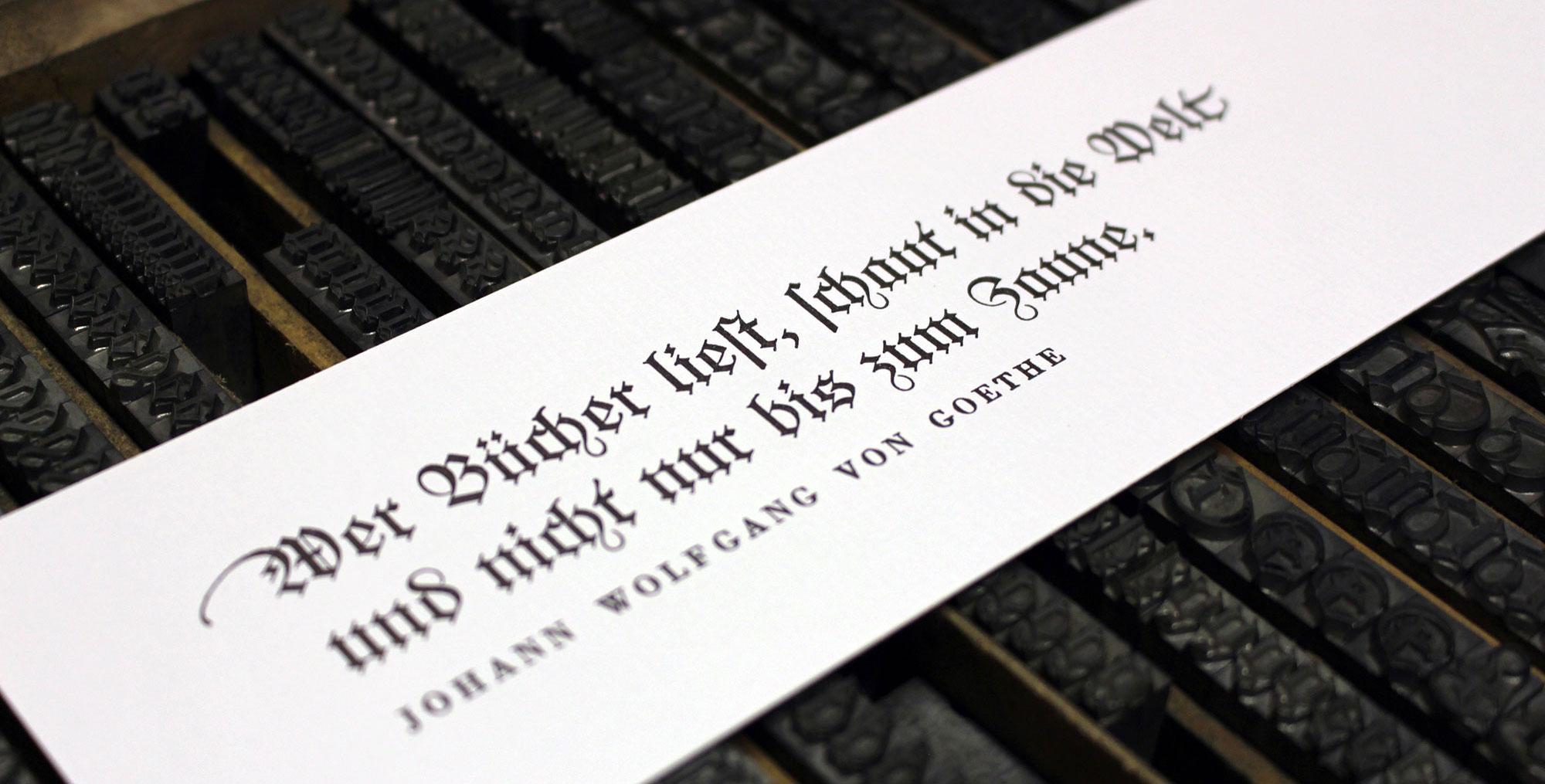

The font in use in the printing museum Pavillon-Presse
Many of today’s revivals of letterpress fonts are created from original type specimen prints. Scanning and digitizing the letterforms is easy to do, but it also has its limits. For one, the technique of letterpress printing doesn’t create an exact representation of the original face on the letterpress letters. The way the letters press into the paper makes the ink spread out. The outline of the letters gets larger and softer and the ink might even close gaps or create unwanted blobs. The smaller the type, the stronger the impact of those effects. Type designers of digital type always need to make a choice about how they want to deal with this. Do they want to keep those letterpress effects or do they try to guess the original design of the face on the letterpress letters?
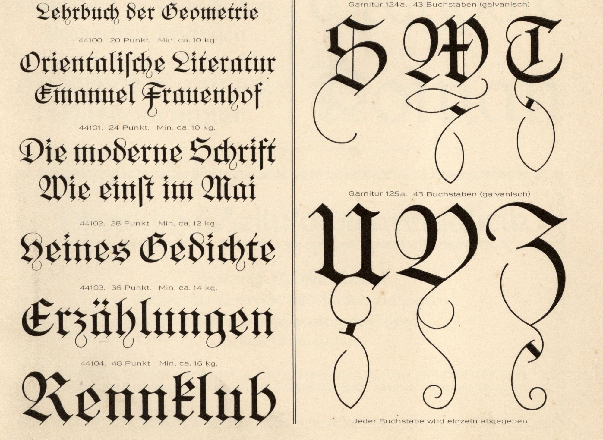
Original type specimen print
And there is another problem when typefaces are digitized from printed type specimens: The prints don’t reveal the actual size of the letters, so setting the sidebearings of each letter is usually guesswork. But with access to the original font, there was a way to overcome this problem. Not by trying to measure the tiny distances with a ruler, but by revealing them in a print. So the alphabet was set in a way, where all letters are enclosed in brass borders.

Things got a little bit more complicated than originally expected—as you can see in the picture above. Some letters had overhanging parts (a.k.a. “kerns”), so a full brass line in the type size pressed against the letters would have easily broken off the kerns. So a matching combination of brass rules and spacing material was used for certain letters. But in the end, this process proved to be successful. From the print of this form specifically made for digitization, vectorizing the font using the original metrics was rather easy.
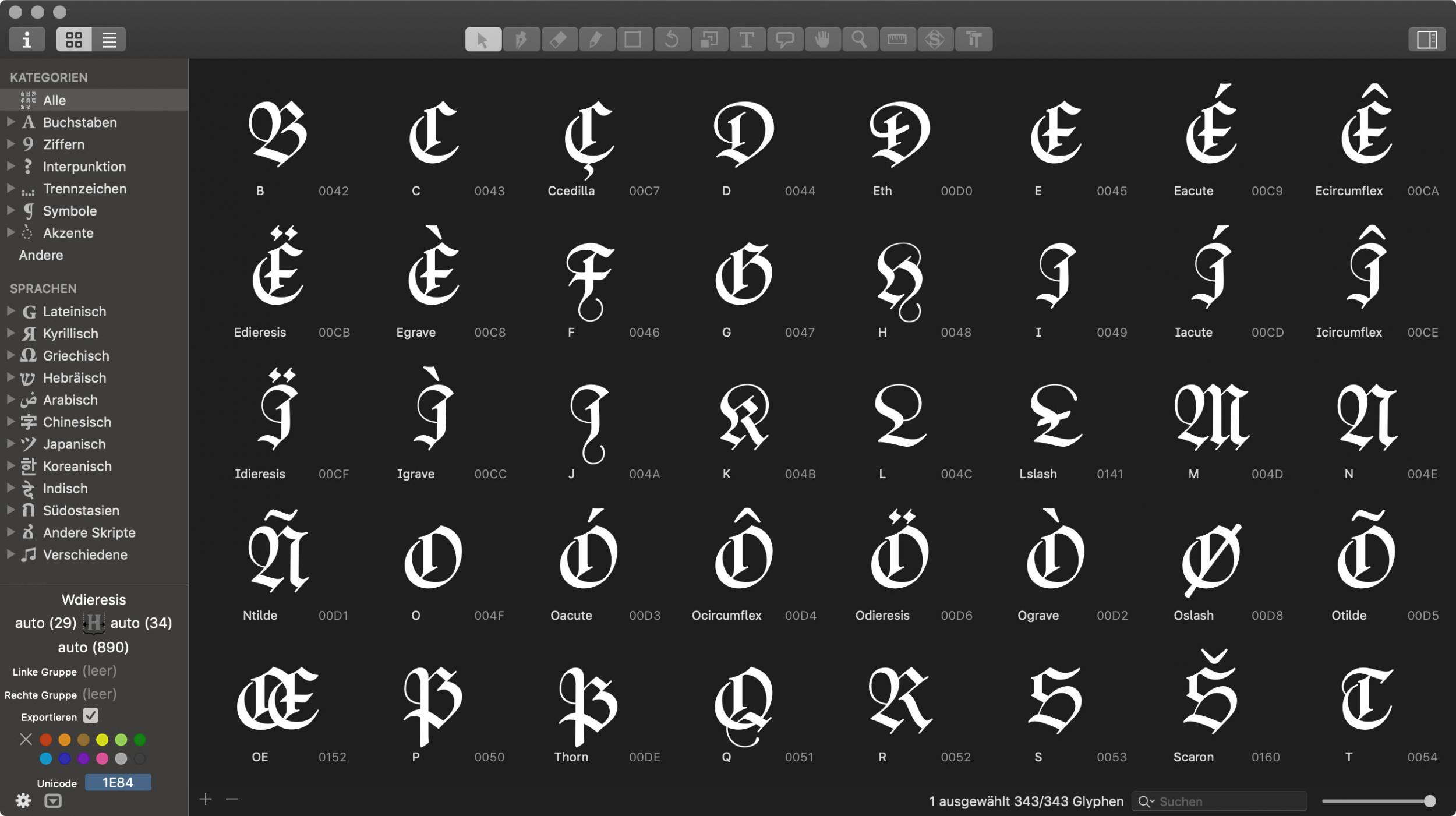
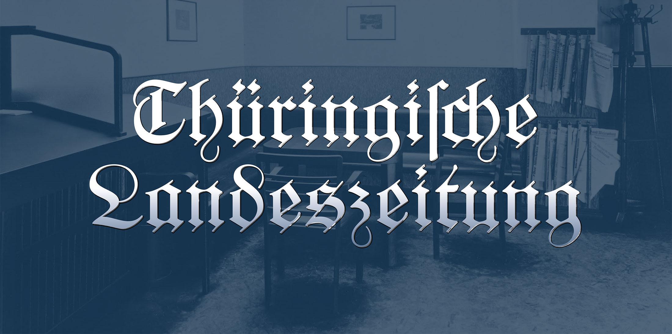
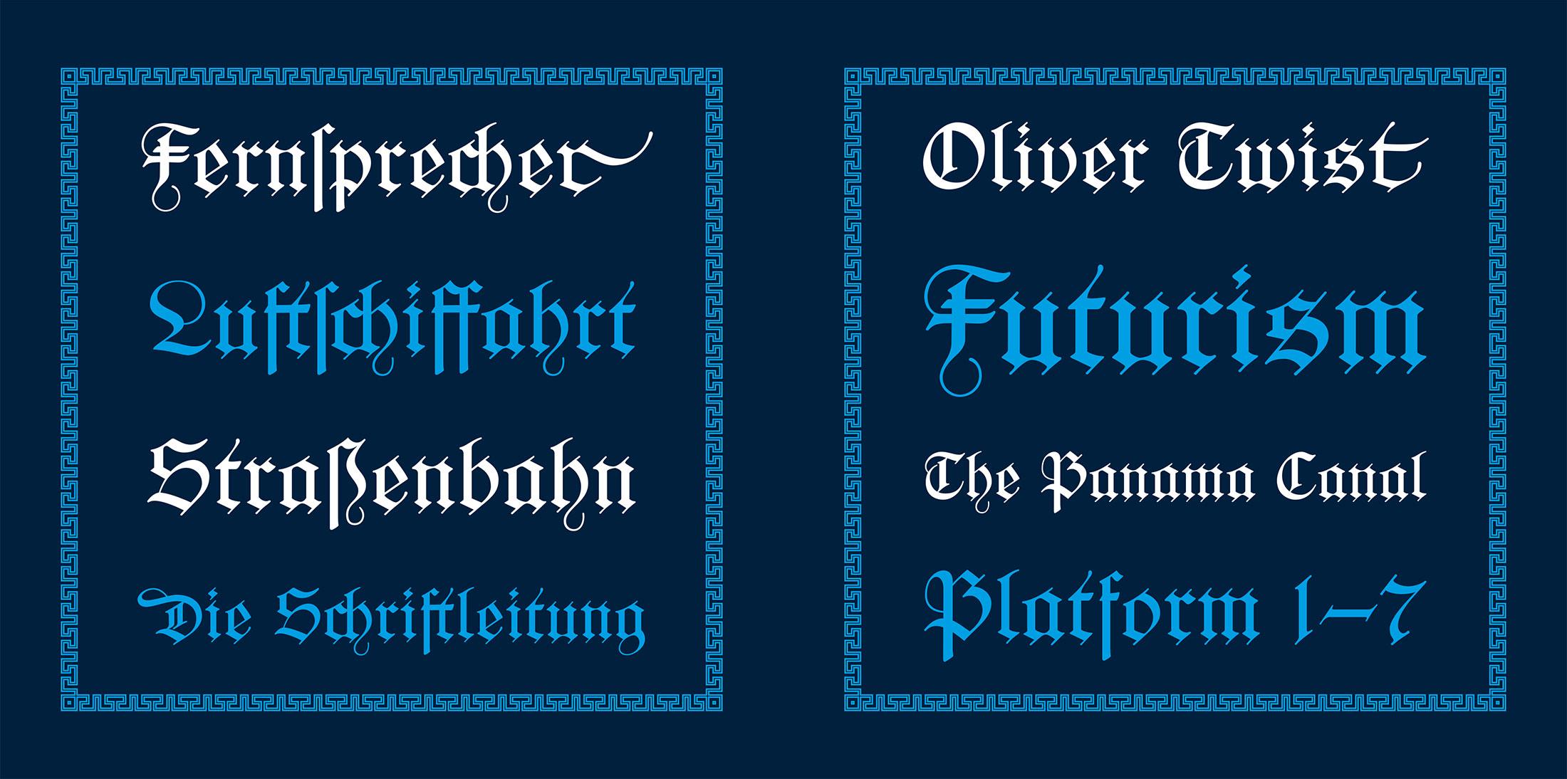
The design was carefully digitized and extended to a complete Latin 1 character set. The font is called “Pavillon Gotisch” after the museum. Version A contains the original design with all the ligatures and swash characters, which can be accessed easily through OpenType.
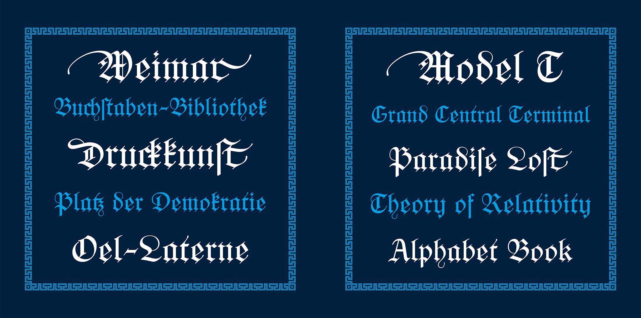
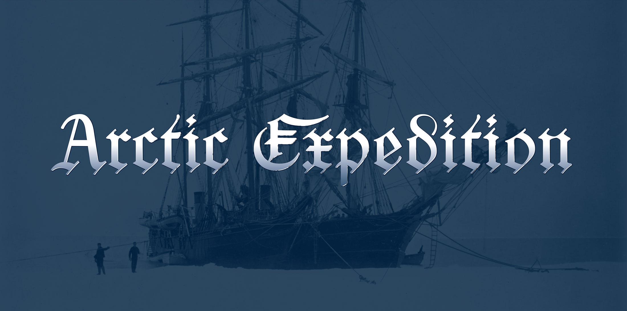
A second style (“B”) was added, which contains romanized letter variations, so the font can be more legible for people not trained in reading German blackletter texts.

The fonts cannot be licensed directly. They are exclusively available to supporters of the museum or the Schriftkontor community websites Typography.Guru and Typografie.info. You can become a Typography.Guru now and get instant access to Pavillon Gotisch A and B with a full desktop license for up to 5 users.
Recommended Comments
Create an account or sign in to comment