To begin with, please tell our readers a little bit about yourself and how you came to the field of type design.
I came to type design through graphic and editorial design. My training was first and foremost focused on the design of printed objects. I later got into digital techniques because the first thing that matters to me is content, not so much the medium you use. Before studying applied arts, I trained in science and engineering but was never very proficient at it, so I decided to leave that behind when I started doing graphic design. But a couple of years later, doing something entirely different highlighted the fact that it wasn’t science engineering I had wished to leave behind, but school … So my scientific and technical curiosity caught up with me and I soon realized I actually loved science as much as design. That’s when I had an epiphany about designing type—also because I’m never happier than when I can design ‘basic’ stuff, and by that I don’t mean that type is a simple thing but rather that it is essential to many—if not all–aspects of communication; the foundation of content.

As for how I came to really designing type—that was a long process. I’m only starting to think I’m any good at it, although I drew my first letter in 2007 if my memory serves me well. I love to learn and I’m not afraid by the idea of doing the same thing over and over again until I’m happy with the result, I’m very stubborn this way. So I kept on designing typefaces for my own use, mostly for the books I was paid to design. They weren’t perfect but that is what kept me trying to make them better, all the time. I later came to realize I’ll never be satisfied, but I try not to retain frustration from that fact. I rather use it to drive me.

How did the Trianon font project start? What made you interested in exploring that area of modern fonts?
This project started like many others that are still on-going, I fell in love with an idea, which in itself sounds like a bad idea. One day, I received a cheap, badly printed, book from the end of the 1950s. It was a manual aimed at learning how to play chess and the copy I was given must have been the 5th or 6th edition of a title that apparently had some sort of success in France from the 1930s onward. This book was in fact quite unremarkable but I was baffled by the fact that reading it felt a lot nicer than a lot of the books one can read today. The most surprising part to me was that the type used seemed to be a sort of Didone with moderate contrast. I was quite a newbie at that time so I thought—as I had been told—that you could not use a Didone to set text because the appearance was too stark and resulted in uncomfortable reading. While it is true for a lot of the Didones you can get your hands on today, this book offered a nice counter-example. That’s how I set my mind to designing a Didone typeface for text. It was the starting point of a long journey through modern typefaces, which ultimately lead me to look into the works of the Didot family.

Tell us a little bit more about the sources you used. Which typefaces or books did you use as a reference? And how much of the Trianon design and its styles is directly inspired by specific sources and how much basically “invented” as an extension of the design.
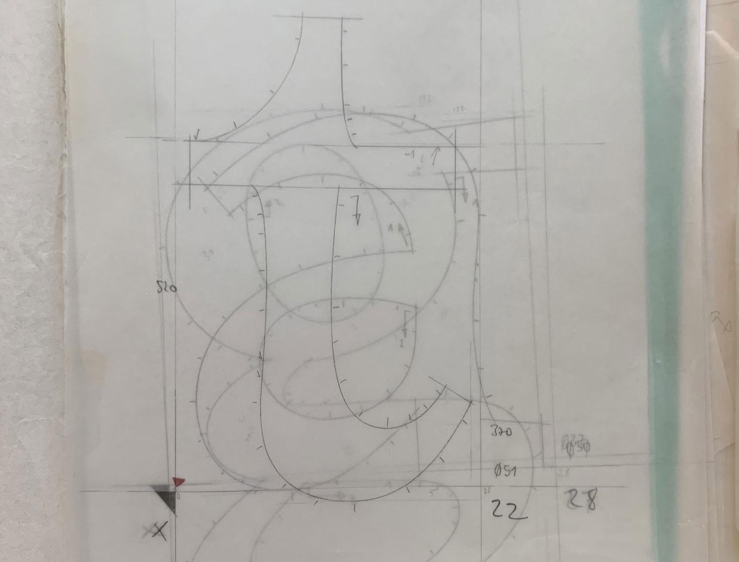
The first drafts for the typeface that would become Trianon were based on the chess-learning book that got me started, so it was a slightly sturdy and not very delicate Didone. At the beginning, I was still a bit new to drawing type so a lot ofit was pretty clumsy and remained so for quite a while. Over the years, as I was learning more and more about the design and history of type, my interest began leaning towards the more classical Didot forms of which my initial reference was a distant interpretation. This tension, or distance, has always been the defining element of the design of Trianon, oscillating somewhere between the quintessential Didot sources—the accomplished punchcutting of Firmin Didot—and the later and numerous versions of Didot faces that were produced by French foundries for more than a hundred years after that. Among my most expected sources, I have type cut by Firmin Didot in books printed by his sons between 1823 and 1833. During that ten year span, it would seem that Firmin wasn’t very active anymore but it is very likely that the type used by his sons were still of his making. That’s for the classical sources in which I took a lot of inspiration for the italics, a bit less for the upright styles. And among the later sources, there are type speciments from the first half of the 20th century, from the Fonderies Bertrand, Latouche & Buffet, or Deberny (and later Deberny &Peignot), which where useful especially for the heavier weights. In the end, the design is really a loose interpretation of a lot of different sources—all French though—and spanning approximately 150 years. As such, it is really a eulogy of French modern types.

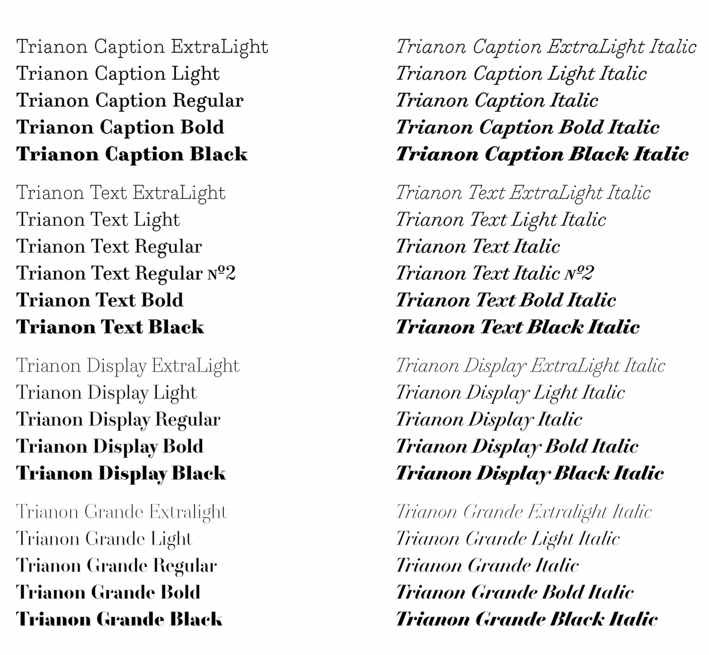
You made this family with 4 optical sizes—a feature which is still pretty rare with digital fonts and sometimes even confuses graphic designers because of the amount of styles. What was the importance of making this family with so many optical sizes?
The optical sizes where a by-product of my work. Initially, my design was really the text version and it was mere curiosity that lead me to make a more contrasted version of the text face, just to see what it would produce. As I was happy with the result, I started considering having two sizes. Later on, I stumbled upon examples of small type among Didot faces, down to 5 or 6 points and I loved what was happening with those tiny letters, which definitely had a Didot feel but didn’t have much of the contrast that is generally considered the basic trait of a Didot typeface. That’s when I started experimenting in the other direction—less contrast—which lead to the Caption style.

While I was designing this small optical size, I was growingly intrigued by the fact that the more contrast I took away, the more these letters started showing similarities with some slab serif faces, and that encouraged me to keep on working on this optical size in a way that it could also be used independently as a style on its own, and not just as the low contrast counterpart of the other styles in the type family.
What is the name of the font family based on?
The name is a contribution by Jean-Baptiste Levée, head of Production Type. For more than five years, the working title of the typeface was Bréviaire. I simply took the title of the book that got me started: Bréviaire des Échecs. When I started to discuss the possibility of releasing the typeface with various people, it became obvious that this name was not good enough—too specific, a slightly bit too french (é) and not sounding very good. The name Trianon was actually found in a street of Strasbourg, the city I live and work in. I was strolling along with Jean-Baptiste and we were thinking of names. I think he’s the one who suggested Trianon, and I loved it right away; short, nice sounding syllables and a little French touch (we wanted that) but still internationally relevant. Once we had made the decision, I gave it a second thought and realized some things weren’t quite right about that name, specifically historical accuracy. The name refers to a number of things that are slightly anachronistic with the development of modern faces. Most French people have heard the name Trianon at least once in their life. It is strongly associated with the former French monarchy. Originally, Trianon is the name of a landmark in the vicinity of Paris. Its name came to be known because of two buildings bearing the name of the location the first one was built on; they were commissionned by two French kings, Louis XIV and Louis XV. Those two buildings are called Le Grand Trianon and Le Petit Trianon. The latter is mostly known for having been given to Marie-Antoinette by Louis XVI as a gift. So in fact, the name refers to historical and cultural details preceeding the golden age of the Didot dynasty. Still, I wanted to make this name work because it felt quite right for this typeface. I eventually solved this conundrum and found a way to be satisfied with this slight achronism: the Petit Trianon (1762–1769) was built around the years of Firmin Didot’s birth (1764). It’s a completely arbitrary symbol but I’m very happy with it.

Which type design tools did you use to design and handle this complex family?
I worked mainly with UFO-based tools: Robofont, Prepolator, Superpolator. The family was finalized in close collaboration with Production Type’s team which was of great help because I could benefit from Jean-Baptiste Levée’s extensive experience in designing and producing huge font families. The Trianon typeface is also a project that lead me to start building my own tools—from little scripts that would do specific tasks (transferring batches of glyphs from a roman master to an italic one and automatically slanting glyphs on the fly) to more complex tools to handle the peculiarities of interpolation for instance. Along the way, I think I wrote more than 40 little scripts and around 3 or 4 tools which I later released on Github.

What type of uses is the font family aimed at? Has it been used already?
Yes, the family has been used already. A travel magazine in New York City (Travel+Leisure) is using it as part of its new design, and in France, the typeface has been used for this year’s issue of Graphisme en France, a yearly publication which sums up the current state of a specific branch of graphic design each year. There seems to be a pattern in uses for this type family this far, and in fact, the initial intent was that it should serve editorial design, be it books or periodicals. What I’m really looking forward to is a lot of uses of Trianon as a text face, but I’m really not sure that it’ll be what I’ll see the most … But I also hope for variety. The family can handle a lot of uses, so let’s have them all!





Recommended Comments
There are no comments to display.