Jump to content
The latest typography links delivered straight to your inbox.

Search the Community

Showing results for tags 'handwriting'.

  • Search By Tags

    Type tags separated by commas.
  • Search By Author

Content Type


The Typography.Guru Forums

  • Public Typography Forums
    • Talk
    • Font Identification
    • Font Downloads
  • Exclusive to Members
    • Type Design Forum
    • Letterpress Forum
    • Calligraphy/Lettering Forum
    • Show
    • Internal
    • Coffee Shop

Categories

  • Journal

Categories

  • Artisanal workshops & studios
  • Museums & Libraries
  • Apps
  • Education
  • Organizations
  • Online Typography Resources
  • Educational Video Channels
  • Typography Books
  • Magazines
  • Publishers

Categories

  • Link suggestions
  • Newsletter Archive (1-99)
    • Typography Weekly #1
    • Typography Weekly #2
    • Typography Weekly #3
    • Typography Weekly #4
    • Typography Weekly #5
    • Typography Weekly #6
    • Typography Weekly #7
    • Typography Weekly #8
    • Typography Weekly #9
    • Typography Weekly #10
    • Typography Weekly #11
    • Typography Weekly #12
    • Typography Weekly #13
    • Typography Weekly #14
    • Typography Weekly #15
    • Typography Weekly #16
    • Typography Weekly #17
    • Typography Weekly #18
    • Typography Weekly #19
    • Typography Weekly #20
    • Typography Weekly #21
    • Typography Weekly #22
    • Typography Weekly #23
    • Typography Weekly #24
    • Typography Weekly #25
    • Typography Weekly #26
    • Typography Weekly #27
    • Typography Weekly #28
    • Typography Weekly #29
    • Typography Weekly #30
    • Typography Weekly #31
    • Typography Weekly #32
    • Typography Weekly #33
    • Typography Weekly #34
    • Typography Weekly #35
    • Typography Weekly #36
    • Typography Weekly #37
    • Typography Weekly #38
    • Typography Weekly #39
    • Typography Weekly #40
    • Typography Weekly #41
    • Typography Weekly #42
    • Typography Weekly #43
    • Typography Weekly #44
    • Typography Weekly #45
    • Typography Weekly #46
    • Typography Weekly #47
    • Typography Weekly #48
    • Typography Weekly #49
    • Typography Weekly #50
    • Typography Weekly #51
    • Typography Weekly #52
    • Typography Weekly #53
    • Typography Weekly #54
    • Typography Weekly #55
    • Typography Weekly #56
    • Typography Weekly #57
    • Typography Weekly #58
    • Typography Weekly #59
    • Typography Weekly #60
    • Typography Weekly #61
    • Typography Weekly #62
    • Typography Weekly #63
    • Typography Weekly #64
    • Typography Weekly #65
    • Typography Weekly #66
    • Typography Weekly #67
    • Typography Weekly #68
    • Typography Weekly #69
    • Typography Weekly #70
    • Typography Weekly #71
    • Typography Weekly #72
    • Typography Weekly #73
    • Typography Weekly #74
    • Typography Weekly #75
    • Typography Weekly #76
    • Typography Weekly #77
    • Typography Weekly #78
    • Typography Weekly #79
    • Typography Weekly #80
    • Typography Weekly #81
    • Typography Weekly #82
    • Typography Weekly #83
    • Typography Weekly #84
    • Typography Weekly #85
    • Typography Weekly #86
    • Typography Weekly #87
    • Typography Weekly #88
    • Typography Weekly #89
    • Typography Weekly #90
    • Typography Weekly #91
    • Typography Weekly #92
    • Typography Weekly #93
    • Typography Weekly #94
    • Typography Weekly #95
    • Typography Weekly #96
    • Typography Weekly #97
    • Typography Weekly #98
    • Typography Weekly #99
  • Newsletter Archive (100-199)
    • Typography Weekly #100
    • Typography Weekly #101
    • Typography Weekly #102
    • Typography Weekly #103
    • Typography Weekly #104
    • Typography Weekly #105
    • Typography Weekly #106
    • Typography Weekly #107
    • Typography Weekly #108
    • Typography Weekly #109
    • Typography Weekly #110
    • Typography Weekly #111
    • Typography Weekly #112
    • Typography Weekly #113
    • Typography Weekly #114
    • Typography Weekly #115
    • Typography Weekly #116
    • Typography Weekly #117
    • Typography Weekly #118
    • Typography Weekly #119
    • Typography Weekly #120
    • Typography Weekly #121
    • Typography Weekly #122
    • Typography Weekly #123
    • Typography Weekly #124
    • Typography Weekly #125
    • Typography Weekly #126
    • Typography Weekly #127
    • Typography Weekly #128
    • Typography Weekly #129
    • Typography Weekly #130
    • Typography Weekly #131
    • Typography Weekly #132

Categories

  • Typography Quotes

Categories

  • Typography Videos

Categories

  • Free Font Lists
  • Font alternatives
  • Fonts by topic/style
  • Fonts by region
  • Signage Fonts
  • Fonts by User

Categories

  • Typography Terms Glossary

Categories

  • How to choose and pair fonts
  • Understanding Kerning & Tracking
  • How to use OpenType in InDesign
  • Font Licensing 101
  • How to use color fonts
  • Variable fonts for graphic and web designers
  • Typography on Apple devices

Categories

  • Font List entries

Categories

  • Hall of Fame
    • 2023
    • 2022
    • 2021
    • 2020
    • 2019

Categories

  • Exclusive Content

Calendars

  • Typography Events

Product Groups

  • Community support options

Find results in...

Find results that contain...


Date Created

  • Start

    End


Last Updated

  • Start

    End


Filter by number of...

Found 3 results

  1. CalligrapherSt92

    'Masculine' Handwritten & Calligraphy Fonts

    I thought this would be a good topic, as the font market is saturated with handwritten/calligraphy fonts that are associated with women's fashion and wedding invitations. As an example I would use Oriole Bird (which itself is tagged 'feminine headline'): Oriole Bird Font But what fonts would you use for a 'masculine' version?
  2. neilE1970

    Font feedback / critique

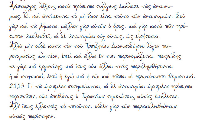
    Hi Guys, Ive been working on my own handwriting font for some time now (it still needs work on it and some kerning)and would like to get some opinions/ feedback on it and any comments on how commercially viable it might be. It is extensive in its variety of letters and also has Greek capability. Many thanks Neil
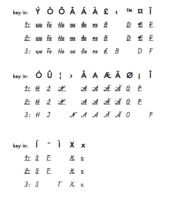
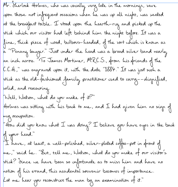
  3. I'd like to show you two commercial fonts, more precisely: a German foundry's demo versions of these fonts, and to be really exact: These are (or should be) two quite different Central European elementary school handwriting programs. #1 and #2 are basically the same: Austria's longhand «Schulschrift 1995», slanted version. — According to the files' stats, this particular font was published in 2005. Font #3 is called «SAS», that would be «Schulausgangsschrift 1968», obligatory (or preferred) elementary school handwriting program in all East German states including the Federal Capital Berlin, and also common in some West German states, including Bavaria. — According to the file's stats, this particular font was published in 2012. Re #1 and #2, Austria's longhand 1995, «Schulschrift 1995», slanted version, cf. the Austrian Federal Ministry of Education's authoritative version: https://commons.wikimedia.org/wiki/File:1995_Schulschrift_2._Schraegschrift.jpg Re #3, Schulausgangsschrift 1968, «SAS», cf. Dr. Renate Tost's authentic version: https://de.wikipedia.org/wiki/Datei:Schulausgangsschrift_1968.png Hm, and now back to the commercial fonts — is it my imagination, or is something wrong there?
FDI Farbmeister: simulate letterpress letters with this set of color bitmap fonts …
×
×
  • Create New...

Important Information

We are placing functional cookies on your device to help make this website better.