Jump to content
Check out our exclusive articles, videos and font downloads on Patreon!

Search the Community

Showing results for tags 'layer fonts'.

  • Search By Tags

    Type tags separated by commas.
  • Search By Author

Content Type


The Typography.Guru Forums

  • Public Typography Forums
    • Talk
    • Font Identification
    • Font Downloads
  • Exclusive to Members
    • Type Design Forum
    • Letterpress Forum
    • Calligraphy/Lettering Forum
    • Show
    • Internal
    • Coffee Shop

Categories

  • Artisanal workshops & studios
  • Museums & Libraries
  • Apps
  • Education
  • Organizations
  • Online Typography Resources
  • Educational Video Channels
  • Typography Books
  • Magazines
  • Publishers

Categories

  • Link suggestions
  • Newsletter Archive (1-99)
    • Typography Weekly #1
    • Typography Weekly #2
    • Typography Weekly #3
    • Typography Weekly #4
    • Typography Weekly #5
    • Typography Weekly #6
    • Typography Weekly #7
    • Typography Weekly #8
    • Typography Weekly #9
    • Typography Weekly #10
    • Typography Weekly #11
    • Typography Weekly #12
    • Typography Weekly #13
    • Typography Weekly #14
    • Typography Weekly #15
    • Typography Weekly #16
    • Typography Weekly #17
    • Typography Weekly #18
    • Typography Weekly #19
    • Typography Weekly #20
    • Typography Weekly #21
    • Typography Weekly #22
    • Typography Weekly #23
    • Typography Weekly #24
    • Typography Weekly #25
    • Typography Weekly #26
    • Typography Weekly #27
    • Typography Weekly #28
    • Typography Weekly #29
    • Typography Weekly #30
    • Typography Weekly #31
    • Typography Weekly #32
    • Typography Weekly #33
    • Typography Weekly #34
    • Typography Weekly #35
    • Typography Weekly #36
    • Typography Weekly #37
    • Typography Weekly #38
    • Typography Weekly #39
    • Typography Weekly #40
    • Typography Weekly #41
    • Typography Weekly #42
    • Typography Weekly #43
    • Typography Weekly #44
    • Typography Weekly #45
    • Typography Weekly #46
    • Typography Weekly #47
    • Typography Weekly #48
    • Typography Weekly #49
    • Typography Weekly #50
    • Typography Weekly #51
    • Typography Weekly #52
    • Typography Weekly #53
    • Typography Weekly #54
    • Typography Weekly #55
    • Typography Weekly #56
    • Typography Weekly #57
    • Typography Weekly #58
    • Typography Weekly #59
    • Typography Weekly #60
    • Typography Weekly #61
    • Typography Weekly #62
    • Typography Weekly #63
    • Typography Weekly #64
    • Typography Weekly #65
    • Typography Weekly #66
    • Typography Weekly #67
    • Typography Weekly #68
    • Typography Weekly #69
    • Typography Weekly #70
    • Typography Weekly #71
    • Typography Weekly #72
    • Typography Weekly #73
    • Typography Weekly #74
    • Typography Weekly #75
    • Typography Weekly #76
    • Typography Weekly #77
    • Typography Weekly #78
    • Typography Weekly #79
    • Typography Weekly #80
    • Typography Weekly #81
    • Typography Weekly #82
    • Typography Weekly #83
    • Typography Weekly #84
    • Typography Weekly #85
    • Typography Weekly #86
    • Typography Weekly #87
    • Typography Weekly #88
    • Typography Weekly #89
    • Typography Weekly #90
    • Typography Weekly #91
    • Typography Weekly #92
    • Typography Weekly #93
    • Typography Weekly #94
    • Typography Weekly #95
    • Typography Weekly #96
    • Typography Weekly #97
    • Typography Weekly #98
    • Typography Weekly #99
  • Newsletter Archive (100-199)
    • Typography Weekly #100
    • Typography Weekly #101
    • Typography Weekly #102
    • Typography Weekly #103
    • Typography Weekly #104
    • Typography Weekly #105
    • Typography Weekly #106
    • Typography Weekly #107
    • Typography Weekly #108
    • Typography Weekly #109
    • Typography Weekly #110
    • Typography Weekly #111
    • Typography Weekly #112
    • Typography Weekly #113
    • Typography Weekly #114
    • Typography Weekly #115
    • Typography Weekly #116
    • Typography Weekly #117
    • Typography Weekly #118
    • Typography Weekly #119
    • Typography Weekly #120
    • Typography Weekly #121
    • Typography Weekly #122
    • Typography Weekly #123
    • Typography Weekly #124
    • Typography Weekly #125
    • Typography Weekly #126
    • Typography Weekly #127
    • Typography Weekly #128
    • Typography Weekly #129
    • Typography Weekly #130
    • Typography Weekly #131
    • Typography Weekly #132
    • Typography Weekly #133
    • Typography Weekly #134
    • Typography Weekly #135
    • Typography Weekly #136

Categories

  • Free Font Lists
  • Font alternatives
  • Fonts by topic/style
  • Fonts by region
  • Signage Fonts
  • Fonts by User

Categories

  • How to choose and pair fonts
  • Understanding Kerning & Tracking
  • How to use OpenType in InDesign
  • Font Licensing 101
  • How to use color fonts
  • Variable fonts for graphic and web designers
  • Typography on Apple devices

Categories

  • Hall of Fame
    • 2023
    • 2022
    • 2021
    • 2020
    • 2019

Find results in...

Find results that contain...


Date Created

  • Start

    End


Last Updated

  • Start

    End


Filter by number of...

Joined

  • Start

    End


Group


Job


Location

Found 1 result

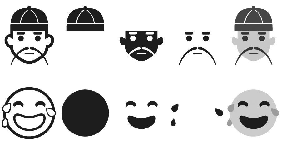
  1. Color fonts are by no means a new idea. When Adobe invented PostScript their Type 3 font standard allowed to specify colors within a font and Fontlab’s bitmap-based Photofont technology is also around for years. But the makers of operating systems and apps never really cared about these technologies—until the major success of the Emoji character sets in Asia. Apple took the lead when they implemented the Apple Color Emoji font in iOS and OS X. It’s a proprietary, unpublished extension of the TrueType/OpenType specification to add PNG images to a font. The single PNG images—one per glyph—are then embedded within running text and can be scaled and copied like regular characters. It was a big hit, especially for the use in messaging apps, and it was no surprise that Apple’s competitors also began to work on color fonts. Google’s solution is very similar to Apple’s (but not compatible) and also uses PNG images. The specification was made public and is now being implemented in FreeType. Windows did already support the typical Unicode emoji characters with its Segoe UI Symbol font, but it was a regular TrueType-based font which did not support colors. With Windows 8.1, Microsoft’s operating system now also supports color emoji. But they did it in a very different way than Apple and Google. Instead of using PNG images, they introduced a support for layered vector glyphs! By default, the new Segoe UI Emoji font behaves like a regular TrueType/OpenType font. It has Unicode-encoded, uncolored “base glyphs”. But there are two additional tables in the font: the COLR table links additional glyphs as layers to the base glyphs and defines the order of these layers. And the CPAL (“Color Palette”) table stores one or more color palettes for the individual layers. (The different color palettes are useful for displaying the font on dark and light backgrounds.) So when there is support for this new color feature, the base glyphs will be replaced with the colored layers. I must say, I really like this approach. The main reasons are: 1. It’s backwards-compatible. We recently released our Wayfinding Sans Symbols font which also allows colored icons—in this case through OpenType position of several glyphs. But it’s a hack and not a robust solution. It’s okay to use it in an app like InDesign, but it’s hardly useable in other situations, like on the web. When there is no proper OpenType support, the layers would just be displayed beside instead of on top of each other and copy & paste would also not work properly, since each character consists of several other encoded characters. Microsoft’s color font approach doesn’t have these problems. One could instantly start using such a font. If you use webfonts to display icons on a website, you could now even use colored icons. If the browser/operating system wouln’t understand the new color tables, the icons wouldn’t be missing. It would just show the base glyphs without colors. And if there is support for the color feature, it could use the included color palette or alternative colors specified via CSS. And there are hundreds of layer fonts, which currently require the user to create several text frames, style them separately and place them exactly on top of each other. Again, something you can hardly do on the web, where you don’t have full control over the text flow. Microsoft’s solution would make it possible to easily use such fonts on websites, in apps or ebooks. 2. It’s easy to create. Type designers have a certain workflow and they use certain tools. Maybe Photofonts never took off, because its just such a different technology that is not compatible to the way type designers usually work. But putting additional glyphs in a font, that represent different layers of a character, is very easy. And it’s also very easy for the software developers of font editors to add the support for the COLR table which links these glyphs. Now we have to wait and see if other software makers are willing to adopt this technology. It they don’t, the COLR and CPAL table will just be Microsoft’s own solution to render emoji and maybe also interface elements. But if other companies would adopt it, it could quickly become a standard way to display colored glyphs in multiple environments. I am all for it!
FDI Farbmeister: simulate letterpress letters with this set of color bitmap fonts …
×
×
  • Create New...

Important Information

We are placing functional cookies on your device to help make this website better.