Search the Community
Showing results for tags 'middendorp'.
-
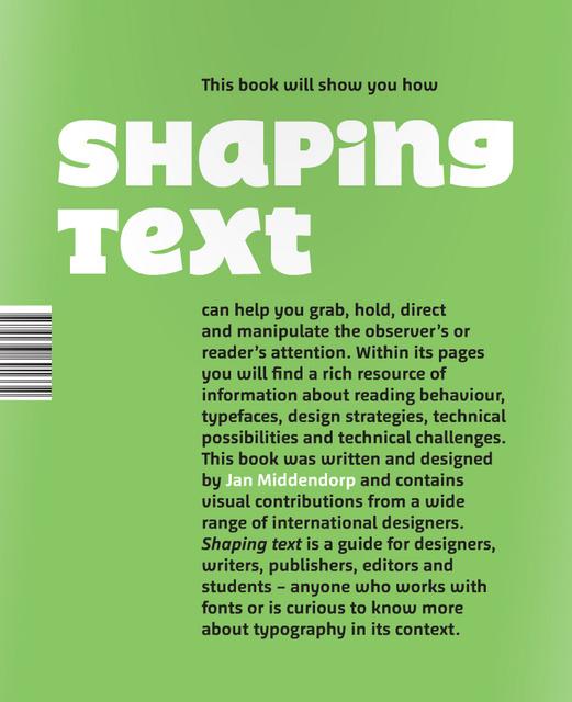
Shaping Text takes a practical and broad approach to typography. It is aimed at design students and graphic designers, and also at those who are concerned with content: writers, editors, and publishers. Showing a wide range of examples from first-rate designers across the world, the book examines why and how typographic designs work well in a given context. Particular attention is given to the team play between the text itself—written language—and the design—the shaping of the text—to form a new, multilevel visual message with a complex content. Jan Middendorp is a freelance editor, writer and designer working in Berlin. He is the author of such reference books as Dutch Type (2004), Type Navigator (2011, with TwoPoints.net), Shaping Text (2012) and Hand to Type (2012). Since 2007 he has been the editor of MyFonts' bi-monthly newsletters, which reach an audience of over a million users. He has written about type, typography, performance and media for a variety of magazines including Eye (London), Typo (Prague), Etapes (Paris), tipoGrafica (Buenos Aires) and Items (Amsterdam).
-
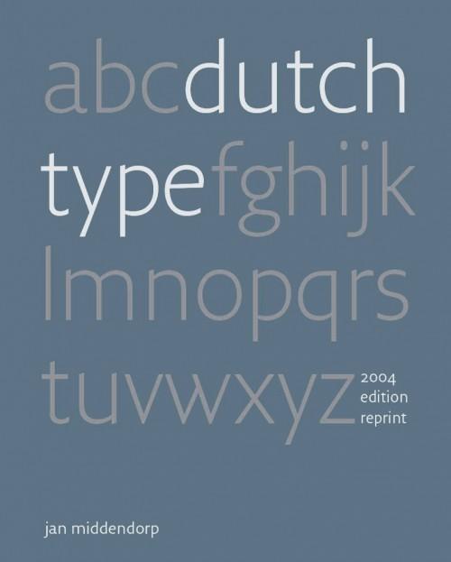
In ‘Dutch Type’, Jan Middendorp presents a comprehensive overview of type design and lettering in the Netherlands, tracing its origins through type designers and lettering artists from the 15th to the 20th centuries. Partly based on interviews, the book also offers insight into the motives and methods of the first generations of digital type designers, featuring published and unpublished typefaces as well as sketches, studies, and samples of lettering work. While the quest for quality and innovation has remained constant, it makes clear that the advent of desktop type has opened up the discipline to a more spontaneous, inventive, and democratic approach. Dutch Type was originally published in March 2004 and was received with huge enthusiasm. Its 3,500 copies sold out in 3 years. The book soon became hard to find and ended up being offered at embarrassingly high prices on Amazon, eBay and by antiquarians — between €400 and $800 for a copy. In 2018 author Jan Middendorp decided to self-publish a near-identical reprint, and successfully financed the production with crowdfunding.
- 1 review
-
- 1
-

-
- middendorp
- book
-
(and 1 more)
Tagged with:
-
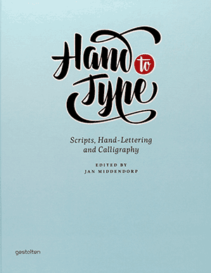
Although, or perhaps because, most of us write less and less by hand, our fascination for handwritten letterforms is growing. Typeface designers who specialize in traditional, charming, or spectacular lettering with a handmade look have become role models for today's young typographers and graphic design students. Script fonts--digital type families based on handwriting--are among the most sought on the typography market today. Scripts from the past, be it 18th-century formal calligraphy or advertising headlines from the 1960s, are being digitized and turned into OpenType programming. The love of the hand-written look is nothing new. Even the oldest printed books pretended to be something unique and not a machine-made mass product. Hand to Type is a collection of some of the best work by today's lettering artists in the fields of hand-made and digital script forms. The book includes texts about outstanding designers and contains a series of expert chapters outlining the principles of script forms that may be lesser known to most western typographers--from the German Sütterlin to Arabic and Asian scripts. Hand to Type also traces script fonts back to some of the earliest examples: hand-lettering as a sign of authenticity, or printing type made to look like formal writing.
-
- middendorp
- book
-
(and 2 more)
Tagged with:


