

Search the Community
Showing results for tags 'sharps'.
Found 1 result
-

The Capital Sharp S in now part of the official German orthography
Ralf Herrmann posted a journal article in Journal
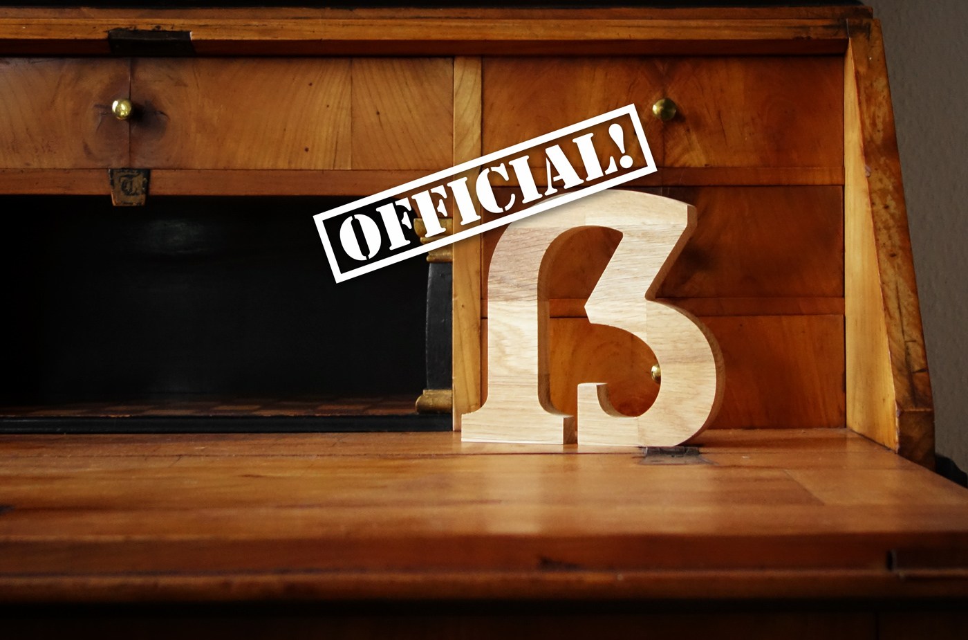 When the German lowercase letter ß (“sharp s”) was standardized and added to all German typefaces around 1900, the addition of a capital version was planned as well. But the introduction was postponed, because the committee couldn’t agree on a design in time. In the end it took over 100 years to get the ball rolling again. Fonts with a Capital Sharp S made in the early 20th century. Their use didn’t catch on and it wasn’t part of the German orthography. The discussion around the missing uppercase letter started again in the 21st century after changes to the German orthography, which reduced the occurrences of the letter ß, but gave it a more distinct phonetic function. But this function was lost when texts were set in uppercase only and German names became ambiguous as well. So once again, the introduction of a Capital Sharp S was proposed. In 2008 it was added to the Unicode standard and after that type designers could start to add it to their typefaces. More than a thousand new type families containing a Capital Sharp S have been released since then—and a keyboard layout with support for the Capital Sharp S was standardized as well. A children’s book from 2014 using a Capital Sharp S And even though the letter wasn’t yet part of the official German orthography, more and more people started to use it. The Council for German Orthography as well as the publishers of German dictionaries like Duden had acknowledged the usefulness of a Capital Sharp S years ago, but they couldn’t prescribe the use of a letter that wasn’t available on keyboards and in fonts. Eight years after the addition to the Unicode, the Council for German Orthography decided that the time was now right for an uppercase ß. They proposed a change to the orthography in 2016 and after the approval process in all the countries using the German language the change became official in June of 2017. The change doesn’t mean that everyone now has to use a Capital Sharp S. The previous spelling of replacing ß with SS in uppercase texts remains the default for the time being. But using the Capital Sharp S is now officially allowed as well and wouldn’t count as spelling mistake anymore. Addition Information: Press Release of the Counsil for German Orthography (in German) The Multifaceted Design of the Lowercase Sharp S (ß) Capital Sharp S – Germany’s new character How to draw a Capital Sharp S Capital Sharp S designs. The good, the bad and the ugly. The Capital Sharp S in Use


