Jump to content
Nova Caps is a striking and globe-trotting editorial typeface that steals inspiration from Roman inscriptions and Art-Deco architectural lettering.
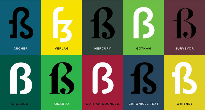
  • Wired asks 15 type professionals about their favourite letterforms
    Riccardo Sartori

    Open the Link

    “THE MOST BANAL QUESTION asked of artists after What is your favorite color? is What pencil/pen/brush do you use? I expected type designers to be equally bored by inquiries into their favorite letterforms.

    Boy was I wrong.”

    www.wired.com


    User Feedback

    Recommended Comments

    Ralf Herrmann

    Posted

    Thanks for not repeating the mistake of the original headline. :winking:

    Riccardo Sartori

    Posted

    On 8/1/2016 at 7:42 AM, Ralf Herrmann said:

    Thanks for not repeating the mistake of the original headline.

    For context:

    CO8brkhWsAAyA2w.png

    To be fair, the author of the article never makes the mistake, so I assume it’s a choice of the editor.

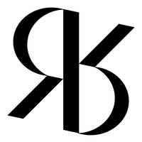
    Here’s a related link, since it seems |&| is a general favourite.


    Create an account or sign in to comment

    You need to be a member in order to leave a comment

    Create an account

    Sign up for a new account in our community. It's easy!

    Register a new account

    Sign in

    Already have an account? Sign in here.

    Sign In Now

Our typography network

Discover the fonts from the Germany foundry FDI Type. A brand of Schriftkontor Ralf Herrmann.
The best typography links of the week.
Typografie.info – The German typography community
The type specimens of the world.
  • Add your content!

    We spread your news free of charge among a growing list of subscribers and tens of thousands of followers of our social media channels.
    Learn more about this
Check out our typography merch store.
×
×
  • Create New...

Important Information

We are placing functional cookies on your device to help make this website better.