Typography Weekly #36
11 typography news links in this category
-
“How typeface designers made room in The New York Times for the general-turned-president’s long last name.”
-
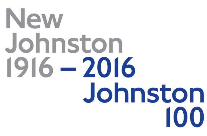
“The face marks the centenary of the type design created by Edward Johnston in 1916. Monotype has worked with TfL over the years on a number of different projects, and was brought in to modify Johnston back in January.”
-
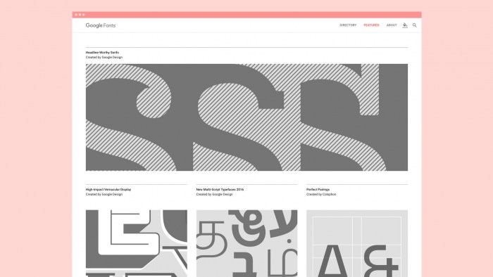
“Check out our new look! Now browsing & choosing fonts is even easier.”
-
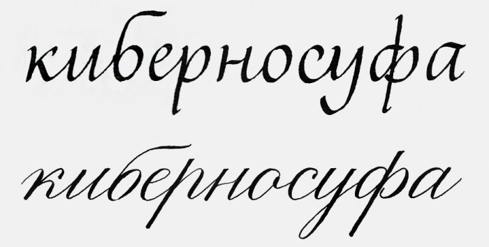
“… learn to love the letter б, and it will always be joyful, beautiful and cheerful.”
-
“Anchored by a major gift from graphic designer and collector Aaron Marcus, this exhibition presents a selection from SFMOMA’s permanent collection of graphic design since 1950. Typeface to Interface notes the shift from analog to digital in visual communication.”
-
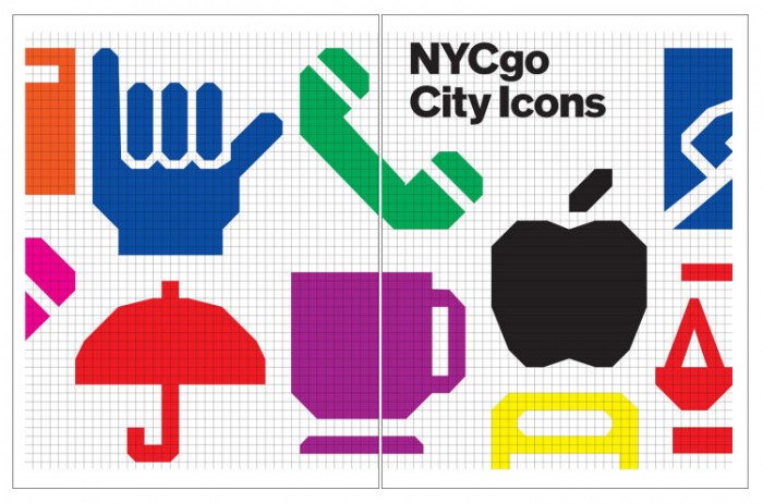
Developed by NYC & Company, the marketing organization for the city of New York, with type designer Nick Sherman.
-
“Your work may be selected by a notable group of jurors to appear in an exhibition at TypeCon2016: Resound […]. The exhibit will highlight speculation in typeface design in order to help new ideas inform future design efforts and enrich the cultural landscape.”
-
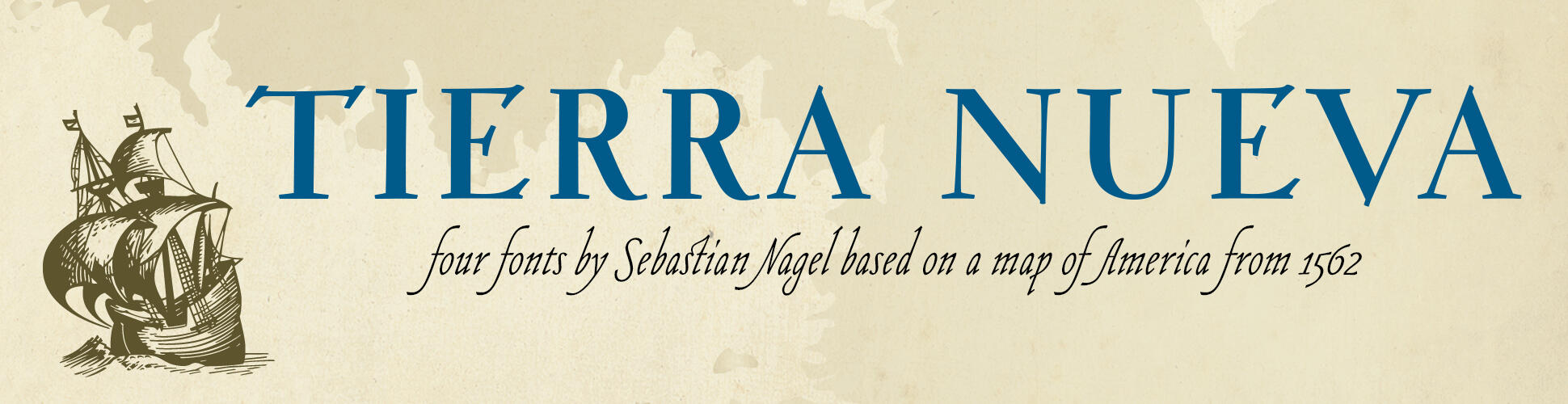
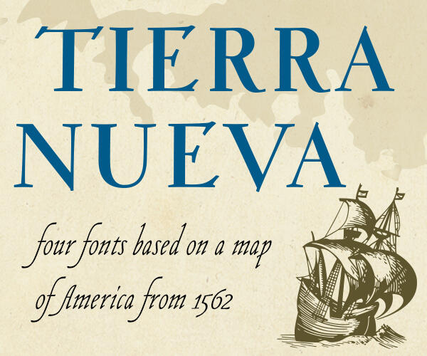
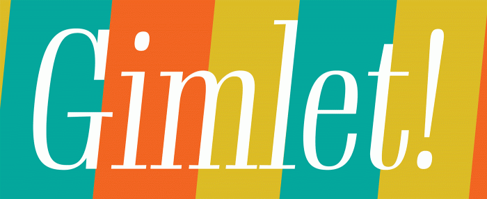
“Gimlet draws its inspiration from Georg Trump’s 1938 typeface, Schadow. I reimagined the oddball serif as an energetic contemporary workhorse, complete with three optical sizes and a flexible set of widths tailored for responsive layouts.”
-
An archival project by Mindy Seu at the Herb Lubalin Study Center.
-
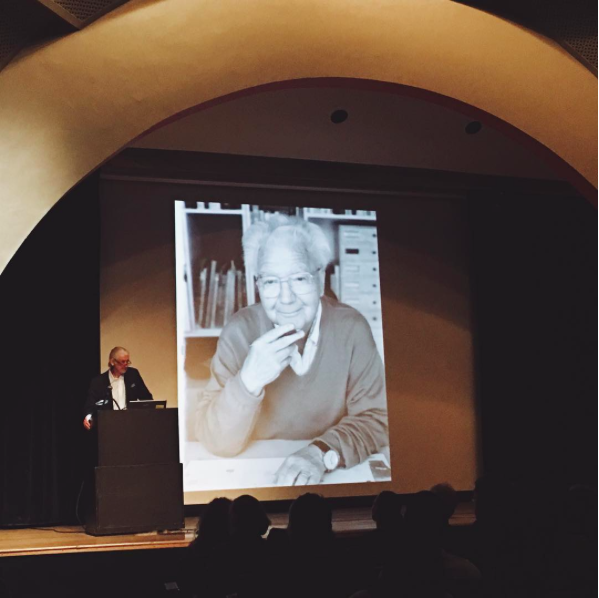
To commemorate the life and work of Adrian Frutiger, the Type Directors Club asked renowned type designer Matthew Carter to speak about his old friend. Here you can watch the Livestream recording of the event.
-
“If you want to add style and functionality to your Web typography, look for fonts that have alternate characters. And if working economically, with just one font, the added characters you get with alternates can stretch your design further.”


Don’t miss the latest typography news!
Typography Weekly via email: Subscribe here
Typography Weekly via RSS feed: Subscribe here