Jump to content
Nova Caps is a striking and globe-trotting editorial typeface that steals inspiration from Roman inscriptions and Art-Deco architectural lettering.
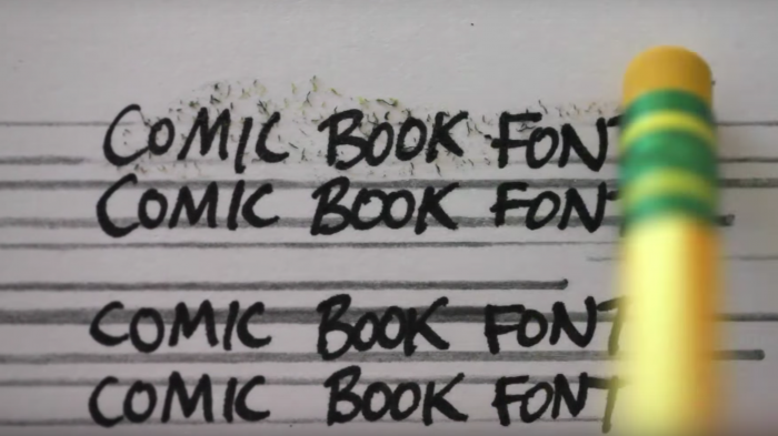
  • Where the “comic book font” came from

    David John Lewis

    Open the Link

    So...why does all the writing in comic books look like that? Vox's Phil Edwards looked into it and found an aesthetic shaped by comics culture, technology, and really cheap paper.

    www.youtube.com

    • Like 1


    User Feedback

    Recommended Comments

    Ralf Herrmann

    Posted

    Nice! I add it to our video section as well. 


    Create an account or sign in to comment

    You need to be a member in order to leave a comment

    Create an account

    Sign up for a new account in our community. It's easy!

    Register a new account

    Sign in

    Already have an account? Sign in here.

    Sign In Now

Our typography network

Discover the fonts from the Germany foundry FDI Type. A brand of Schriftkontor Ralf Herrmann.
The best typography links of the week.
Typografie.info – The German typography community
The type specimens of the world.
  • Add your content!

    We spread your news free of charge among a growing list of subscribers and tens of thousands of followers of our social media channels.
    Learn more about this
The latest typography links delivered straight to your inbox.
×
×
  • Create New...

Important Information

We are placing functional cookies on your device to help make this website better.