

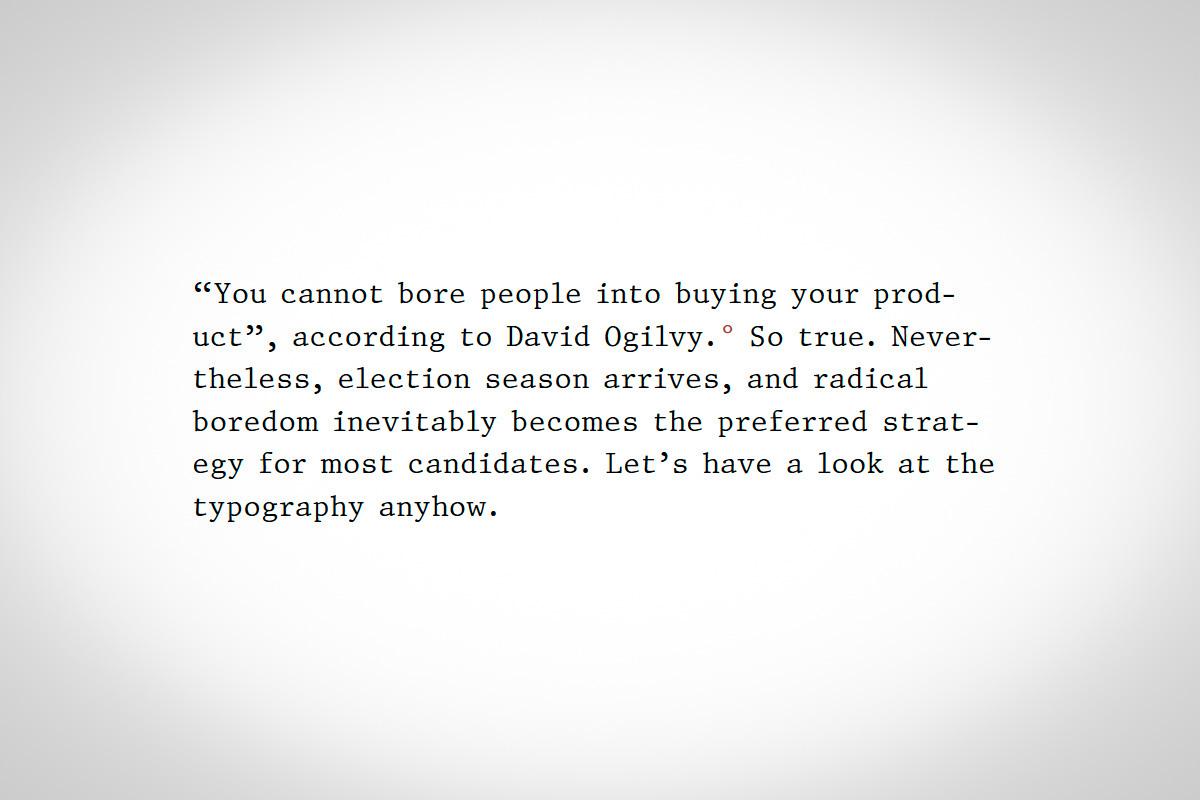
-
Typography 2020: A special listicle for America

Suggested By Riccardo Sartori
“Book publishers spend a lot on cover design. Candidates likewise spend a lot on their public presentation. Why? For the same reasons: voters (or readers) are going to make judgments based on design factors (whether consciously or not). So just as we should feel justified judging a book by its cover—because that’s what it’s for—we should likewise feel justified considering how typography reflects on each candidate.”
practicaltypography.com
User Feedback
Our typography network


-
Add your content!
We spread your news free of charge among a growing list of subscribers and tens of thousands of followers of our social media channels.
Learn more about this


Recommended Comments
There are no comments to display.
Create an account or sign in to comment
You need to be a member in order to leave a comment
Create an account
Sign up for a new account in our community. It's easy!
Register a new accountSign in
Already have an account? Sign in here.
Sign In Now