-
Typography Weekly #105
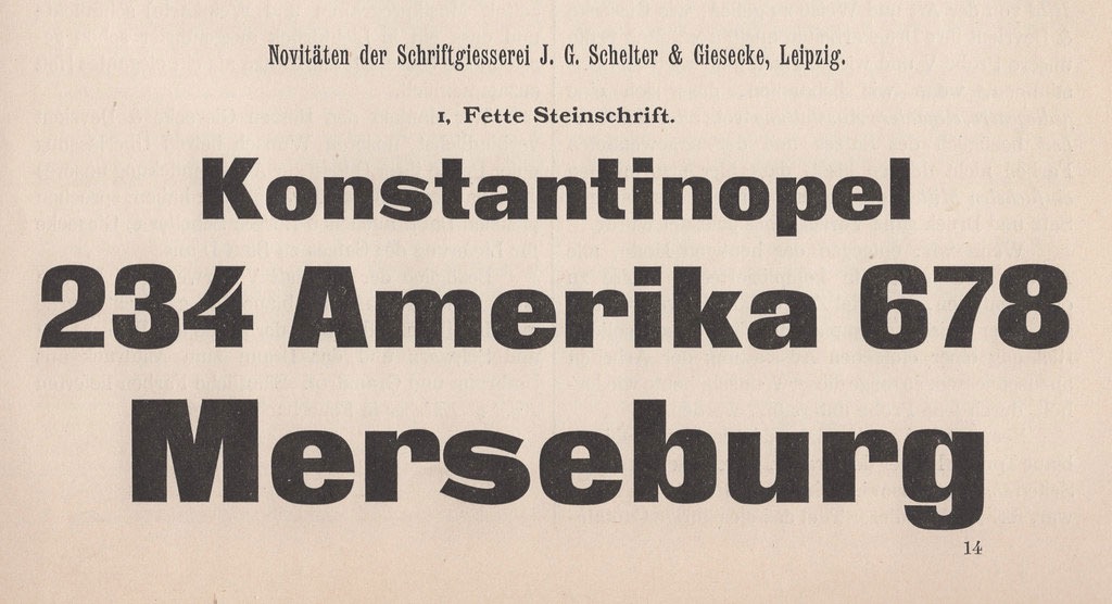
Imperial-era Germany’s definitive heavy sans
“The Danzig-based Francke typefoundry first advertised a heavy sans-serif typeface called Zeitungs-Grotesque in 1874. Their specimens for the typeface announced that other foundries could purchase duplicate matrices of its design. Many founders took Francke up on that offer: the Zeitungs-Grotesque design quickly became the most widely-distributed heavy sans serif in German-speaking Europe.”
www.typeoff.de
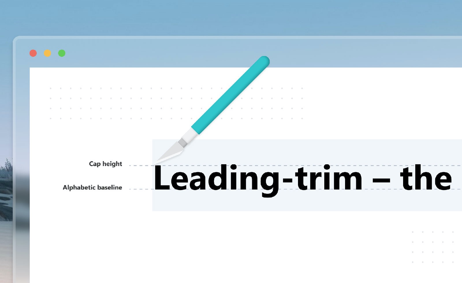
4 commentsLeading-Trim: The Future of Digital Typesetting
How an emerging CSS standard can fix old problems and raise the bar for web apps
medium.com
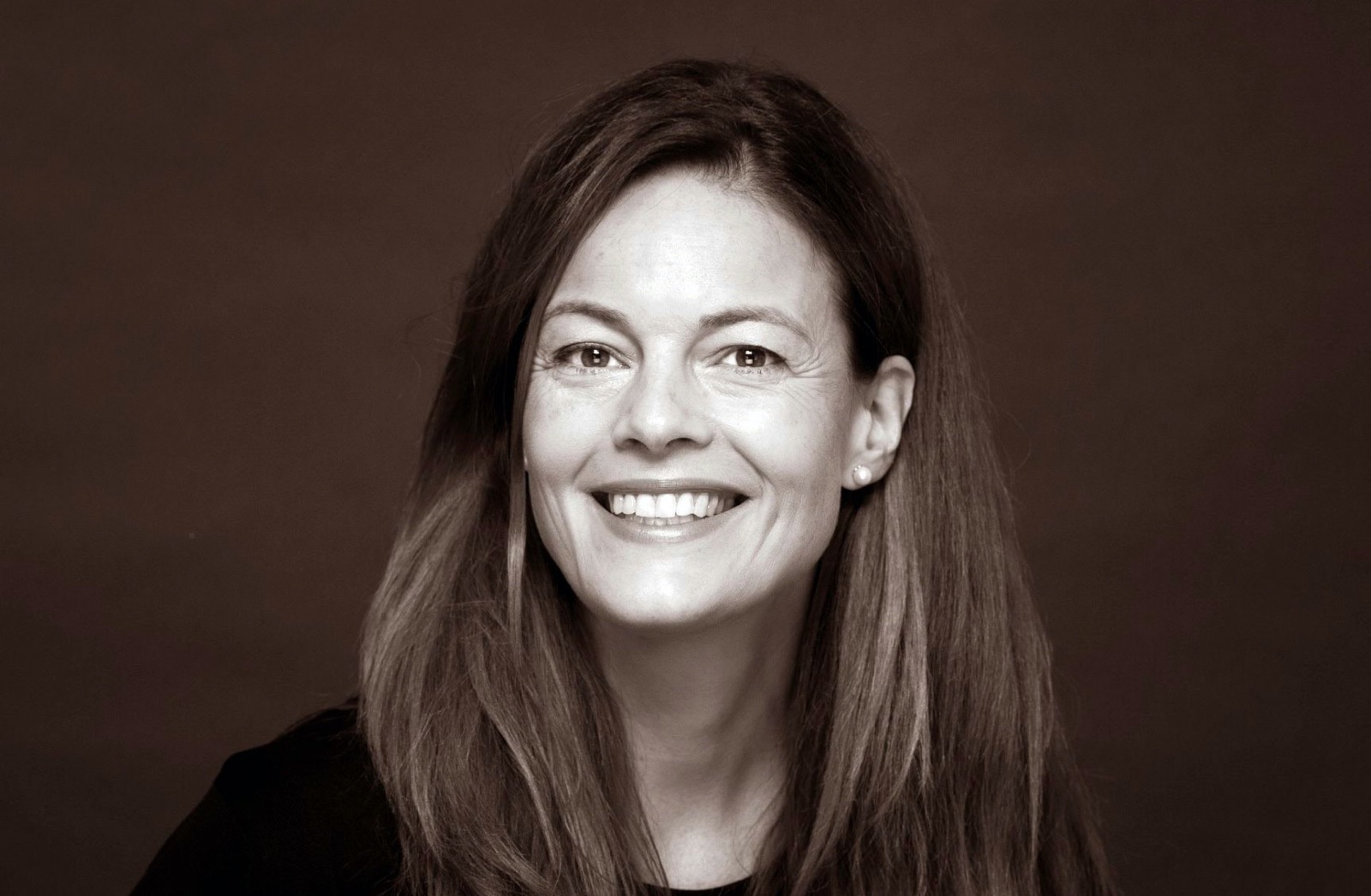
1 commentATypI announces new president Carolina Laudon
“It gives us great pleasure to announce that ATypI has its first woman president! Carolina Laudon, country delegate from Sweden, dedicated volunteer, board member since 2018, and most recently board VP, was elected yesterday, August 18, 2020, as the president of the ATypI board of directors.”
www.facebook.com
Suggested By Riccardo Sartori
Font Li Beirut
“To show support and solidarity for the people of Beirut, the international type design community has come together to create a typeface that would raise funds to support the victims of the blast and the reconstruction efforts. All profit raised will go towards charities supporting the victims and the reconstruction efforts.”
www.indiegogo.com
TDC: Moving forward
“The board has been working to reverse the course of the club, from financial insolvency caused by the pandemic, to becoming a viable non-profit institution for all. […] The Board is committed to seeing the TDC survive and thrive. This moment is one in which we are working—with your help!—to rethink and restructure the TDC into a better, more equitable and more responsive organization, and continue to celebrate typographic excellence the world over.”
www.tdc.org
Fontwerk foundry and services launched
“From the typographic epicentre in Berlin, we operate as a permanent team and international network of designers, font engineers and marketing experts. Many of us are from the original FontShop universe; the place where typographic trends were set, simple license models devised, experimental limits explored and the largest library of contemporary typefaces emerged. We carry this DNA within us and develop it further – 100% independently.”
fontwerk.com


