Jump to content
Check out our typography channel on Instagram
  • How The 2016 Olympic Logo and Font were Created

    Riccardo Sartori

    Open the Link

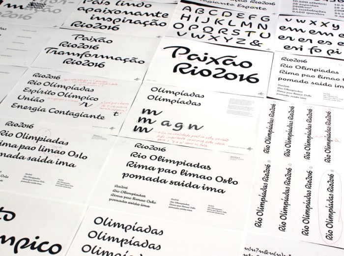
    “Our prompt was that the font had to be an exact replica of the letters in the logo,” says Maag, who knew it would be a challenge due to its reverse creative process. “Usually you make the font and then do the logo,” he notes. Dalton Maag had 3 letters and 4 figures to use as a roadmap.

    99u.com


    User Feedback

    Recommended Comments

    There are no comments to display.


    Create an account or sign in to comment

    You need to be a member in order to leave a comment

    Create an account

    Sign up for a new account in our community. It's easy!

    Register a new account

    Sign in

    Already have an account? Sign in here.

    Sign In Now

Our typography network

The type specimens of the world.
The best typography links of the week.
Discover the fonts from the Germany foundry FDI Type. A brand of Schriftkontor Ralf Herrmann.
Typografie.info – The German typography community
  • Upcoming Events

  • Add your content!

    We spread your news free of charge among a growing list of subscribers and tens of thousands of followers of our social media channels.
    Learn more about this
Elfen-Fraktur—a monolinear blackletter typeface
×
×
  • Create New...

Important Information

We are placing functional cookies on your device to help make this website better.