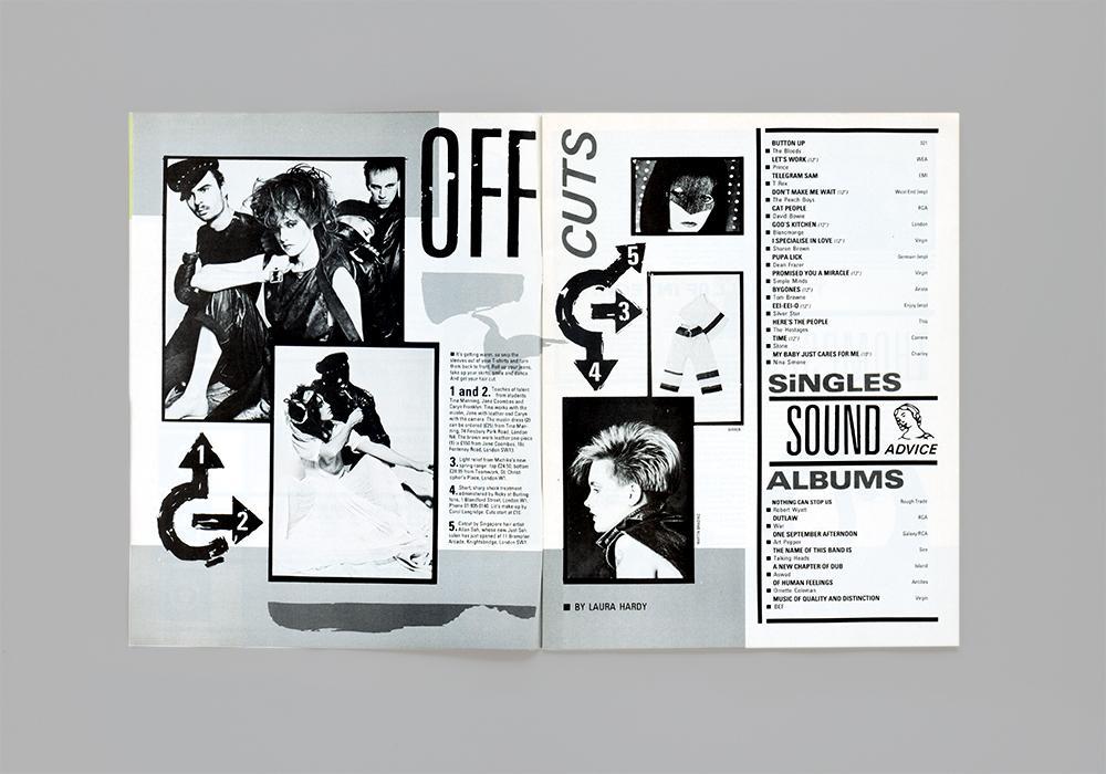
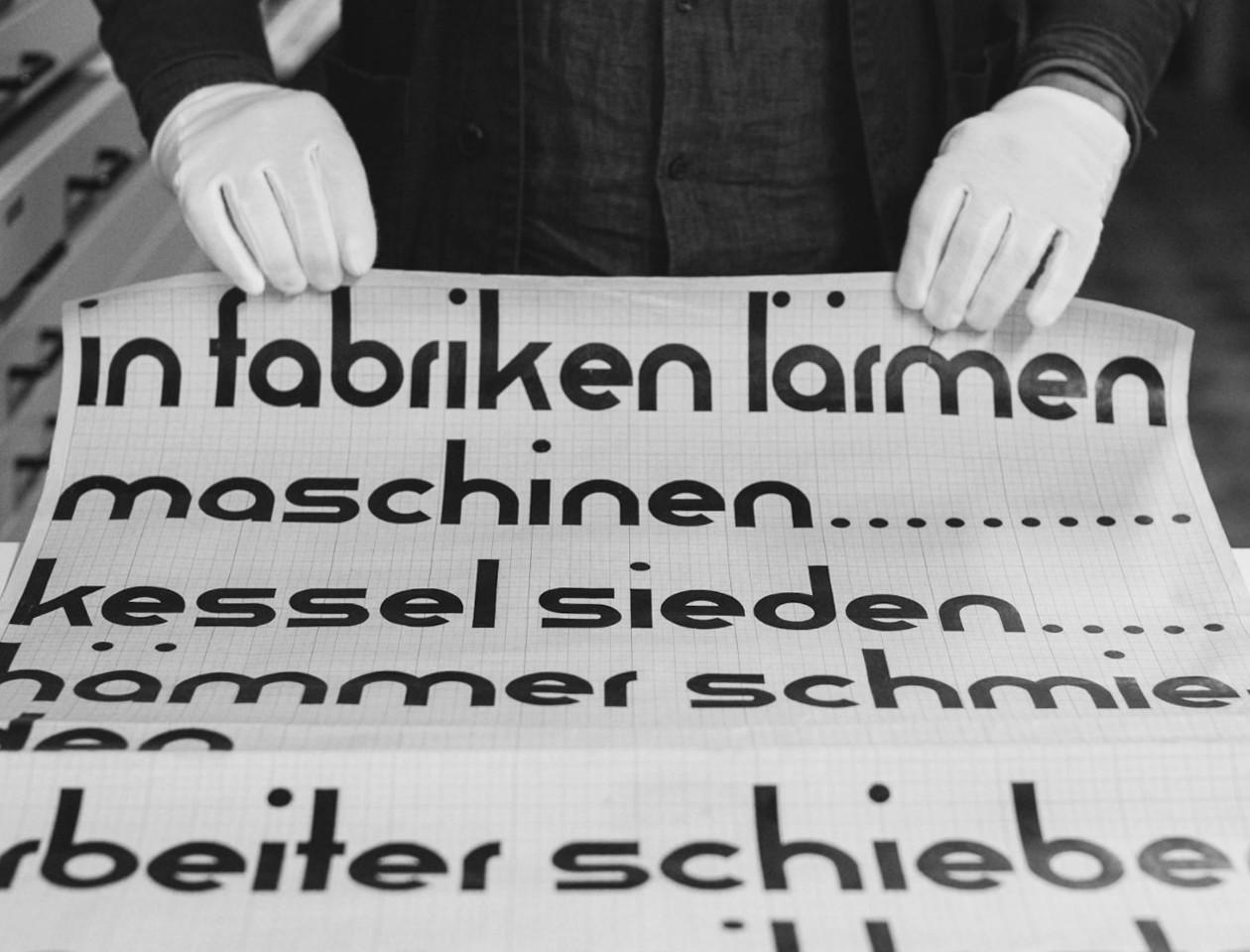
“In our first post we look at how Letraset helped to bring about the visual language of punk and became a staple of the DIY attitude to music-making established in the late 1970s and early 80s.”
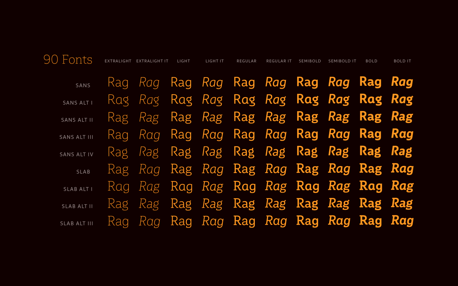
“As its name suggests, Multiple is a family with multiple font styles. The idea that sums up the concept behind the typeface is a workhorse—the challenge was to develop a useful font fit for any scenario and suitable to any design needs: editorial design, packaging, branding, screen use, etc.“
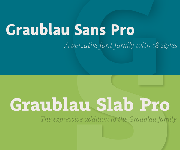
A “pay what you want” 90 fonts typeface family.
Because of the web, the role of the typographer has changed. We no longer decide; we suggest. In this book, available July 24, Tim Brown illuminates the complex, beautiful world of typesetting—arguably the most important part of typography, as it forms the backbone of the reading experience—and shows us how to parry the inevitable pressures that arise when we can no longer predict how, and where, our text will be read.
The family is an exploration of contrast methodologies, combining various aspects from the canon expansionist systems, inverted contrast, and the contrast behavior of standard sans-serif grotesks.
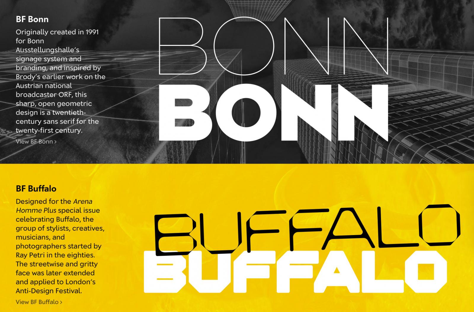
Brody Fonts is a new development in partnership with Brody Associates—Neville Brody’s global visual design agency, located in London, that specializes in typography, identity, and digital design. The foundry focuses on publishing new typefaces from Brody as well as from other studio associates, and will also revisit key moments in Brody’s typographic legacy, re-engineering, enhancing, and expanding some iconic font families for contemporary use.
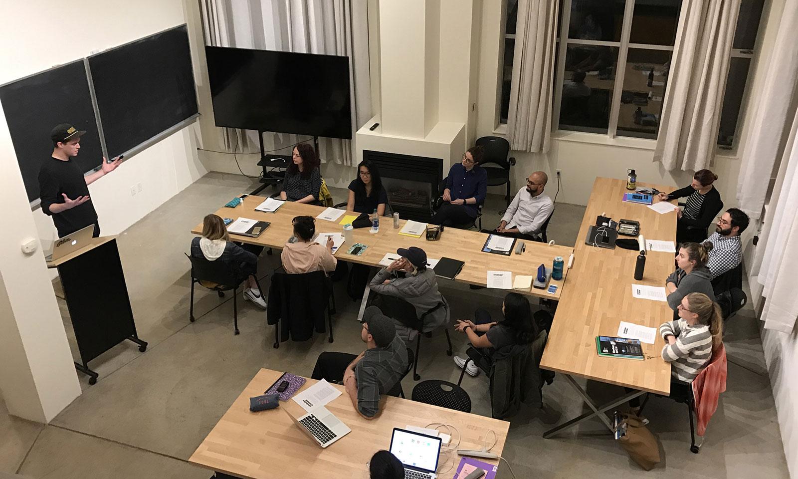
Beginning in October 2018, the year-long program will include in-depth courses in type design history, theory, and fundamentals, with classes led by James Edmondson, Grendl Löfkvist, Graham Bradley, Catherine Leigh Schmidt, Christopher Slye, and several guest instructors and advisors
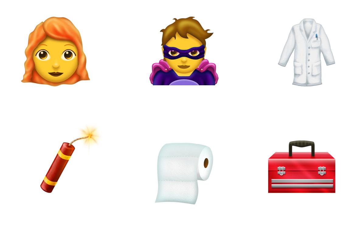
Unicode 11.0 adds 684 characters, for a total of 137,374 characters. These additions include 7 new scripts, for a total of 146 scripts, as well as 66 new emoji characters.
Herb Lubalin was born 100 years ago. To celebrate, Unit Editions launched a Kickstarter campaign to republish Herb Lubalin: American Graphic Designer (1918-81) a limited-edition, numbered and boxed monograph first published in 2012.
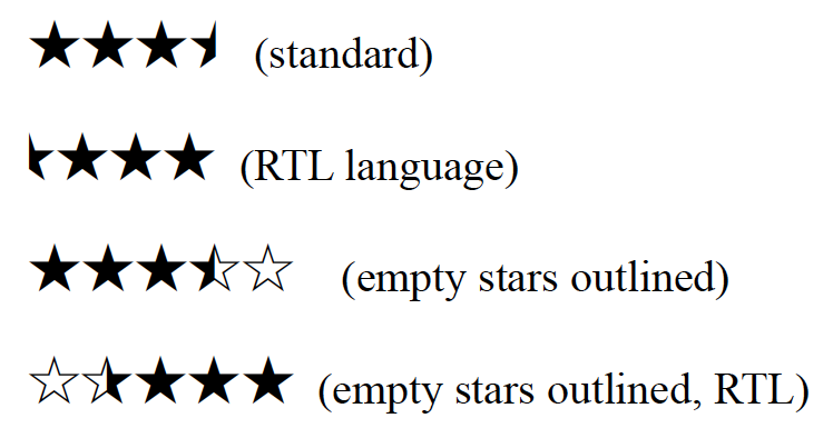
Star characters (☆★) have long been part of the Unicode standard, which means they can appear as characters in web pages, text, and email. But half-stars were missing, so they required special images or custom fonts. Until now.
Forgotten Shapes publishes digital reconstructions of typefaces that have somehow vanished. Run from Leipzig, Germany by Stephan Müller, Pierre Pané-Farré & Reymund Schröder.
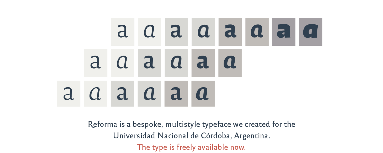
“Reforma is a bespoke typeface designed by PampaType for the Universidad Nacional de Córdoba, Argentina, earliest university in the country and one of the first in the continent, with a history of more than 400 years. The typeface was commissioned as part of the celebrations for the centenary of the University Reform. The typeface has been liberated for public and private use under a Creative Commons license.”
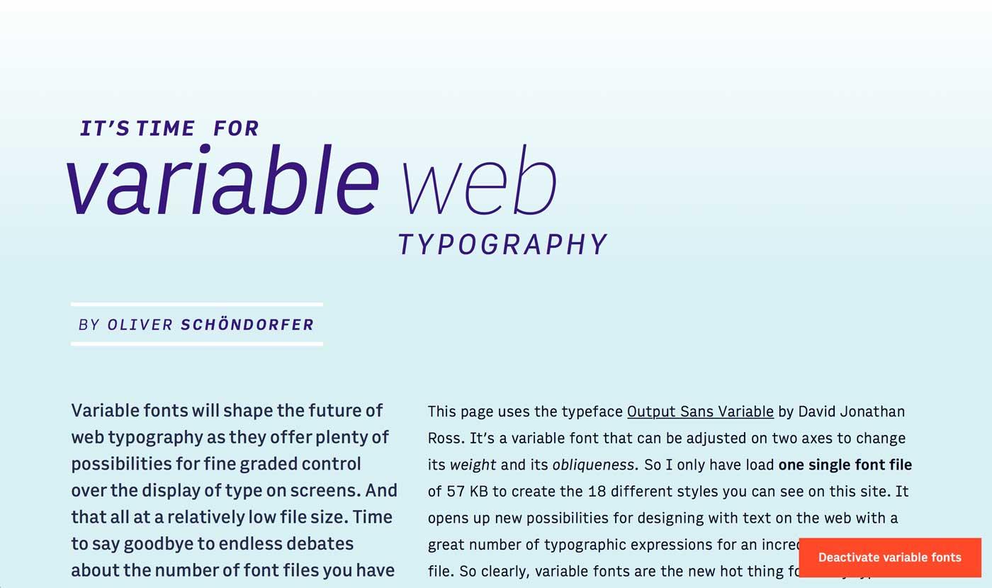
“Variable fonts are the font technology made for the digital era. They have the power to bring more typographic richness to the web at a lower file size. But with new possibilities and advantages new challenges and complexity arise. So what’s so hot about the next big thing since the introduction of web fonts (at least to all type nerds) and how can you use it?”