“The Internet is drowning in typographically monstrous quotations. This site is designed to remedy this ghastly situation and, in doing so, likely affect world peace. You’re welcome.”
Fascinated by segmented typography – not quite vectors, not quite pixels – designer/typographer/writer Marcin Wichary made an interactive typing playground showcasing both real world and experimental designs.
María Ramos: At TYPO Labs 2018, Gerry Leonidas pulled the trigger with a thoughtful presentation: ‘I am now in an environment where the design space is by default way bigger than my ability to imagine it, not just my ability to do something with it’.
“After trying to find an available screen-optimized font system that would work for the company’s needs and coming up empty-handed, the company worked with typeface foundry Dalton Maag to create the new font.”
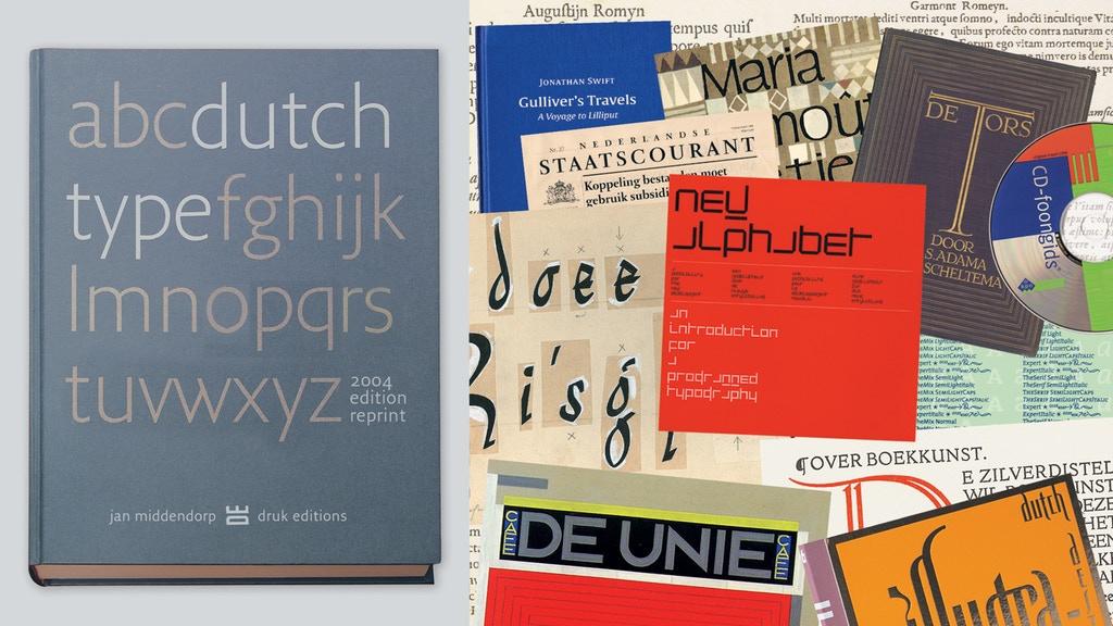
Dutch Type was published in March 2004 and was received with huge enthusiasm. Its 3,500 copies sold out in 3 years. The book soon became hard to find and ended up being offered at embarrassingly high prices on Amazon and eBay – from 500 € to $ 1,200 for a copy.
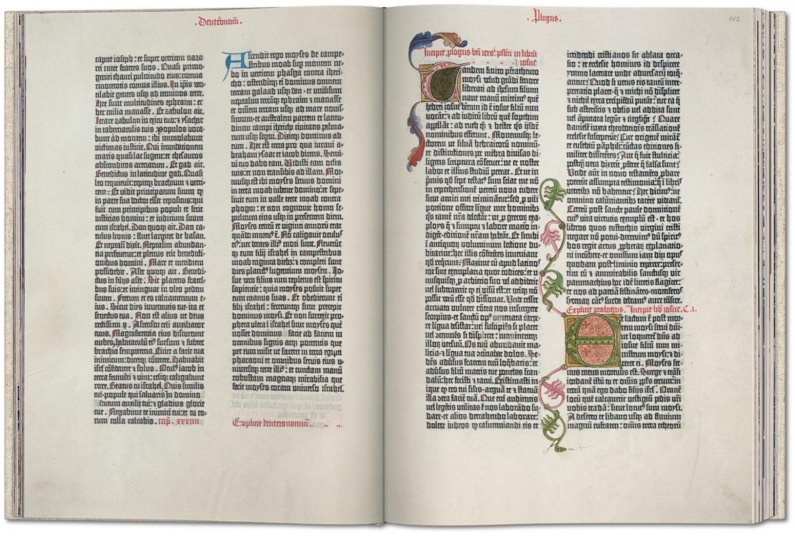
Published in Mainz around 1454, the Gutenberg Bible was the first major Western publication to be printed with movable metal type, ushering in a whole new age of knowledge distribution through mass-produced books. This fascimile edition derives from one of the very few surviving complete vellum Latin originals worldwide; the Göttingen Library edition, one of the most valuable books in the world, listed in the UNESCO Memory of the World program.
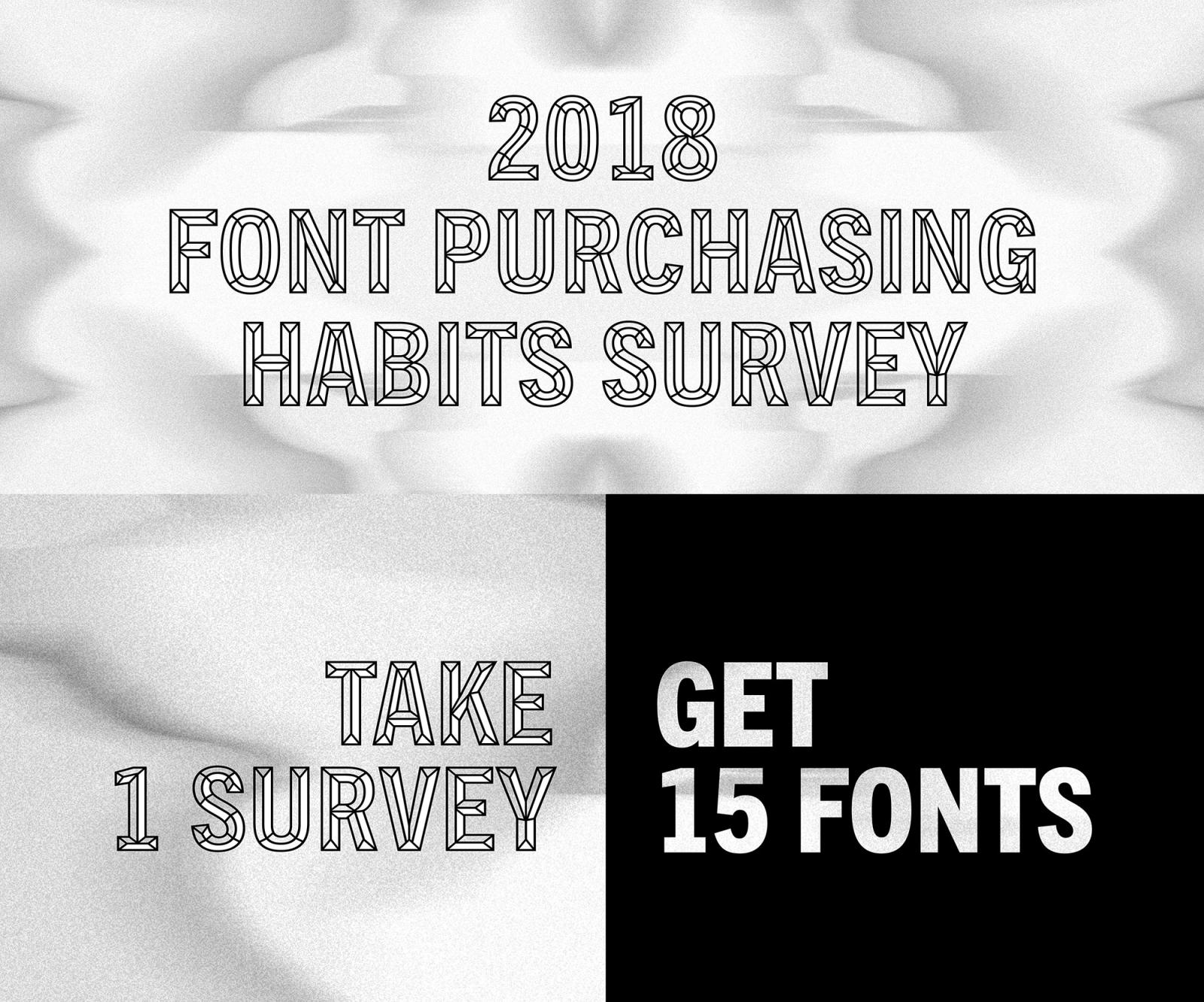
“Take the 2018 Font Purchasing Habits Survey to share your font preferences and purchasing habits. After completing the survey, you will receive a pack of 15 fonts for free.”
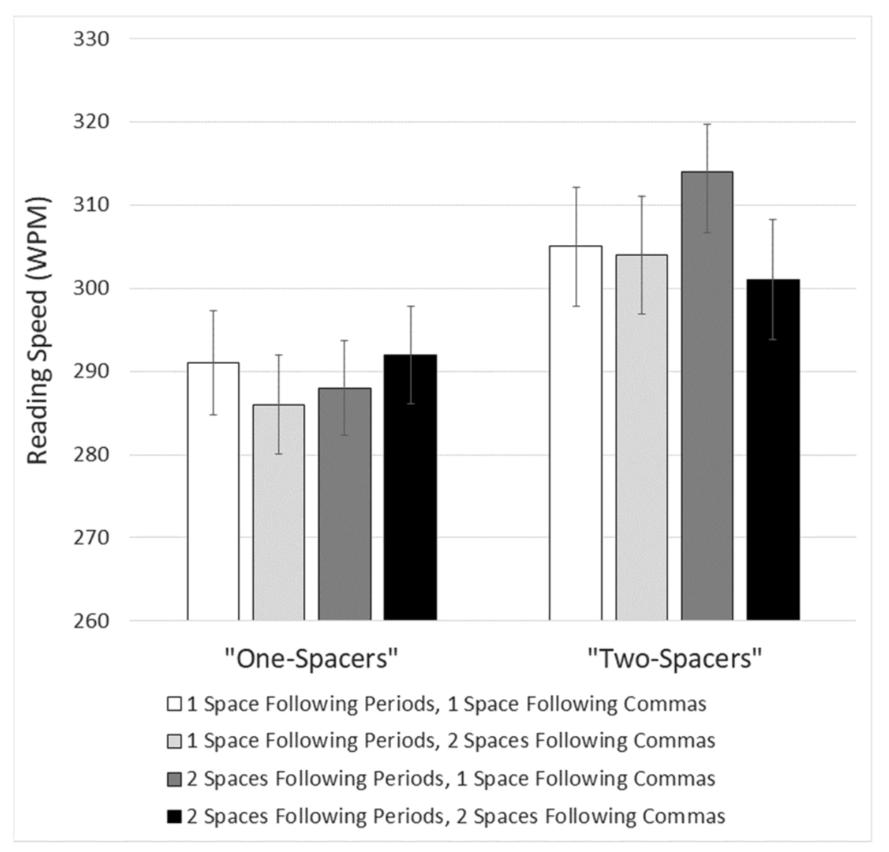
An article by Matthew Butterick, responding to the study “Are two spaces better than one? The effect of spacing following periods and commas during reading”, written by Rebecca Johnson, Becky Bui, and Lindsay Schmitt.
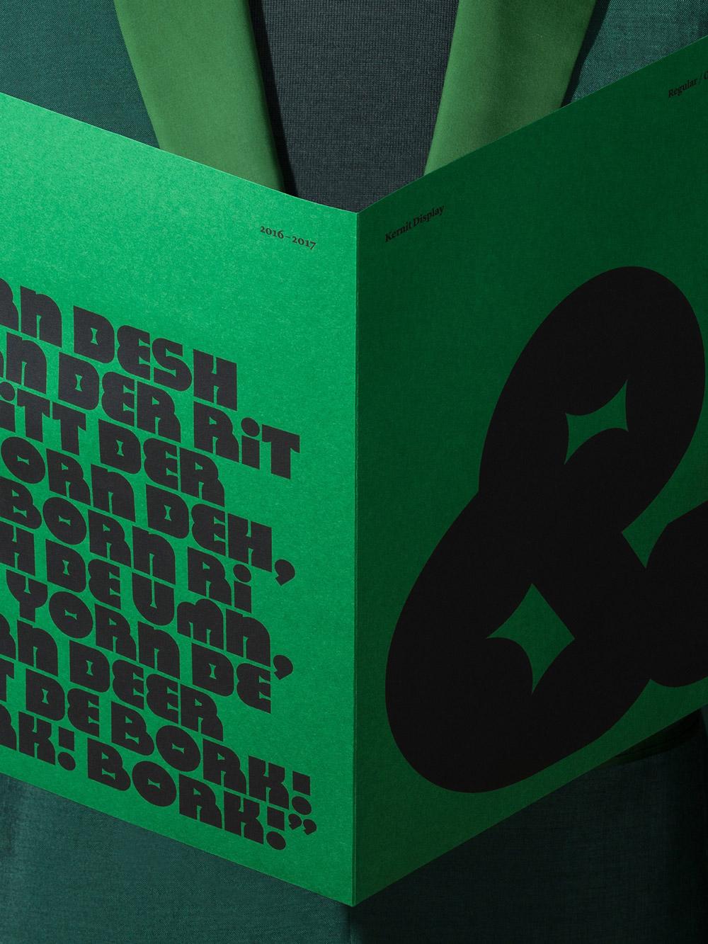
Kernit is a typeface inspired by the work and characters created by the late Jim Henson. It was developed as part of the initial design exploration for The Jim Henson Exhibition at The Museum of the Moving Image in New York City.
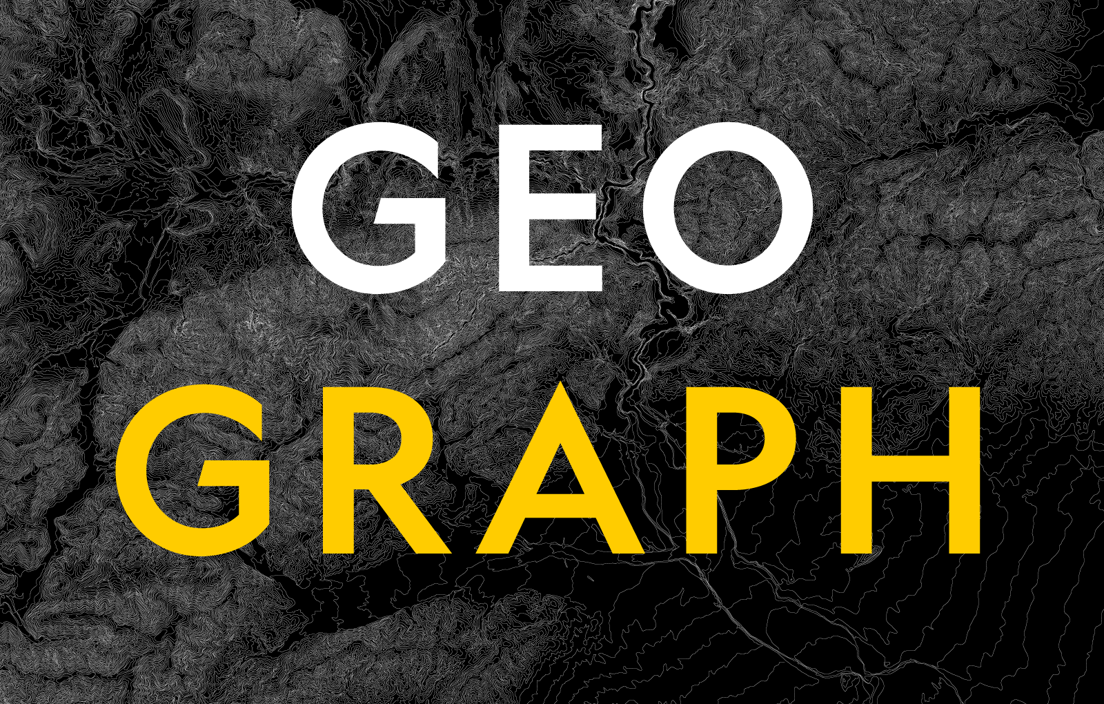
“Geograph is a contemporary, plain sans serif designed for National Geographic. It comprises 24 styles for use across their broadcast, print and web channels.”
“Originally designed in 1928, Plak is something of a lost gem in the type world. Despite being drawn by Futura creator Paul Renner, it never achieved the same popularity and spent decades lacking a much-needed digital revival.”