“Bass’s work can catch you by surprise at how deceivingly simple it is. We are thrilled to hold a small selection of his distinctive work, which continues to inspire a new generation of graphic designers.”
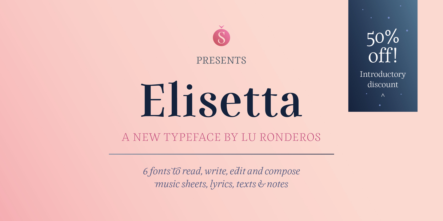
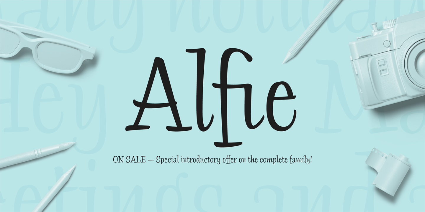
“Alfie Script is a delightful connecting script with a touch of comfortable elegance. Use it for everything from social announcements to headlines and packaging.” The family is currently 50% off as introductory offer.
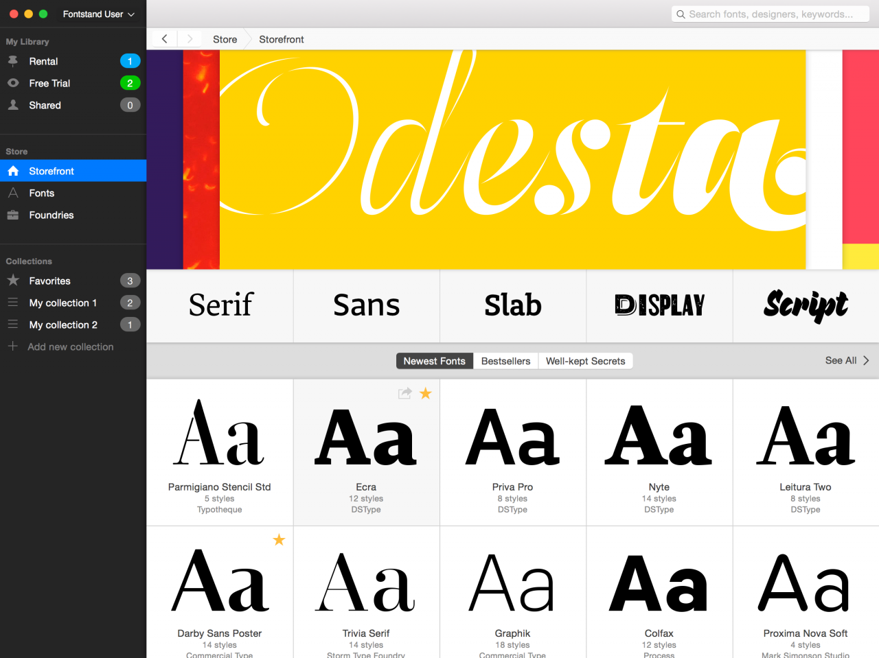
“Fontstand is an app for Mac OS X and Windows that allows you to try fonts for free or rent them by the month for desktop and web use for just a fraction of the regular price.”
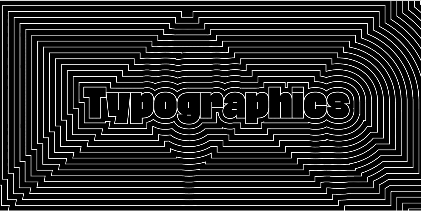
Typographics is a design festival for people who use type. The annual event series, now in its 4th year, takes place June 11–21, 2018, and is devoted to contemporary typography, with talks, workshops, and tours focusing on where typography is today and where its future may lie. It will be held at The Cooper Union in New York City.
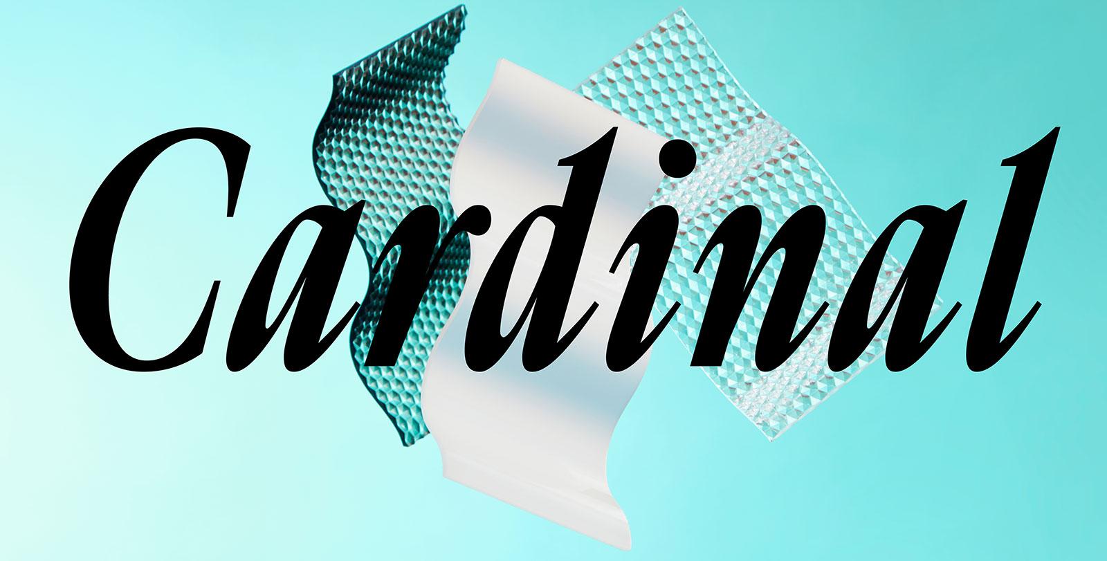
“Cardinal is the first type family which entirely originated from the womb of Production Type. It was drawn by Yoann Minet & Quentin Schmerber under Levée’s guidance and debuted as the core typeface in the Trax magazine redesign rollout. After two years of refinement and live-testing by a handful of design studios, the Cardinal collection is now available to a wider audience.”
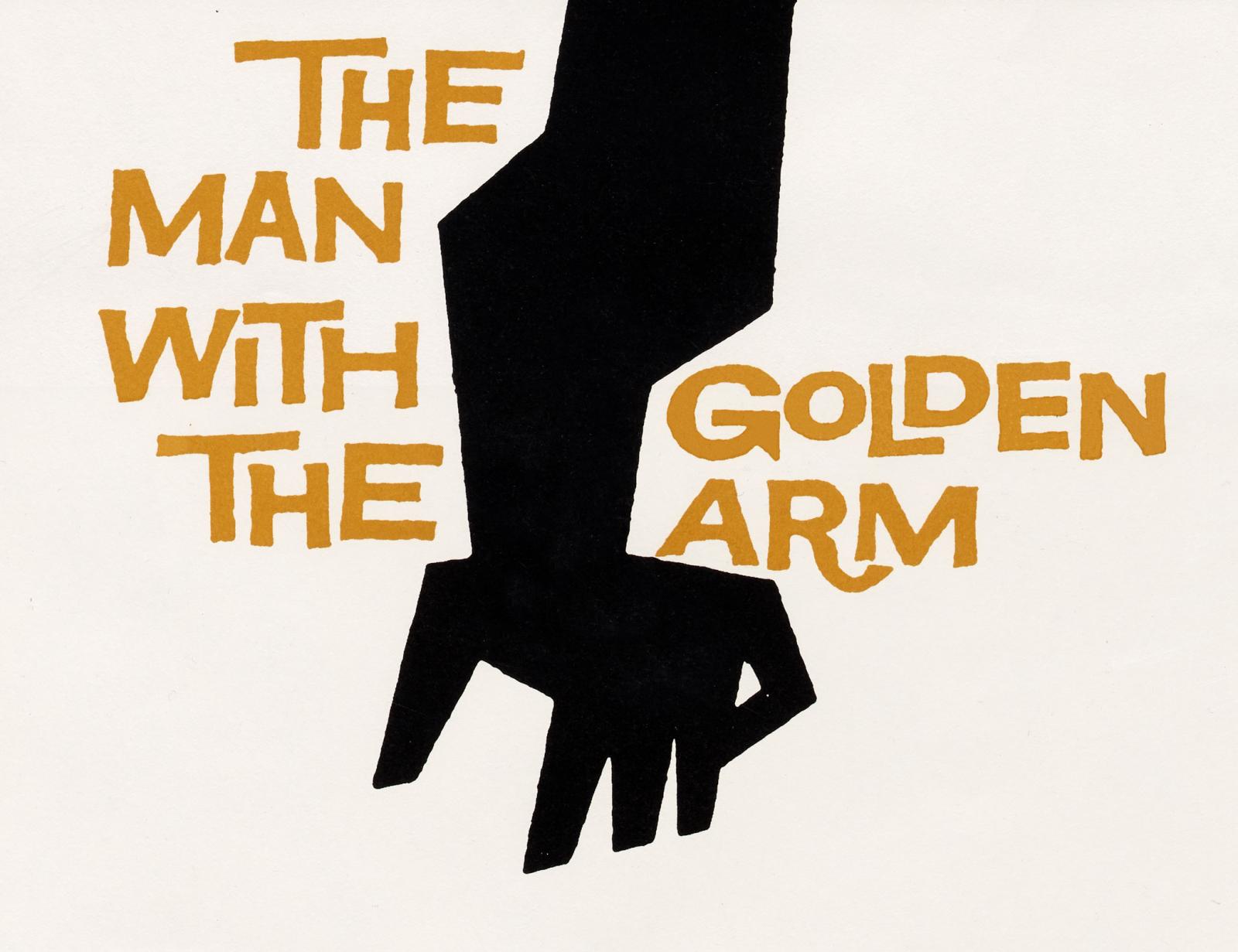
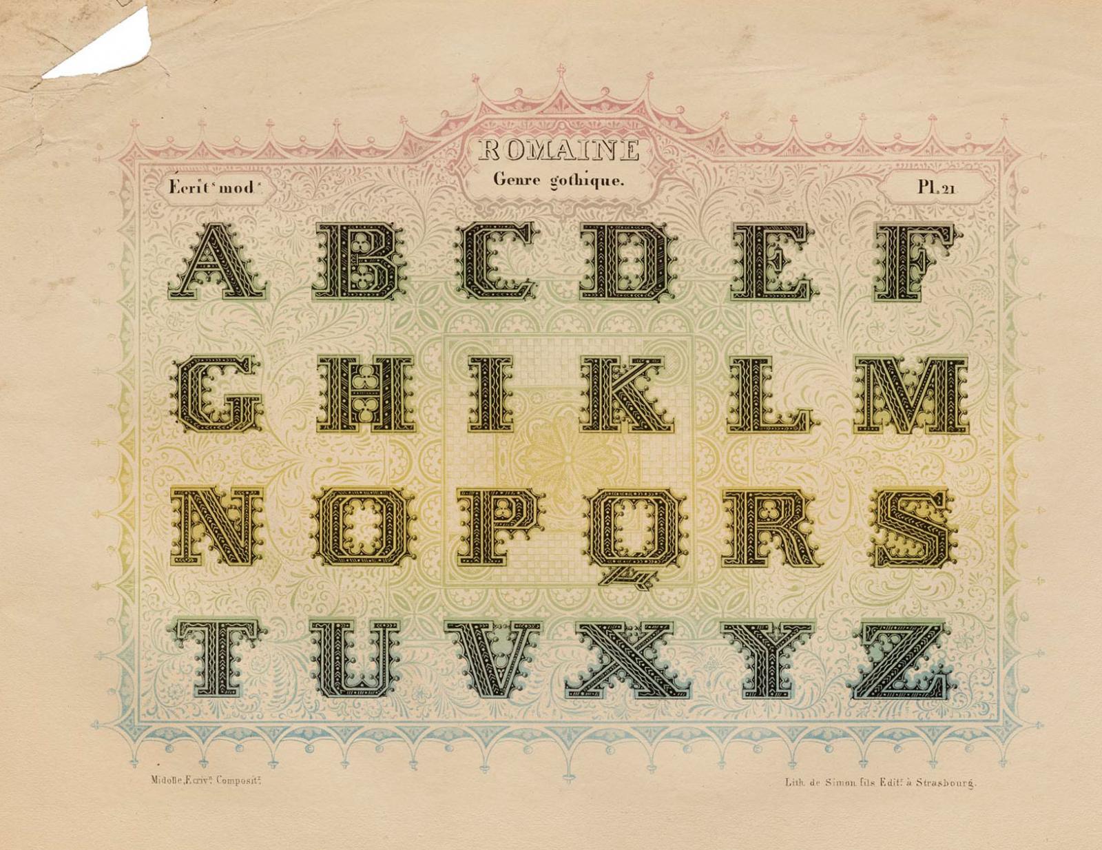
“An enigmatic portfolio of fantastical lettering styles continues to fascinate designers and historians. Guest author Dan Reynolds highlights a few favorite plates.”
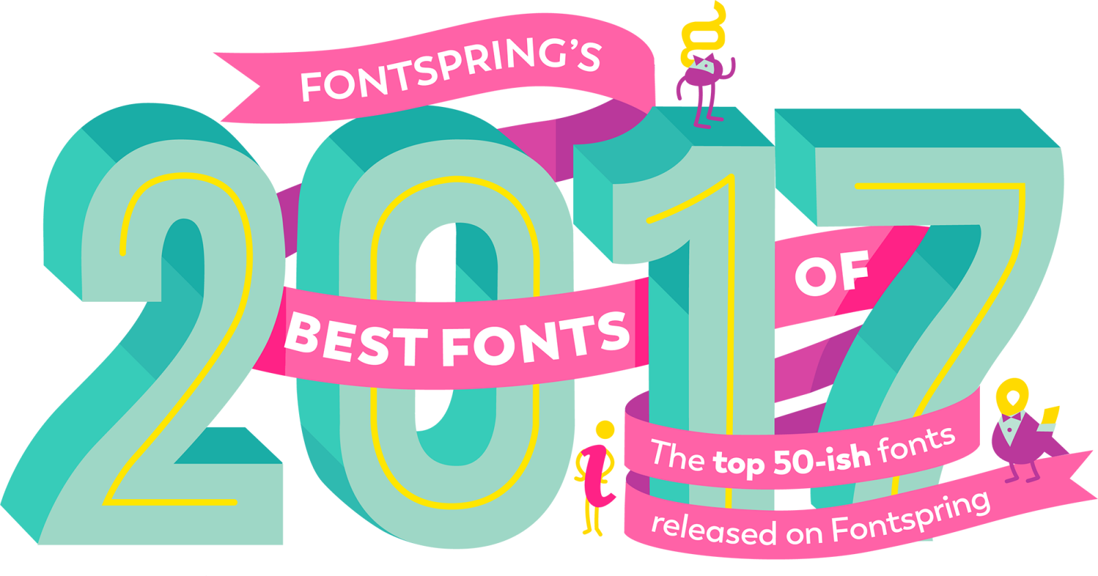
“From sleek sans serifs, to striking slab serifs, to fun display families, this list includes only the highest quality font families released this past year. Out of almost 2,000 families released on Fontspring in 2017, we whittled the list down to the 60 top fonts.”
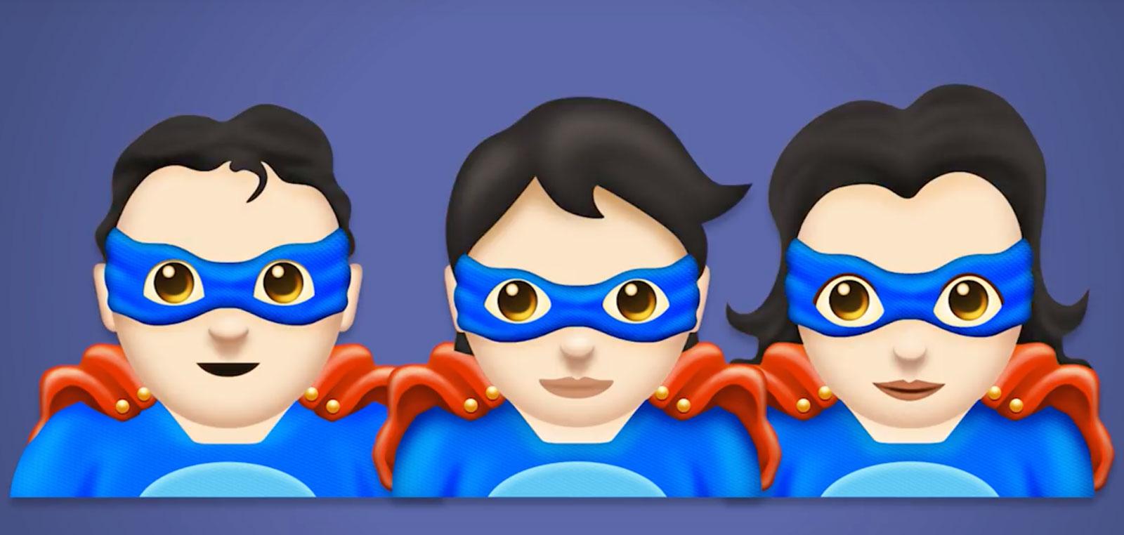
The new Emoji 11.0 set is fixed and final, and includes the data needed for vendors to begin working on their emoji fonts and code ahead of the release of Unicode 11.0, scheduled for June 2018. The new emoji typically start showing up on mobile phones in August or September.
“Foster Type is the typographic work of Dave Foster, an independent designer based in Sydney, Australia. He draws typefaces and lettering for design studios, type foundries, brands and individuals around the world.”
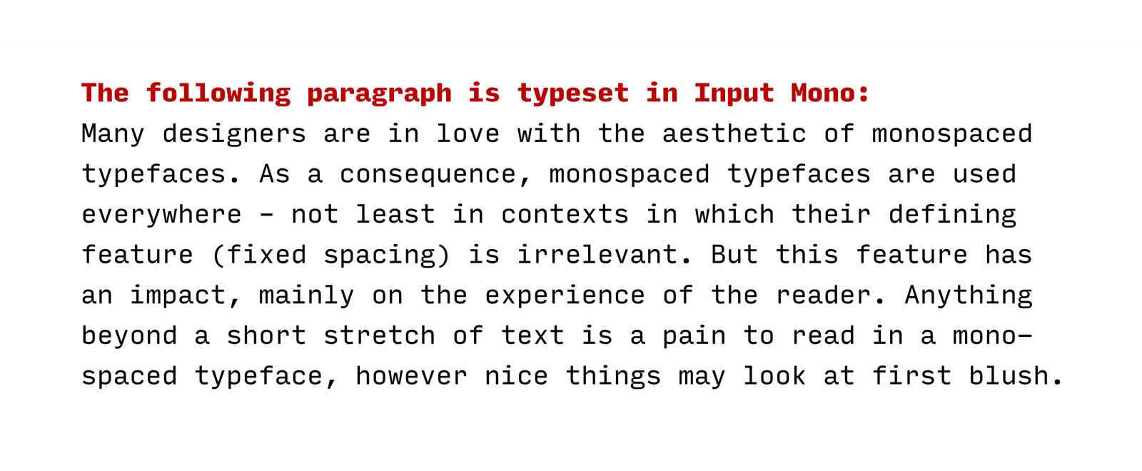
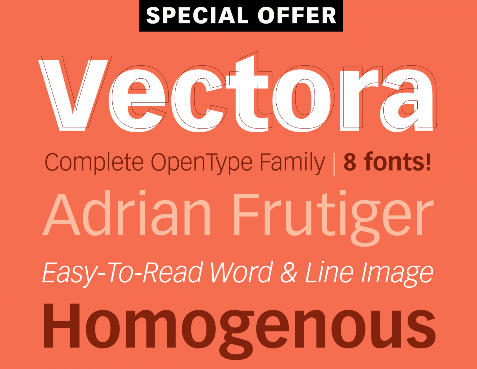
“This clear, distinct typeface came about because the designer consciously allowed himself to be influenced by the American grotesque sans-serif of the early 20th century.”
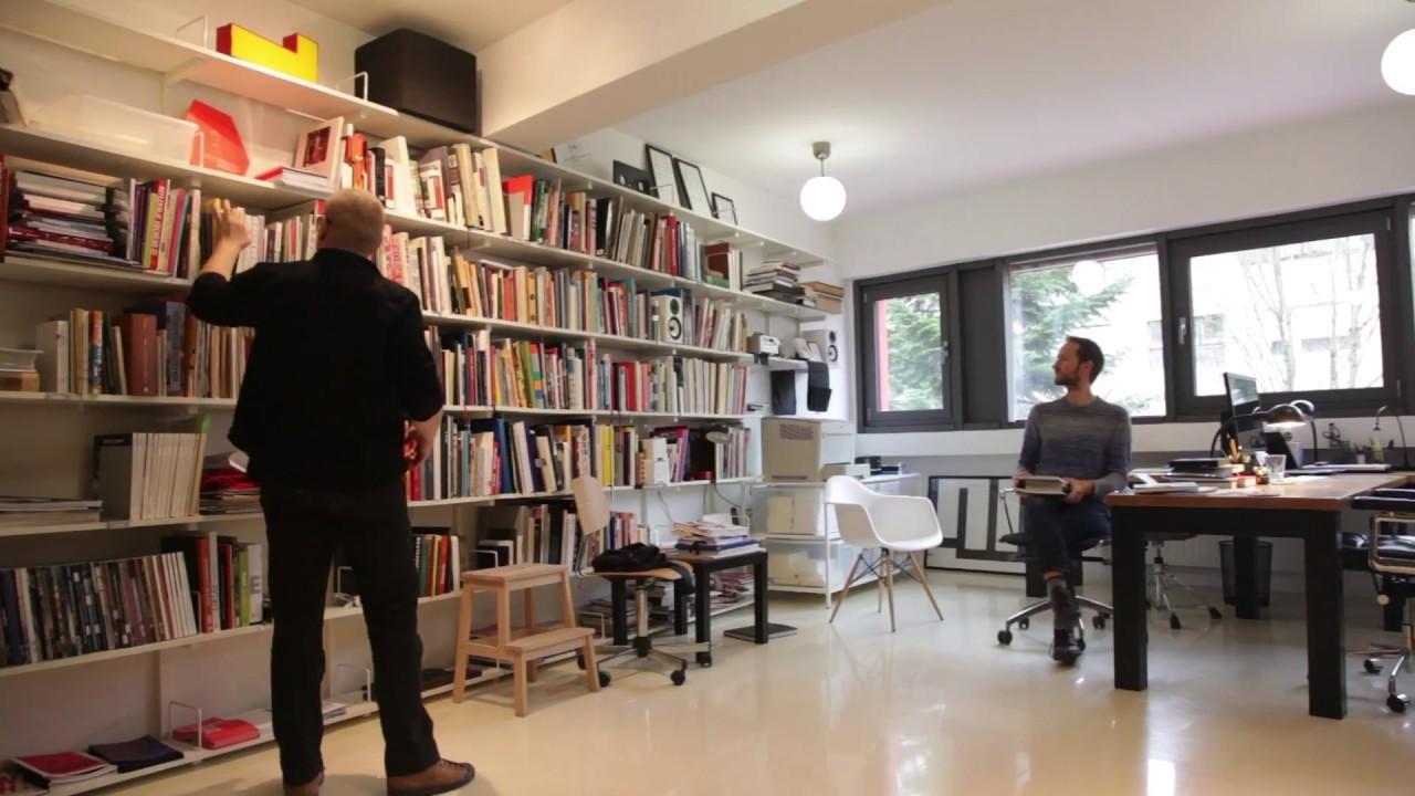
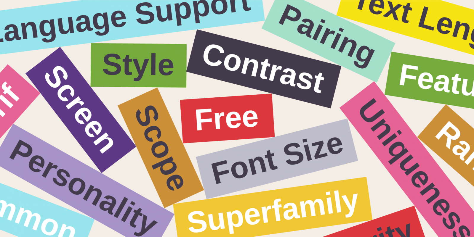
“The right typographic choice always reflects the specific needs of the project itself. These needs are not only aesthetic, but also technical and functional—and there’s only so much you can tell from snippets of text as you scroll through a dropdown menu from Alegreya to Zapf Dingbats.”