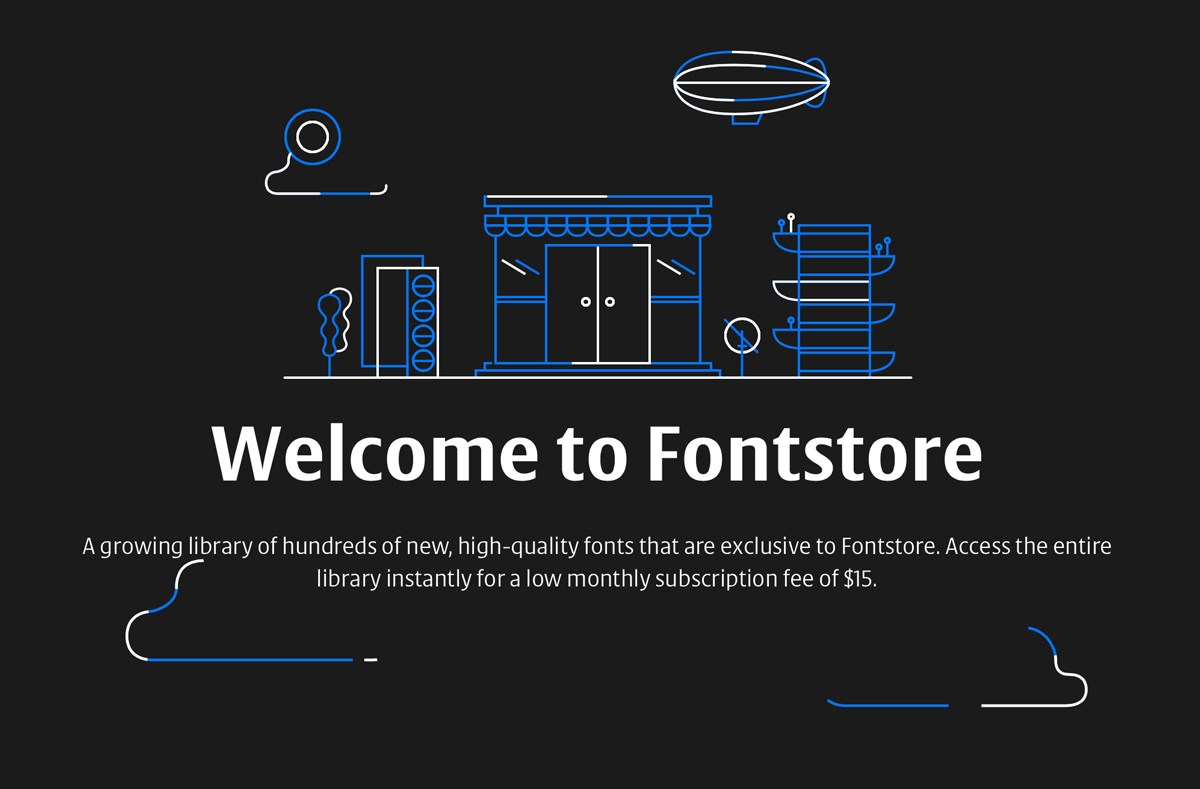
“A growing library of hundreds of new, high-quality fonts that are exclusive to Fontstore. Access the entire library instantly for a low monthly subscription fee of $15.”
“Join the Font of the Month Club and get a fresh new font delivered to your inbox every single month! Each font is lovingly designed and produced by David Jonathan Ross.”
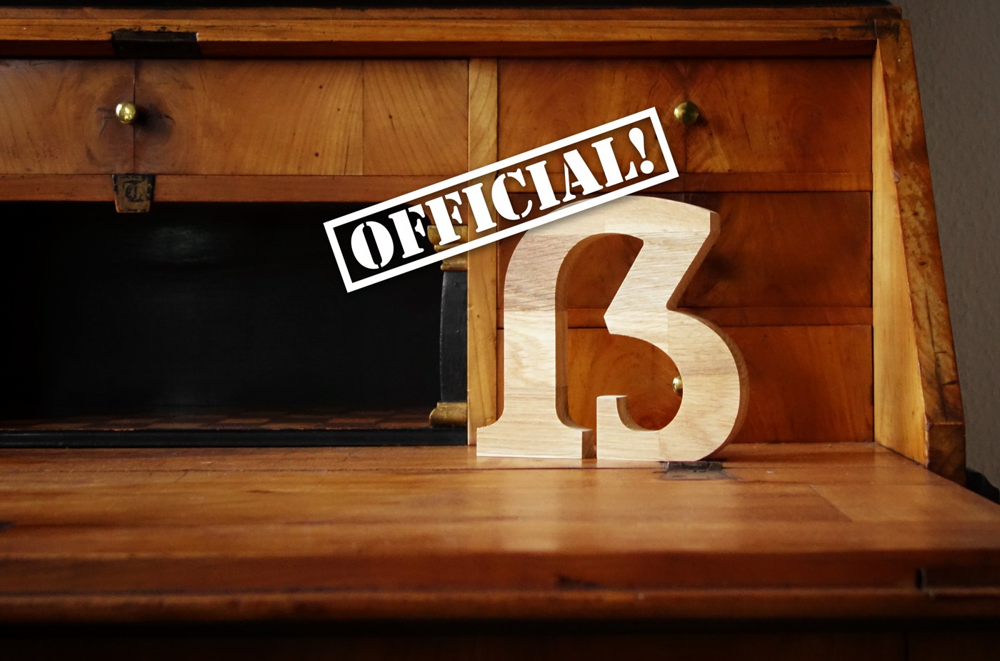
The Council for German Orthography published a new 2017 version of the German orthography. Among the changes is the inclusion of the Capital Sharp S. The German alphabet is now finally complete.
Mark Simonson: “Over the years I've noticed that sometimes designers don't seem to like the little blobs I put on some of the characters, such as the b and o, so they remove them. Coquette 2.0 includes these alternate forms.”
Paul D. Hunt: “To have true gender equality, we would need to think about how to provide representation for people who do not have a binary gender identity.”
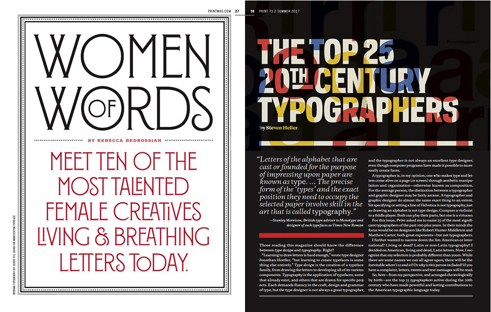
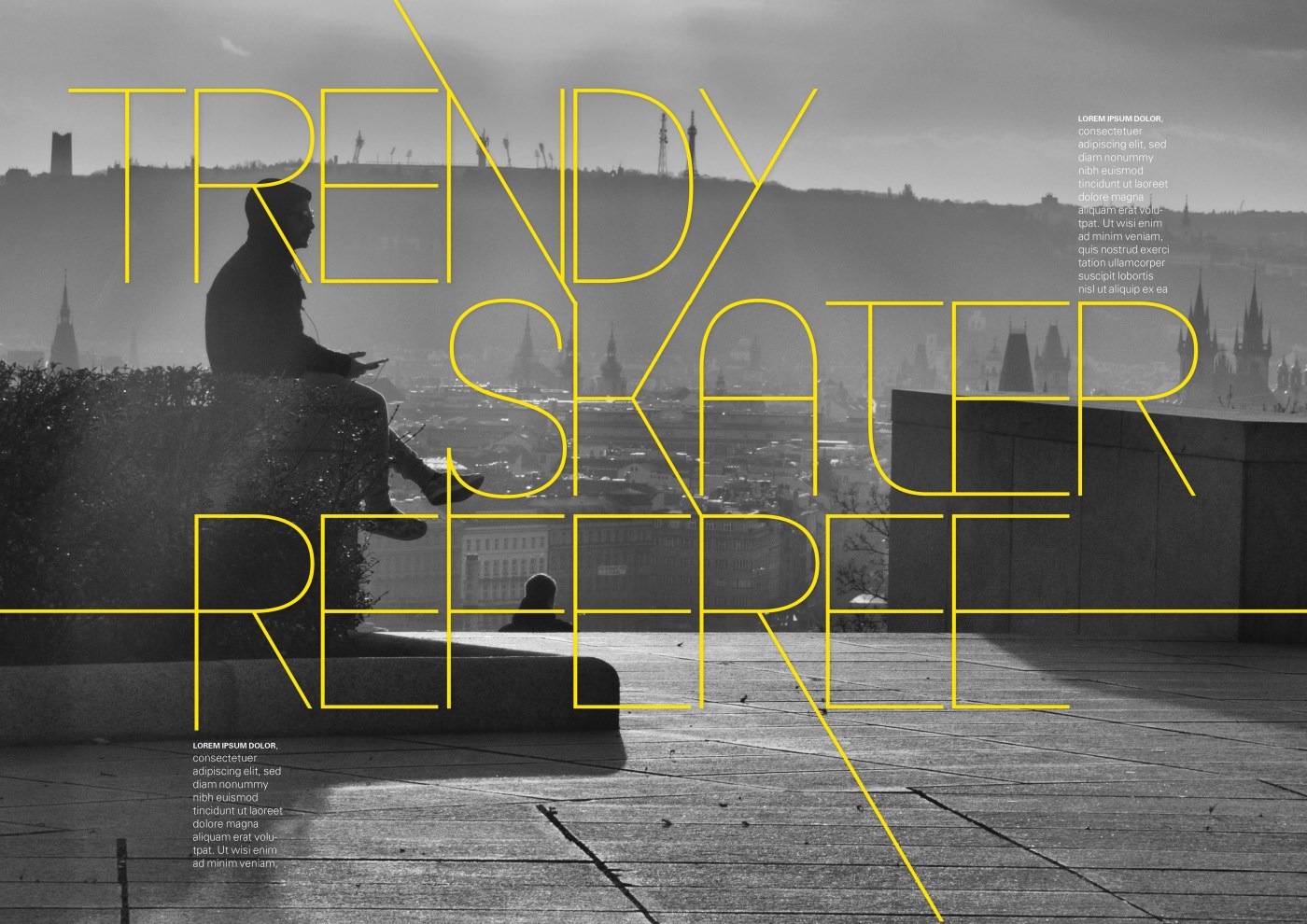
“This typography issue, with cover photo by John Keatley and typography by Louise Fili, is a bit different from past editions. Here, we dive into the turning tides of typography. Throughout the issue you’ll find voices advocating for ‘the strict adherence to classic terms,’ while others advocate for everyone to ‘lighten up.’”
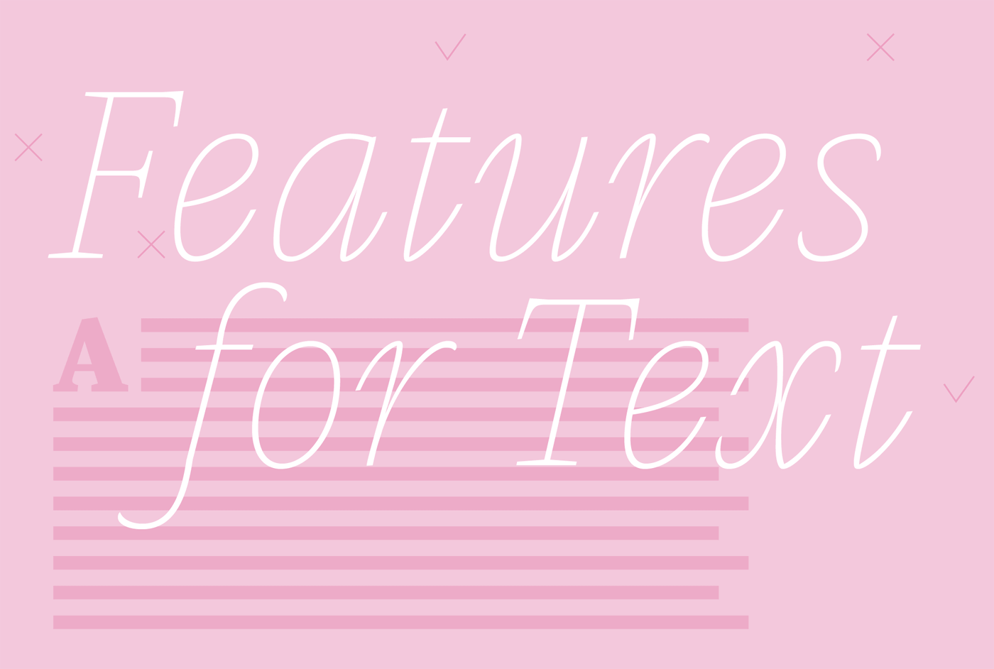
“Most features for improving the legibility of typefaces are not yet scientifically proved and most of them are more a question of readability – the typographical treatment of text – not a question of the typeface’s design. Anyhow we would like to introduce you to some features you should look for when choosing typefaces for text.”
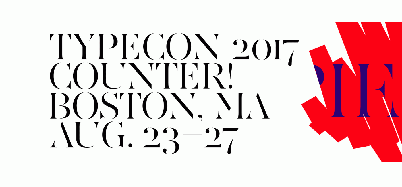
“We’ve been putting the finishing touches on this year’s conference program and are very excited to share a preview of what to expect this summer in Boston.”
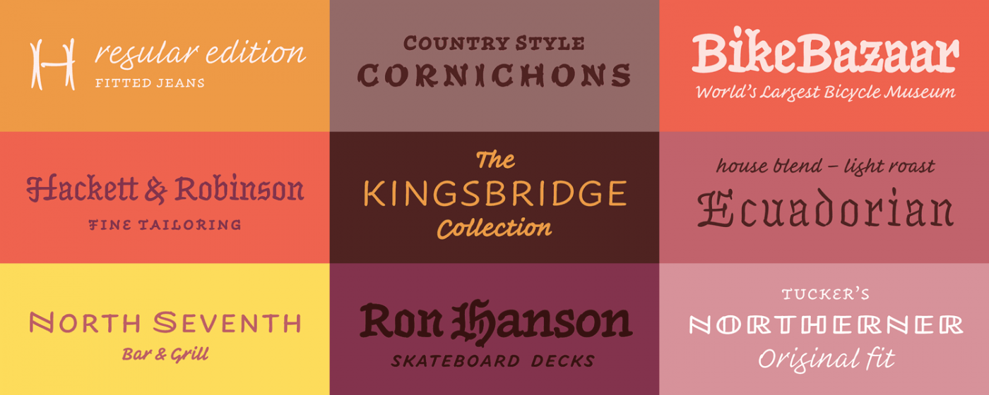
“Originally designed for newspaper text, Exchange strives for clarity and efficient copyfit across multiple platforms. Its strategy relies on an unorthodox collection of historical references, from nineteenth-century Britain to Depression-era America.”
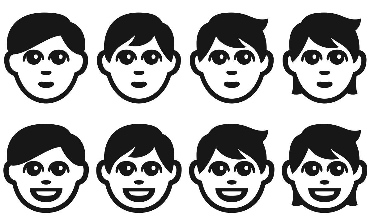
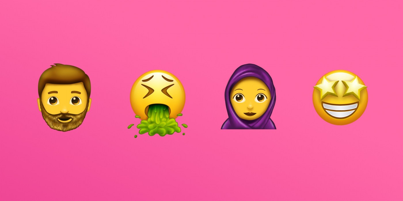
Version 10.0 adds 8,518 characters, for a total of 136,690 characters. These additions include four new scripts, for a total of 139 scripts, as well as 56 new emoji characters. (Image: Emojipedia.org)