“Production Type was commissioned by Google Fonts to create a new typeface primarily intended for immersive reading, that is now available from GSuite, Google’s collaborative office-suite for documents, slides and spreadsheets.”
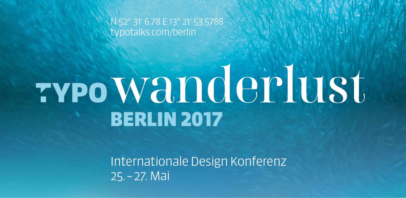
“Typography is undergoing a public renaissance. Typography usually strives to be invisible, but recently it’s become a mark of sophistication for readers to notice it and have an opinion.”
“Get the complete Between font family with all 48 styles in OpenType Pro format for only EUR/$ 49 by June 15. You save $150 (75%) off the normal price.”
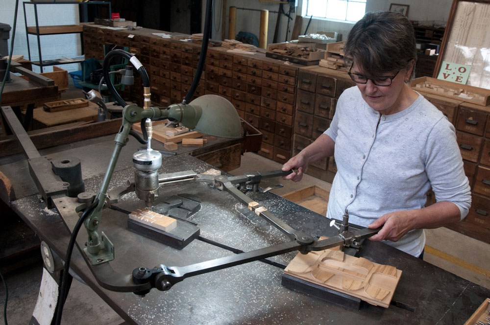
P22 Type Foundry and The Hamilton Wood Type Museum have announced the newest addition to the Hamilton Wood Type Legacy Project: Brylski by Nick Sherman, named for retired wood type cutter Norb Brylski and designed to be cut as wood type at the museum in Two Rivers, WI.
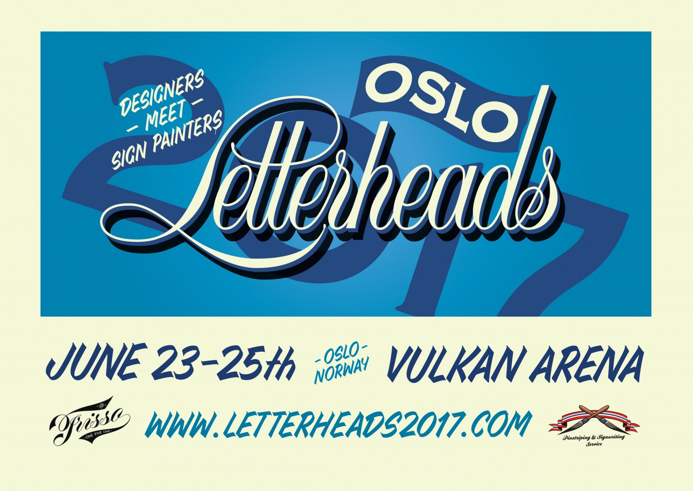
This year International Letterheads Meet will happen in Oslo, Norway. A weekend for sign painters, designers, typography lovers, artists and craftsmen, loaded with workshops, demos, talks and lots of fun. Letterheads are all about "keeping the craft alive", in a light and cool atmosphere with over a hundred people from all over the world sharing their knowledge and experience.
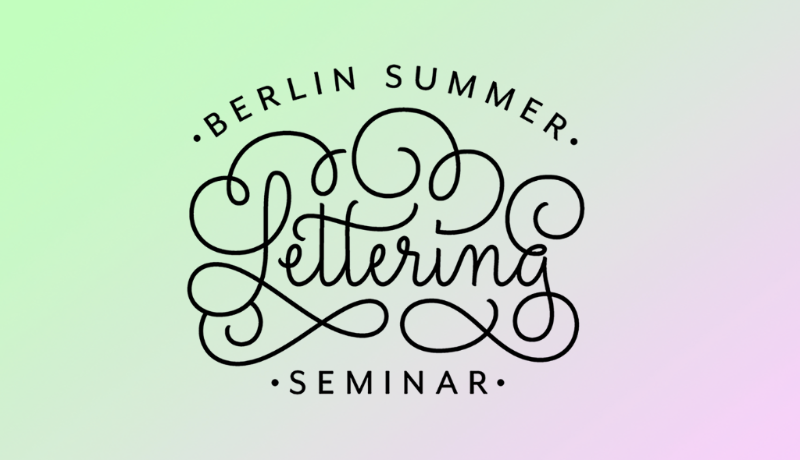
In this 3 days intensive session (for €645) you’ll design a piece of lettering from sketch to final color digital artwork. The attendants will drive the process of thinking, sketching, refining and digitising a lettering piece.
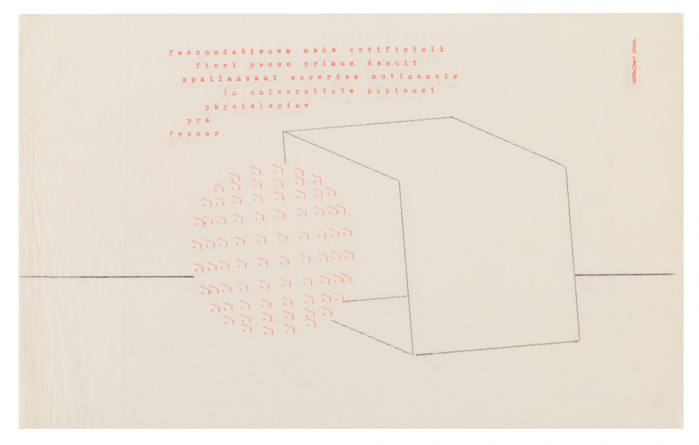
An exhibition in London showcasing the work of Dom Sylvester Houédard (1924 – 1992), a Benedictine monk who became a cult figure of counter-culture sixties London. Known simply as dsh, he was a pioneer of Concrete Poetry (typewriter art), wrote extensively on new spiritual approaches to art and was an authority on the Beat movement. His abstract visual poems, known as ‘Typestracts’, were A4 in size and typed on an Olivetti Lettera 22.
“Condensed by design, Pilot is an informal jobbing typeface for short texts and striking display use – e.g. headlines, posters, book jackets or packaging.”


.png.4965af134e838fce6c675263f1f5b826.png)