TypeMedia is a full-time one year master program held at The Royal Academy of Art, in The Hague, The Netherlands, that gives participants the possibility of delving deeper in the field of type design.
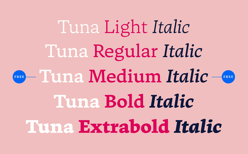
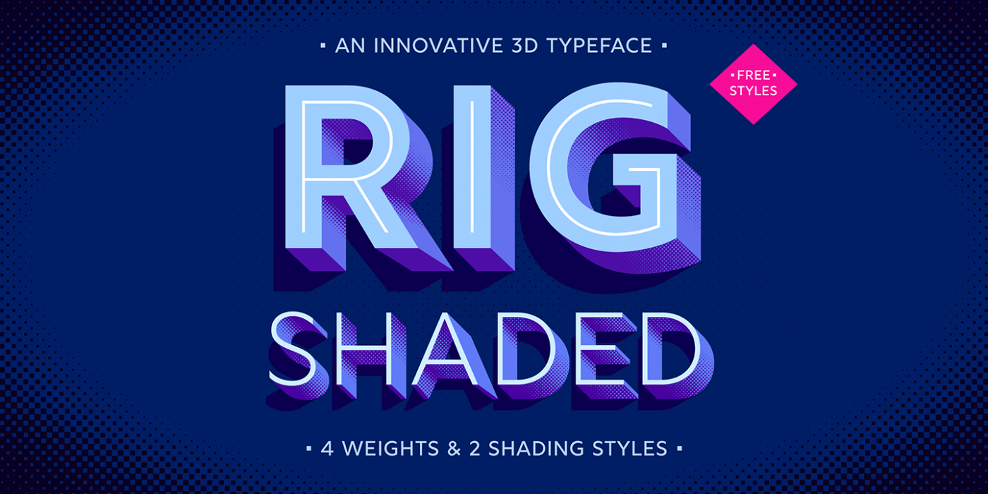
We proudly announce the release of our new typeface TUNA. Optimized for crossmedia publishing TUNA is smooth like butter while reading on screen as well as paper. The complete family is 50% off in the first month at MyFonts. Both Medium weights are completely free! If you want to find out, how we used the charming broad-nibbed calligraphic style to optimize legibilty on screen, or simply want to see the webfont in use, please have a look at our promotion website: http://tuna-typeface.com
“Welcome to MyFonts’ annual round up of bestselling fonts from the previous year, where we compile our list of new type families that have proven popular with you, the customer.”
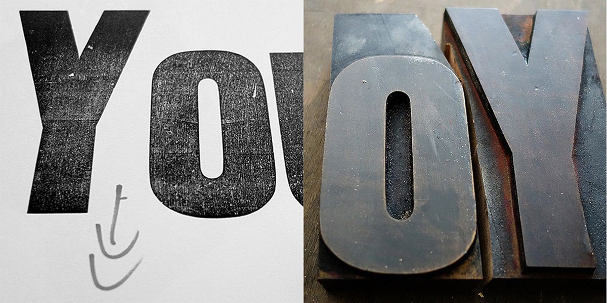
“Since the advent of computers in our studios, we’ve all spent hours looking for the right typeface from thousands of choices, fussed with tiny increments in size, introduced refinements in OpenType fonts containing hundreds of ligatures, alternate characters and content-sensitive positions. And now ‘letterpress’ is back”
Monotype looks to encourage the use of easy-to-read typefaces.
Monotype is working with MIT AgeLab on new research looking at how easily typefaces can be read at a glance, reflecting our “increasingly fast-paced, information-gathering” culture.
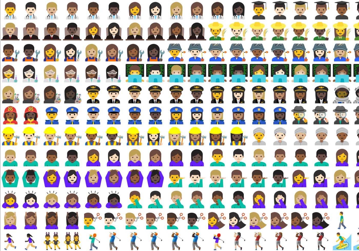
“So here I am, a year later, trying myself as an emoji designer and simultaneously exploring possibilities of bringing this font to life. And that, I discovered, is a bottomless pit if I’ve ever seen one.”
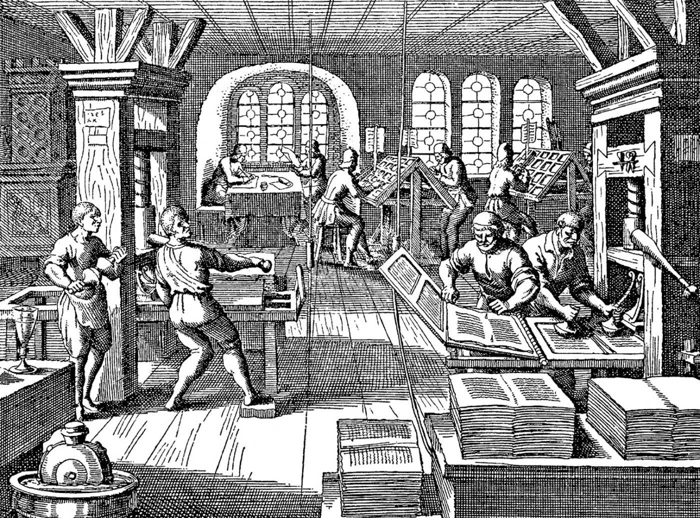
“What are the skills we need to contribute to the future of typography? And what do two ghostly figures from the 15th century have to do with that future?”
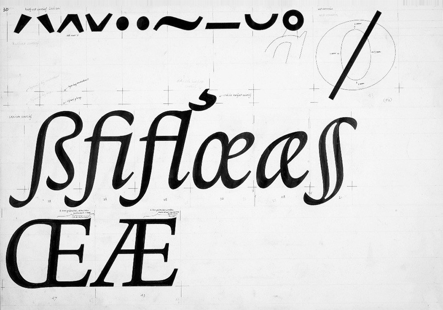
“The letter ‘Æ’ evolved from the Classical Latin diphthong ‘AE’. With its long history, there are multiple models for its design. Nevertheless, there are some aspects worth highlighting.”
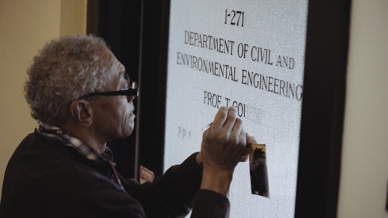
“If a name appears written in black letters on a professor’s office door at the Massachusetts Institute of Technology, it’s more likely than not that Glenn Silva put it there with the delicate stroke of his paintbrush.”