“GT America builds a bridge between the American Gothic and European Grotesque typeface genres. It combines design features from both traditions and unites them in a contemporary family. The versatile system consists of eighty-four styles across six widths and seven weights.”
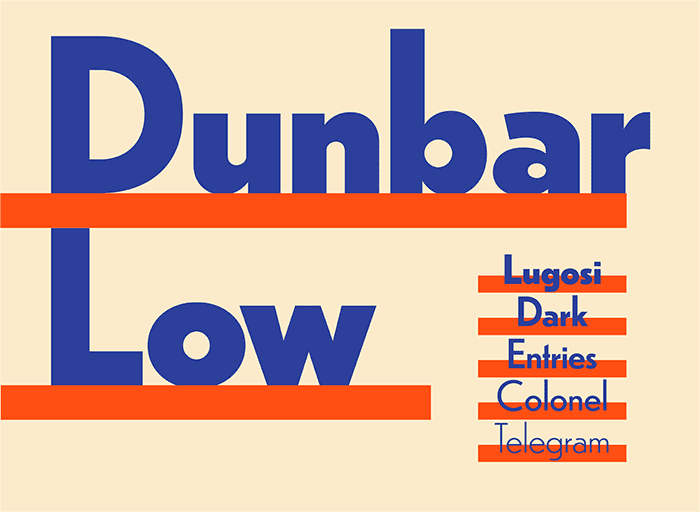
“Dunbar is an exuberant geometric sans with a unique structure, including Tall and Low display versions for large sizes and a Text version for smaller sizes.”
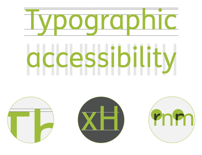
“We have produced an infographic to help designers gauge how accessible a font is. The illustrations use one of our most accessible typefaces FS Me which was researched and developed with charity Mencap and designed specifically to improve legibility for people with learning disabilities.”
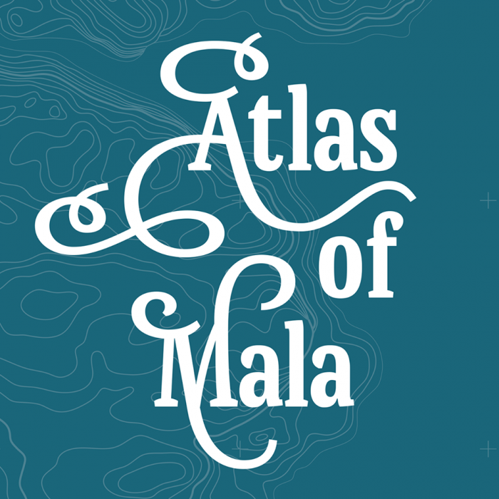
“Maps, of any kind, are complex and multilayered sources of information. They are not read continuously like books, but use type in a very different way. Mala by Barbara Bigosińska is designed for exactly that.”
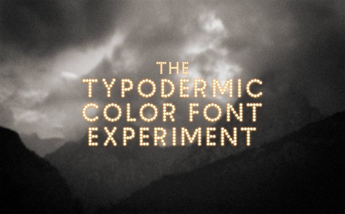
“The Typodermic Color Font Experiment is a free collection of 105 color fonts in the very latest color font formats, licensed for commercial use. These fonts can’t be installed and used in applications like normal fonts can… that’s why they’re experimental.”
“Superficially it’s very similar to the old one and we’ve retained all the simplicity and ease of use which are the hallmarks of FontStruct; but under the hood the new FontStructor uses standard HTML5 technology for the first time, and no longer relies on the Flash plugin.”
“Vulf Mono is the official typeface of Vulfpeck, a funky four-piece rhythm section from Ann Arbor, Michigan. The typeface draws main inspiration from 12 point Light Italic, a font for the IBM Selectric typewriter.”
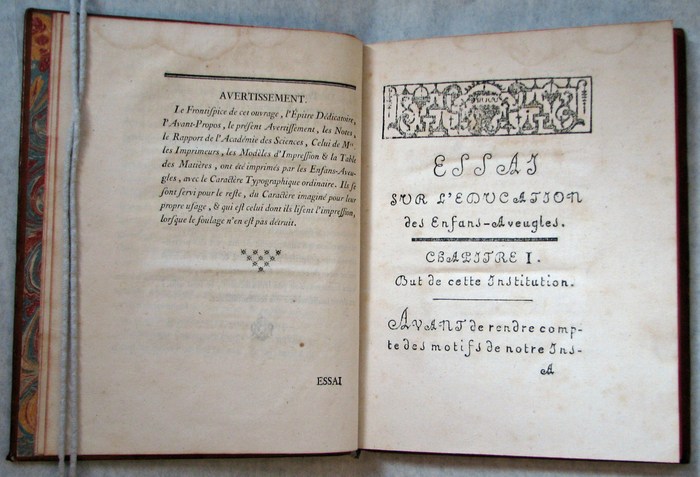
“To better understand the history of Ambroise, at least a few references to the Didot’s history provide some clarity. Where to start when exploring the Didot story? From Romain du Roi or Fournier, as strategic roots? For the sake of brevity, we will start with: Gillé.”