Typography Feed (complete)
- Today
-
GraphicStories joined the community
- Yesterday
-
HawgHeaven joined the community
-
Odin joined the community
- Last week
-
The combination of capital and small letters caught me.
-
Looks like Devil Breeze - bold (free for personal use). Commercial license at [email protected].
-
What font is used for the CLOUD part of the logo? None of the font identification sites could find the correct one. https://en.wikipedia.org/wiki/Cloud9
-
Seiko joined the community
-
I don't think AI will have a big impact on the font industry. For one thing, AI is not able to design and produce fonts in the common .otf and .ttf formats. The only thing AI can do is reproduce fonts - and only in pixels. I work with FontLab 8.4 - in my opinion a high-end software with a very wide range of functions. I can imagine that some of FontLab's functions will be taken over by AI in the future. For example, matching individual masters to each other.
-
Dipesh Parmar joined the community
-
Feru joined the community
-
deezmfntz joined the community
-
.thumb.png.51dfb6cc71a655bbb607ec7a044b60c4.png)
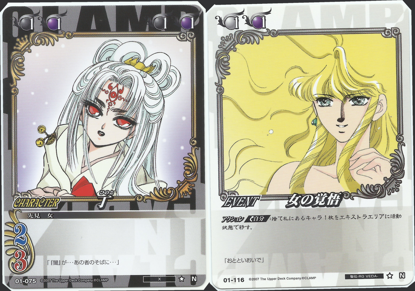
Need help finding this CLAMP TCG font.
MissNobody replied to Sergonauta's topic in Font Identification
Looks like Beaumarchais.- 1 reply
-
- 1
-

-
So there was this Trading Card Game published in 2007 that compiles characters from many of CLAMP works that was called "CLAMP IN CARDLAND". I need help to identify the typography that is used in the words "Characters" and "Event" from this two types of cards.
-
You are a superstar......thank you so much . 😄
-
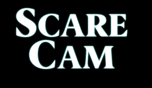
Looking for the font used for ‘Ghost Stories The Show’
Becky replied to Becky's topic in Font Identification
Thanks so much! -
.thumb.png.51dfb6cc71a655bbb607ec7a044b60c4.png)
Looking for the font used for ‘Ghost Stories The Show’
MissNobody replied to Becky's topic in Font Identification
Looks like Berlingske Serif. -
Looks like Carentro.
-
Hi was wondering if anybody knows what typeface it is, have tried to identify but struggling. Many thanks in advance for your help on this. Taz
-
Taz HVP joined the community
-
-
Becky joined the community
-
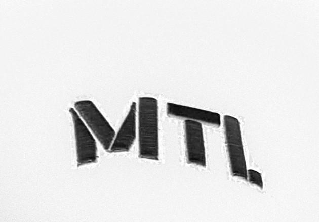
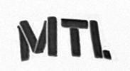
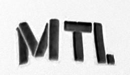
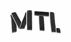
Looking for the font of an embroidered 'Je choisis Montréal' hat
xeiga replied to xeiga's topic in Font Identification
Thank you! At least I don't have to search for it any longer then. -
that's right! thank you!
-
.thumb.png.51dfb6cc71a655bbb607ec7a044b60c4.png)
name of this font from Avid Media Composer?
MissNobody replied to t_510's topic in Font Identification
-
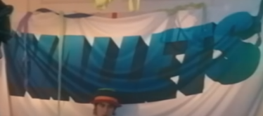
The music video that the banner can be found in is called "Nobody Gets Me (Like You)" and it is also used on the band members' t-shirts and can be seen in many frames during the video around 3:42-4:33. It spells out WALLETS in a gradient blue color. The font is 3 dimensional and blue but I am more interested in finding the font despite the color! 🙂 Thank you. Here is the music video in Youtube: Here is a mostly clear screenshot of the banner in the background using the font:
-
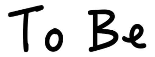
this was a font in an earlier version of avid media composer. it's no longer there. anyone know the name? thx.
-
I used to have a hat with the embroidered letters 'MTL' for Montreal on it. It was given to me by Montreal's city marketing initiative trying to attract international students called 'Je choisis Montréal' (I choose Montreal). This initiative does not exist anymore since a few months, their website is still online but nearly empty. I now try to find the font used for the letters on my hat. A name would be fantastic, it doesn't matter if it's a free font or not. I have attached images that were created from photos of me wearing the hat, with the only modifications being a colour reduction and contrast improvement. Still, automated tools for font identification seem to struggle, probably because of the distorted perspective. I further found an image on another website (scroll down) that has the letters 'MTL' in a very similar font except for the stencil-style gaps that exist on my hat, but not in the linked image. Thank you in advance for any hint you can give!
-
Newsletter
Sign UpSubscribe to our monthly newsletter, which highlights recent and noteworthy content from the community.
-
New in Typography Weekly
-
Tell a friend
-
Article | See more …
-
Latest Videos | see more…
-
Latest Lists | see more…
-
Random Quote


