‘Why do type designers traditionally think in black and white?’
Are typographers and type designers really black-and-white thinkers? Are they really so conservative as to think that text in books, periodicals, newspapers and other print, including the text on your laptop, tablet or mobile phone, should always be black? There’s plenty of color in the print media, at least in illustrations, and occasionally we come across a color headline. Traditionally, texts in manuscripts were written in black, or nearly black, ink. Gutenberg’s invention did not make it easy, technically, to print a second color. So from 1450 up to now, text has mostly been presented to us in a single color: black.
But this is going to change.
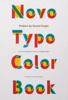
(Preface by Gerard Unger in Novo Typo Color Book, text and design by Mark van Wageningen)
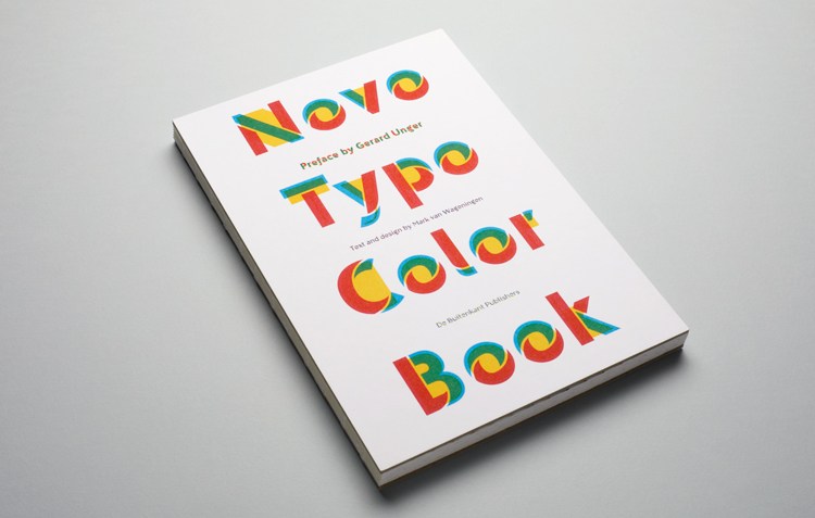
The Novo Typo Color Book is published by De Buitenkant, Amsterdam, The Netherlands.
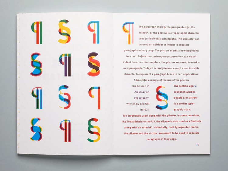
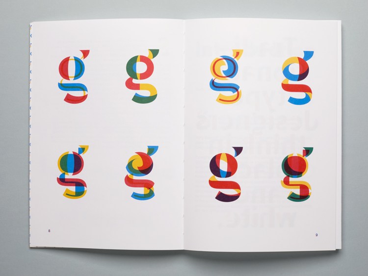
Hardcover, size 16,5 x 24 cm, 96 pages printed in 3 pms colors offset and letterpress.
