Typography Books
74 directory entries in this category
-
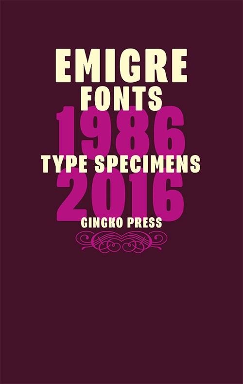
This book is a 752-page compilation celebrating the art of the type specimen. It features reprints of Emigre's most remarkable specimen designs covering a period of 30 years. Besides displaying the virtues of the fonts and revealing the processes used to design them, these specimens go beyond their primary function as sales tools and can be enjoyed as much for the typefaces as for their esoteric content. If your collection of Emigre's popular type specimens is incomplete, or if you've missed out
-
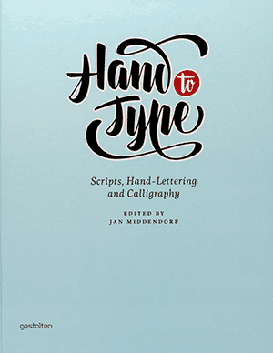
Although, or perhaps because, most of us write less and less by hand, our fascination for handwritten letterforms is growing. Typeface designers who specialize in traditional, charming, or spectacular lettering with a handmade look have become role models for today's young typographers and graphic design students. Script fonts--digital type families based on handwriting--are among the most sought on the typography market today. Scripts from the past, be it 18th-century formal calligraphy or adve
- Scripts, Hand-Lettering and Calligraphy
-
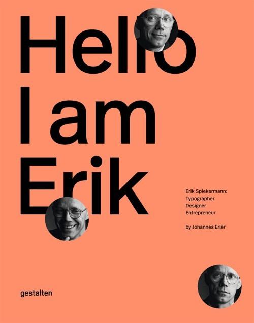
Erik Spiekermann is the epitome of a typographer. With his typefaces, commercial projects, and enterprises, he has shaped the world of graphic design like no other. This comprehensive book is the first to showcase his body of work and tell the story of his life. Hello, I am Erik is the first-ever visual biography of Erik Spiekermann s work. The book documents his projects, traces milestones in his life, and offers his personal perspectives on design. Essays by notable designers and authors
- Typographer, Designer, Entrepreneur
-
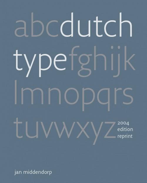
In ‘Dutch Type’, Jan Middendorp presents a comprehensive overview of type design and lettering in the Netherlands, tracing its origins through type designers and lettering artists from the 15th to the 20th centuries. Partly based on interviews, the book also offers insight into the motives and methods of the first generations of digital type designers, featuring published and unpublished typefaces as well as sketches, studies, and samples of lettering work. While the quest for quality and innova
-
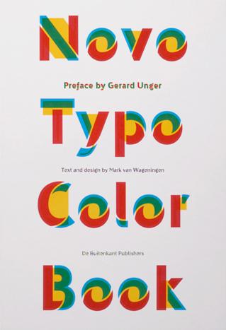
‘Why do type designers traditionally think in black and white?’ Are typographers and type designers really black-and-white thinkers? Are they really so conservative as to think that text in books, periodicals, newspapers and other print, including the text on your laptop, tablet or mobile phone, should always be black? There’s plenty of color in the print media, at least in illustrations, and occasionally we come across a color headline. Traditionally, texts in manuscripts were written in b
- ‘Color will be the new Italic. Color will be the new Bold.’
-
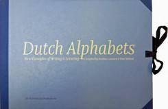
Dutch Alphabets is a portfolio containing 47 broadsides featuring new samples of lettering and writing by today’s most significant ‘Dutch’ lettering artists, type designers, calligraphers and sign painters. All the contributors are working and/or educated in the Netherlands. This collection of lettering has been compiled by Mathieu Lommen (University of Amsterdam) & Peter Verheul (Royal Academy of Art, The Hague), and was published in a limited edition. It showcases a wide variety of let
- compiled by Mathieu Lommen and Peter Verheul
-
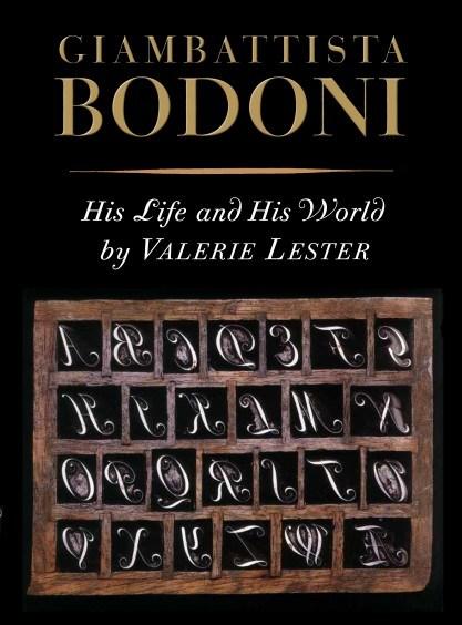
This is the first English-language biography of the relentlessly ambitious and incomparably talented printer Giambattista Bodoni (1740–1813). Born to a printing family in the small foothill town of Saluzzo, he left his comfortable life to travel to Rome in 1758 where he served as an apprentice of Cardinal Spinelli at the Propaganda Fide press. There, under the sponsorship of Ruggieri, his close friend, mentor, and protector, he learned all aspects of the printing craft. Even then, his real talen
-
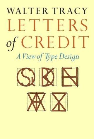
THE REVOLUTION in typesetting - a revolution that over the past two decades has eliminated a five-hundred-year-old system of hot metal production and replaced it with one of photo-generated and computer-driven composition - shows no sign of winding down. This book, more than any other we know, traces the steps that went into that revolution and simultaneously makes the argument that the letter forms themselves are in process of evolution. Tracy argues that, whether they are of the sixteenth or t
- A View of Type Design
-
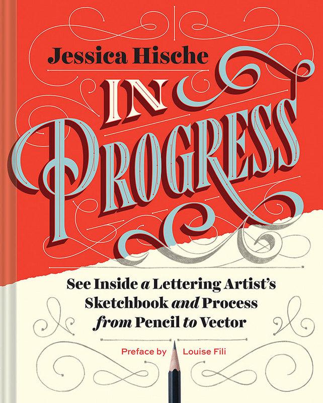
This show-all romp through design-world darling Jessica Hische’s sketchbook reveals the creative and technical process behind making award-winning hand lettering. See everything, from Hische’s rough sketches to her polished finals for major clients such as Wes Anderson, NPR, and Starbucks. The result is a well of inspiration and brass tacks information for designers who want to sketch distinctive letterforms and hone their skills. With more than 250 images and metallic silver ink printed th
- See Inside a Lettering Artist’s Sketchbook and Process
-
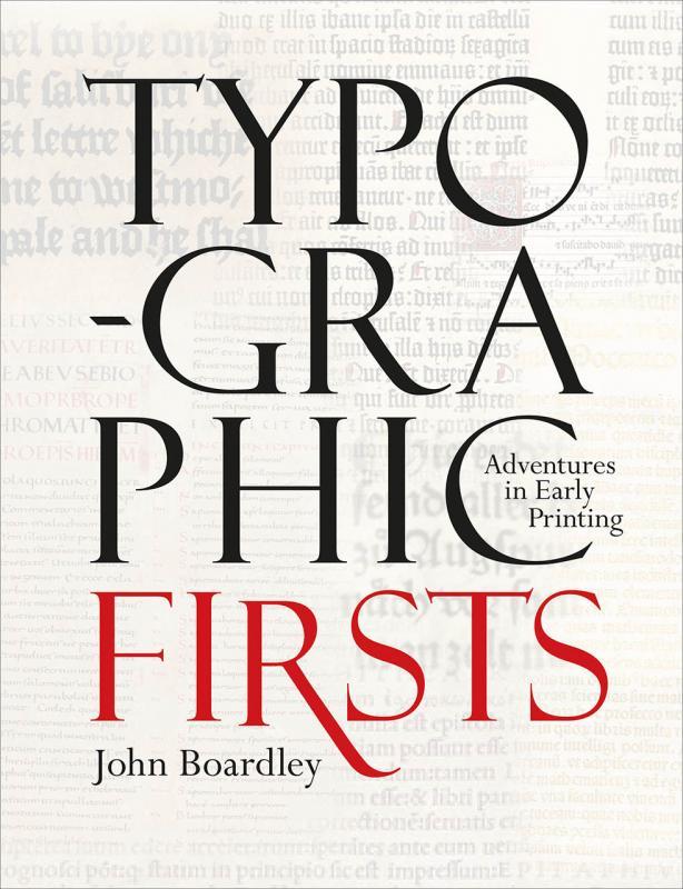
How were the first fonts made? Who invented italics? When did we work out how to print in color? Typographic Firsts charts the formative early history of the printed or typographic book. Many of the standard features of the printed book were designed by pioneering typographers and printers in the latter half of the fifteenth century. Although Johannes Gutenberg is credited with printing the first books with moveable type, at the height of the Renaissance printers and publishers found innova
- Adventures in Early Printing
-
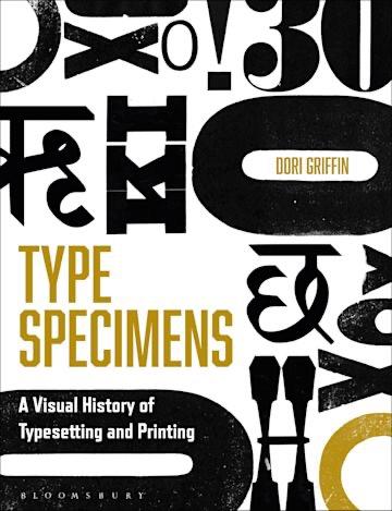
Type Specimens introduces readers to the history of typography and printing through a chronological visual tour of the books, posters, and ephemera designed to sell fonts to printers, publishers, and eventually graphic designers. This richly illustrated book guides design educators, advanced design students, design practitioners, and type aficionados through four centuries of visual and trade history, equipping them to contextualize the aesthetics and production of type in a way that is pra
- A Visual History of Typesetting and Printing
-
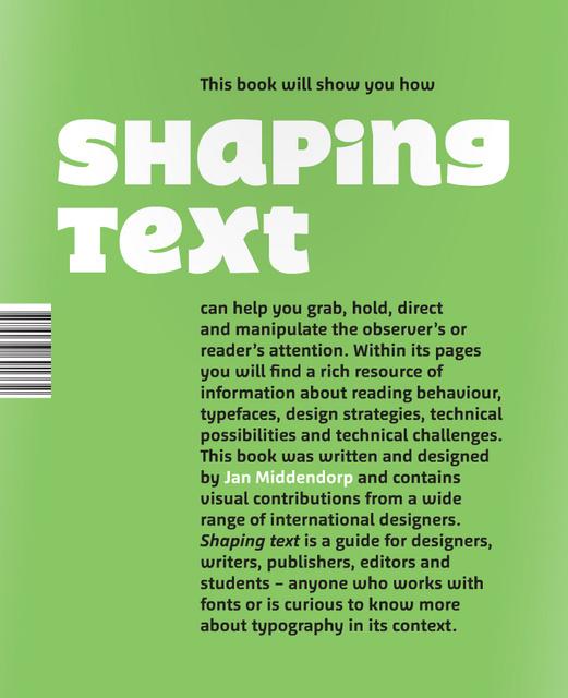
Shaping Text takes a practical and broad approach to typography. It is aimed at design students and graphic designers, and also at those who are concerned with content: writers, editors, and publishers. Showing a wide range of examples from first-rate designers across the world, the book examines why and how typographic designs work well in a given context. Particular attention is given to the team play between the text itself—written language—and the design—the shaping of the text—to form a new
-
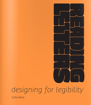
Sofie Beier from Denmark holds a PhD from the Royal College of Art in London. Her research focuses on typeface legibility, aiming at a better understanding of how different typefaces and letter shapes can influence the reading process. Her book “Reading Letters—designing for legibility” tries to bridge the gap between scientific research and applied graphic and type design. The purpose of the book is to support type designers in creating legible typefaces and help graphic designers to deter
- Designing for Legibility
-
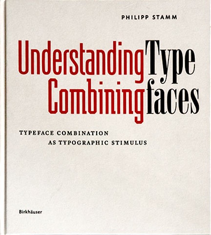
Combining typefaces is one of the great challenges and, at the same time, a continuing allure for typographers and designers: is it meant to be extravagant or should it only be carried out to a limited degree or, ideally, not at all? Which fonts harmonize with each other, and which don't? Which ones complement each other or even enhance each other? There are few answers to be found in the professional literature. This handbook demonstrates that it is possible to determine criteria for the c
- Typeface Combination as a Stimulus in Typography
-
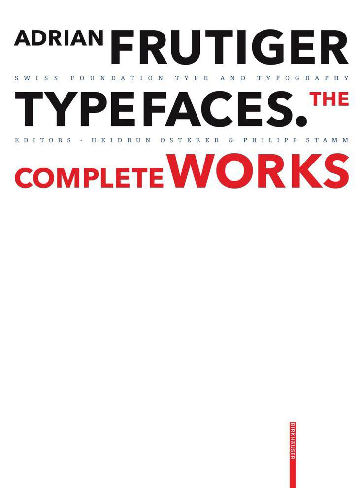
The Swiss type designer Adrian Frutiger decisively influenced the international creation of typefaces after 1950. His Univers typeface and the machine-readable font OCR-B are milestones, as is his type for the Paris airports, which evolved into the Frutiger typeface. All set new standards for signage types. In all, he created some fifty types, including Ondine, Méridien, Avenir, and Vectora. Based on conversations with Frutiger himself and on extensive research, this publication provides a
-
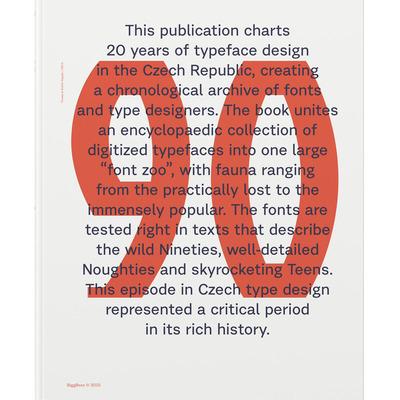
Typo 9010 unites an encyclopaedic collection of Czech digitized typefaces starting from 1990, a time when computers were starting to replace phototypesetting and copying letters by hand, and ending with 2010, when almost a dozen small type foundries were operating in the country. The book captures the most important moments at the oldest Czech type design studio (at the Academy of Arts, Architecture and Design in Prague) and recapitulates the most important milestones in the industry.
- Czech Digitized Typefaces 1990–2010
-
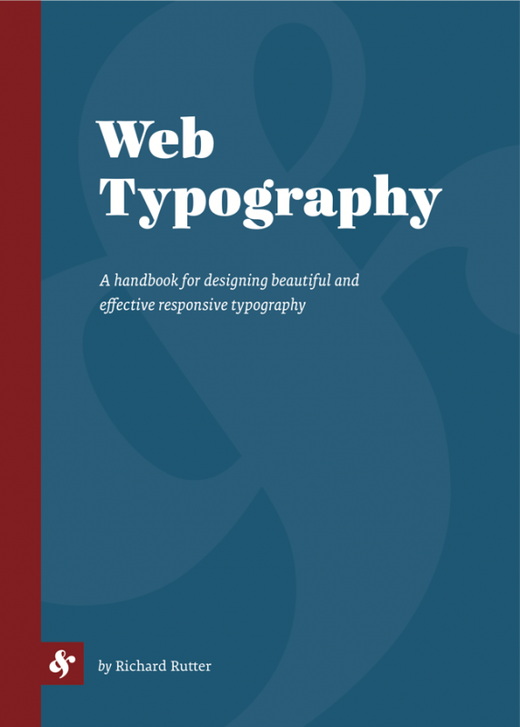
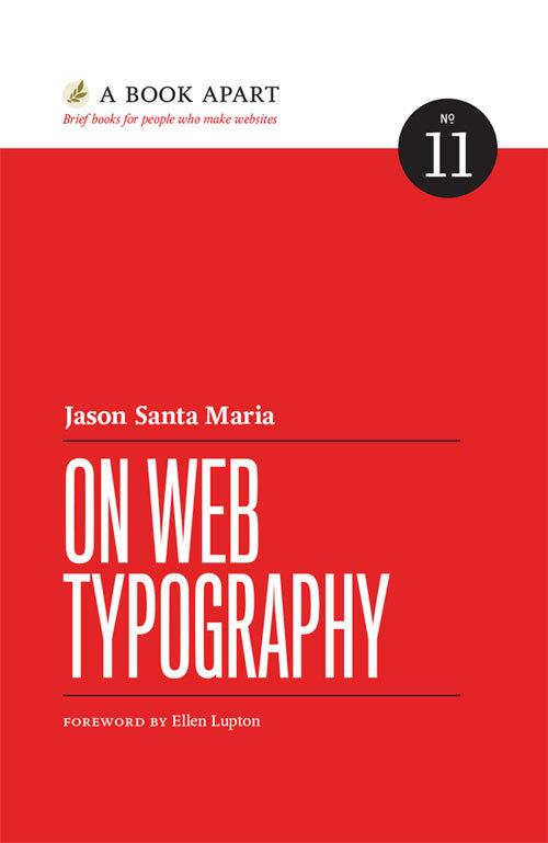
Typography is what comes between the author and the reader. This is as true on the web as it is in any other medium. If a text has anything at all significant to say, it needs a typographer’s care, which will in turn be repaid by the reader’s attention. If you design websites or use CSS then you are a typographer whether you know it or not. This book is a practical guide and companion reference to all aspects of typography on the web. It deftly combines implementation details with typograp
- A handbook for designing beautiful and effective responsive typography
-
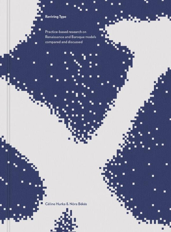
Reviving Type is a book by Céline Hurka and Nóra Békés. Two studies, that started as a university course assignment and developed into an independent design-research, are woven together into one volume: one about the Renaissance letters of Garamont and Granjon, the other about the Baroque types of Nicholas Kis. The publication guides the reader from finding original sources in archives, through historical investigation and design process to the finished typeface. The first part of the book provi
- Practice-based research on Renaissance and Baroque models compared and discussed
-
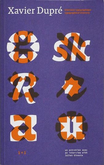
- itinéraire typographique / typographical itinerary
-
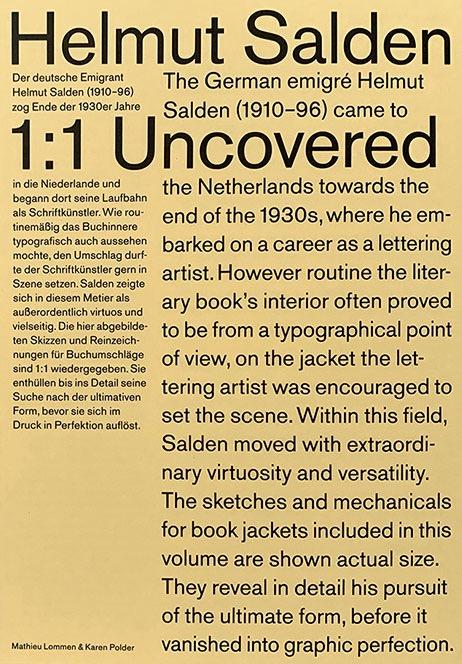
Helmut Salden Uncovered 1:1 is the first international monograph on Helmut Salden (1910–96), exploring his original sketches and working drawings. The material spans the years 1939 through 1970. In those years, Salden was the most celebrated Dutch lettering artist. All drawings are reproduced at actual size and reveal in detail his pursuit of the ultimate form. Helmut Salden Uncovered 1:1 by Mathieu Lommen & Karen Polder Language: English/German Pages: 80 Size: 16
-
Typography is your design's voice and the most powerful tool you have to communicate with your readers. Learn how to wield type with care and wit: how to evaluate typefaces, consider technical constraints, create flexible typographic systems, and put together your own collection of favorite faces. Jason Santa Maria wants you to see type beyond code or flourishes. You'll discover how typography shapes the way we read and how you can adapt the craft's practices for the screen. So go ahead. Choose,
-
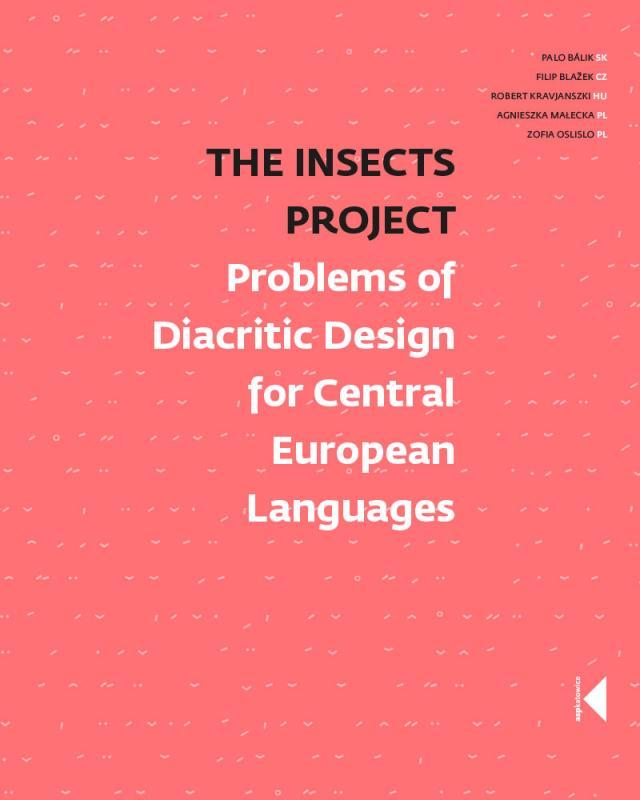
The Insects Project is a product of a collaborative research aimed at sharing knowledge about Central European typography and promoting design that is sensitive to the needs of all those who are unlucky enough to be native users of Czech, Hungarian, Polish and Slovak. Perhaps few users of “diacriticless” languages (such as e.g. English) realise how lucky they are to be able to choose from literally thousands of typefaces. Central Europeans, on the other hand, are nowhere near as spoiled for
- Problems of Diacritic Design for Central European Languages
-
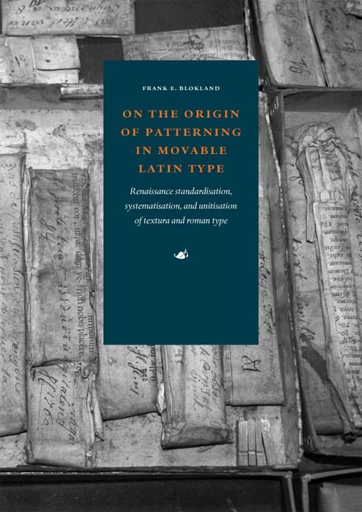
In 2016 type designer, software developer, and lecturer Frank E. Blokland successfully defended this PhD dissertation at Leiden University. Blokland’s research is conducted to test the hypothesis that Gutenberg and consorts developed a standardised and even unitised system for the production of textura type, and that this system was extrapolated for the production of roman type in Renaissance Italy. For roman type, Humanistic handwriting was moulded into a prefixed standardised system already dev
-
Explorations in Typography is a vast collection of typesetting examples. Page after page, a brief article by Erik Spiekermann has been set in hundreds of ways in hundreds of typefaces, creating an extended visual taxonomy of typesetting that allows you to learn by looking. Beautifully printed and bound, with complete type specifications on every page and examples set in hundreds of faces (many from the FontFont library), the book is an extensive resource of typesetting ideas. The seco
- Mastering the Art of Fine Typesetting