Typography Books
74 directory entries in this category
-
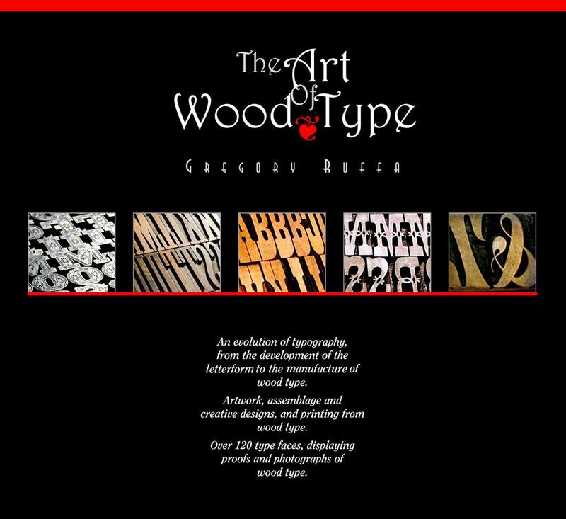
330 pages filled with the history of alphabet, the anatomy of the letterform, and how wood type was made. Personal stories from artists, typographic designers, the new uses of wood type in printing from two university professors, and the story of the world’s largest collector of wood type, Leo Kaplan, the Grandfather of the wood type collage and Dave Greer, the largest collector of rare wood and metal type. The book is not available in stores, but can be ordered via [email protected]
-
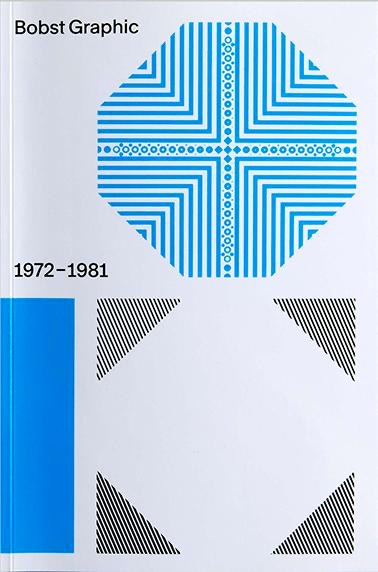
In the early 1970s, the Swiss packaging company Bobst S.A. began to wonder whether it would be ready for the future with only one product type. The Lausanne-based company, already far advanced in terms of packaging manufacturing technology, decided to launch phototypesetting machines. Thanks to the participation of some of the best font designers in the country, e.g. Team 77, different font families were developed for the new technique. The history of Bobst Graphic – a pioneering feat
-
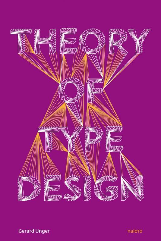
Theory of Type Design by type designer Gerard Unger is a comprehensive theory of typeface design. This volume consists of 24 chapters, each describing a different aspect of type design, from the influence of language to today’s digital developments, from how our eyes and brain process letterforms to their power of expression. This book includes more than 200 illustrations and practical examples that illuminate the theoretical material. The terminology is explained in the volume’s extensive gl
-
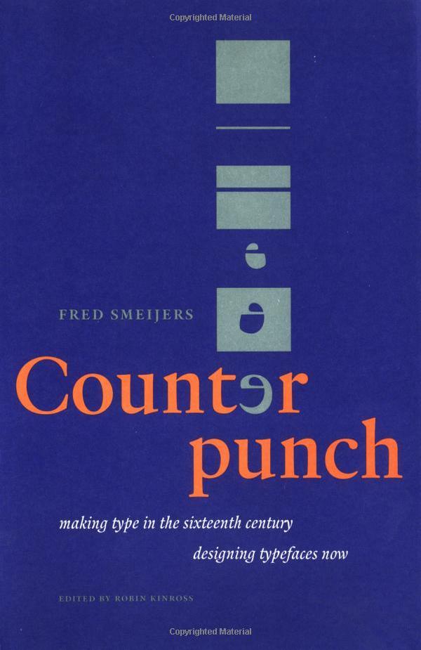
Counterpunch is both an explanation of the 16th-century method of cutting metal type and an impassioned plea for contemporary designers to incorporate the lessons of history as a means of creating typography in our digital age. Smeijers sees the counterpunch technique as essential for ensuring the regularity of form, repeatability, and speed of production necessary for rational design. Smeijers traces the history of letterform design to discover how technique influenced the shape of type, w
- Making Type in the 16th Century
-
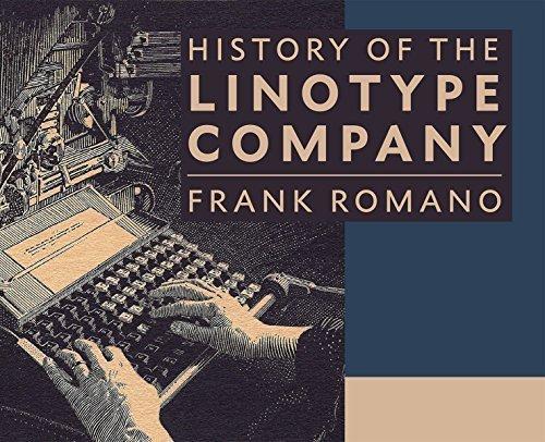
The book contains 464 pages of in-depth history of the people, places, and products manufactured by the Mergenthaler Linotype Company. Frank Romano traces the history of corporate acquisitions, product development, and competing machines all with his usual wit and experience. He also writes about his own personal history working at Linotype starting in 1959. There are hundreds of color reproductions of advertisements, publications, photographs, and typeface specimens. It also includes 120 pages
-
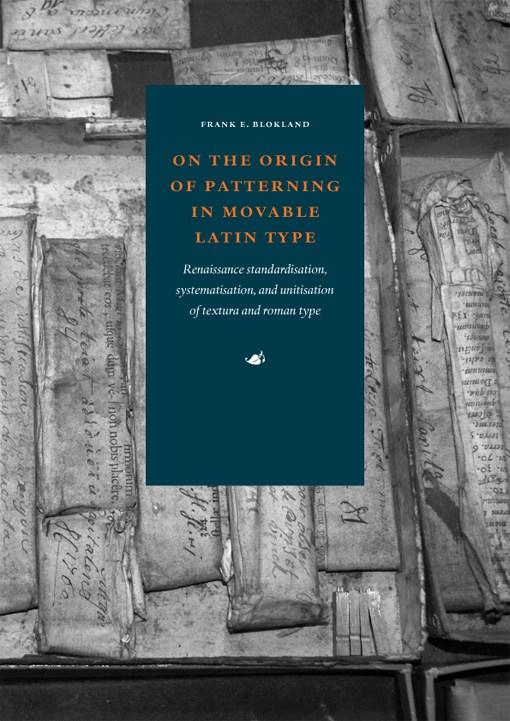
In 2016 type designer, software developer, and lecturer Frank E. Blokland successfully defended this PhD dissertation at Leiden University. Blokland’s research is conducted to test the hypothesis that Gutenberg and consorts developed a standardised and even unitised system for the production of textura type, and that this system was extrapolated for the production of roman type in Renaissance Italy. For roman type, Humanistic handwriting was moulded into a prefixed standardised system already dev
-
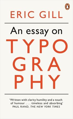
Eric Gill’s opinionated manifesto on typography argues that “a good piece of lettering is as beautiful a thing to see as any sculpture or painted picture”. This essay explores the place of typography in culture and is also a moral treatise celebrating the role of craftsmanship in an industrial age. Gill, a sculptor, engraver, printmaker and creator of many classic typefaces that can be seen around us today, fused art, history and polemic in a visionary work which has been hugely influential on m
-
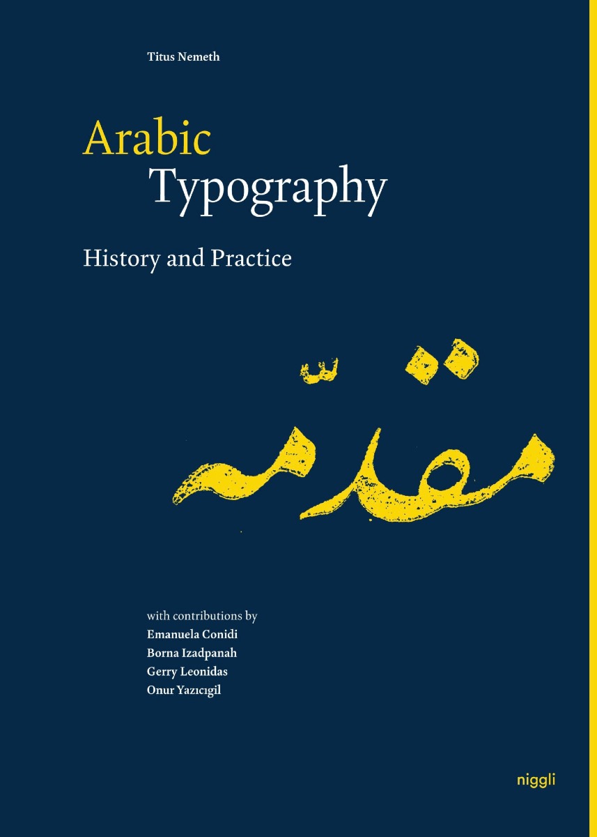
Although Arabic is the third-most widely used script in the world, there is a lack of sound typographic literature. This publication is a multi-disciplinary reference work that combines the latest academic research with applied typography. The focus on elements that pertain specifically to Arabic typography prevents overlapping with the comprehensive literature on Latin script typography, making the book relevant and accessible to the widest possible audience. The first part provides an in-depth
- History and Practice
-
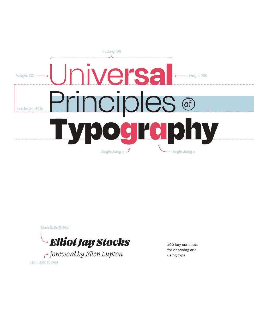
Explore 100 key concepts, theories, and guidelines that are critical for choosing and using type. We communicate with text every single day, but what does it mean to really understandtype—to use it with clear intent and purpose? The art and science of typography combines subtle tweaks to line lengths with harmonious combinations of weights and styles; considered typeface pairings with a robust set of alternate characters; exciting technological advances with the realities of font licensing.
- 100 Key Concepts for Choosing and Using Type
-
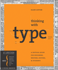
Thinking with Type is the definitive guide to using typography in visual communication, from the printed page to the computer screen. This revised edition includes forty-eight pages of new content, including the latest information on style sheets for print and the web, the use of ornaments and captions, lining and non-lining numerals, the use of small caps and enlarged capitals, as well as information on captions, font licensing, mixing typefaces, and hand lettering. Throughout the book, visual
-
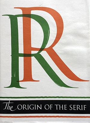
The Serif is the short cross stroke at the beginning and end of letter parts. Its origin in Roman inscription letters is one of the uncharted areas of paleography. In this book the author questions accepted theories as to the serif’s origin, and his own theory with skillful reasoning, detailed illustration, and epigraphic proof. Demand for copies of The Origin of the Serif has been constant since Fr. Catich published it in 1968. The information found there is not available elsewhere, and Ca
- Brush Writing & Roman Letters
-
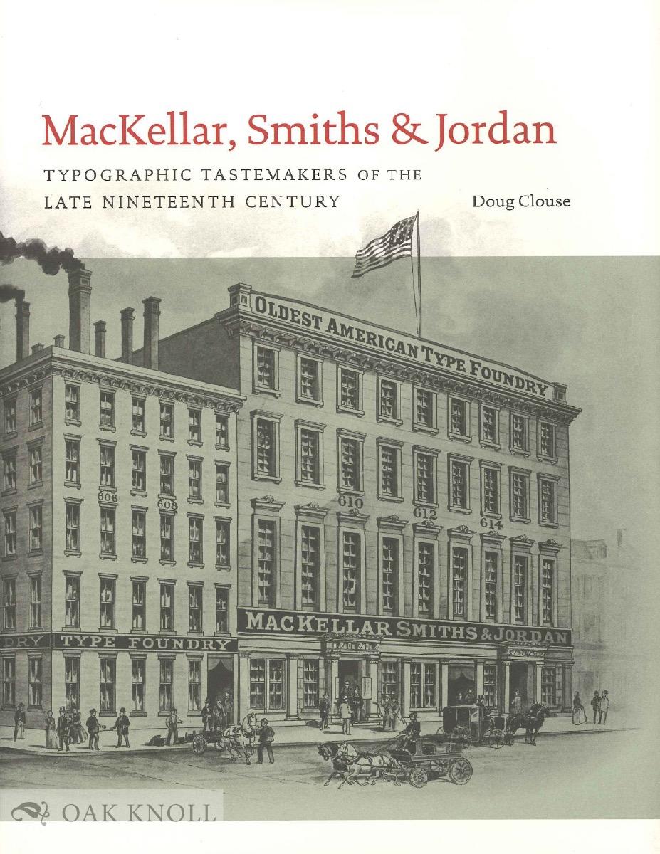
This study of America’s leading type foundry of the nineteenth century, MacKellar, Smiths & Jordan, emphasizes the design of the hundreds of typefaces that were produced by the foundry, from its inception in the 1860s until its merger with most other American foundries at the end of the century. The author describes how changing business conditions and technical improvements in type founding interacted with changes in public taste over the decades to modify the appearance of American typefac
- Typographic Tastemakers of the Late Nineteenth Century
-
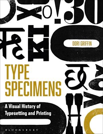
Type Specimens introduces readers to the history of typography and printing through a chronological visual tour of the books, posters, and ephemera designed to sell fonts to printers, publishers, and eventually graphic designers. This richly illustrated book guides design educators, advanced design students, design practitioners, and type aficionados through four centuries of visual and trade history, equipping them to contextualize the aesthetics and production of type in a way that is pra
- A Visual History of Typesetting and Printing
-
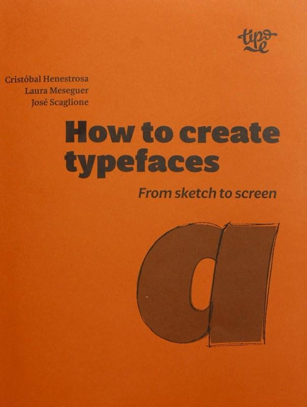
How are typefaces designed? What is the process? Which characters are essential? What is the difference between roman, italic and cursive? What is OpenType? In How to create typefaces Cristóbal Henestrosa, Laura Meseguer and José Scaglione answer these and many other questions in a straightforward and direct way. This publication, aimed at new and novice type designers as well as those trained in the field, unravels the fascinating task of creating a font, from sketch to screen. Content
- From sketch to screen
-
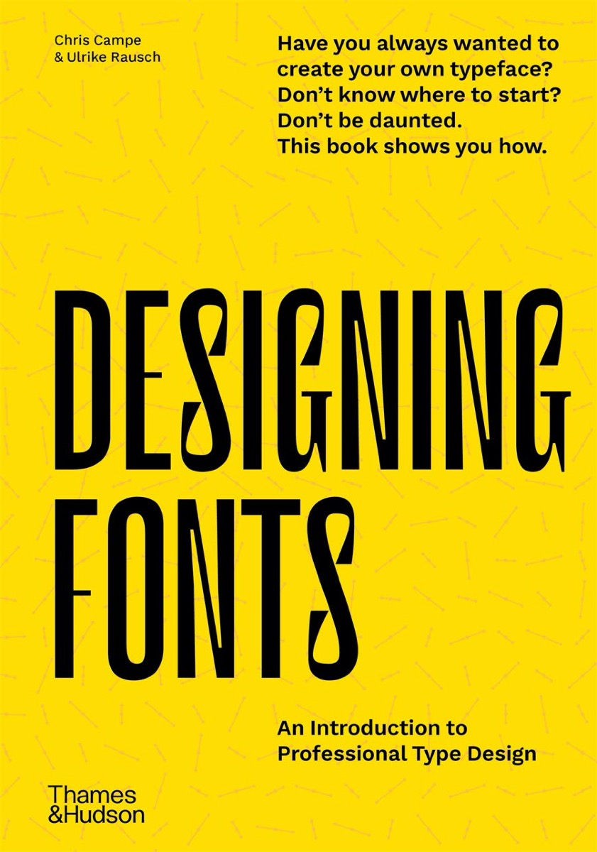
With easy-to-follow instructions, many examples and professional tips, the book teaches you how to design unique typefaces tailor-made for your own projects or customer orders. Designing Fonts has two parts. Part 1 explains the theoretical, creative and technical basics of type design and font production. Six chapters then cover everything from alphabet to font, showing you how to find and develop typeface ideas, design matching letters, produce fonts and expand them with special functions
- An Introduction to Professional Type Design
-
Reviving Type is a book by Céline Hurka and Nóra Békés. Two studies, that started as a university course assignment and developed into an independent design-research, are woven together into one volume: one about the Renaissance letters of Garamont and Granjon, the other about the Baroque types of Nicholas Kis. The publication guides the reader from finding original sources in archives, through historical investigation and design process to the finished typeface. The first part of the book provi
- Practice-based research on Renaissance and Baroque models compared and discussed
-
Alfabeti Modernisti Type Specimens illustrates twenty-five digital revivals based on wooden and lead typefaces produced in Italy in the 1930s and 1940s, documenting a research and enhancement project that intertwines memory and design and gives new voice to a little-explored chapter of Italian graphic design. Very popular at the time but now forgotten, the typefaces have been recovered by Luca Lattuga over a period of more than ten years. Reissued by the CAST type foundry, available for purchase
-
Explorations in Typography is a vast collection of typesetting examples. Page after page, a brief article by Erik Spiekermann has been set in hundreds of ways in hundreds of typefaces, creating an extended visual taxonomy of typesetting that allows you to learn by looking. Beautifully printed and bound, with complete type specifications on every page and examples set in hundreds of faces (many from the FontFont library), the book is an extensive resource of typesetting ideas. The seco
- Mastering the Art of Fine Typesetting
-
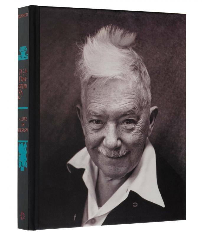
Often credited with inventing the term "graphic design," W. A. Dwiggins was a quintessential maker — fabricating his own tools, inventing techniques, and experimenting with design in areas as wide-ranging as modular ornament, stamps, currency, books, kites, marionettes, and theatrical sets and lighting. More than any of his contemporaries, he united the full range of applied arts into a single profession — designer. Despite this, a thorough study of Dwiggins has never been published. Until now.
-
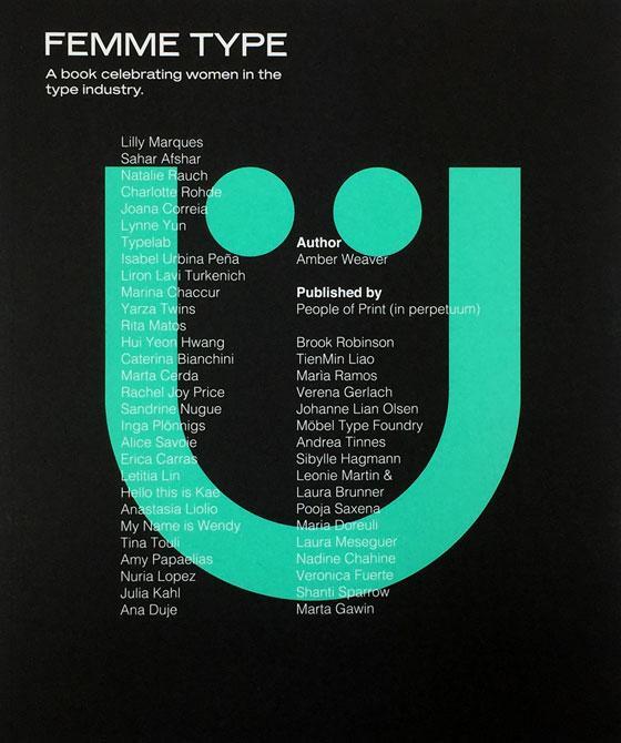
Femme Type is an all-female publication conceptualised by ex-University of Arts London Chelsea attendant Amber Weaver aiming to celebrate over 40 skilled, international women in the type industry. The mission is to create a valuable stage and platform for designers to showcase their typographic achievements wrapped up in a printed format. Includes contributions from over 40 international women Foreword by GoodType Founder Brooke Robinson 272 pages + 4pp Cover / 25cm x 21c
- A book celebrating women in the type industry
-
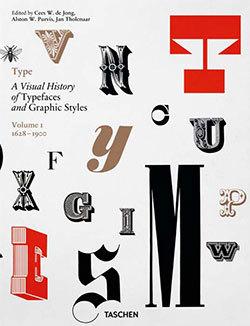
Know your type: A visual history of fonts and graphic styles: 1628–1938 This book offers a connoisseur’s overview of typeface design, exploring the most elegant fonts from the history of publishing. Taken from a distinguished Dutch collection, this exuberant two-volume edition traces the evolution of the printed letter via exquisitely designed catalogs, showing type specimens in roman, italic, bold, semi-bold, narrow, and broad fonts. Borders, ornaments, initial letters, and decorations are
-
The Insects Project is a product of a collaborative research aimed at sharing knowledge about Central European typography and promoting design that is sensitive to the needs of all those who are unlucky enough to be native users of Czech, Hungarian, Polish and Slovak. Perhaps few users of “diacriticless” languages (such as e.g. English) realise how lucky they are to be able to choose from literally thousands of typefaces. Central Europeans, on the other hand, are nowhere near as spoiled for
- Problems of Diacritic Design for Central European Languages
-
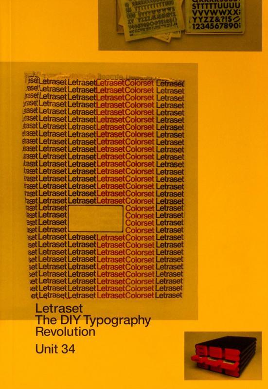
Letraset: The DIY Typography Revolution is the first comprehensive history of Letraset, the rubdown lettering system that revolutionised typographic expression. The book tells the Letraset story from its early days as a difficult-to-use wet system, to its glory years as the first truly democratic alternative to professional typesetting. The book also looks at Letraset’s present-day revival amongst a new set of admirers who recognise the typographic excellence of the system’s typefaces.
-
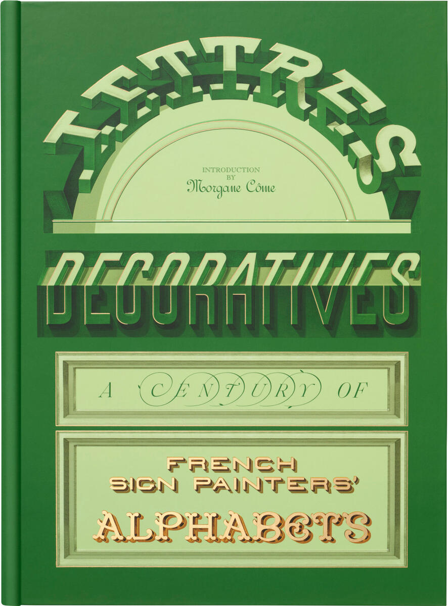
From the Age of La Peinture en Lettres — A kaleidoscopic survey of letterforms from nineteenth- and twentieth-century France, Lettres Décoratives includes more than 150 plates from grand lithographic albums printed at the height of the sign painter’s craft. Originally made to demonstrate styles and inspire artists to decorate cities with increasingly colorful, adventurous, and refined forms, these portfolios preserve a rich visual history of urban alphabets. An introduction by practitioner Morga