

Typography Feed (complete)
- Past hour
-

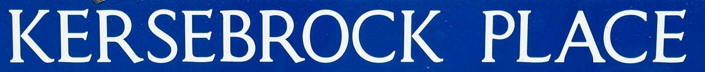
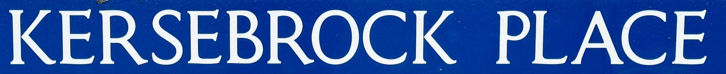
Street name sign, font identification required
Ralf Herrmann replied to vectorwise's topic in Font Identification
Which city? -
First post, any help much appreciated. Looking for the name of the font in the photo or something very similar. Thank you Andrew
-
 vectorwise joined the community
 - Today
-

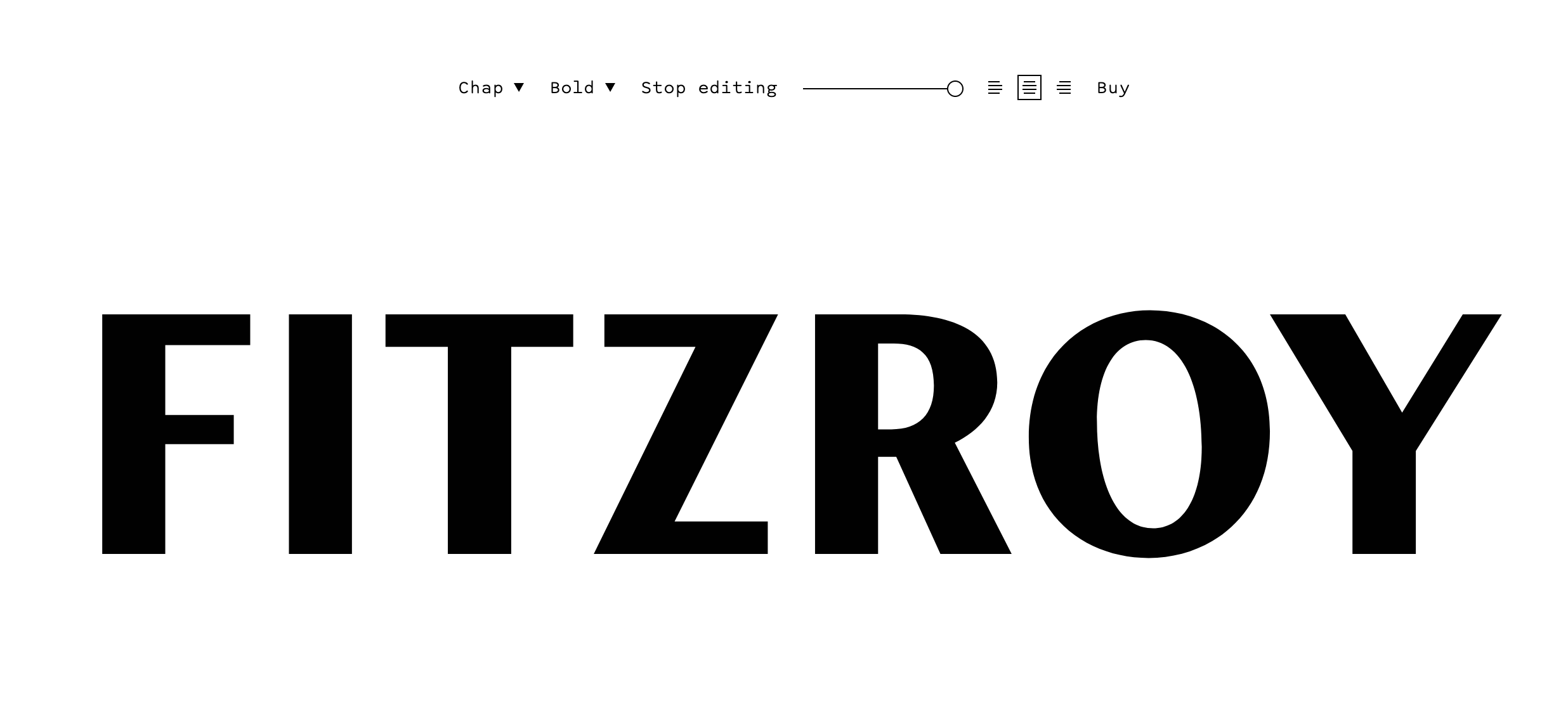
Can I get help with the "FITZROY" typeface please?
DesignEdinburgh replied to DesignEdinburgh's topic in Font Identification
I agree Kevin, that is a very close match. Thanks. -

Can I get help with the "FITZROY" typeface please?
Kevin Thompson replied to DesignEdinburgh's topic in Font Identification
If I were a betting man, I'd bet that Chap was the basis of the wordmark—the R, O, and Y (if you artificially condense them) are quite close, and the O even has the angled counter.
-
Can I get help with the "FITZROY" typeface please?
Kevin Thompson replied to DesignEdinburgh's topic in Font Identification
For something off the shelf with a similar vibe, try Hildegard. -
Can I get help with the "FITZROY" typeface please?
DesignEdinburgh replied to DesignEdinburgh's topic in Font Identification
Thanks Kevin, appreciate your help with this. I did think that. Just trying to get a closer match on the basic font. -
Can I get help with the "FITZROY" typeface please?
Kevin Thompson replied to DesignEdinburgh's topic in Font Identification
Sorry, but it appears to be custom (not finding a match). Chap could be edited to match. -
ROOM is set in Retro v2 Light. I've had no luck IDing “stell”—it may be hand lettered.
-

Name of the font used on this gratulation card
Nina771 replied to Nina771's topic in Font Identification
Thank you so much for your help! 😉 -
 Jeremiah joined the community
 - Yesterday
-

Need your help to identify this car font!
Bjørn Edvard Torbo replied to pakzy's topic in Font Identification
Nobody’s gonna arrest you if you go with Helvetica on that one, trust me.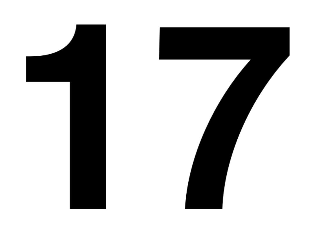
-
.thumb.png.51dfb6cc71a655bbb607ec7a044b60c4.png)
Name of the font used on this gratulation card
MissNobody replied to Nina771's topic in Font Identification
Looks like Messy Smiling Cactus. -
This number was attached to my car a few years ago. Now it's time to put a new number on it. Unfortunately, I no longer know which font it is and would therefore like your help to find out. Thank you

-
 pakzy joined the community
 -
Can you please help me to identify the font used in this attached picture? Thank you very much in advance!

-
Nina771 joined the community
-
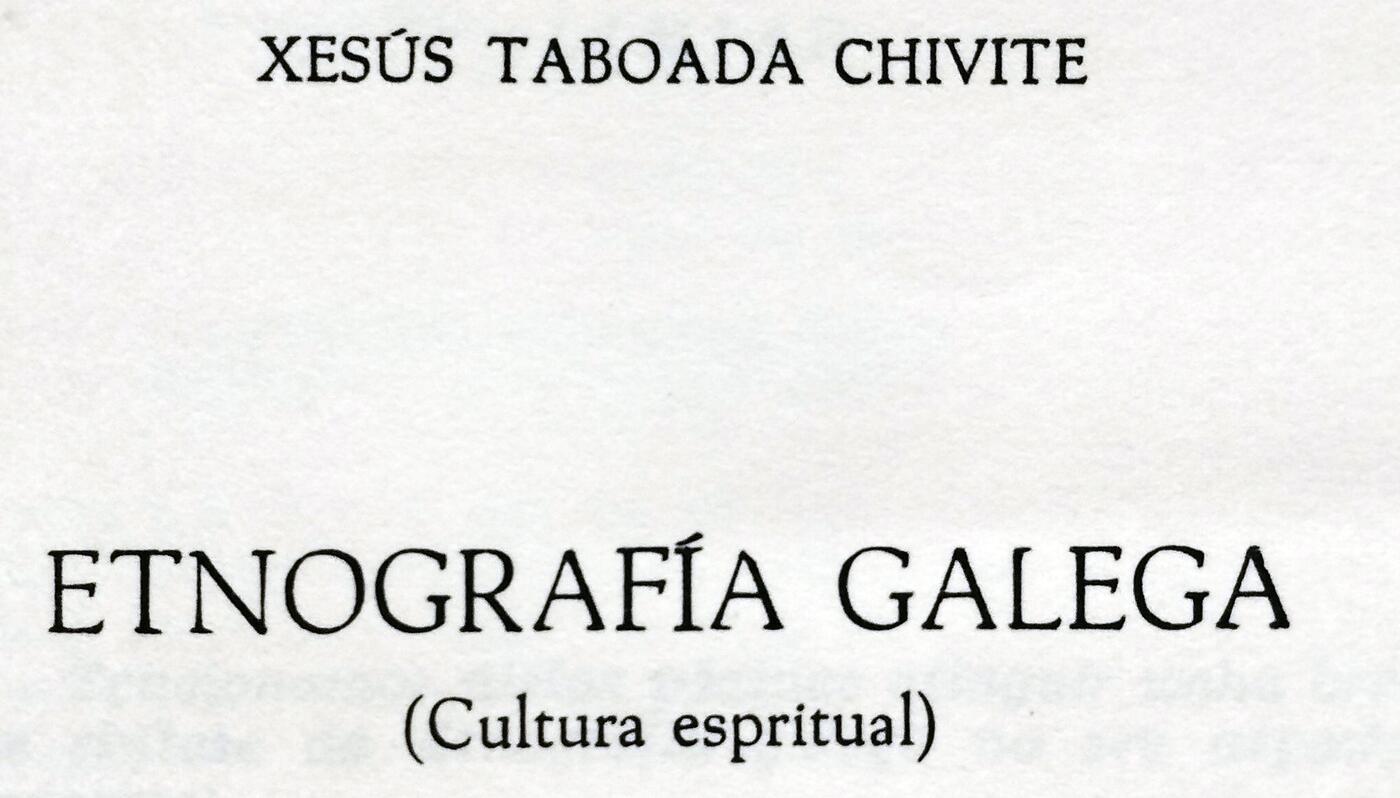
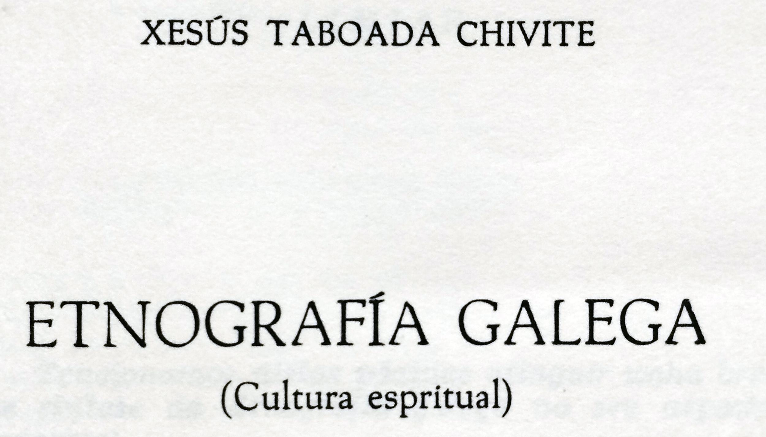
 Yes, Ralf. These pics are from another book but the same series of the same editorial.
-
DesignEdinburgh joined the community
-
Any chance to see the lowercase characters in a good resolution?
- Last week
-
Or Steelfish.
-
Alternate Gothic No. 2
-

Looking for the typeface used by a 2000s drift team called PRIDE
Drifto replied to Drifto's topic in Font Identification
Thank you very much!!!!! -
Thank you, it looks similar but it's not
-
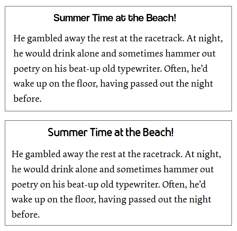
Neither of those fonts strikes me as being especially narrow. The first, however, to me looks like the letters are crammed in too close together for easy reading. I rather like the second choice, and it seems to balance well with the visual weight of the body text.
-
My original post might be a bit vague, so here are a few examples of the kind of font that I have in mind (coolvetica top, bloomsburg bottom).
-
Thanks everyone for your suggestions. I mean narrow in the sense that you can fit more words into the header. An example would be Interstate.
-
Maybe Saira Extra Condensed licensed under SIL Open Font license


-
Newsletter
Sign UpSubscribe to our monthly newsletter, which highlights recent and noteworthy content from the community.
-
New in Typography Weekly
-
Tell a friend
-
Article | See more …
-
Latest Videos | see more…
-
Latest Lists | see more…
-
Random Quote
By all means break the rules, and break them beautifully, deliberately, and well. That is one of the ends for which they exist.


