

Typography Feed (complete)
- Past hour
-
 georgia tregunno joined the community
 - Yesterday
-
Hello What do people think of the Sakkal Kitab Arabic font? https://www.sakkal.com/type/sakkal_kitab_features08.pdf It seems to be the most advanced arabic font so far?
-
 There are thousands of sort-of similar fonts to be found, but having the exact one would be golden. Note this image is probably bolder than it was originally. Source: LED signage in a dry spa in the Ibis Styles Hotel, Paignton, UK. Thanks in advance!
-

Tracking down Lars Bergquist's Waldstein (discontinued fonts)
Addison Hall replied to Addison Hall's topic in Talk
I did hear back from one of the foundries with a very kind reply, however he was no longer in contact with Mr. Bergquist (he had retired maybe?). I'll probably reach back out to Rod Cavazos at PSY/OPS to see if he knows anything... I knew this would be a longshot, but you never know until you try. 😉 -
nobi-wan joined the community
-

Tracking down Lars Bergquist's Waldstein (discontinued fonts)
Ralf Herrmann replied to Addison Hall's topic in Talk
Did you get a reply? That does sound like the best lead as far as I can see. -
 Outstanding, @Kevin Thompson and many thanks, as usual, @MissNobody. Now how do I mark 2 posts as the 2 solutions?!
 -
 ORIGINAL and JAN 14 seem to be set in Max Sans, a custom typeface created for HBO by F37 Foundry (based on their typeface F37 Moon).
 -
 I also struck out on "Original" and "Jan 14." There's a very subtle curviture to the diagonal strokes in the "R" of "Original"and the "N" of "Jan" that I ca't recall ever seeing before.
 -
 I too think this is the one, thanks for the help!
 - Last week
-
I purchased licenses for some of Mr. Bergquist's fonts from the now closed Fountain Type Foundry way back in the day, and I regret that I never snagged Waldstein. I've been trying to track it down of late, and I've even reached out to a couple of foundries that still sell his fonts. I'm posting in hopes that someone here may have an idea of how to find a discontinued font -- in a legitimate way, of course. I don't know how to contact Mr. Bergquist, or the Bruhn family (Fountain Type), but I'm more than happy to pay for use of the font. I really only intend to use it for personal projects. Thank you in advance!
-
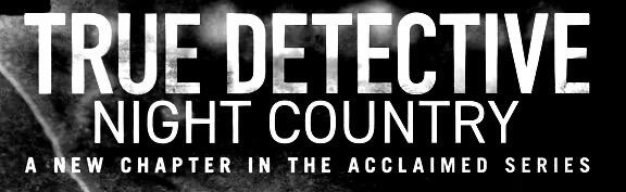
.thumb.png.51dfb6cc71a655bbb607ec7a044b60c4.png) The most similar I can find for these: 'TRUE DETECTIVE' - DIN 1421. 'NIGHT COUNTRY' - DIN 2014 (vertically scaled down). The rest I don't know, but I created more hi-res version, still can't find it.
The most similar I can find for these: 'TRUE DETECTIVE' - DIN 1421. 'NIGHT COUNTRY' - DIN 2014 (vertically scaled down). The rest I don't know, but I created more hi-res version, still can't find it.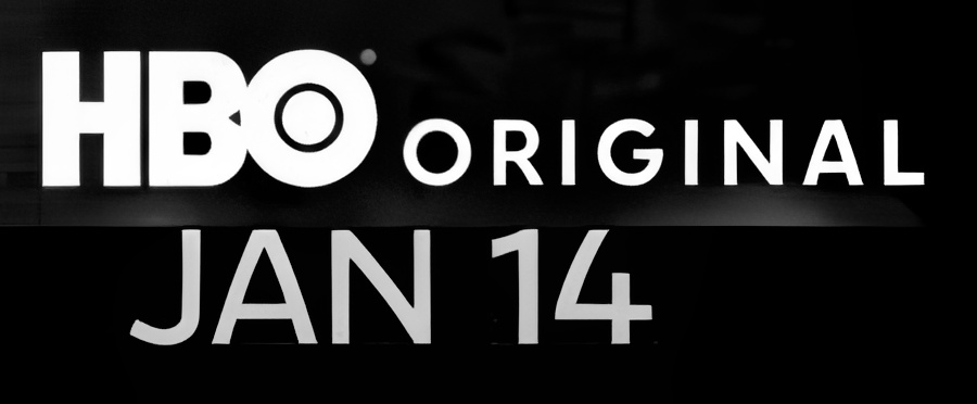
-
Well, 'HBO' logo font is Avant Garde Gothic Bold.
-
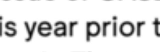
These font samples are of the 5 fonts used in the key art for the HBO Max series. I need to "True Detective," "Night Country," "HBO," "Original," and "Jan 14." Thank you in advance. I posted these in other accounts but they seem to be deleted. Trying again.
-
That said, it is very similar to Jungka also by the aforementioned.
-
Pirelli is the large title font, I usually don't even try to identify small-print text, because it's usually futile to determine exactly.
-
I think the size of ‘e’ & bowel of ‘p’ seems to be a bit narrow on Pirelli compared to the one used in the catalogue.
-
 troubl3d joined the community
 -
 Polonym joined the community
 -
WOW! Amazing... thats exactly that font! Thank you soo much! 🙂
-
Looks like Billet.
-
Hello folks, I'm currently searching for a font name of a looka example. I couldnt find exactly this font in the whole web 😕 Has someone maybe the name? Here is a screenshot: Thanks for help! 🙂
-
 Johnney joined the community
 -
Looks like Pirelli by Karel Martens and Jungmyung Lee.
-
 Ramy mohamed joined the community
 -
Letraslut: A wiki about dry transfer brands
Ralf Herrmann posted a news entry in Typography Weekly #134
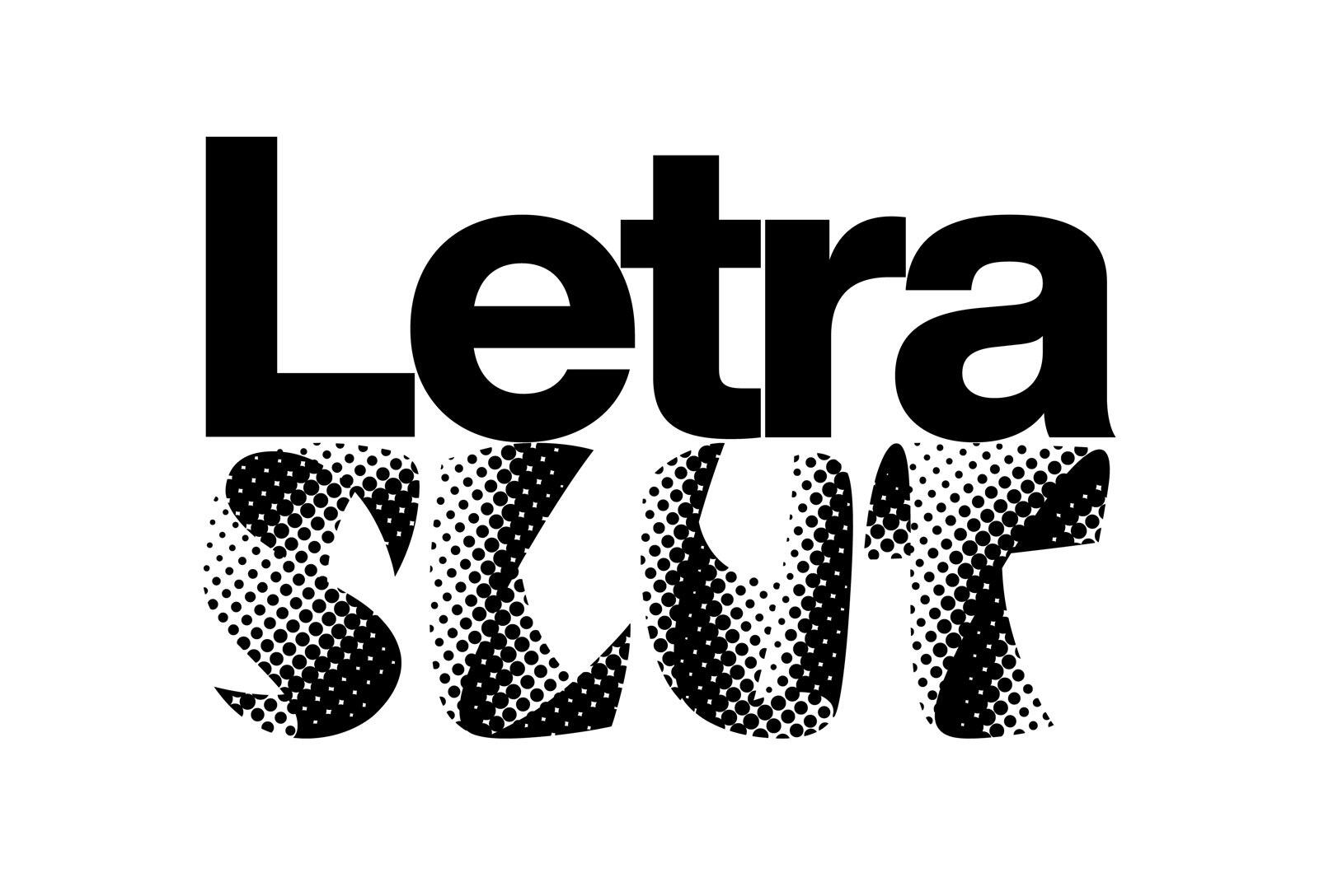 A collection of artifacts and publications relating to Letraset and other brands of dry transfer type.
 -
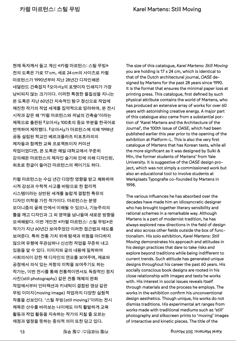
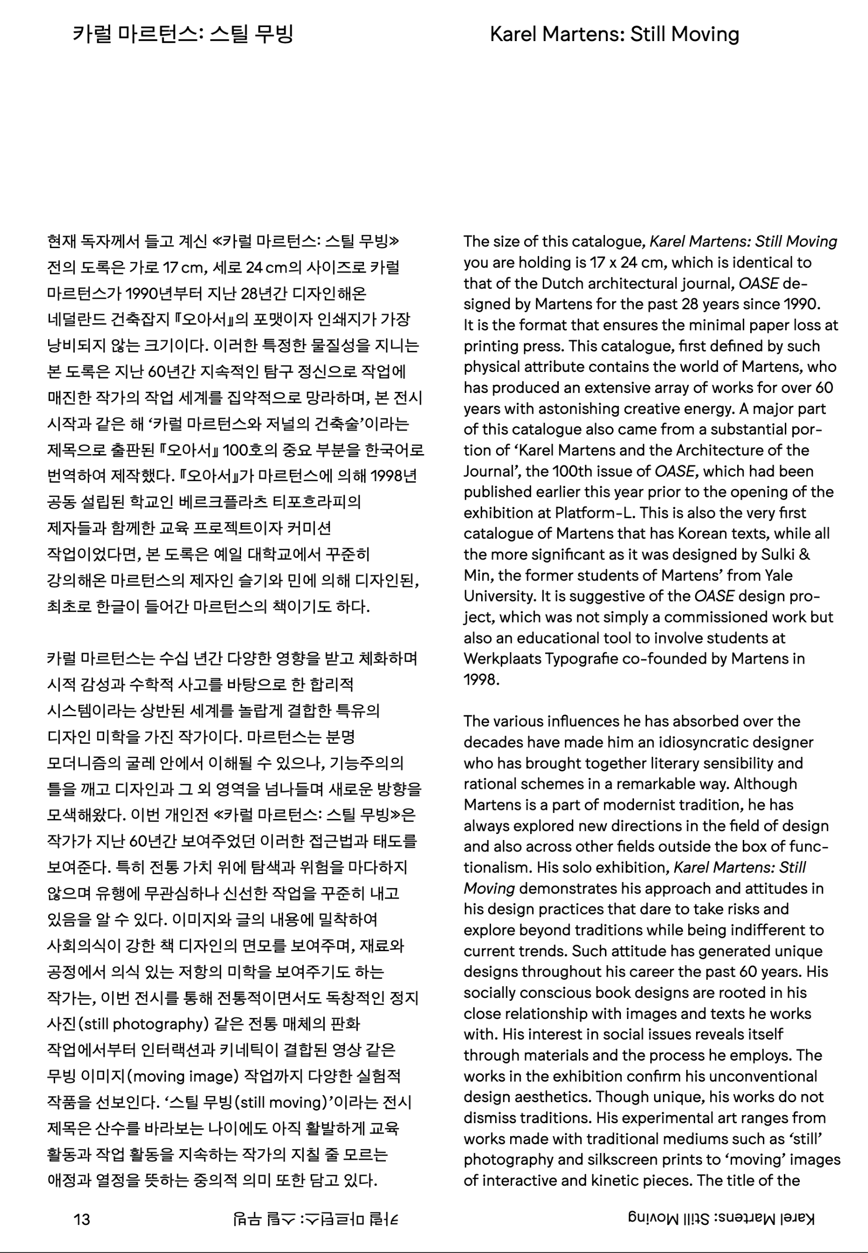
You can see the other pages in here. https://issuu.com/platform-l/docs/issuu-_____-3?utm_medium=referral&utm_source=m.platform-l.org
-
I'm specifically trying to find the english fonts used in the page & title.
-
joeylhc joined the community
-
Thank you so much, I had Mulberry on my list of alternates to try, but this is it! I'll purchase on behalf of the client.
-
Sorry, the price should have read €29 (about $32 US).


Our typography network


-
Newsletter
Sign UpSubscribe to our monthly newsletter, which highlights recent and noteworthy content from the community.
-
New in Typography Weekly
-
Tell a friend
-
Article | See more …
-
Latest Videos | see more…
-
Latest Lists | see more…
-
Random Quote
Typography is a hidden tool of manipulation within society. All schools should be teaching typography; we should be fundamentally aware of how typographic language is forming out assholes.


