

Typography Feed (complete)
- Past hour
-
.thumb.png.51dfb6cc71a655bbb607ec7a044b60c4.png)
Looking for big love font on State of Elliot wedding welcome sign
Member Mis… replied to Member Geo… 's topic in Font Identification
The names look like Bigola (Display). Smaller text is too small to be sure. - Today
-

Looking for big love font on State of Elliot wedding welcome sign
Member Geo… posted a topic in Font Identification
Looking to identify the font for the names of the people & the below smaller body text Found at https://stateofelliott.com.au/products/big-love-welcome-board-a1
-
It is! Thank you so much.
-
I found it as "Dutch Treat", but it's not from Solotype. Cannot find any legal source of information on it. So no link.

-
For anyone else who may have encountered this issue, I have determined that the Noto fonts are being installed along with new installations and updates of LibreOffice. There is no option in custom installation to NOT install these fonts. This means that on every computer I own, whenever I update LibreOffice I immediately have to go into Windows Fonts and delete the unwanted Noto fonts (which means all of them, since I have never used them and have no need for them).
-
Member Geo… joined the community
- Yesterday
-
Font appeared on a Chaka Khan CD from 1998. Any idea? The usual online tools don't help me this time.

-

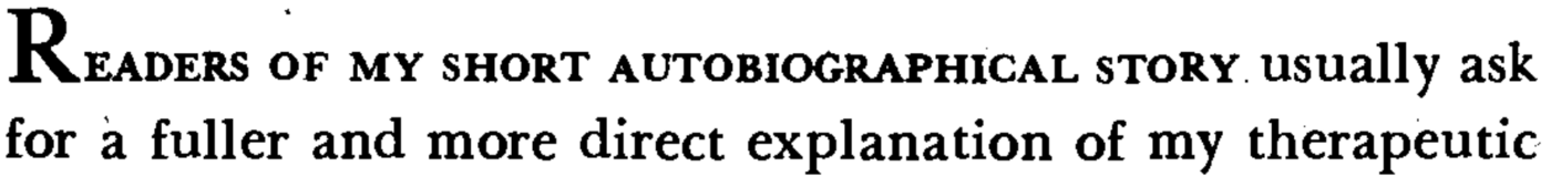
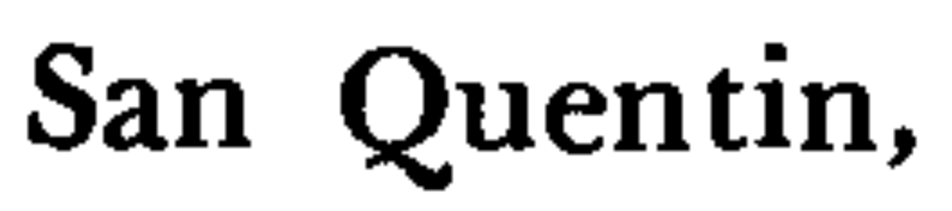
Looking for the font used in the Touchstone 3rd edition of Viktor Frankl's Man's Search for Meaning
Member Kev… replied to Member Ell… 's topic in Font Identification
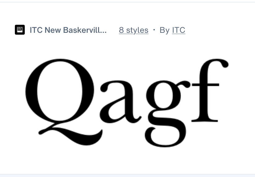
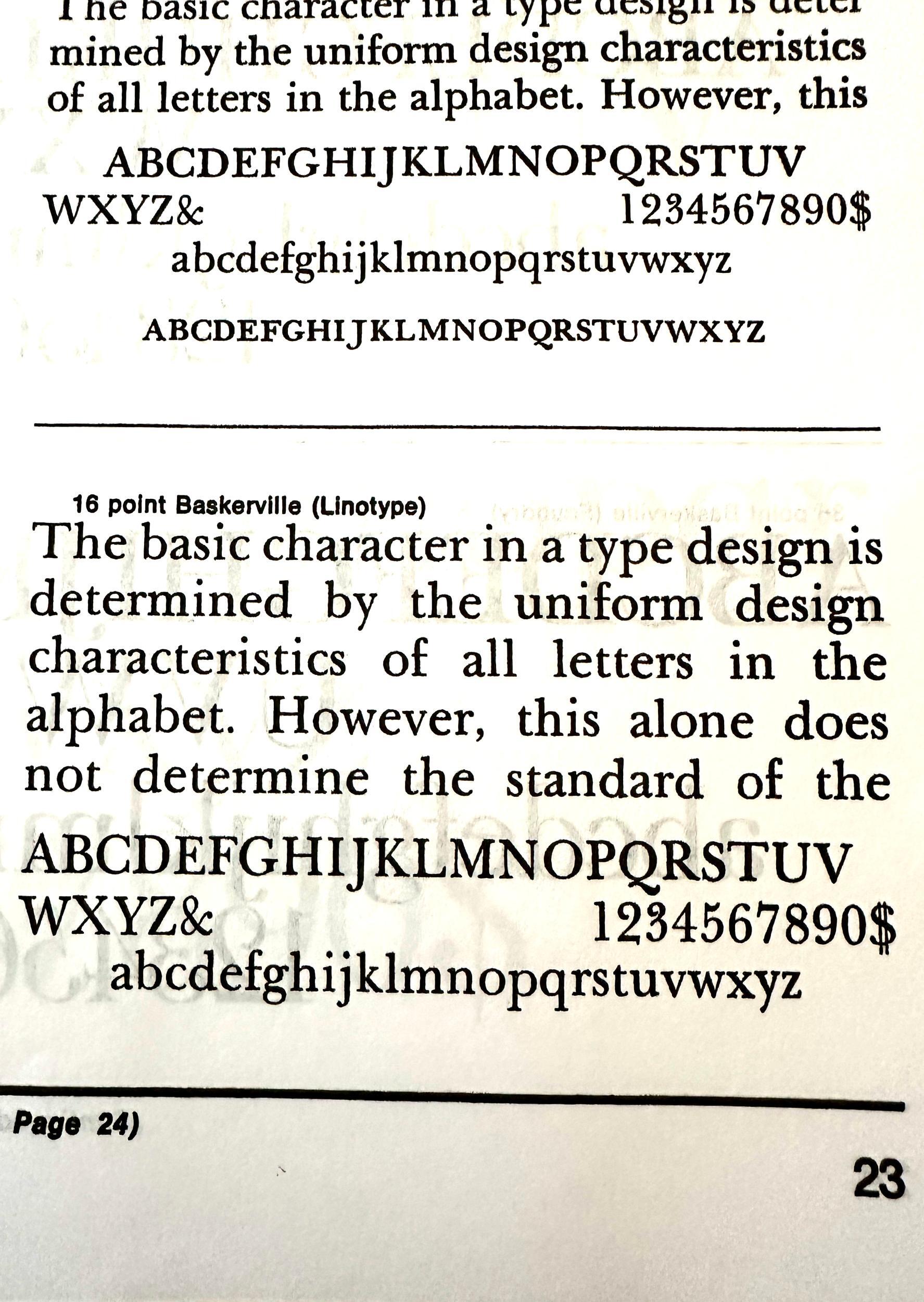
The ampersand and numerals (the latter in old style form on the original sample) seem to be a match to the sample I posted. Calling this Linotype Baskerville, likely a metal version given how much the baseline jumps. Unfortunately, none of the currently available digital versions of Baskerville or Bulmer are spot-on matches for the printed sample from 40 years ago. Some digital versions don’t even include old style figures (like Libre Baskerville, unfortunately). ITC New Baskerville or Baskerville Neo would be your best bets for approximating the look. -

Looking for the font used in the Touchstone 3rd edition of Viktor Frankl's Man's Search for Meaning
Member Ell… replied to Member Ell… 's topic in Font Identification
As requested, here are some numbers and ampersands: As well, here are some more "Th" pairings:


- Last week
-
Looking for the font used in the Touchstone 3rd edition of Viktor Frankl's Man's Search for Meaning
Member Bjø… replied to Member Ell… 's topic in Font Identification
I must admit that your argument is convincing, Kevin. It stands to reason that the production of this sample is characterized by unreliable mechanical manufacturing. -
Looking for the font used in the Touchstone 3rd edition of Viktor Frankl's Man's Search for Meaning
Member Kev… replied to Member Ell… 's topic in Font Identification
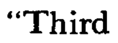
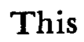
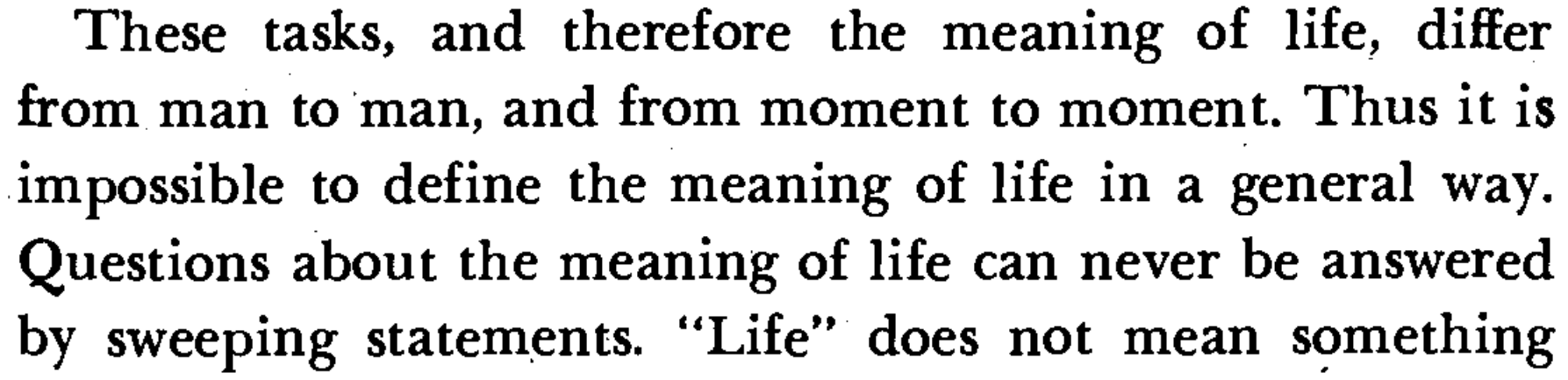
Look at the baseline in what you posted, Bjørn, and then check the other Th pairing in “Thus” at the end of the next line.... With such an uneven baseline, I'm now wondering if the book was actually set in metal type, and just how old that type was.... -
Looking for the font used in the Touchstone 3rd edition of Viktor Frankl's Man's Search for Meaning
Member Bjø… replied to Member Ell… 's topic in Font Identification
To my eye, the h is clearly lower that the T. 🤷♂️
-
Looking for the font used in the Touchstone 3rd edition of Viktor Frankl's Man's Search for Meaning
Member Kev… replied to Member Ell… 's topic in Font Identification
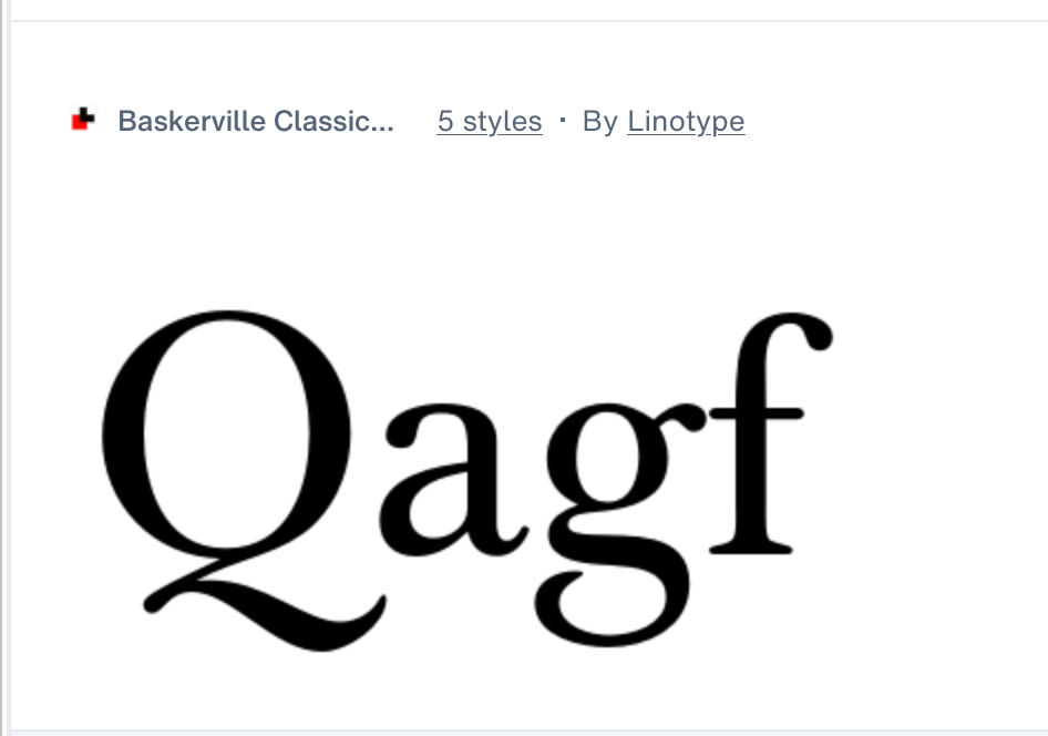
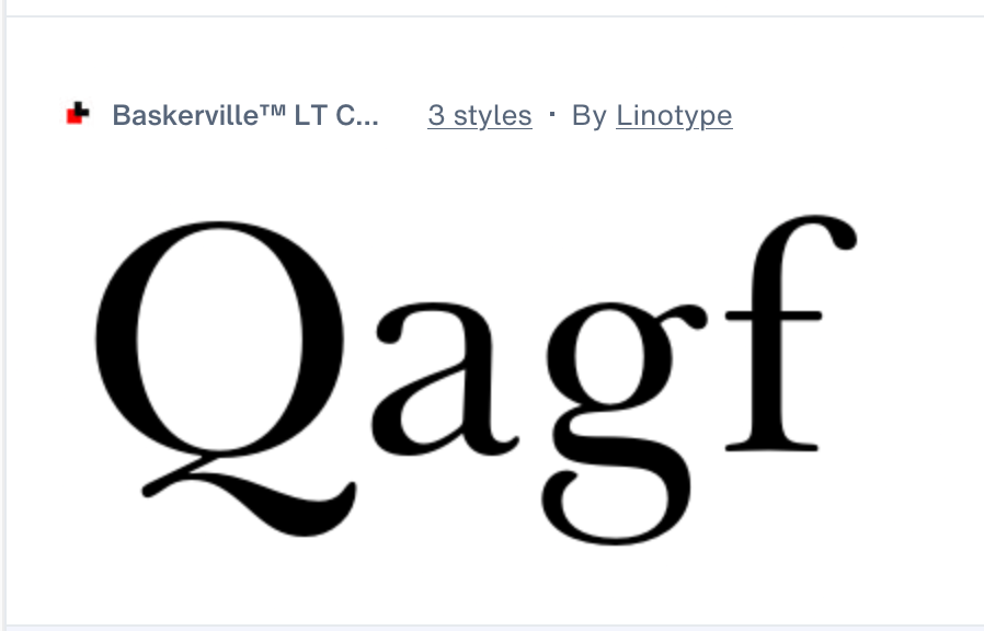
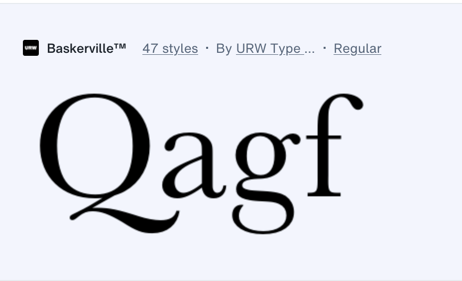
I think Linotype's phototypesetting version comes quite close (from page 23 of The Type Specimen Book, 1974). Note the tail on the Q below—a better match to the sample than any current digital version of Baskerville/Bulmer. As for the h cresting the top of the T, that varies among the current digital versions as well (some with more extreme differences than in the sample below). To my eye, the T and h are pretty much even in the original sample. If Ms. Schroeder could find a page with numbers and/or an ampersand, that could narrow the ID further. Not all phototypesetting faces were faithfully reproduced as digital typefaces (if they were digitized at all). Alternate characters were often excluded, the person doing the digitizing would “fix” things they considered errors, or the digital face would be based on much larger (display size) samples, which often changed the character of the face at text sizes. Without a better source image, I've exhausted my resources.
-
Looking to identify the font used on the facade of this auctioneers business
Member Mis… replied to Member Ire… 's topic in Font Identification
Looks like ARS Novelty. -
Looking for the font used in the Touchstone 3rd edition of Viktor Frankl's Man's Search for Meaning
Member Bjø… replied to Member Ell… 's topic in Font Identification
What bothers me about Baskerville in this scenario is that I haven’t been able to find a version where the lowercase h is lower than the uppercase T. -
Looking for the font used in the Touchstone 3rd edition of Viktor Frankl's Man's Search for Meaning
Member Kev… replied to Member Ell… 's topic in Font Identification
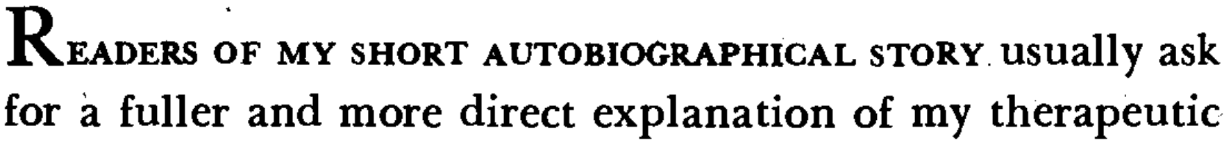
The italic definitely puts it squarely in the Baskerville family (Bulmer, Morris Fuller Benton’s/ATF's version of Baskerville, is also a possibility). Libre Baskerville would be a good open source alternate. -
Looking for the font used in the Touchstone 3rd edition of Viktor Frankl's Man's Search for Meaning
Member Ell… replied to Member Ell… 's topic in Font Identification
Thank you everyone for your thoughts! I unfortunately don't have a better scan, but here's an attempt to post more "zoomed in" images:

-

Looking to identify the font used on the facade of this auctioneers business
Member Ire… posted a topic in Font Identification
I passed this business in Paris and loved the font used to display its name on the facade of the building. I have tried several fonts identificators but none could give me a perfect match. I am a graphic designer and would like to know what font this is so that I could maybe buy it and use it for future projects. Thanks!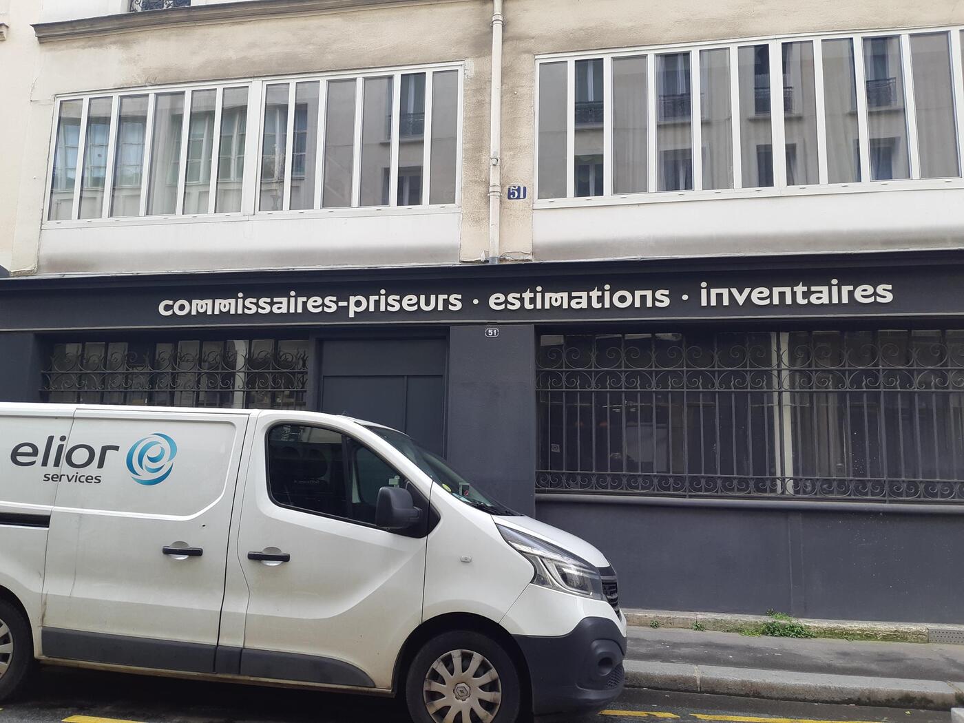

-
Member Ire… joined the community
-
I know that you stated that you’re running Windows 10 (ew) in the first post, so this is not relevant for you, but since it’s a public forum with users that run a variety of operating systems, I think it’s okay to point out that since MacOS Ventura, Apple have disabled the functionality to deactivate supplemental fonts (of which Noto is a part). Thus, there’s effectively no way to deactivate Noto on present Mac OSes. I solve this personally by creating “font favorites” in apps like Affinity to filter out the deadweight.
-
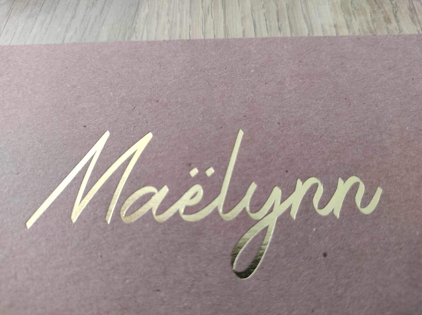
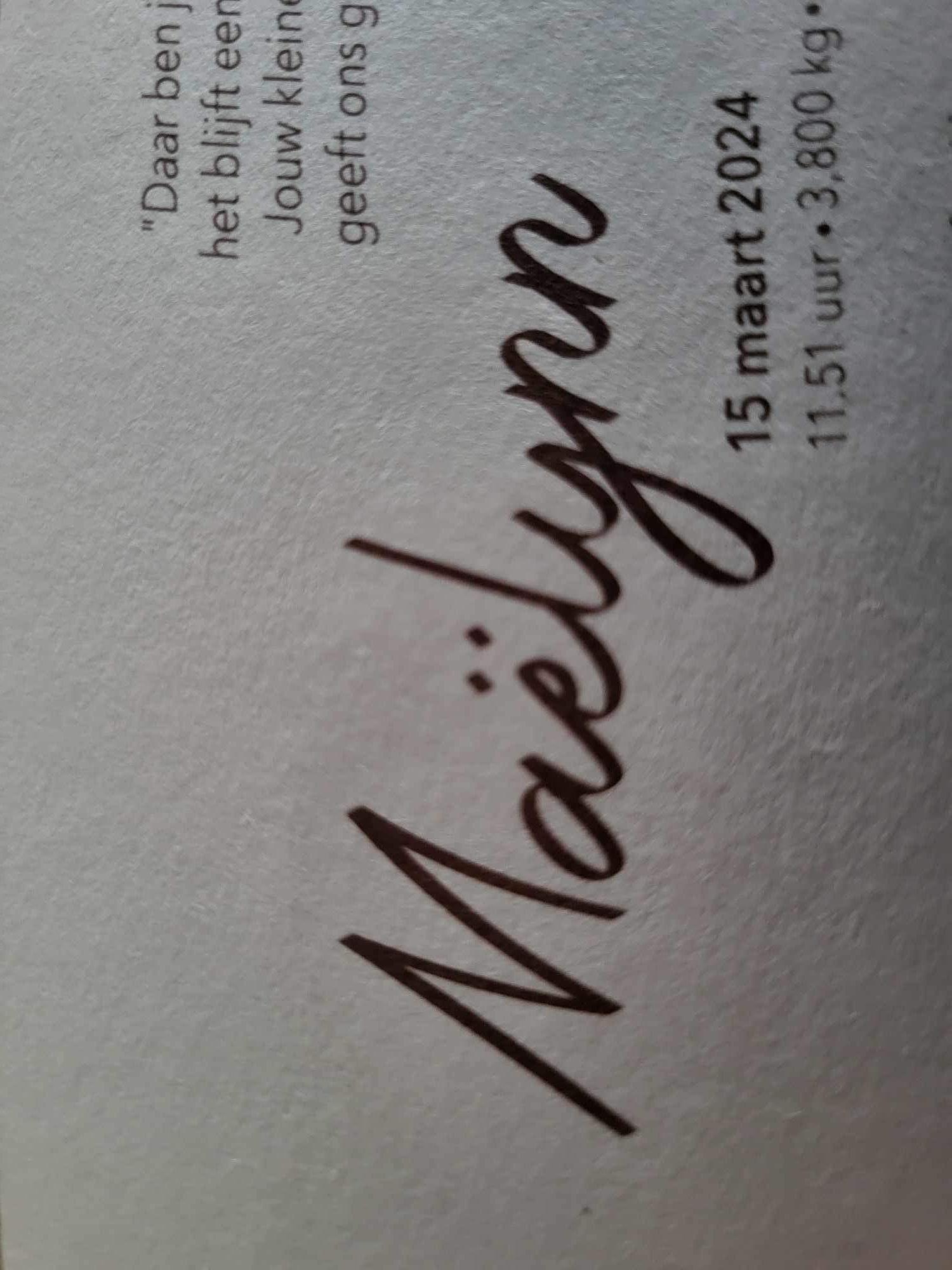
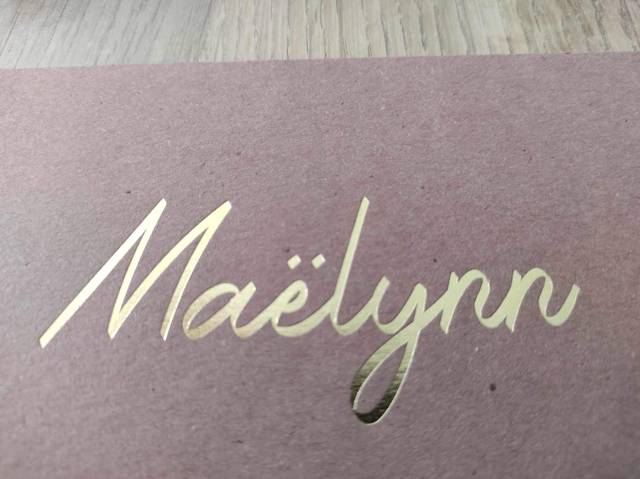
Looking for the font of "Maëlynn" in picture attached
Member Mis… replied to Member eli… 's topic in Font Identification
Looks like Halana.- 1 reply
-
- 1
-

-

Looking for the font of "Maëlynn" in picture attached
Member eli… posted a topic in Font Identification
I'm looking for the font used for the name "Maëlynn" on attached pictures. Thanks for the help!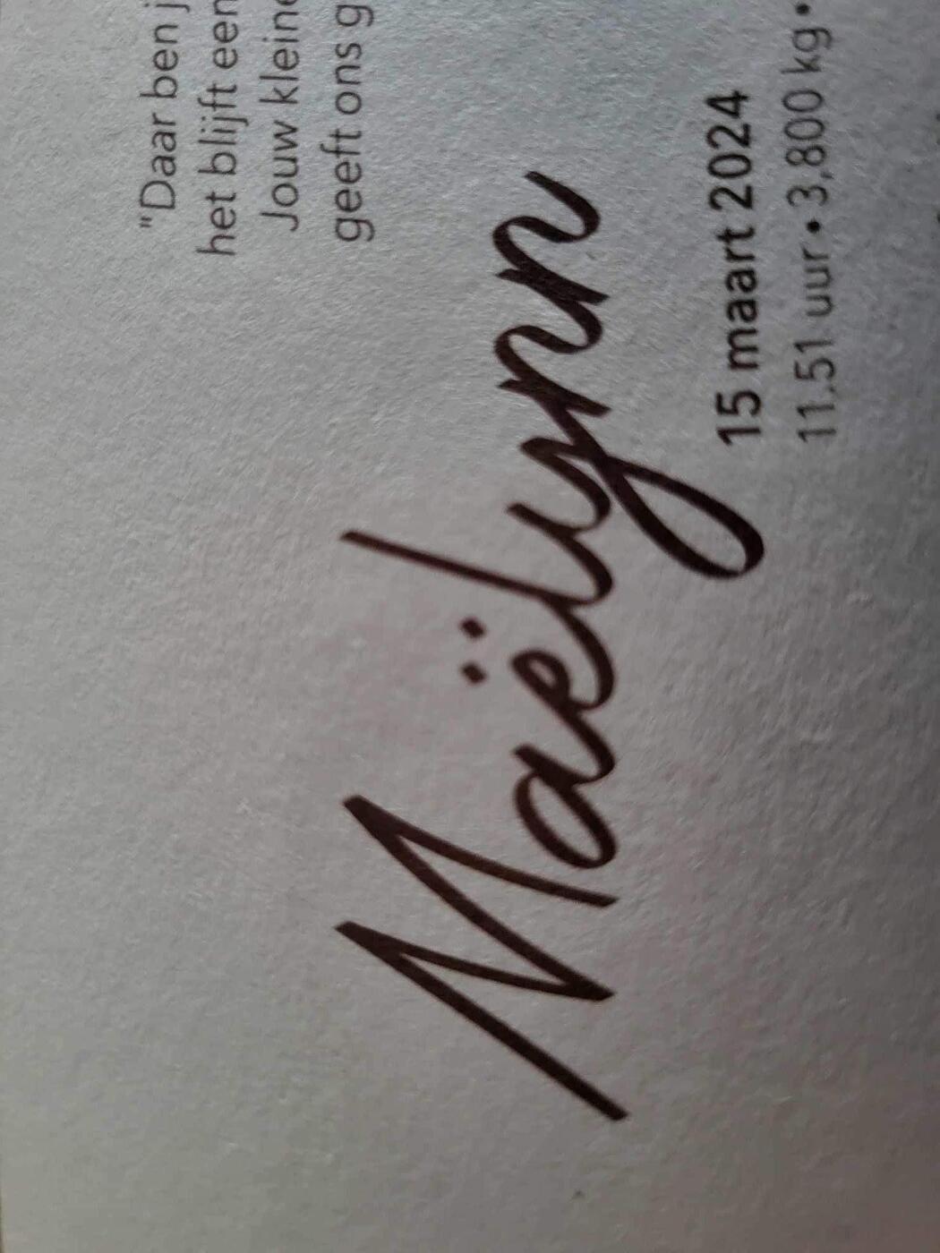
-

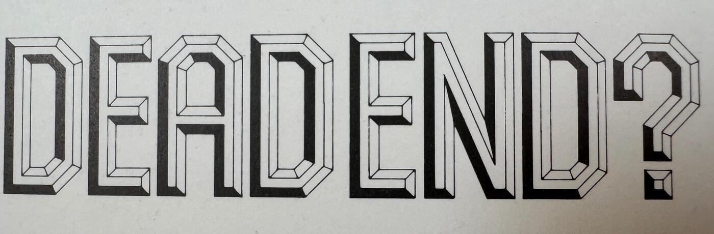
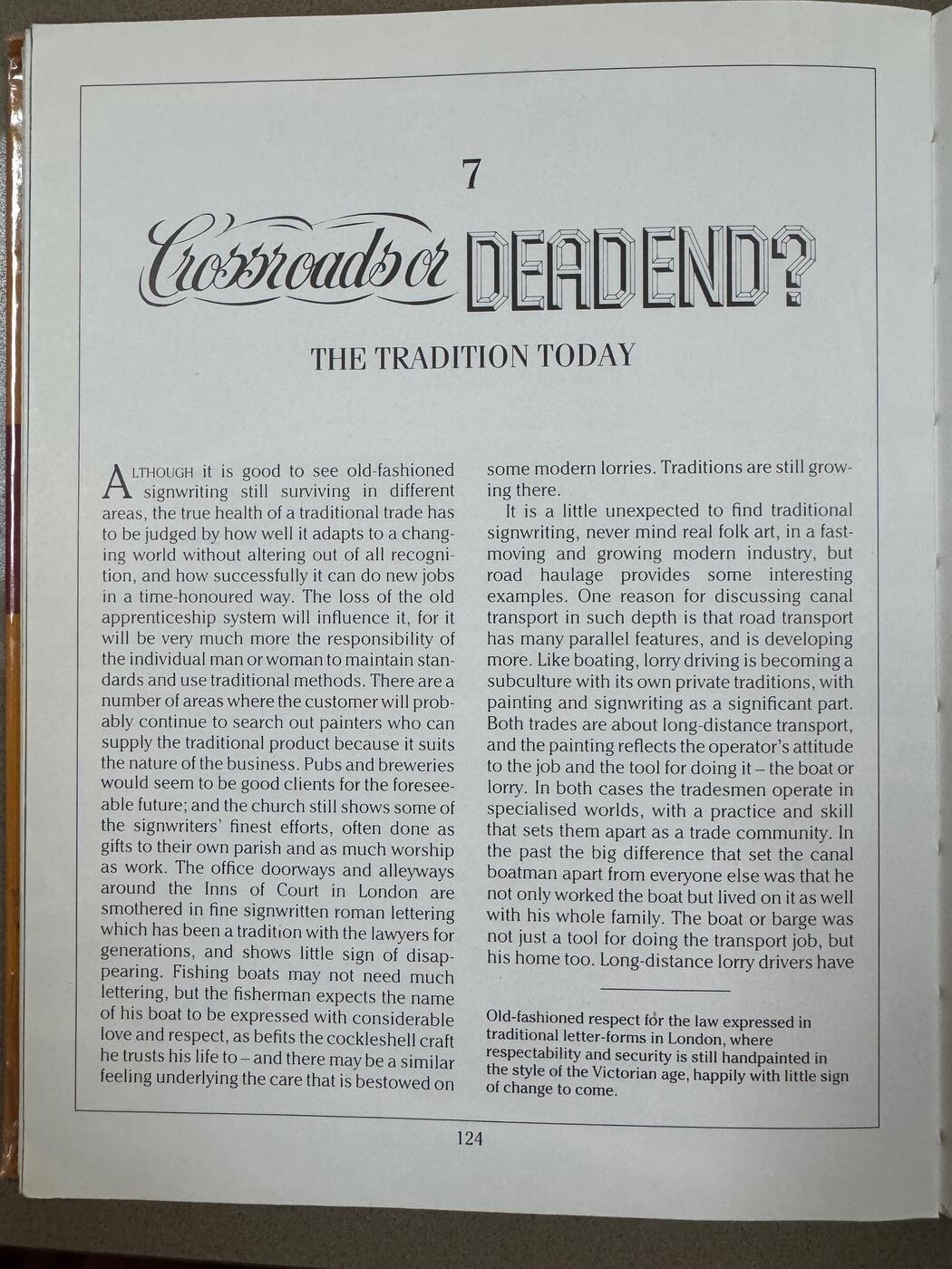
What’s this font (Signwritten Art book)
Ralf Herrmann replied to Member Sue… 's topic in Font Identification
It will not be this obvious to everyone, especially since that book and even that page uses fonts. But yeah, I agree, that this header is almost certainly lettering. -
What’s this font (Signwritten Art book)
Member Kev… replied to Member Sue… 's topic in Font Identification
So, you want to know where you can find a digital typeface to match the handdrawn lettering from a book about signpainting? I think you may have missed the point of the book. Not as detailed, but same vibe: Forged Outline -
 Member Tol… joined the community
 -
Found in 1989 book Signwritten Art by A.J.Lewrey. I would really like to find out where I will be able to find a digital version so I can recreate with a different word.
-
 Member gao… joined the community
 -
 Member Sue… joined the community
 -
Looking for the font used in the Touchstone 3rd edition of Viktor Frankl's Man's Search for Meaning
Member Mis… replied to Member Ell… 's topic in Font Identification
To chime in. The closest I can find were: Dashiell or Halant. There's probably not an exact digital match. Can you, perhaps, post a more quality photo (meaning less text in favor of being more zoomed in)? -
Looking for the font used in the Touchstone 3rd edition of Viktor Frankl's Man's Search for Meaning
Member Kev… replied to Member Ell… 's topic in Font Identification
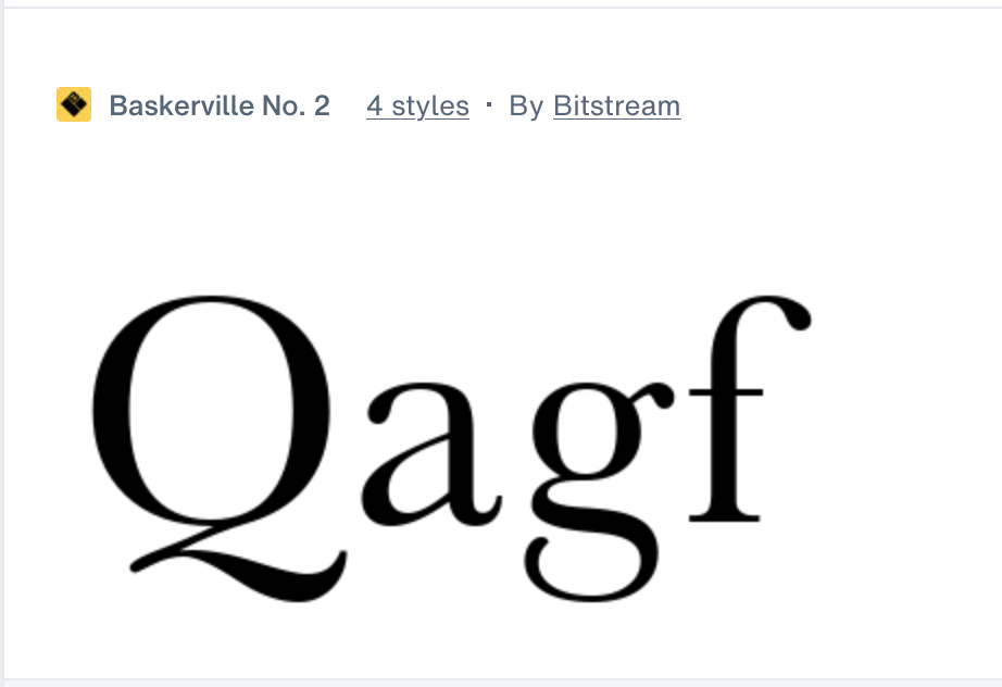
I didn't say anything about Baskerville Old Face. Your sample appears to be set in a face very similar to Baskerville, but one with a narrower and more angled tail on the Q and a few other differences. Whatever it is, it may not have survived into the digital age.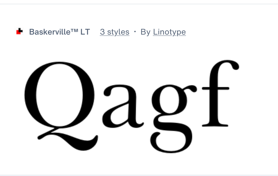


-
Newsletter
Sign UpSubscribe to our monthly newsletter, which highlights recent and noteworthy content from the community.
-
New in Typography Weekly
-
Tell a friend
-
Article | See more …
-
Latest Videos | see more…
-
Latest Lists | see more…
-
Random Quote
Typographical design should perform optically what the speaker creates through voice and gesture of his thoughts.


