

Typography Feed (complete)
- Today
-

Searching for Football club Cologne T Shirt Font
sdaio h replied to Jun H's topic in Font Identification
thank you, how did you know that? -
sdaio h joined the community
-
 Michael Oldenburg joined the community
 - Yesterday
-
 buiducvu36998 joined the community
 -
Indeed. Looks like Real Head.
-
 Shefee Ks joined the community
 - Last week
-
 nothinhers joined the community
 -
Looking to ID this beautifully modern sans serif for a recent logo redesign of the Episcopal Church digital subscription service for youth development here. The font may be inspired by Franklin Gothic. I can't identify it, but I've a feeling @MissNobody will.
-
Thanks for commenting - My last day there yesterday, I had planned to get some sneak pics - photography is banned - but were were in deliberation for over 5 hours and there was only security left. Morris' Golden families are closer than Kelmscott because the RCJ has a pronounced, ornate broken cross apex on the uppercase W. Other notable caps are N and B, there is a sign designating a room as "BBC Studio" and the fancy Bs next to relativly normal C could not have been predicted in the 1870s, but might have influenced the design. The type is easily differentiated from the simplicity of William Morris or Emery Walker but still seems related. Looking into it further, I also wonder why Street did not go for a more Gothic design given his passion for Gothic revival is realised in this building. As for use - most signs are either printed on ceramic or plastic tiles - inserted into wooden slots on A2-A1 sized boards - reminicent of church hymn number boards, but mounted atop on wooden stands. These might be recent but appear to be old or restored. Some are printed on paper and stuck on notice boards. The Royal Courts of Justice are open to the public and free to enter Mon-Fri 9-4.30.
-
Affinity software gains support for variable fonts in version 2.5
Bjørn Edvard Torbo commented on Ralf Herrmann's news entry in Typography Weekly #133
Affinity is slowly becoming the graphic design powerhouse that we long for it to be. We need true vector brushes, a decent image trace feature and preferably support for plugins like Astute and FontSelf, but you could switch today and live a happy, productive life as a designer as it is. It plays very nice with Glyphs 3, for instance. -
Introducing Spotify Mix, Our New and Exclusive Font
Bjørn Edvard Torbo commented on Ralf Herrmann's news entry in Typography Weekly #133
I feel that “To design this typeface, we broke free from traditional typographic constraints and merged elements from a variety of font styles” is a bit of a mouthful for a pretty standard sans serif with a modest level of personality. They didn’t exactly reinvent the wheel with this. -
 saku joined the community
 -

Introducing Spotify Mix, Our New and Exclusive Font
Ralf Herrmann posted a news entry in Typography Weekly #133
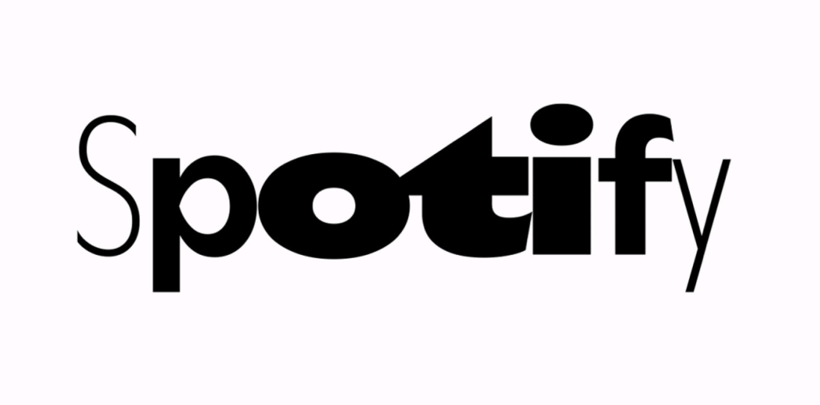 “Today we are introducing our new bespoke typeface: Spotify Mix. Spotify Mix replaces the current font used in our in-app and desktop experiences.”
 -
 Thank you.
 -
Affinity software gains support for variable fonts in version 2.5
Ralf Herrmann posted a news entry in Typography Weekly #133
 You’re now able to use variable fonts in all Affinity apps. In addition, the typography dialog was converted from a pop-up into a panel so you can easily dock it.
 -
.thumb.png.51dfb6cc71a655bbb607ec7a044b60c4.png) I can't find any legit source. If you google 'ComputerNarrow', you'll find it.
I can't find any legit source. If you google 'ComputerNarrow', you'll find it. -
That looks like it. Thank you, MissNobody. 👍 Do you have a link to its website?
-
 kirjean joined the community
 -
Looks like Computer Narrow + some effects.
-
Ok, let's start again.
-

Looking for the font used to make this Bloom Sheffield logo
Cla123 replied to Cla123's topic in Font Identification
Wow, thank you so much! -
 jist joined the community
 -
I see no sign that this is typeset. It looks (at least partially, but more likely fully) hand-drawn. Fonts cannot create such results. Not even color fonts.
- 1 reply
-
- 1
-

-

Looking for the font used to make this Bloom Sheffield logo
Kevin Thompson replied to Cla123's topic in Font Identification
BLOOM SHEFFIELD appears to be set in Value Sans Bold. Community Garden for Women is set in FF Super Grotesk, with the tittle over the i turned 90 degrees. Too heavy for regular weight but lighter than the medium weight, so I'm guessing they added a stroke to the regular weight. -
I need to create some artwork using this logo but I only have a PNG of the original, so I need to remake it. Font ninja is telling me it's Futura but that doesn't seem like a perfect match. Thank you so much!

-
 Trying to help out a friend who is helping out their friend on designing this logo. I am almost positive I've seen the font before and it is a free font but I've been searching for a bit to no avail. Any help would be greatly appreciated.
- 1 reply
-
- 1
-

-
jammin0 joined the community
-
Morris is the best I can find as well. The 'T' seems a bit out of place. If you look closely at 'o's they're similar, but not identical. So this might be originally hand-painted.
-
To break the awkwardness, do you have a better image source? Perhaps a screenshot per font, instead of all-in-one screenshot? Other than that I would pick two fonts you want the most, and let's go from there. Ideally with better resolution images. 😉
-
 wwQ joined the community
 -
The honest YouTube Sans reviews
Bjørn Edvard Torbo commented on Ralf Herrmann's journal article in Journal
Yeah, it's not great. I flat out despise the slanted terminals, especially in the G, H, I, J and N. I can sort of live with the E, F, f and t. Great comments and insights from Spiekermann, Phinney and Hoefler. 👍 -
Dude, Ralph just told you: “It’s probably best to ask specifically about one or two fonts.” I for one am not gonna quit my day job in order to have the time to figure out a ton of fonts that I don’t even find all that appealing in the first place.
-
OK, I apologise. How should I proceed from here?
-
It’s probably best to ask specifically about one or two fonts. Asking about 26 at once might be a bit too much for our volunteers helping with these kinds of questions.
-
On a recent visit to The Royal Courts of Justice in The Strand, London, I noticed that the typeface used on the main sign outside is also used for large print sign posts and notices in and around the courts (over 100) court rooms accross the inter-linked buildings. I thought this would be easy to look up. But all I find is a suggestion that the typeface was designed by the Architect George Edmund Street. Street was at the spearhead of the 'gothic revival' during the mid-victorian period, and the RCJ is his seminal work, which was mostly churches and books on design and architecture. One of Street's apprentices was William Morris and scans show the closest font to be 'Morris', a recent design based on Morris's original typefaces; but 'closest' doesn't mean close. Nothing really comes close to the capital R, with the downward slope at the top of the bowl,the decorative 'blade' protruding from the leg. The tilted oval bowl on the lower case 'o'; 'drunk as a judge'? Has anyone come accross this in digital font, or indeed have any knowledge about the history of the font or a full copy of the glyphs? I'm assuming it's 'crown copyright' but I need support; clearly. Thanks for reading.


-
Newsletter
Sign UpSubscribe to our monthly newsletter, which highlights recent and noteworthy content from the community.
-
New in Typography Weekly
-
Tell a friend
-
Article | See more …
-
Latest Videos | see more…
-
Latest Lists | see more…
-
Random Quote
We are interpreters — not merely translators between sender and receiver. What we say and how we say it makes a difference. If we want to speak to people, we need to know their language. In order to design for understanding, we need to understand design.


