

Typography Feed (complete)
- Past hour
-
.thumb.png.51dfb6cc71a655bbb607ec7a044b60c4.png)
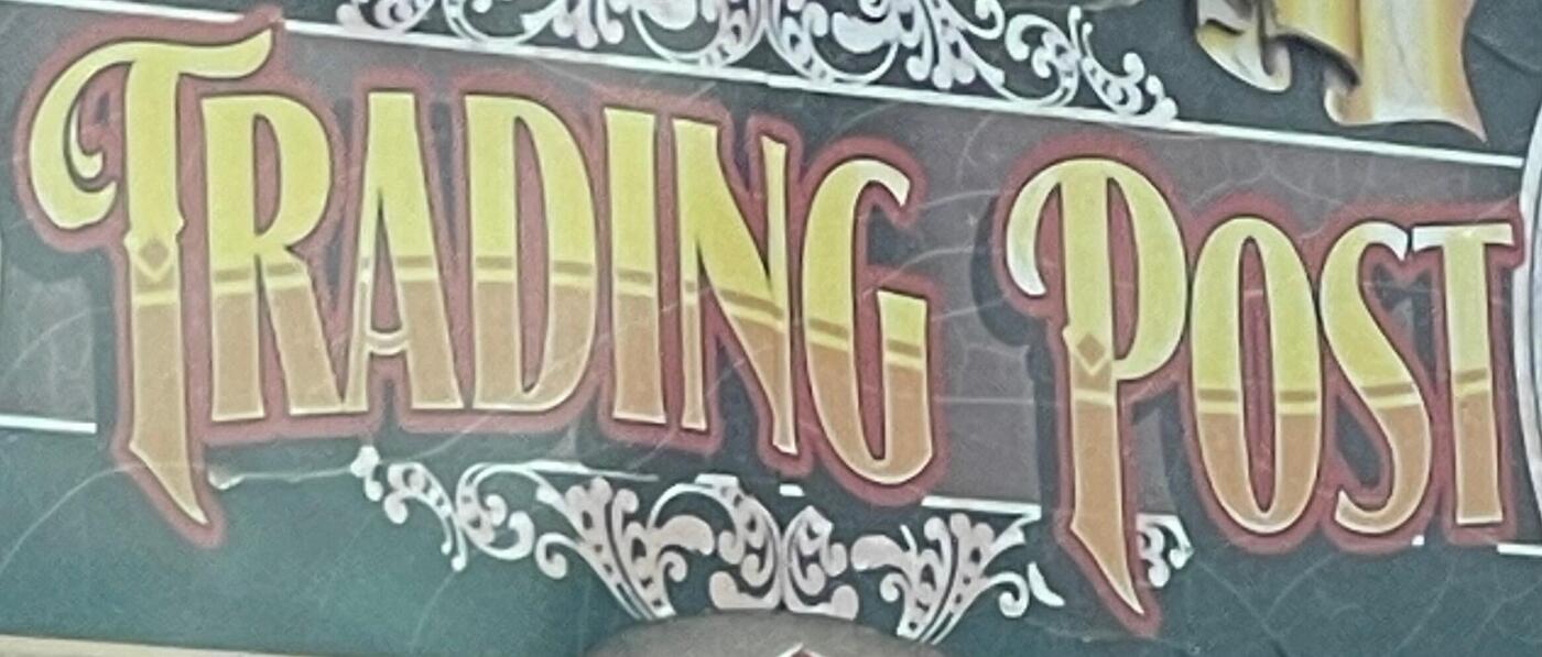
Looking for the name of the font used for this Trading Post store in Custer, SD
Member Mis… replied to Member MDo… 's topic in Font Identification
I think it's Signmaker 2 from LHF. Mix of Regular and Fancy. - Today
-

Looking for the name of the font used for this Trading Post store in Custer, SD
Member MDo… posted a topic in Font Identification
-
Member MDo… joined the community
-

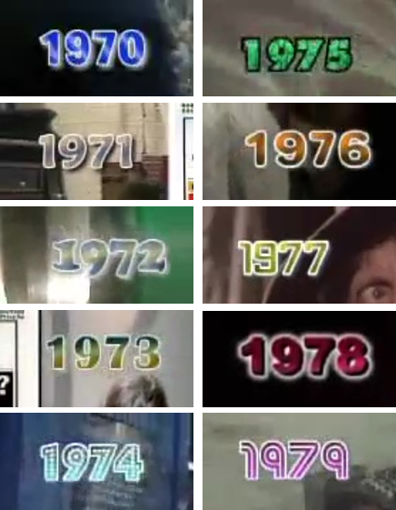
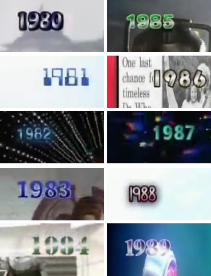
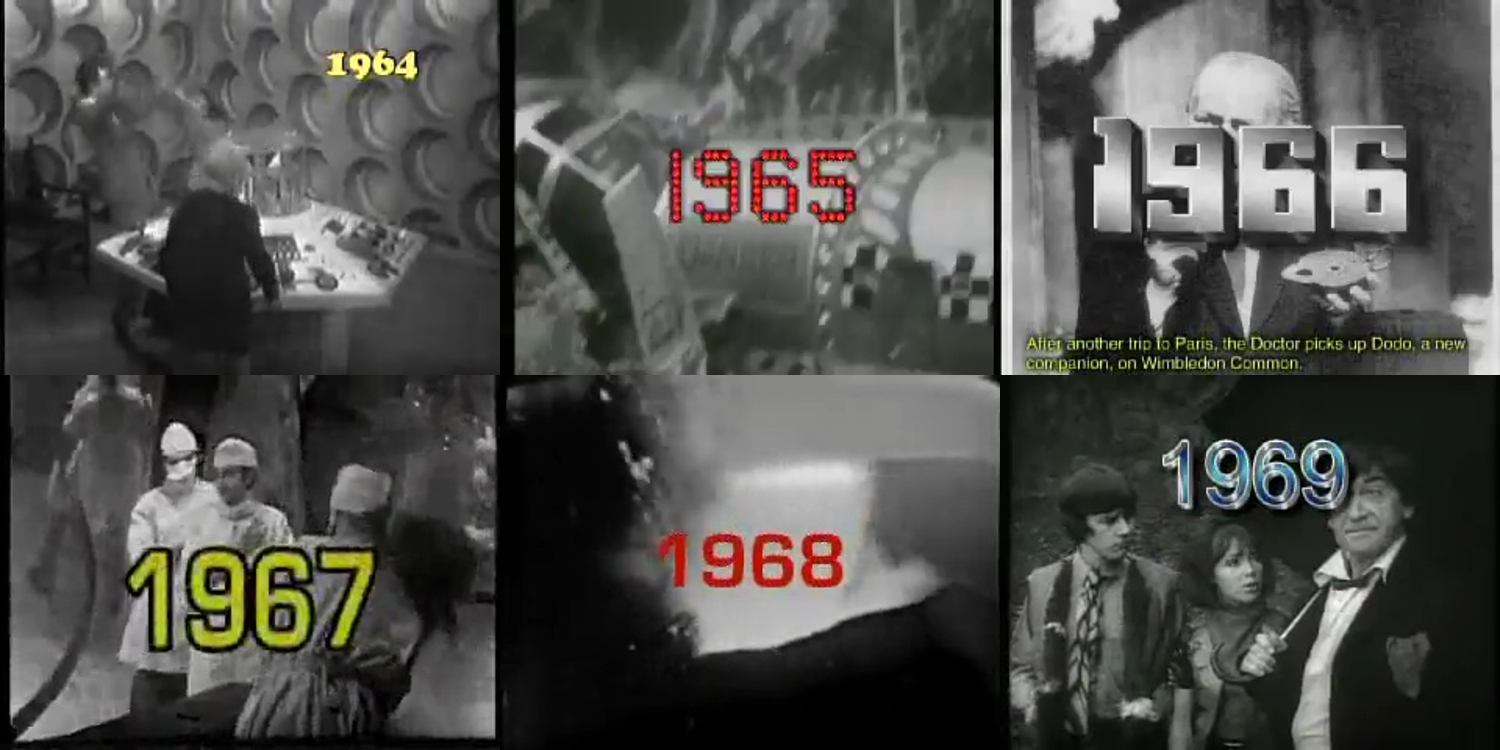
Help with fonts used in a web video published on the BBC website in 2005
Member Joh… posted a topic in Font Identification
Hi all, I would like some help with fonts used in a BBC web video from 2005. Here are screenshots from said video (sorry about the picture quality but it was 2005). I think I've managed to identify most of them, but would like to have a second opinion from the experts on here; and also have help to narrow down some to specific fonts within a family. 1964 > Cooper Black 1965 > ?? 1966 > ?? 1967 > in Eurostile family 1968 > in Eurostile family 1969 > Arial 1970 > ?? 1971 > Maiandra 1972 > Cooper Black 1973 > Britannic Bold 1974 > Budmo Jiggler 1975 > Futura Extra Bold 1976 > Arial Rounded or Helvetica Rounded 1977 > ?? 1978 > Arial Black 1979 > Street Cred 1980 > Hobo 1981 > Computer Regular 1982 > ?? 1983 > ?? (similar to Tahoma) 1984 > Stencil 1985 > Arial Rounded or Helvetica Rounded 1986 > Bauhaus 1987 > Segoe UI 1988 > ?? 1989 > ?? Thank you in advance 🙂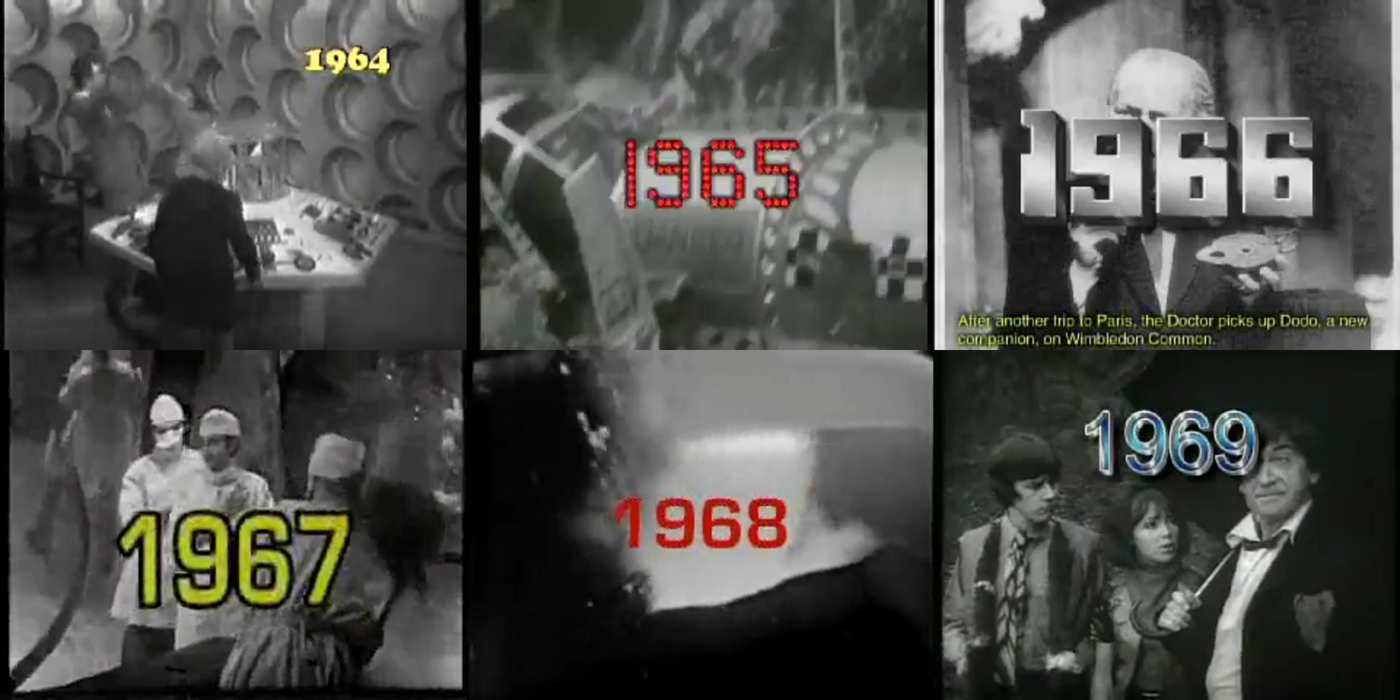
-
 Member ess… joined the community
 -
I am looking for the font used in this Kabi Kabi People logo.
Member Mis… replied to Member Dar… 's topic in Font Identification
Looks like Luna by Carolina Mejia Villegas.
-

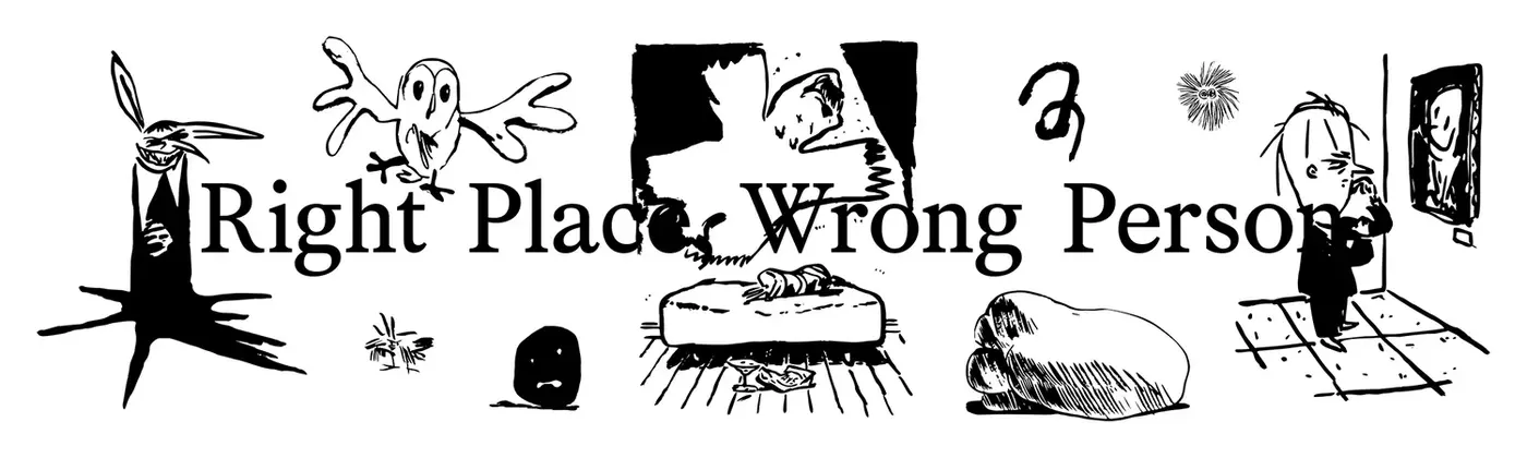
Looking for the font used on RM's upcoming album Right Place, Wrong Person
Member mer… posted a topic in Font Identification
This font is used in graphics for RM's album Right Place, Wrong Person that's coming out in a few weeks. I've done some digging on my own including inspecting the website and it seems similar to Nanum Myeongjo but it doesn't match perfectly. I'm looking for a digital version and commercial fonts are fine.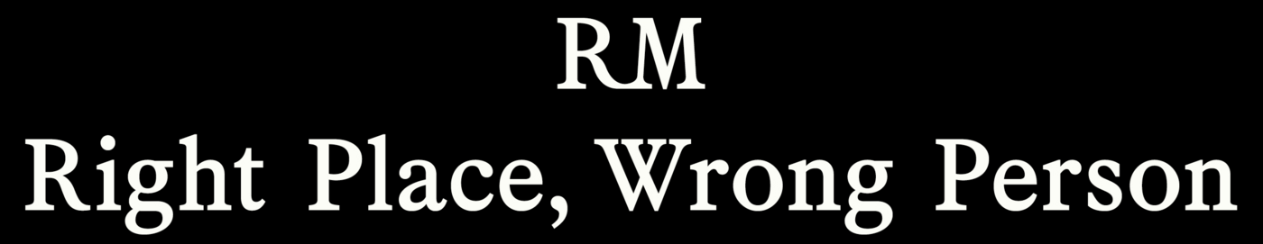

-

I am looking for the font used in this Kabi Kabi People logo.
Member Dar… posted a topic in Font Identification
I am looking to re draw this logo for the Kabi Kabi People.
-
Member Dar… joined the community
- Yesterday
-

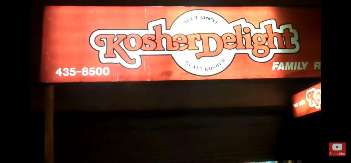
80's logo signage identification Kosher Delight
Member Kev… replied to Member Naf… 's topic in Font Identification
Mellissa, which sadly has never been digitized.- 1 reply
-
- 1
-

-
This store used to be on 13th Ave in Brooklyn. Looks super familiar but i can't seem to find a match with the swashes. Thanks!!

-
 Member Naf… joined the community
 -
If you're not sure what doesn't work, how could anyone assist you? 🤷♂️ You need to identify the problem, and share it. Then it would be possible to give advice. There are an abundance of beautiful typefaces out there, and Bembo is clearly one of them. I think Spectral would be a nice alternative to Bona Nova, if we were to stick to Google Fonts.
-
Yes, the question is vague. I suppose it would be best to stick to the Windows system font.
-
 A professional and faithful revival of Berthold’s Signal type family originally published in the 1930s.
 -
The request is a little vague. There are hundreds of typefaces that could work, but it’s not clear what the goal of the font choice would be. You would need to define what you want visually or what the technical requirements are (number of styles, character set, licensing …). Have you looked through all the Windows system fonts? There are probably good choices there already which would play nicely with Microsoft apps and come with a sufficiently large character set.
-
We use Bona Nova font for this magazine designed in MS Publisher (as it is a free publication). When printed, there is something about it that doesn't like right. Not sure what it is. Is there a similar paid font that you recommend? Do you think bembo would be good in this situation?
-
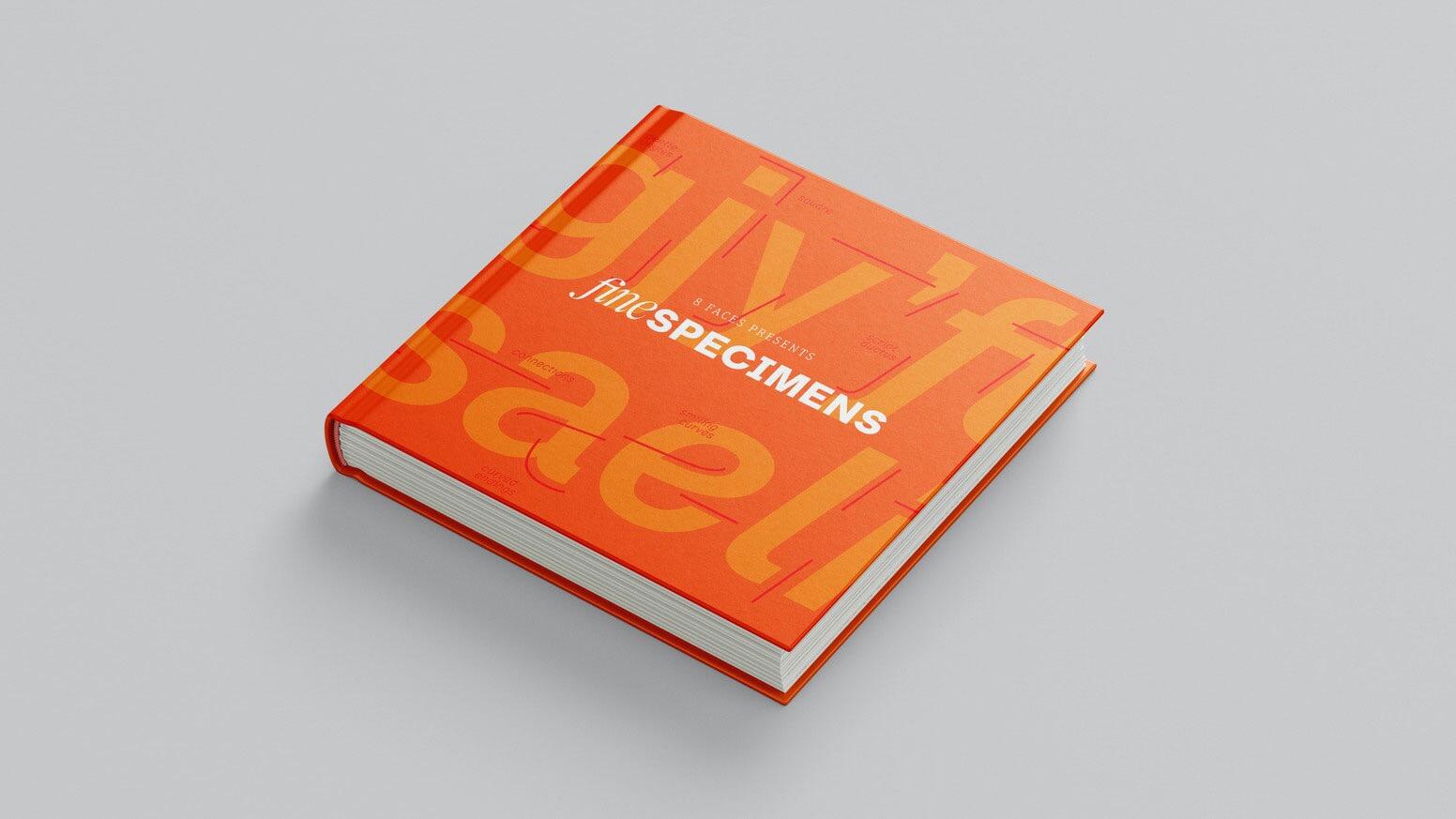 A collection of contemporary specimen graphics from indie type foundries around the world, created by the team behind 8 Faces.
 -
Need to ID 3 fonts from Changing Mission: Unchanging Faith
Member Mis… replied to Member Typ… 's topic in Font Identification
'CHANGING MISSION' looks like Teko (Bold 700). 'Episcopalians' indeed seems to be Minion (Minion Pro Bold Italic). 'LEE LITTLE' looks more like Faustina (Regular 400). - Last week
-

Need to ID 3 fonts from Changing Mission: Unchanging Faith
Member Typ… posted a topic in Font Identification
Maybe Countach and Minion and Landa, but I'm not sure. From the cover of the book Changing Mission: Unchanging Faith by Lee Little published here. Thank you in advance typophiles.
-
It was designed by Geoffrey Lorenzen, but his website (www.omaticdesign.com) is no longer live and the typeface is “no longer available,” per the PDF attached. GLorenzen.pdf
-
THANK YOU!!!
-
I found it as "Spoing", can't find any license information.

-
Hey there, can anyone help me identify the font that says Playas Gon Play? It’s been a struggle to find it. Thanks in advance!

-
 Member Jay… joined the community
 -
I need help finding this fancy font type from a bridal shower invitation
Member Mis… replied to Member khi… 's topic in Font Identification
Looks like Mozart Script. -

I need help finding this fancy font type from a bridal shower invitation
Member Les… replied to Member khi… 's topic in Font Identification
Try searching for 'Copperplate Scripts'. Some that are similar: Novia, Gravura, Cynthia June JF -

Font identification: Jean Cocteau Handwriting/Signature
Member CN1… replied to Member CN1… 's topic in Font Identification
Thanks you David. We did look at Auteur but the majority of the letterforms just seem way off. Many thanks for looking. -
Font identification: Jean Cocteau Handwriting/Signature
Member CN1… replied to Member CN1… 's topic in Font Identification
Thanks Miss Nobody! Pretty good! -
I need help finding this fancy font type from a bridal shower invitation
Member Bjø… replied to Member khi… 's topic in Font Identification
Snell Roundhand is a classic, beautiful script typeface in this tradition. Shelley (Volante) by Matthew Carter is another.


-
Newsletter
Sign UpSubscribe to our monthly newsletter, which highlights recent and noteworthy content from the community.
-
New in Typography Weekly
-
Tell a friend
-
Article | See more …
-
Latest Videos | see more…
-
Latest Lists | see more…
-
Random Quote
Type design is a job where there is no room for easy solutions. Letters can perhaps be designed quickly using a compass and ruler, but these are unsuitable for a typeface, as they fail to satisfy the subtle optical laws that make reading enjoyable.


