

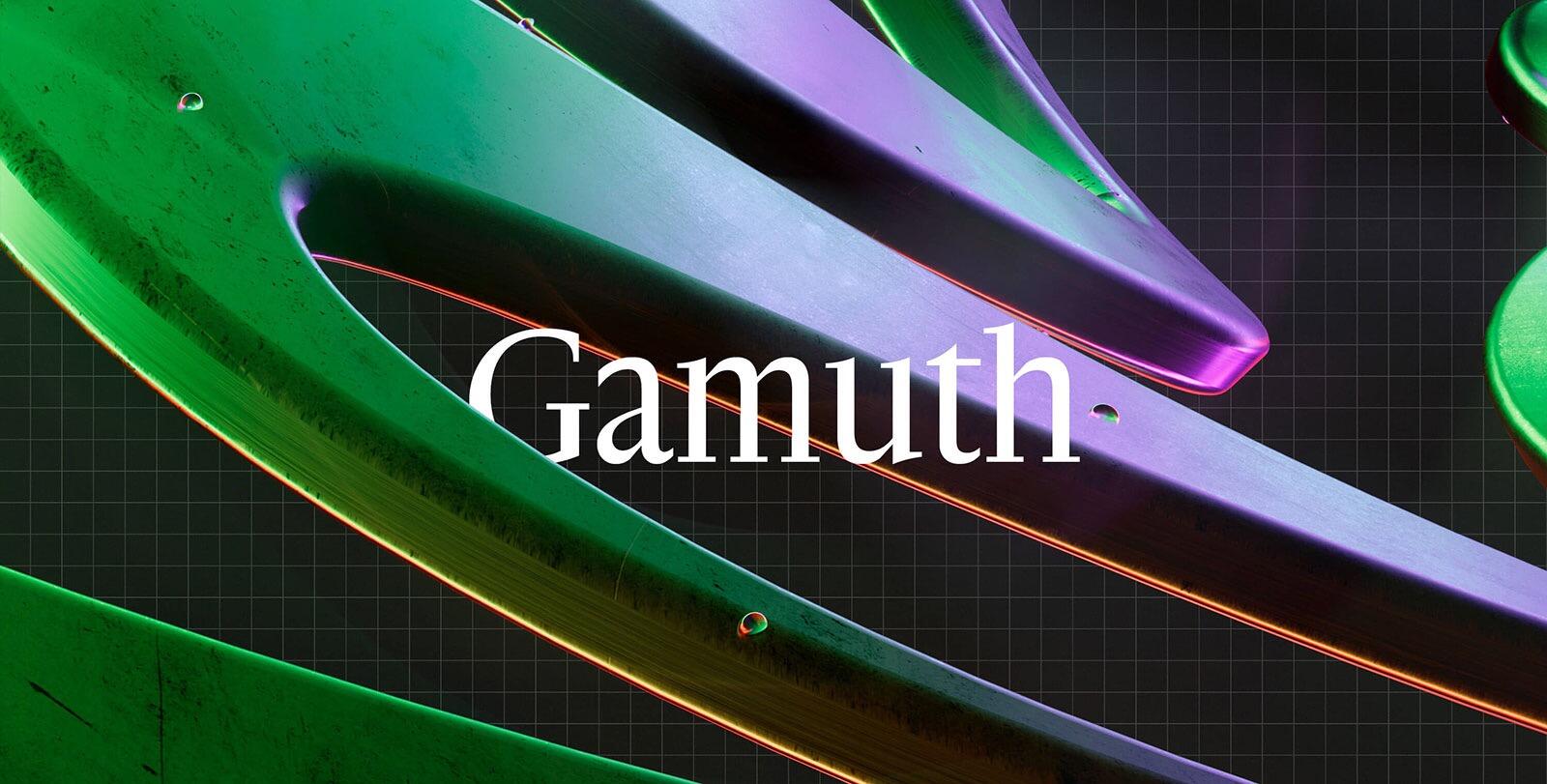
Gamuth is conceived as a multi-faceted work, of which the first panels are two optical sizes (Display, Text) of the same serif typeface. Gamuth borrows from Dutch Baroque faces and their typical breadth.
Competition: April 2023
Won 2nd place


.")

Recommended Comments
There are no comments to display.