

Typography Feed (complete)
- Today
-
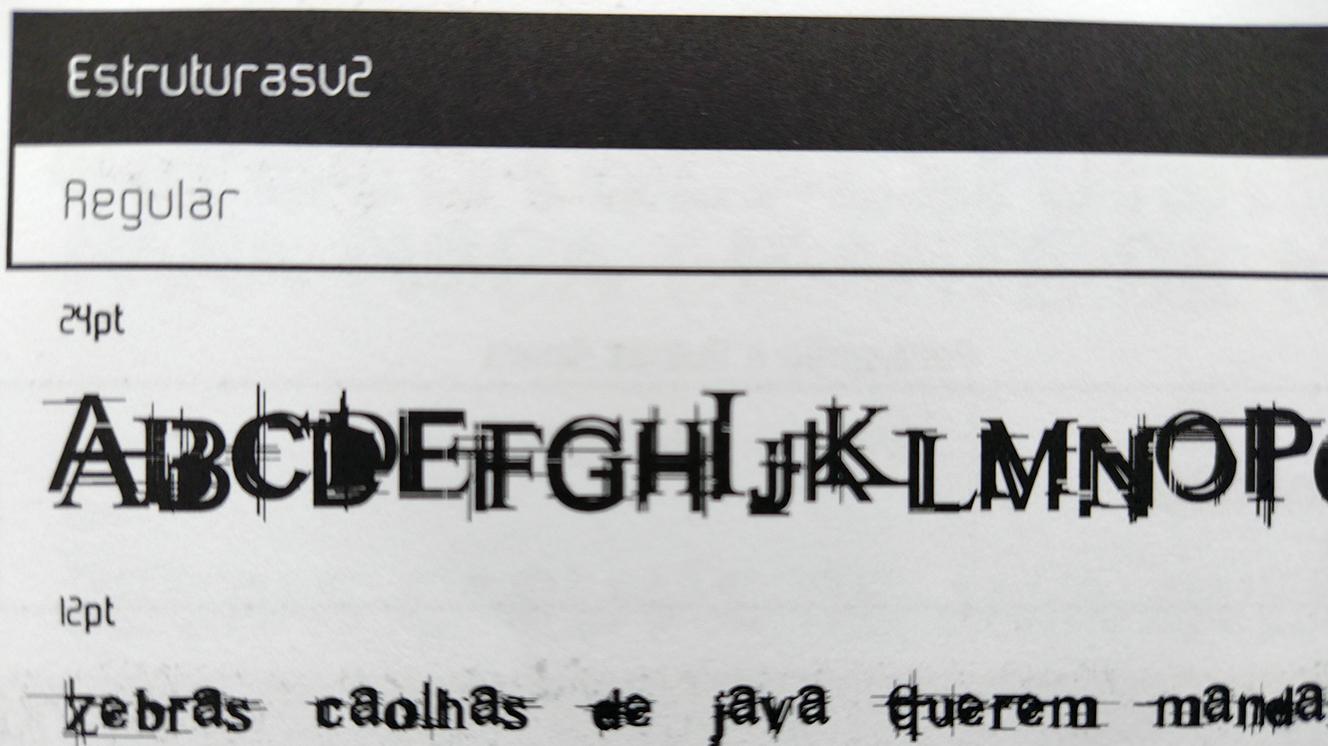
Can't find anything. I would try what Kevin suggested. Unless Marcos Buccini is already the author you've contacted. I've tried a different approach, searching for a Brazilian type designer, that has a similar style. I only found Eduardo Recife. Seems like he enjoys similar "Misprinted Type" style. If it's not Marcos Buccini or Eduardo Recife, it might be a good idea to post any information, from the book, you have. Like original author you've contacted, year when the font was created, or basically any information that is not shown on the picture you posted.
-

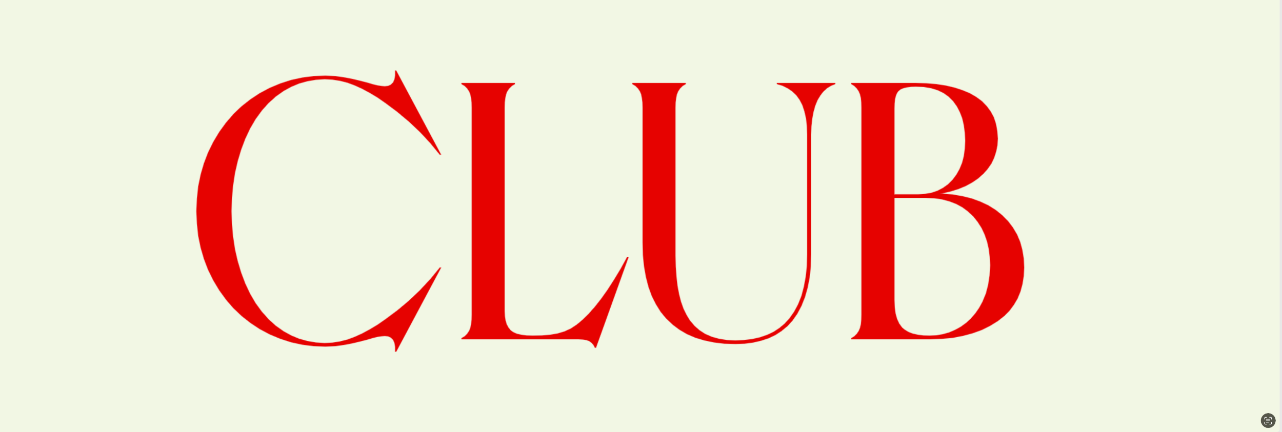
Looking for the font of this NYC gallery invitation from circa 1990.
Member Lam… replied to Member Lam… 's topic in Font Identification
Thank you so much for the help Ralf! -

Looking for the font of this NYC gallery invitation from circa 1990.
Ralf Herrmann replied to Member Lam… 's topic in Font Identification
A version of Friz Quadrata https://www.myfonts.com/de/search?query=FRIZ QUADRATA -
Looking for the font of this NYC gallery invitation from circa 1990.
Member Lam… posted a topic in Font Identification
Looking for a digital version. Commercial fonts are fine. I need a free alternative if possible.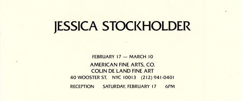
-
Survey: The Monotype Collection—the next chapter
Ralf Herrmann posted a news entry in Typography Weekly #133
 The care of the Type Archive collection has been taken over by the Science Museum Group (SMG). How might new generations use the collection? Take the survey.
 -
 Member Lar… joined the community
 - Yesterday
-
Member Lam… joined the community
-
 Member sie… joined the community
 -
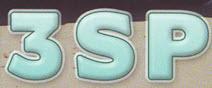
The book is called, "Brazilian Digital Sources from 1989 to 2001" ("Fontes Digitais Brasileiras de 1989 a 2001"), published by Rosário with ADG Brasil.
-
Perhaps the same Marcos Buccini? And here, with a contact email.
-
I believe the name is actually Estruturas v2, and the designer appears to be Marcos Buccini, both referenced here in an archived website from 2005. Luc Devroye's page about the group of type designers to which Buccini belonged. Unfortunately, their website (Tipos do aCaso) is no longer live, but is accessible via archive.org.
-
What is the name of the book?
-
Hello everyone, Do you know where I can find the typography from the image? If you know any similar ones, I welcome recommendations. The image is from a book about typefaces created by Brazilians from 1989 to 2001 that I found at the university. Despite having the name of the typeface and the author's name, I managed to contact him, but according to him, this font is not his and possibly could have been an error by the publisher. I appreciate everyone's help.
-
 Member jpi… joined the community
 -
 Member Eas… joined the community
 - Last week
-
interesting font in park in Catania sicily
Member Bjø… replied to Member gen… 's topic in Font Identification
Don’t mention it. If you like the overall style, you could always go inspiration shopping for “art nouveau” typefaces. The elegant, dynamic, organic flow inspired by forms found in nature is very typical for the style. Things being hand made as well, ironically. I see why you were inclined to investigate the specimen in the first place. -

interesting font in park in Catania sicily
Member gen… replied to Member gen… 's topic in Font Identification
Thank you, I think you are right. thanks to you and Bjørn for looking at this. Genevieve -

Looking for font used in a QSL card
Member Myf… replied to Member Myf… 's topic in Font Identification
Unbelievable ..... I think you are spot on. Thanks for your help. Very much appreciated -
.thumb.png.51dfb6cc71a655bbb607ec7a044b60c4.png)
Looking for font used in a QSL card
Member Mis… replied to Member Myf… 's topic in Font Identification
Looks kinda like Boris Black Bloxx by Manfred Klein.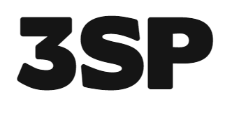
-
When radio-amateurs make world-wide contact, both sides confirm this connection by sending "post"-cards named SQL-cards, stating the details of this event (transmitting frequency, power, type of transmission, date/time and more..) I found a font used by a print-shop that I want to use also, but after days of trying to find this font, I'm out of ideas. My interpretation of this font is a font with a glow, shade and slight depth effect but no luck so far. Any ideas
-
Member Myf… joined the community
-
 Member jen… joined the community
 -

Font for: Leo Sayer - Endless Journey?
Member Ffe… replied to Member Ffe… 's topic in Font Identification
Cheers for that. Certainly the closest I seen so far. Though you are right, The R dosen't quite match and it might be a little too wide but, as I say, not perfect but best match so far. -

Looking for this typeface, found deep within my inspiration folder!
Member Aid… replied to Member Aid… 's topic in Font Identification
You are right, thanks a lot!!! -
Looking for this typeface, found deep within my inspiration folder!
Member Mis… replied to Member Aid… 's topic in Font Identification
Looks like Charlottenburg (Classic). -
Looking for this typeface, found deep within my inspiration folder!
Member Aid… posted a topic in Font Identification
Can anyone help identify this lovely font? I found this image within a folder of saved inspiration and its perfect for an upcoming project but sadly can't find the name of the font anywhere. I have tried all the font identifiers as well as scrolling through a few font foundry websites but had no luck. My guess is that it is a fairly new commercial font from a small type foundry, but sadly this is all the information that I have. Thanks a lot for your help!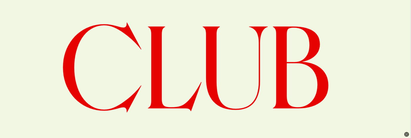
-
interesting font in park in Catania sicily
Ralf Herrmann replied to Member gen… 's topic in Font Identification
Keep in mind that it could just be hand-painted without an existing font. -
 Member qtm… joined the community
 -
interesting font in park in Catania sicily
Member gen… replied to Member gen… 's topic in Font Identification
I don't really think the Rivanna font is the solution. clearly the font is not as interesting others as it was to me! -

Experts in Dutch typographic traditions are asked about the proper quotation marks for csquotes in LaTeX
Member AlM… posted a topic in Talk
Comments from the experts in Dutch typographic traditions are kindly requested in https://github.com/josephwright/csquotes/issues/71 . Everyone else is kindly asked to ignore this topic. -
FontLab 8 sale 🛍 until Sunday, 28 April 2024
Ralf Herrmann posted a news entry in Typography Weekly #133
 8 Days of FontLab 8: SAVE 40%
 -

Looking for the font used by The Australian newspaper in mid-2010s
Member JV_… replied to Member JV_… 's topic in Font Identification
Fantastic - thank you both for your efforts! -

I need these fonts to create vector versions of a family's crest and logo.
Member Dur… replied to Member Dur… 's topic in Font Identification
Fantastic ! That was exactly it. It fits perfectly over my template (except for the new slightly improved kerning, of course) (… which doesn't make that design any nicer). And just when I was beginning to accept defeat, too. Thank you very much, Kevin ! P.S. : Unfortunately, I could only mark one answer as the solution (and Bjørn was first), but yours is certainly as deserving as his.


-
Newsletter
Sign UpSubscribe to our monthly newsletter, which highlights recent and noteworthy content from the community.
-
New in Typography Weekly
-
Tell a friend
-
Article | See more …
-
Latest Videos | see more…
-
Latest Lists | see more…
-
Random Quote
If you remember the shape of your spoon at lunch, it has to be the wrong shape. The spoon and the letter are tools; one to take food from the bowl, the other to take information off the page ... When it is a good design, the reader has to feel comfortable because the letter is both banal and beautiful.


