


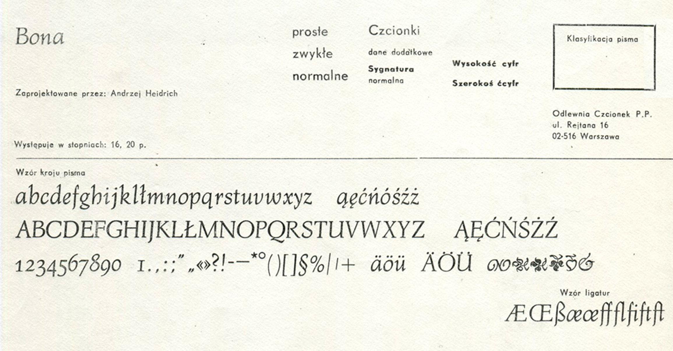
Letterpress version and type specimen of Bona
Mateusz Machalski started the project in 2011, when he was in his second year at the Academy of Fine Arts in Warsaw. The font had only existed in metal type and it was available in the typesetting room of the academy. When Machalski became interested in the font, his professor arranged a meeting with its designer Heidrich. “I was surprised that he did not laugh at my projects. It made me more confident and I told him about my idea. He reacted with real enthusiasm” Machalski remembers. Digitization started quickly after that meeting, but the work remained unfinished for a few years.

In 2016, together with Leszek Bielski, the project was revived again. More meetings with Heidrich took place and an extended type family (regular, italic, bold) was planned. Bona was Heidrich’s only full type design. But as graphic designer in those days, lettering for book jackets for example was a typical job. But there was little choice for body copy texts. “We always worked with 12 pt Times or Garamond—to the point of boredom. Each book looked the same inside. There was a deep need for new typefaces. For each cover or other design the lettering was custom made. It had to be drawn or painted, as there was not enough time to create and cast new letters.”

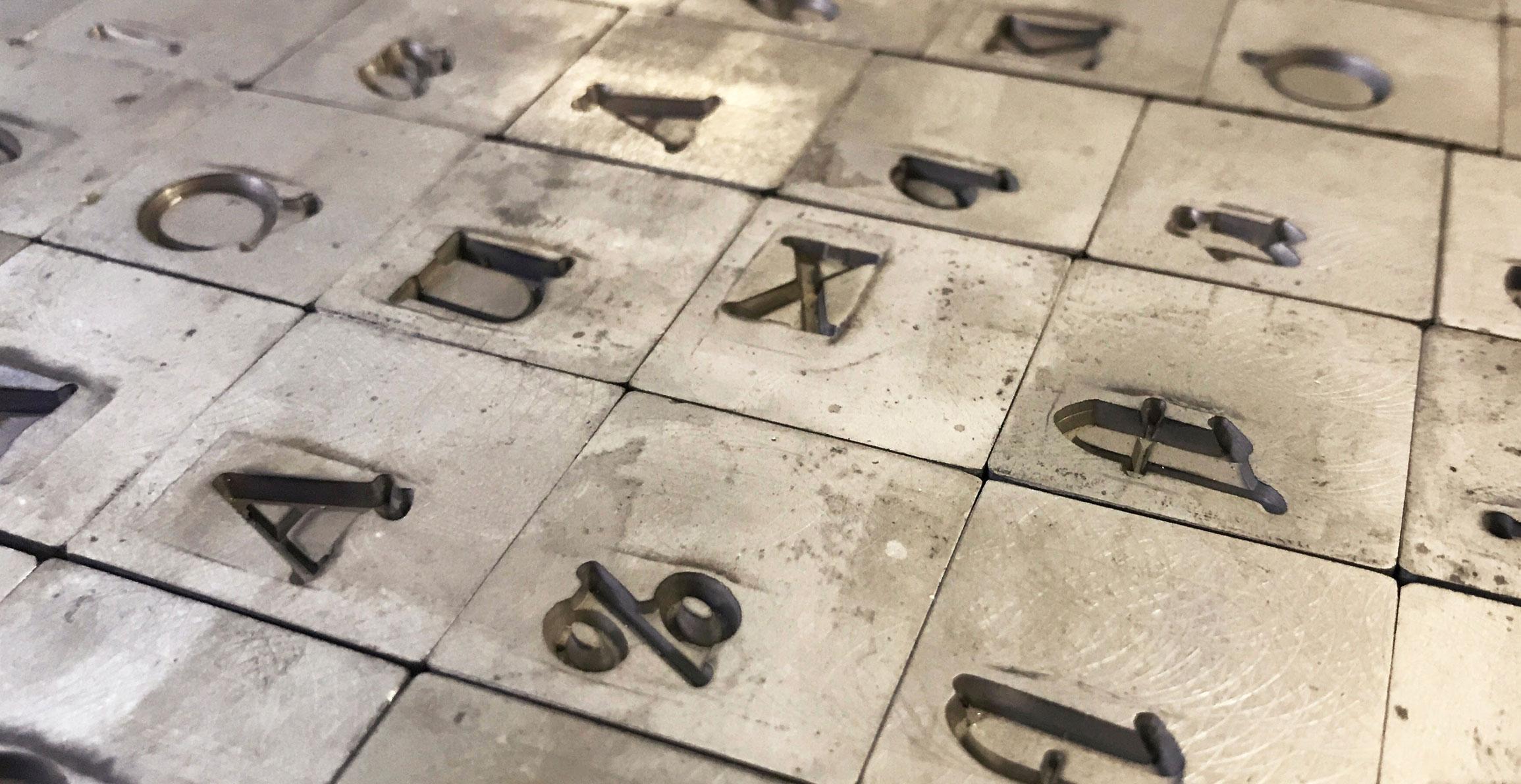
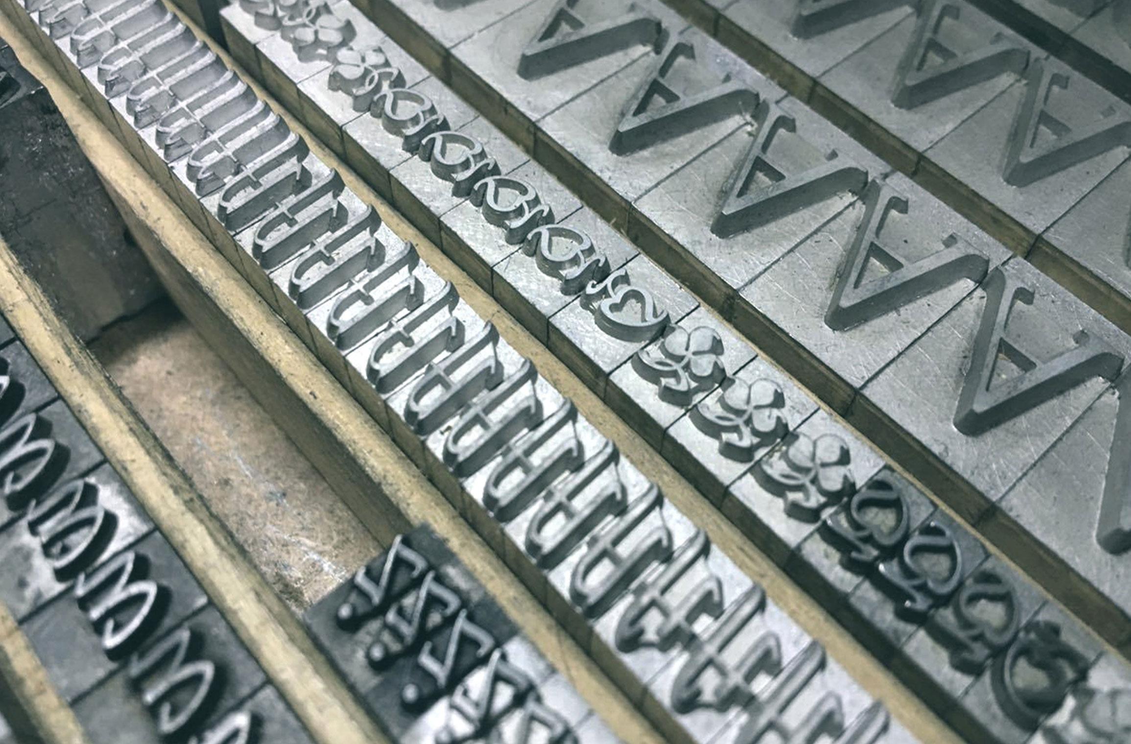
Original sketches and matrices
Heidrich worked on Bona as a side project—for the “pure pleasure” of it as he remembers. There was no specific brief or job for the design. The typeface was cast and a full set ended up in the typesetting studio of the Academy of Fine Arts in Warsaw, where it was used occasionally.
For the digitization Heidrich provided all the original sketches of the italic and the matrices could be inspected as well. But there were still so many design decisions to be made for the digital version. “With Bona Nova, the most interesting things happened during the design work. I published images and details about the progress on the internet and the Bona Nova fanpage became a stage for a typographic debate on many levels” says Machalski.
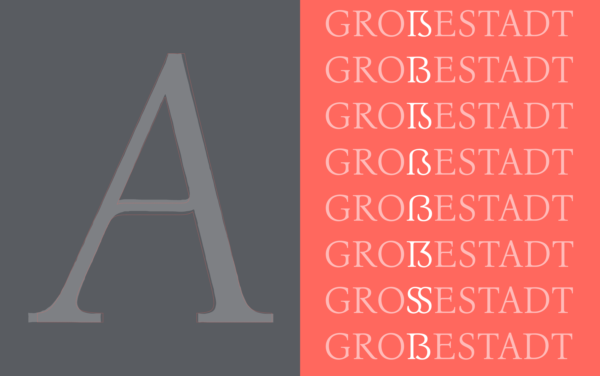
Among other details, the design for the Capital Sharp s was heavily discussed on Facebook
And of course a roman design had to be developed from the italic, which is rather unusual. Letters on stamps and banknotes by Heidrich helped to work out certain characteristics. The final designs got an extended Latin character set with over 1000 glyphs, including small caps, lots of ligatures, multiple figure sets and ornaments.

But the family still continued to grow. Three inline versions were added and three title versions with a very high contrast. These are available as commercials offers. And there might be more in the future. “There are some plans—perhaps Cyrillic? Maybe a sans serif version … Only time will tell.”


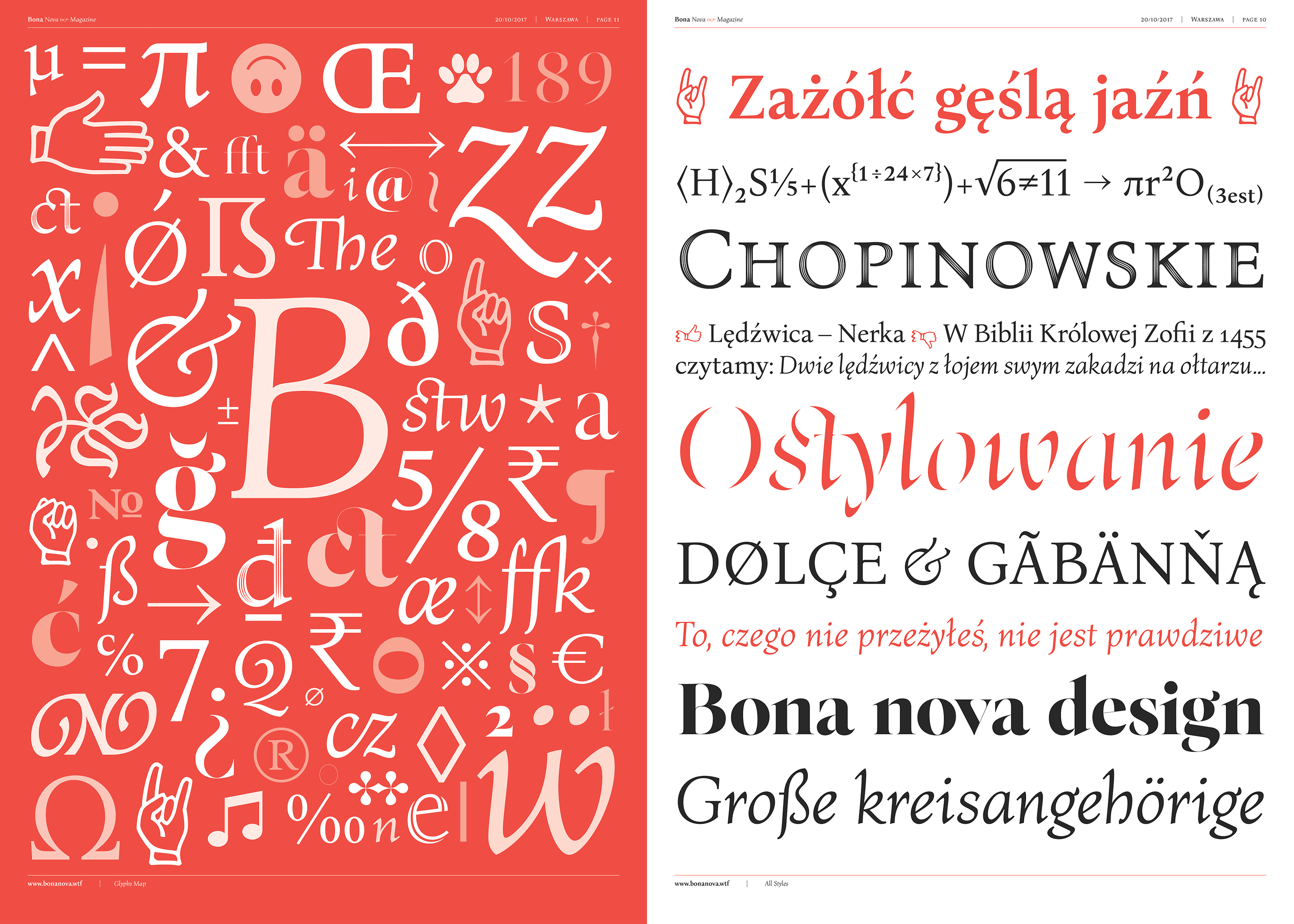
Specimen images from Bona Nova
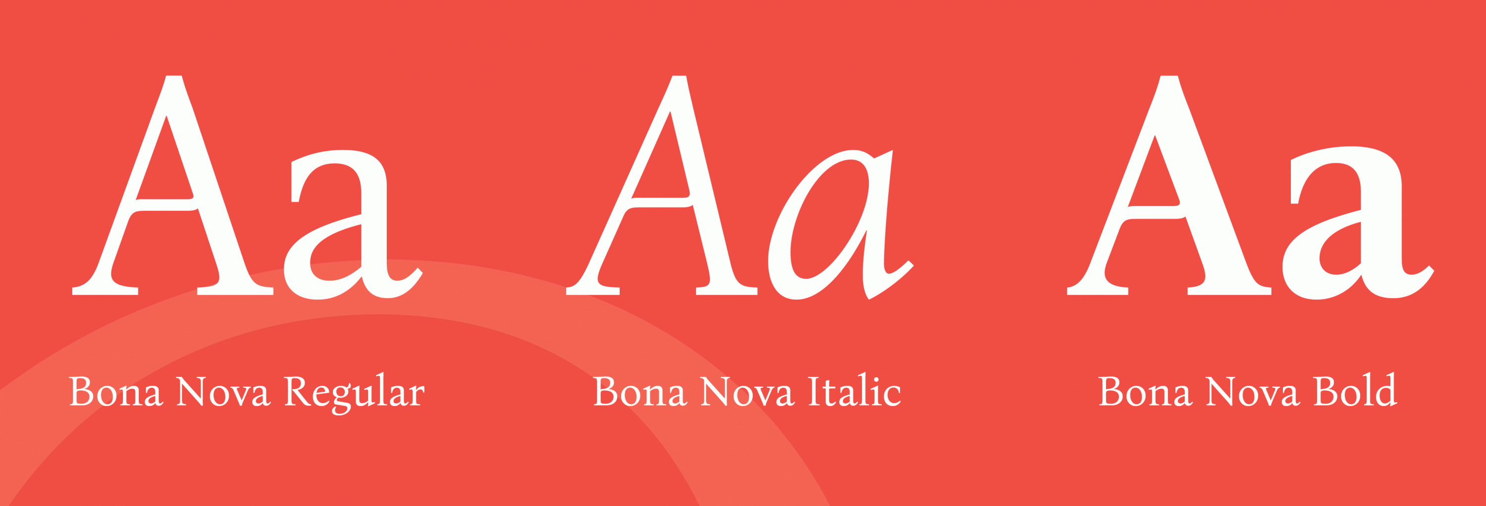
The free styles of Bona Nova
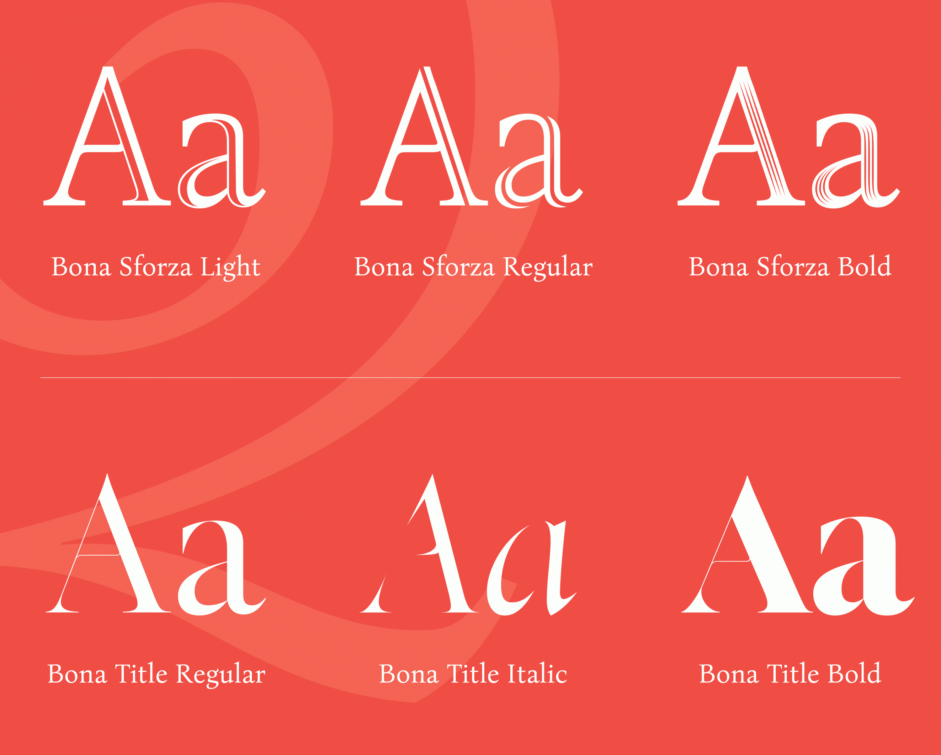
The commercial styles of Bona Nova
The free and the commercial styles are available on the Capitalics website.
More information about the project in Polish and English here: http://bonanova.wtf


Recommended Comments
Create an account or sign in to comment