Search the Community
Showing results for tags 'font'.
Found 17 results
-
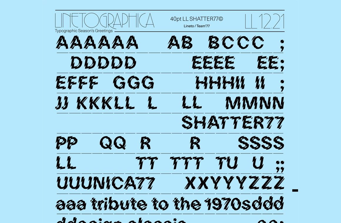 For a limited time, Swiss foundry Lineto is offering a free download of Shatter77, a design that applies the Shatter treatment to their Unica77.
 -
Hello Guys! I'm working on creating an invitation for a wedding and I'm looking for a font. I was thinking about a cursive English font. What do you guys think? Could you give me some suggestions?
-
.png.24463718a9d2f40923ed3d261686481e.png) “To show support and solidarity for the people of Beirut, the international type design community has come together to create a typeface that would raise funds to support the victims of the blast and the reconstruction efforts. All profit raised will go towards charities supporting the victims and the reconstruction efforts.”
“To show support and solidarity for the people of Beirut, the international type design community has come together to create a typeface that would raise funds to support the victims of the blast and the reconstruction efforts. All profit raised will go towards charities supporting the victims and the reconstruction efforts.” -

Quality type: how to spot fonts worth your money
Member Ric… posted a news entry in Typography Weekly #104
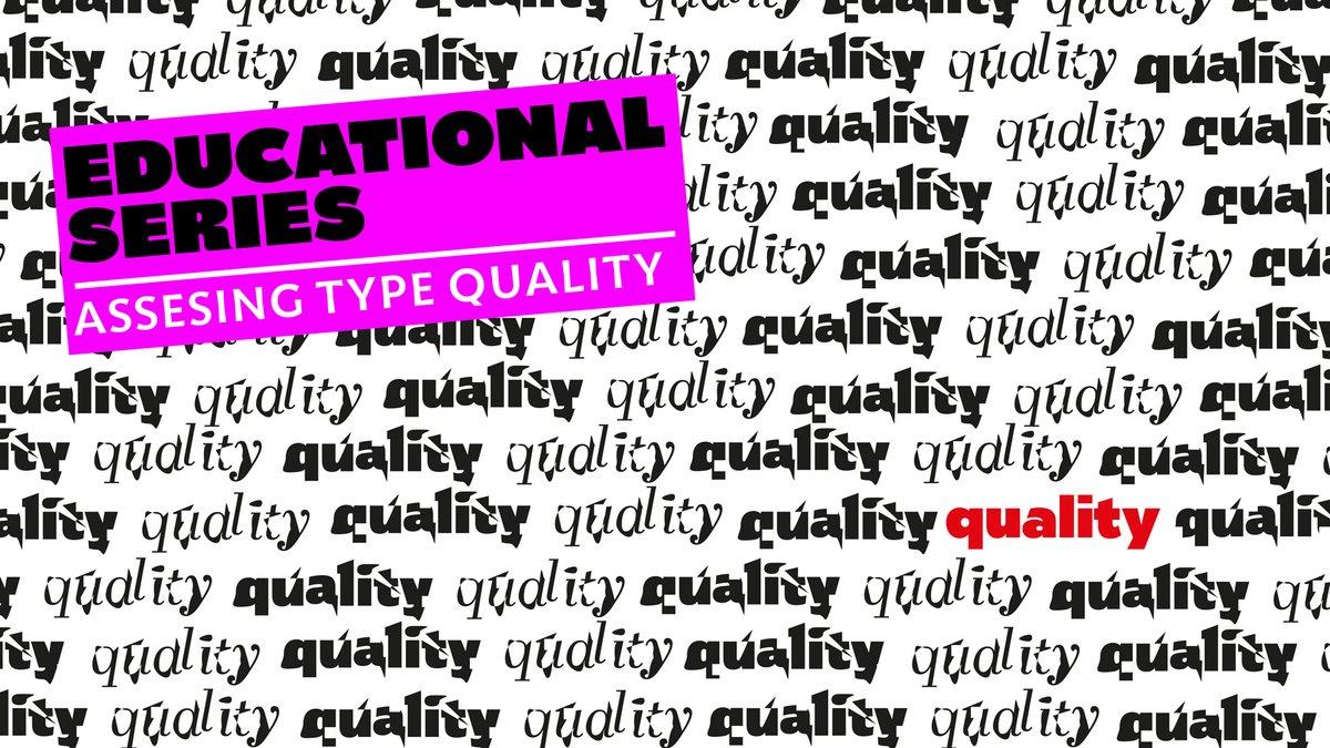 “Graphic designers play a fundamental role in visual communication, whether in print or digital format. They sit between content and reader and, for better or worse, they shape the way the public interacts with information. So when graphic designers choose typefaces they have a responsibility to the reader that should be taken seriously.”
-
- 1
-

-
- type
- typography
- (and 3 more)
-
I've tried all the big ones (Times, Georgia, etc.) and am still having trouble with the "a" and "i". Can anyone assist? Thank you!
-
 A font is a set of symbols, which can be used for typesetting. In metal typesetting, each piece is called a “sort” and a each point size of a typeface makes up its own font. This is not the case for digital fonts, since they are scalable. The different fonts of a type family are usually referred to as “styles” (e.g. regular, italic, bold italic). Digital fonts are made up of characters and glyphs.
 -
What in your opinion is the typeface (or font) which corresponds / represents / symbolizes the year 2019? (I’m a student of Graphic Communication Design researching this for a project! Any help would be appreciated)
-
Hi! I've recently noticed a trend in typography that has distinctively playful shapes and thick/thin contrast (see attached image for example, this is 'Blackest' by Zetafonts). I was wondering if you know of any similar typefaces. This style is super appealing to me and always catches my attention. Also wondering if this type of font design or its characteristics have any particular name, other than 'display'. Thanks for your time and have a fun day! -Ella 🙂
-
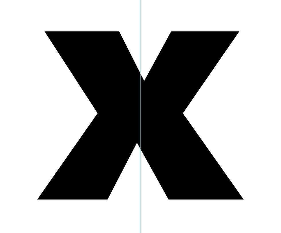
Hey, wondering if anyone can explain why some X's are designed asymmetrically? Noticed it in a few fonts, the example shown here is a capital X from Frutiger Ultra Black. Thanks.
-
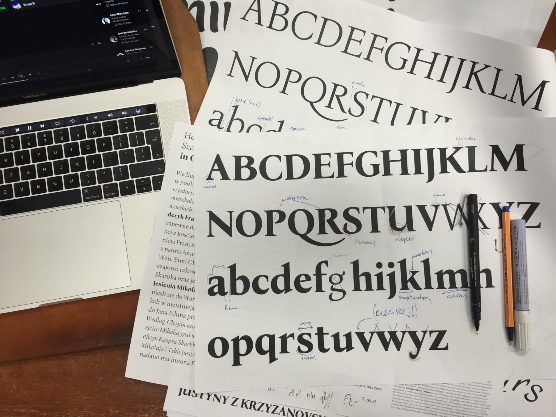 Letterpress version and type specimen of Bona Mateusz Machalski started the project in 2011, when he was in his second year at the Academy of Fine Arts in Warsaw. The font had only existed in metal type and it was available in the typesetting room of the academy. When Machalski became interested in the font, his professor arranged a meeting with its designer Heidrich. “I was surprised that he did not laugh at my projects. It made me more confident and I told him about my idea. He reacted with real enthusiasm” Machalski remembers. Digitization started quickly after that meeting, but the work remained unfinished for a few years. In 2016, together with Leszek Bielski, the project was revived again. More meetings with Heidrich took place and an extended type family (regular, italic, bold) was planned. Bona was Heidrich’s only full type design. But as graphic designer in those days, lettering for book jackets for example was a typical job. But there was little choice for body copy texts. “We always worked with 12 pt Times or Garamond—to the point of boredom. Each book looked the same inside. There was a deep need for new typefaces. For each cover or other design the lettering was custom made. It had to be drawn or painted, as there was not enough time to create and cast new letters.” Original sketches and matrices Heidrich worked on Bona as a side project—for the “pure pleasure” of it as he remembers. There was no specific brief or job for the design. The typeface was cast and a full set ended up in the typesetting studio of the Academy of Fine Arts in Warsaw, where it was used occasionally. For the digitization Heidrich provided all the original sketches of the italic and the matrices could be inspected as well. But there were still so many design decisions to be made for the digital version. “With Bona Nova, the most interesting things happened during the design work. I published images and details about the progress on the internet and the Bona Nova fanpage became a stage for a typographic debate on many levels” says Machalski. Among other details, the design for the Capital Sharp s was heavily discussed on Facebook And of course a roman design had to be developed from the italic, which is rather unusual. Letters on stamps and banknotes by Heidrich helped to work out certain characteristics. The final designs got an extended Latin character set with over 1000 glyphs, including small caps, lots of ligatures, multiple figure sets and ornaments. But the family still continued to grow. Three inline versions were added and three title versions with a very high contrast. These are available as commercials offers. And there might be more in the future. “There are some plans—perhaps Cyrillic? Maybe a sans serif version … Only time will tell.” Specimen images from Bona Nova The free styles of Bona Nova The commercial styles of Bona Nova The free and the commercial styles are available on the Capitalics website. More information about the project in Polish and English here: http://bonanova.wtf
 -

Should the terms font and typeface be used interchangeably?
Ralf Herrmann posted a journal article in Journal
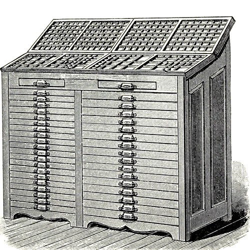
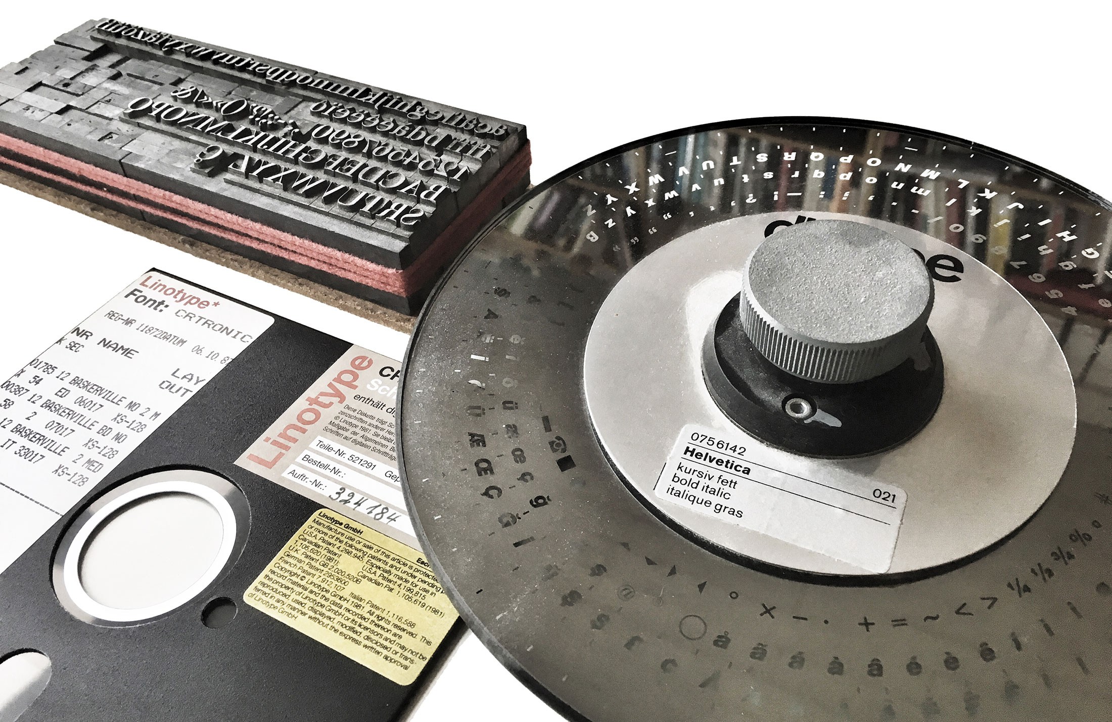 Defining the terms What do these terms mean anyway? The most simple explanation is: a typeface is what you see, a font is what you use. Both refer to a “set of letters (or symbols to put it more broadly) with a specific style”, but the term typeface puts the focus on the artistic work, whereas font points to the actual tool to arrrange and print or display text using a design with a specific style. Considering the most common techniques, this tool can be … the letters (made from materials such as metal or wood) in a single letterpress type case a phototypesetting disc or strip containing letters as photographic negatives a digital font file containing letters as digital outlines Fonts used for different typesetting techniques In contrast to what one might expect, most dictionaries aren’t of much help either and they demonstrate that the problems around the distinction between the two terms isn’t a new phenomenon caused by computer users with a lack of knowledge about letterpress printing. Most English dictionaries I checked use something like a “set of letters in a particular design” as the key element for the definition—but for both terms! The additional characteristics usually vary. Some limit the terms to printing, others have updated this to include today’s digital use as well. Some mention a specific size for fonts, some make that optional or omit it altogether. But most experts in our field probably agree that at its core, it’s about the visual design on the one hand (☞ typeface), and the useable manifestation or instance of this design (☞ font) on the other hand. And this broad definition works for all typesetting techniques. The debate It can’t be denied: The term font is used all the time in our field today. We go to sites like myfonts.com, fonts.com, fontshop.com and download digital font files to put them in a font folder and later use them in our application by opening the font menu. And other designers who see our work might later ask for a “font identification”. Still, there are people who reject this use of the word font, because it is not a perfect match with how they might have learned to define it decades ago when they started out with letterpress printing. Yes, fonts for letterpress printing happened to be size-specific. It’s just a physical requirement of this technique. And in a letterpress cabinet, each size of a typeface would be referred to as individual font. But as shown before, this is not necessarily a key element nor a requirement to define the term font for all eternity. Just as with the material by the way. Font (or “fount”) probably comes from the “melting” or “casting” of the metal alloy in order to make the moveable type. Yet, the same term was used when wood type became common, even though nothing is actually melted or casted in this case. Despite the conflict with the “original” meaning of the term font, it made sense to adopt it for wood type as well, because the purpose was the same. And the same thing happened with the shift to scalable fonts with phototypesetting and later digital typesetting. A phototypesetting disc was neither casted from metal nor was it restricted to a specific type size. Yet, just as a letterpress font it was used to typeset a specific type design and that’s why the term font was used as well. Sure, we could also use completely different terms for different typesetting techniques, but using a shared definition for letterpress fonts, phototypesetting fonts and digital fonts is just a normal effective use of language. The interchangeable use of font and typeface Now that we have clarified what the terms mean and why they exist the way they do, let’s move on to the actual question of this article. A typical complaint about today’s use of font and typeface is that the interchangeable use removes the distinction between the terms and so this is something that must be avoided. But in my opinion, that is a flawed logic, which often seems to be based on the assumption that only one term could be correct in any situation. The other extreme—which is also quite common today—is to say we should just give up and accept that these terms are essentially synonyms today. I disagree with both positions. They only propose two possible options: the use of these terms must be exclusive or identical. But that is a false dilemma. There are more options and I want to argue, that the interchangeable use of font and typeface is mostly the result of the fact, that both terms usually apply at the same time and so it just doesn’t matter much which one we pick. Let me explain that with an analogy. Take the words “song” and “recording” for example. They aren’t synonyms of course. I can whistle a melody and someone standing next to me might recognize the “song”. The person is standing next to me, listening to me. No recording was involved. But I could also give a talk and someone makes an audio recording of it. There is now a “recording”, but since it was just talking, the word song wouldn’t make sense. Both words have different meanings and in these two examples only one was valid in each case. But if we talk about music albums for example, both terms apply at the same time. There are songs—the musical composition (and optionally lyrics)—and there is a specific recording of that song on a certain album. If we talk about a specific album, it doesn’t matter if we refer to the songs or the recordings on that album. We could mean exactly the same thing. The recordings are the manifestations of the songs and both are bound together. This relationship can be shown in a very simple Venn diagram: There can be exclusive and overlapping uses of the terms. It doesn’t have to be “exclusive” or “identical”. Usually we just refer to a song or a recording by the same name written on the album cover and there are hardly any confusions. The linguistic symbols are pointing to the same thing. But as shown in the diagram, there are exclusive uses as well. A song might appear on different albums of the same artist or even different artists. In this case song and recording clearly point to different things and we need to make sure to use the correct words. And I would argue, that typeface and font share the same relationship as song and recording. When a new typeface or family with different styles is released, there will be fonts available to actually use the design or the different designs within the family. It goes without saying. And that’s the overlapping use that explains the interchangeable use. Helvetica Bold Italic is both a typeface and an available font. But that does not mean that typeface and font are synonyms. The exclusive uses remain as well. A type designer sketching letters in a notebook isn’t drawing a font. The designer is working on the visual artwork—the typeface! If the designer ships that typeface in various font formats I might have a folder on my computer with one typeface, but two or more fonts. In such cases an interchangeable use of font and typeface would make little sense and might cause unnecessary confusion. Conclusion Words don’t have intrinsic meanings—words have usages. Therefore it makes little sense to cling to a very narrow metal type definition of the word font, just because that happens to be the first or literal meaning of that word. It’s almost ridiculous to deny the reality of the usage of the word that became common with phototypesetting and digital type. Nothing is lost anyway. It is always possible to apply a broader or more narrow meaning depending on what the specific context requires, as we do it with many other words as well. If necessary, we can use a broader meaning for the word font which covers all typesetting techniques. And at the same time we can create categories and sub-categories to be highly specific about certain types of fonts. The specifics of a letterpress font can still be described by referring to it as “letterpress font” or “wood type font” to be even more specific. And in my opinion the interchangeable use of font and typeface is fine, as long as we stay in that overlapping area of the Venn diagram. There can be a fine line between words being used interchangeably in certain contexts and words being synonyms. In this case, it is a difference that matters and one that we should be aware of.
 -
Can anyone help me anaylise the type PTF Nordic ( https://www.dafont.com/ptf-nordic.font ). I've been trying to be more in-depth and sophisticated when analysing but I'm pretty stuck on this one. Any help would be appreciated. Thank you
-
Hi, I'm going to use Acherus Militant 1 ExtraBold for my logo, now I'm finding a suitable font for the tagline below my logo font. Can you recommend which font is good at pairing with Acherus Militant 1 ExtraBold? Thank you a lot.
-
Hallo everybody, I really like to have a handbook with the most common fonts collection to have a speed visual reference( as starting point) to choose a typeface for every project. I mean something which shows the most common fonts (number, symbol, character, families, ...). There are many online resources but in this case a paper book would be perfect! Suggestions?
-
What were some of the first classical fonts that were optimized for the computer? I cant seem to find the answer anywhere so I was hoping someone here would be able to help me out thx
-
Hey there, does anyone have any idea why Roboto looks so thick, almost medium/semi-bold like on my page, despite being regular? 300 looks to thin, 400 too fat. I'm kinda stuck in the middle. I do like the look of the font in combination with Rajdhani - tried about 20 others, nothing looked as good. Any ideas how to improve the look or alternatives? Example: http://bit.ly/1NQq3zk Thank you!
-

WANTED: Font from an old german newspaper. PRIZE: endless thankfulness
Member a16… posted a topic in Talk
Hello, I'm looking for fonts from german newspaper from 1938. I'm working on a project named "Culture aspects of communication design". I want to make a newspaper with present polish news and put it into german layout from '38. After all I'll make a research to know what feelings are caused by this culture experiment. I have already posted it in the german version of this siie and one of the users (Wrzlprmft) suggested that one of them is "Mainzer Fraktur" and he is right (IMO) but some glyphs are different. He also suggested Unifraktur (this one have even polish diacritics) and it'a great too! I have also identify "minion" and "akzidenz grotesk" (photo "2"), but I am still looking for texture font with alternate glyph for letter "A" like in the headline from the photo "1". The rest of the fonts are not really important for me (they are stylized as the handrawn so I can simulate them by myself). I just want to be sure that I will use proper fonts in my work :) It's important to take care of the details. As one of my lecturer says "Details make the project!" :) Thank you all for your help! Best regards, Mateusz