


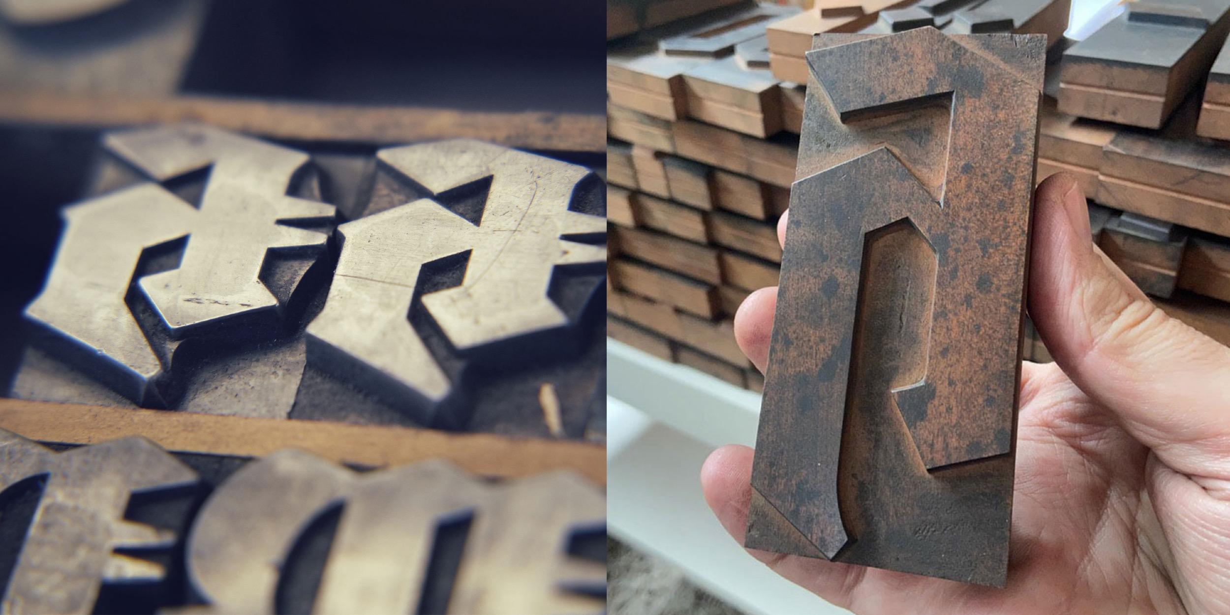
In 2020, I created a Kickstarter campaign to revive the blackletter font Wiking. In 2021 I planned an even more elaborate campaign regarding the blackletter font Deutschmeister. Thanks to the support from people around the world, this project got funded too and the digital fonts FDI Altmeister and FDI Neumeister are now also available for free under the Open Font License. This time, I didn’t digitize the fonts from printed samples, but from the original letterpress letters themselves. After decades of use in different print shops, the appearance of those letters has its own charm. But of course that wouldn’t be visible in a digital vector font.
And that gave me an idea: What if wouldn’t just digitize the outlines, but the appearance of the physical letters as well? The support for bitmap and vector color fonts has increased in recent years and became even part of the OpenType standard with SVG. Well, one year after having the idea, the fonts have now been released and I am really happy with the result, even though there were quite a few challenges along the way.
The general idea was to create a rectangular bitmap image for each letter using a bird’s eye perspective. That would allow typesetting with the appearance of a real letterpress layout where each letter touches the surrounding letters. But creating these images wasn’t as easy as I originally thought. Parts of the face of the letters extend to the side of the letterpress body. So, from a camera perspective, those parts would extend well over the letterpress body (see image below).
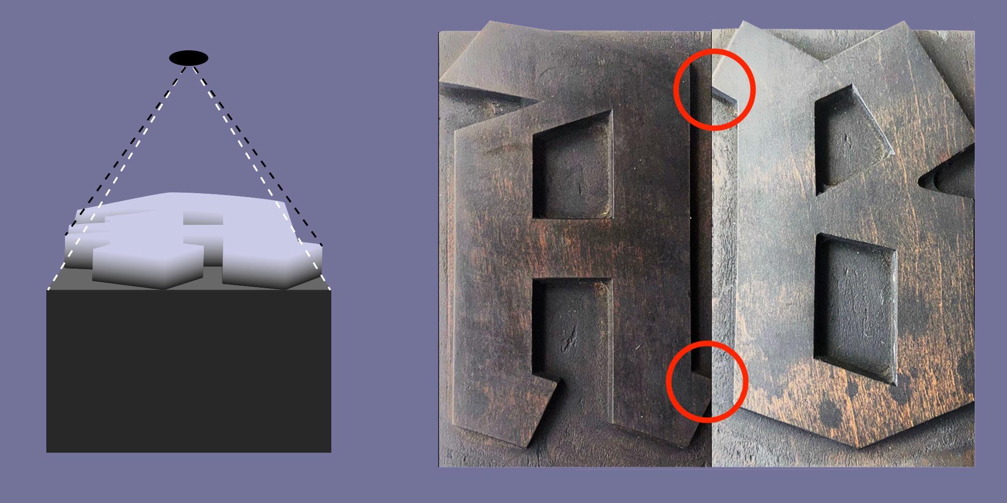
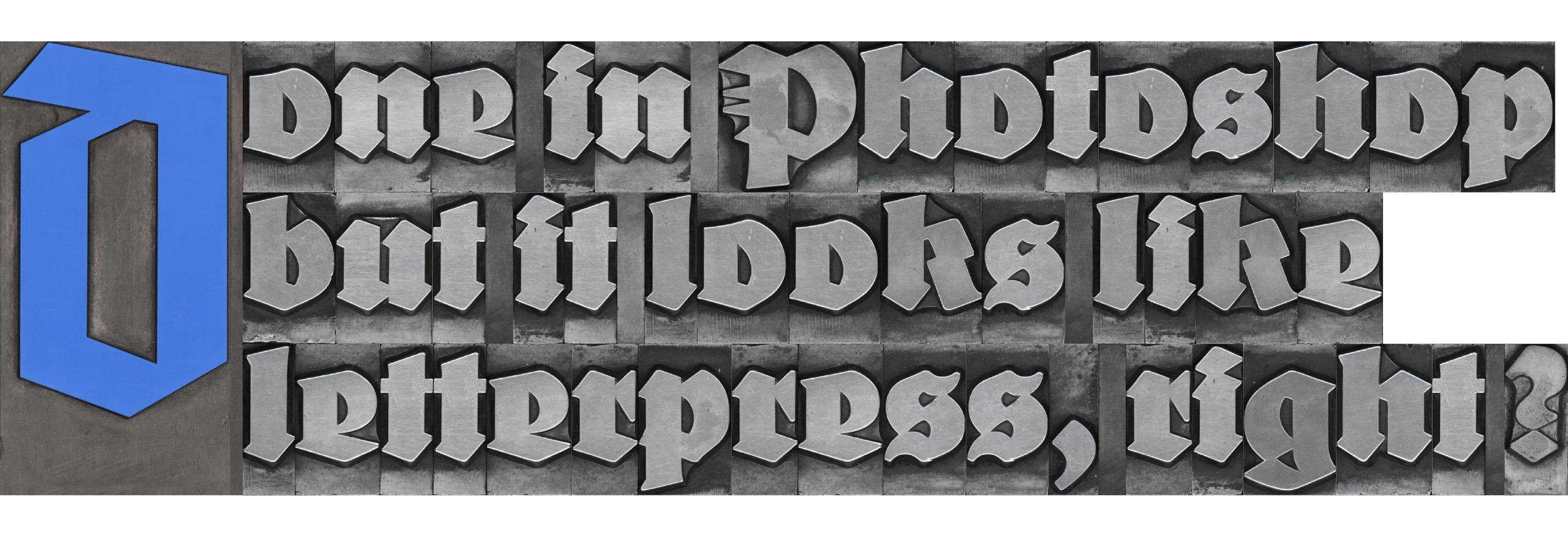
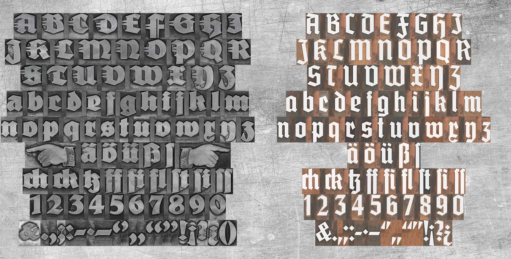
My first attempts with scanners also wasn’t successful, since they will usually distort anything that isn’t directly touching the glass surface. But in the end, I found a suitable scanner using the CCD technology, which would not distort parts of the image. Each letter of the two original letterpress fonts was scanned separately, so I got clear edges for all letters. But the edges were far from being straight and the issue of overlapping letter-parts was also present with scanned images. I solved all this by manually retouching all letters in Photoshop. I slightly increased the size of each letter and with that, the edges got straight and the overlapping parts were now inside the rectangular bitmap image. The result was a “pixel perfect” design.
![]()
The digital letters of FDI Alte Farbmeister connect as they would in a letterpress layout
The PNG glyphs are included in two sizes in the font. A version 256 pixels high for low-resolution previews and a version with a height of 1000 pixels for the full resolution. As a result, even in a size of more than 3 inches, the fonts will appear sharp in print.
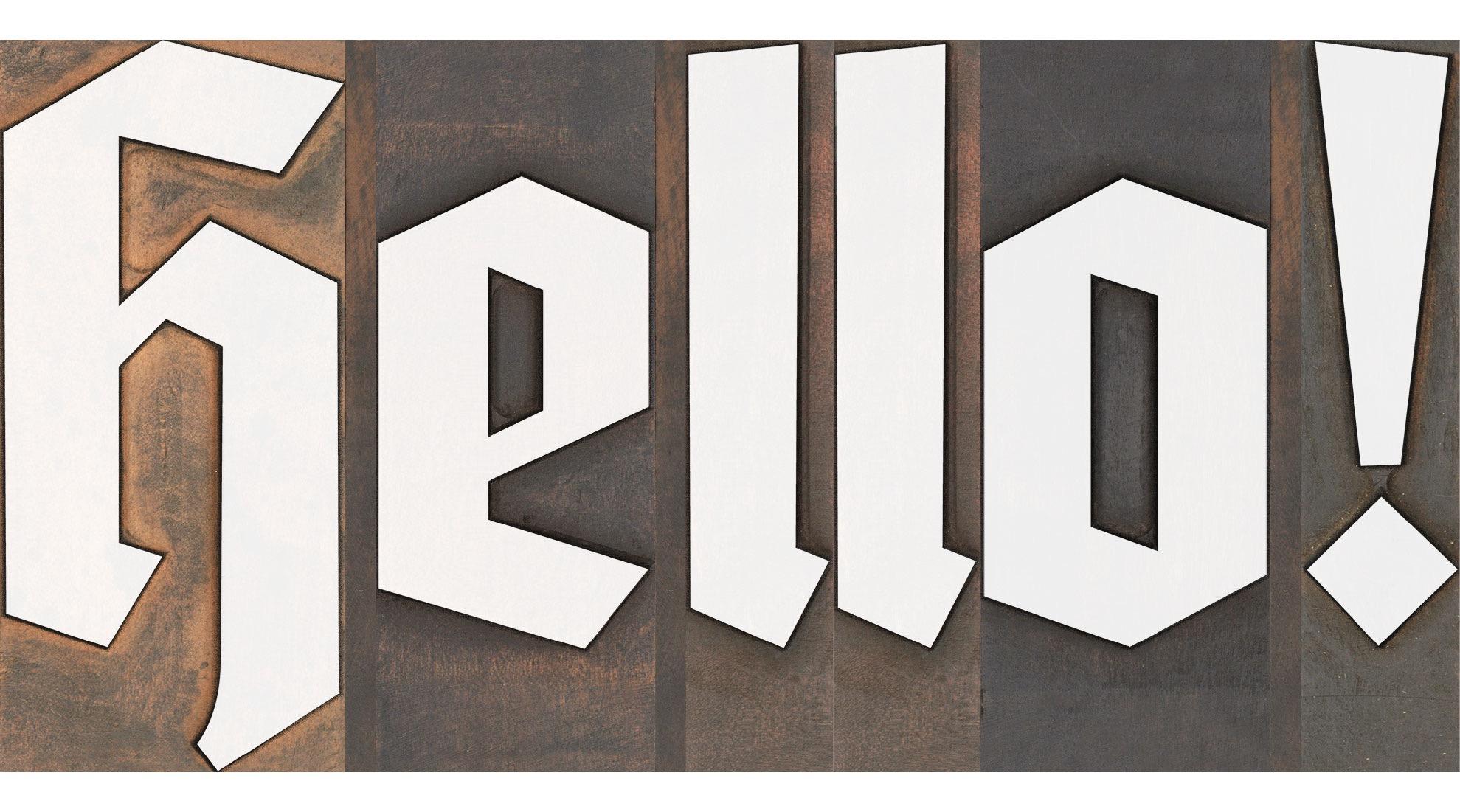
The type size works just like it does with letterpress fonts, because the bitmap images use the full type size. So, if you set the line-height equal to the type size, all lines will connect perfectly. You can even combine different type sizes as you would in a letterpress layout. For example: a drop cap in 36 points can sit next to three lines of text in 12 points.
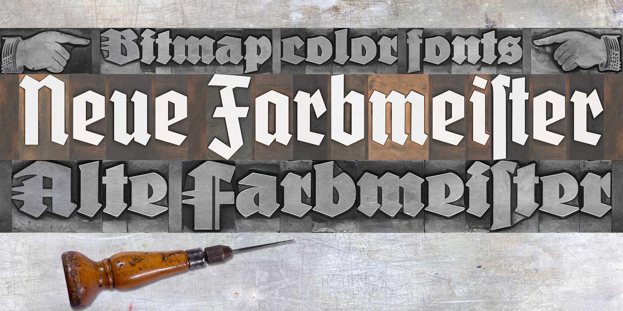
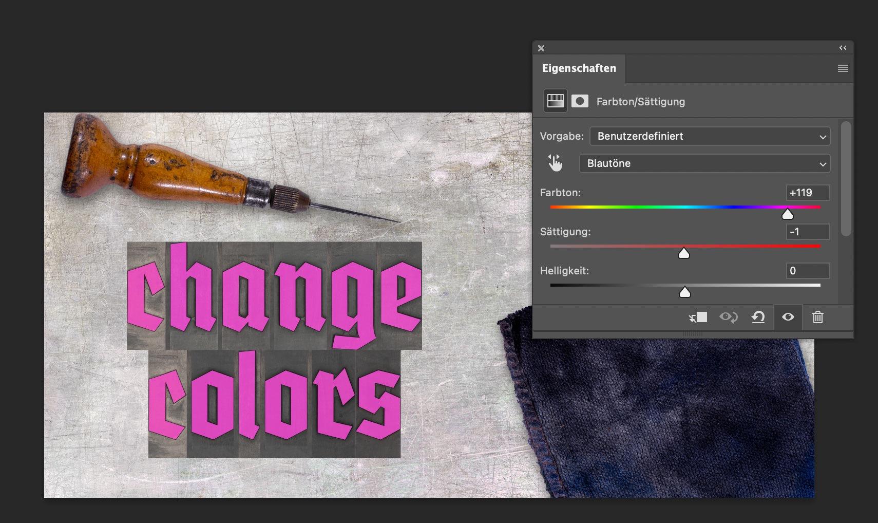
Creating the wood type version was also challenging, because I ran into a problem I hadn’t anticipated. Because some letters had been used more than others, there was a significant color contrast between the individual letters of the font, while there was almost no contrast between the face of the letters and the shoulder area. As a result, putting these letters together without ink would just create a series of rectangles with different colors. But the letters weren’t legible. After considering and testing various options, I decided to create “digital ink” in Photoshop in two versions. One version of FDI Neue Farbmeister uses white ink, which creates a sufficient contrast and can be used as is. A second version uses blue ink. I chose blue because there aren’t any blue hues on the wood type letters itself. So, in a photo-editing app like Photoshop it is very easy to target the blue hues and change them to any color you like.
Using the software tools for kerning and tracking isn’t recommended with these fonts. With increased letter-spacing the background would appear and with decreased letter-spacing, the bitmap images would overlap in a way that wouldn’t look natural. But users of these fonts can still apply spacing changes as a letterpress compositor would do it. For this purpose, the fonts contain a thin space (U+2009) and a hair space (U+200A).
The fonts use two color font technologies within the same font files: Apple’s SBIX format, which works in many apps on Apple’s operating systems and SVG, which is supported across multiple platforms and already works in many design applications. For more details check out https://www.colorfonts.wtf/
More details about FDI Farbmeister can be found on the foundry website, where there is also a link to a demo font to test the support in the apps you are using.
☞ https://fdi-type.de/fonts/farbmeister/


Recommended Comments
Create an account or sign in to comment