Standard Kurrent letters as they would appear around 1900
The development of the Kurrent style over more than 500 years
A writing master’s Kurrent (Johann Gottfried Koeppel, 1781)
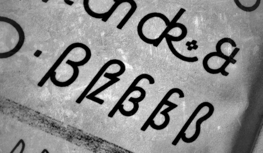
Kurrent was also a style of the writing masters of the time and they embellished the type with decorative swashes for caps, ascenders and descenders. This gave the style it’s typical proportions with a rather small x-height. With these features fully developed over time, Kurrent became its own branch within the Latin script. The small x-height in connection with the zig-zag patterns and similar letter shapes made the type style more decorative than legible.
Blackletter and Kurrent in a type specimen from the type foundry of Karl Tauchnitz, 1825
When learning to write German, people would have to learn the Roman block letters and cursive, as well as blackletter and Kurrent, which were the most-used styles for written and printed German. Therefore their colloquial name became “Deutsche Schrift” (German Script). This semantic differentiation between “Latin script” and “German Script” was later misused to support the growing nationalistic ideology at the end of the 19th century and in the first half of the 20th century. The so-called German script was glorified as unique and superior creation of the German people and used as nationalistic symbol.
German postcards in Kurrent
From the magazine Die zeitgemäße Schrift, which was published between 1928 and 1943
Books in Kurrent from the publisher Alexander Duncker Verlag, Weimar
Sütterlin
At the beginning of the 20th century the teaching of Kurrent was reformed. The proportions of Kurrent in connection with the influence of the steel pen were neither very legible nor a good foundation for a characteristic personal hand-writing style. The German graphic designer Ludwig Sütterlin developed a set of reformed alphabets for the ministry of culture of the state of Prussia. The Kurrent alphabet was introduced in 1915. In the 1930s it had become the dominant writing style for teaching to write German. Even though Ludwig Sütterlin had also created a Latin alphabet for schools, his name became a synonym for his the Kurrent style.
Sütterlin writing in a children’s cook book
Sütterlin did not try to invent new letters. Instead he modified the existing Kurrent style to make it easier to write and read. The general design of the letters remained basically unchanged. But the proportions were changed to a simple and more legible 1×1×1 ratio (ascender/x-height/descender). Beginners now wrote the letters upright and with a Redis pen without any pressure modulation while writing.
Beginner’s Sütterlin alphabet
The use of Sütterlin and blackletter typefaces was actively supported and even demanded, when the Nazis gained power in 1933. The publishers of school books had to use blackletter typefaces and had to focus on Kurrent writing—Jewish publishers on the other hand were not allowed to use any so-called “German typefaces”. So during the 1930s blackletter and Kurrent writing were on the rise again and the political connotations of this use became more prominent.
Sütterlin store signage (“Edelmann”)
A children’s book from 1945
Because of their connections, Kurrent and Sütterlin were not easy to be designed as metal typefaces, but they were offered and used nevertheless.
Offenbacher Script
The famous German calligrapher and type designer Rudolf Koch also got in the game and developed his own style of Kurrent writing: It was published in 1927 and was called Offenbacher Schrift. Koch wanted a script that was not only easy to write, but it should also allow for some artistic quality and freedom. The design was much more lively than Sütterlin’s Kurrent alphabet and was introduced in schools in the state of Hesse. But despite it’s good reputation in the field of typography and calligraphy, the writing style of Rudolf Koch wasn’t widely adopted.
In 1941, after years of promoting the typical German type styles, things changed from one day to the next. The Nazis had realized, that they couldn’t easily force their type styles onto the people in the conquered territories. And the German metal typefaces had to be shipped throughout Europe just to print them, which was rather expensive. So the Nazis took a pragmatic approach: they invented a Jewish connection to the development of blackletter typefaces and with that banned all “German typefaces”. Now the Roman block letters and cursive were proposed as Normalschrift (“standard script”). After that, blackletter and Kurrent quickly fell out of use and were removed from the school curriculum. And with that, hundreds of years of handwritten German became illegible to the general public.
- 5 comments
- 154,277 views