While blackletter was still in broad use during that time, the type modernization of the 1920s was almost exclusively applied to non-blackletter or “roman” typefaces—called Antiqua in German. As Jan Tschichold put it in his New Typography manifest:
❝ None of the typefaces to whose basic form some kind of ornament has been added (serifs in Roman type, lozenge shapes and curlicues in Fraktur) meet our requirements for clarity and purity. Among all the types that are available, the so-called “Grotesque” (sanserif) or “block letter” (skeleton letters would be a better name) is the only one in spiritual accordance with our time.❞
In the 1930s, designers and type foundries started to consider to replicate the popular modernization of sans-serif designs in the category of blackletter typefaces. But how should this be done? The typical German blackletter design of this time was the Fraktur—a rather calligraphic, broad-nip pen design, that wasn’t very suitable to be reduced to simple geometric shapes. So the designers came up with a different approach: They went back to the origins of blackletter—the textura of the Gothic period. Those designs already used a very simple and geometric letter skeleton, but often had elaborate decorations at the same time. By stripping all the decorations, a modern blackletter look was created. Several of these typefaces started to appear from 1933 onwards, creating a new blackletter category.
Modern German blackletter in the 1930s. Left: Element typeface by Max Bittrof. Right: Hindenburg Lettering by Georg Wagner
But there was another benefit in going back to the origins of blackletter. At that time, roman and blackletter designs were much closer together. So using the old textura letter skeletons bridged the gap between roman and blackletter designs. This contributed to the modern look and reduced legibility concerns.
And this brings us back to Krimhilde. Its designer Albert Auspurg also tried to bridge the gap between blackletter and roman typefaces to create modern and legible letters. But he chose a different path to achieve this. Instead of going with textura letter shapes, he merged the geometric sans with Fraktur in a rather unique way. The lowercase letters of Krimhilde use roman proportions and geometric designs, just as typefaces like Futura. But where possible, a blackletter treatment is added as well. The angular stroke endings are an example of this. The uppercase letters of Krimhilde use the typical Fraktur designs, but in an unusual monolinear application.
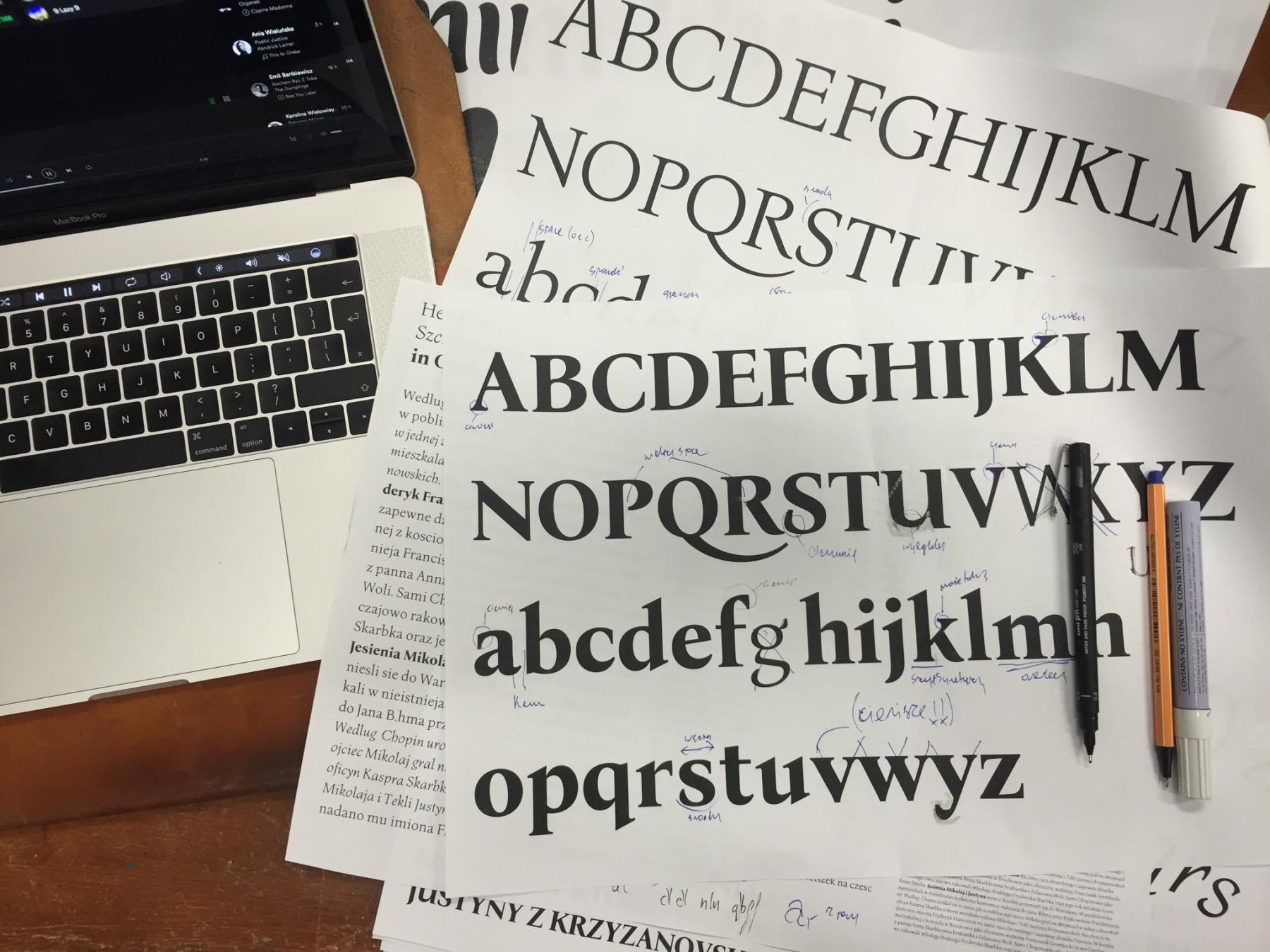
Type specimen images of the metal type version of Krimhilde published by Ludwig & Mayer
Krimhilde was published in a regular and a bold style. It didn’t became very successful in the 1930s. After World War II, blackletter came out of use in Germany and so there was little demand for any of the modern blackletter fonts from the 1930s. Krimhilde was dropped from the catalogs of the type foundry Ludwig & Mayer and became forgotten.
Krimhilde from FDI Type, released in 2018
But I believe Krimhilde has its charm and so I decided to revive it. Just as with Elfen-Fraktur, I did not just digitize the outlines from scans. Instead I recreated both the regular and bold design by starting with just the letter skeletons. And I also created two versions again: version A is close to the original design with all its traditional blackletter shapes. Of course the fonts also include a long s (ſ) and the German blackletter ligatures such as ch/ck/ſch/tt and tz as stylistic set. Version B swaps some letters with roman letter shapes, which are more legible to readers not familiar with the traditional blackletter designs.
Version A and B of the new Krimhilde
In addition to the basic set (regular and bold as version A and B), I added some display styles to use Krimhilde as layer font with multiple colors. There is a shadow and a fill style available for the regular and the bold version and an outline style just for the bold versions. All Krimhilde styles have a full Latin 1 character set.
Krimhilde at Fontspring Krimhilde at FDI Type Foundry
- 0 comments
- 14,337 views