I checked a lot of online mapping tutorials, but the ones which mentioned this effect recommended rather cumbersome methods to achieve it. Mostly they required an additional step, like combining all paths to one object or copying all paths to another layer and style those paths individually. But that would make later changes to the maps much harder or even impossible. More creative solutions used layer transparency settings so the overlaying outlines would knock each other out or simply cover the unwanted overlaps with even more outlines laid on top with layer styles …
But all these methods are work-arounds and have their flaws. What we really want is that Illustrator would take all our streets (usually drawn as outlines) and squares (usually drawn as fills), merge them together dynamically and draw an outline around it. And guess what, that’s actually possible and pretty easy to achieve — all we need to to is to combine two layer effects.
An here is how you do it:
First, draw your streets and put them on a layer. If you have different kinds of roads, I would recommend to put each category on one separate layer. This makes styling, editing and selecting much easier. In every layer where you used outlines (e.g. all street layers), open the Appearance panel and add an effect: Path → Outline Stroke.
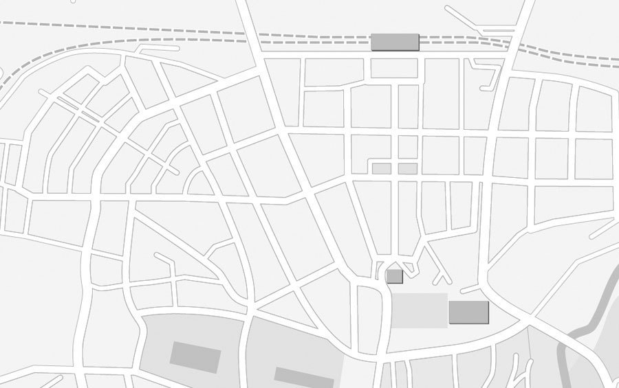
Now assign all these layers to a parent layer. This new layer will be used to create the outline around all objects in the child layers. Click on the circle beside the name of our parent layer in the Layer panel. Now you can add a new outline as layer style in the Appearance panel which will be applied to the outlines of all objects on our child layers. In this case, this even works for strokes, since we have applied the “Outline Stroke effect” before, which basically turns all outlines dynamically to filled objects. Your map should look something like this …
All objects have the outlines we want, but they are not merged yet. So still in the Appearance settings of our container layer, we add another effect: Pathfinder → Merge. And that’s it! All overlapping objects from all child layers will dynamically be merged together and outlined with an additional stroke. And all objects remain fully editable and you can continue to work in a true WYSIWYG mode.
- 1 comment
- 17,525 views