Right or wrong?
The book by Christopher Burke about Paul Renner (Hyphen Press, 1998) was a good start to read. The second was an article by Burke about ‘The Authorship of Futura’ in Baseline 23 (1997) that should bring me on the right track. In this article Burke widens this authorship to the design staff of Bauer Type Foundry. Not strange when you look at the complex production of a typeface in that period of time, but sadly it makes my research not easier. Technical support by foundries played a big role in almost every type design in the lead era. Often the typedesigners where artists or architects by profession and could not oversee all the aspects of the production process. Luckily Burke also gave some publications to read further. One is an article from the author Hans Peter Willberg (Tiessen, 1969). Willberg writes that Kramer was a student at the Städel-Schule in Frankfurt in 1925 and that he made there the first drawings on which Renner based his design on Futura. But Kramer was in 1925 already a well-known architect and product designer and was working at the building department of the city of Frankfurt. He never attended the Städel-Schule as far as I know. Renner began with his first drawings for Futura in 1924 and winter 1924/25 first cuts of Futura were already done by Bauer Type Foundry. So both assertions of Willberg where wrong.
Setting the dates
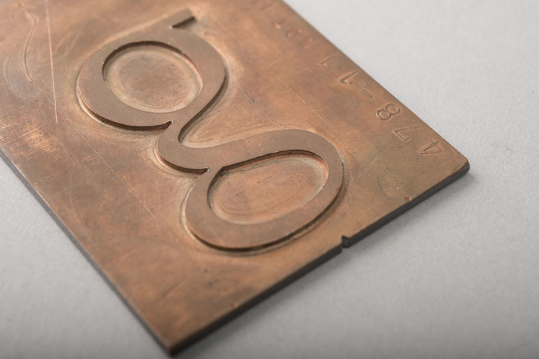
The most used piece of evidence about Kramer-Grotesk is a sheet of paper that shows capitals of Futura with some of them in outline that are crossed out. Elsewhere on the sheet alternative characters for the crossed out capitals are enclosed [picture 1]. In a lot of publications this sheet is dedicated to Kramer.
Picture 1: Bauer, Konrad F., Wie eine Buchdruckschrift entsteht, 1958
So I had to figure out when this designsheet was first published and why it was attributed to Kramer. Since most of the material of Bauer Type Foundry is supposed to be destroyed during World War II I first looked at publications from before this war. One important publication is an article by Denis Megaw in ‘Typography 7’, published in 1938. On page 34 drawings are shown that are presented as the first designs of Futura by Renner. These are the lower case characters and capitals that are placed on top of the page in picture 2.Below this a complete set is shown from Futura as published by Bauer in 1927 in its final form (without the extra alternative characters).
Picture 2: Megaw, Denis, Typography 7, 1938
The sheet of paper with sketches [picture 1] show in black more or less the definitive forms of the capitals of Futura while the outline forms are showing his first designs from 1924 for the A and K as in Megaw’s article. An invitation card for a lecture dated 3. July (1925) [picture 3] made with trial cuts of Futura by Bauer show also these capitals that are in a state between the first designs in the article from Megaw and the final ones on the same sheet.
Picture 3: Luidl, Philipp and Lange, Günter Gerhard, Paul Renner (Eine Jahresgabe der Typographischen Gesellschaft), 1978
Look for example at the M, N and R. The same story is told by a trial setting that was made for the publication ‘Schrift’ by F.H. Ehmke that was published on July 9th 1925 [picture 4].
Picture 4: Ehmcke, F.H., Schrift, ihre Gestaltung & Entwicklung in neuerer Zeit, 1925
You have to keep in mind that at that time making a book would have taken several months from concept to printed matter. As described by Paul Renner in ‘From Georg-Müller book to Futura and Meisterschule; recollections by Paul Renner’ (translated), published in 1940 and 1943, he reports that he showed slides (Lichtbilder) of Futura by Bauer Type Foundry already in February 1925 during lectures at large printing firms in Cologne and Mönchengladbach.
Renner meets Kramer
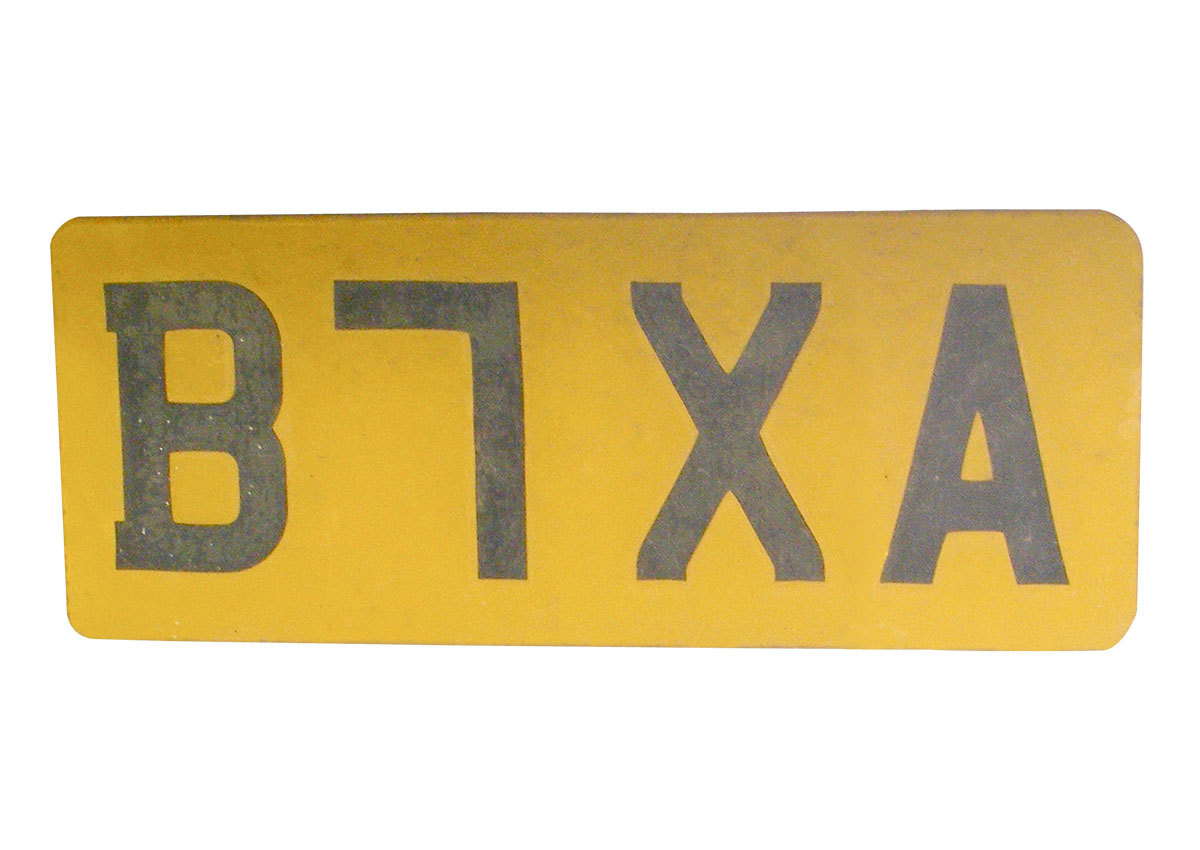
In May 1925 Renner moves from Munich to Frankfurt to teach at Fritz Wicherts Frankfurt Art School (the former Städel-Schule). He also meets Wicherts friend Ernst May who is head of the building department of the city of Frankfurt. Another person he met was the architect Ferdinand Kramer who was also working at this department. Ernst May had ambitious plans for rebuilding parts of the city of Frankfurt. A lot of inspiration for the plans came from the Bauhaus and buildings of the Stijl in The Netherlands. One of the examples also published in the magazine ‘Das Neue Frankfurt’ was De Unie in Rotterdam by Architect Oud. On that building geometrical sans serif typography is clearly an essential part of the architecture. May asked Renner to deliver a typeface that could be used in architecture as well as on shops, advertising and small structures like bus stops. I think that the sheet that was delivered by Renner to the building department is the sheet that also can be found in the ‘Werkkatalog Ferdinand Kramer 1923-1974’ by Jochem Jourdan.
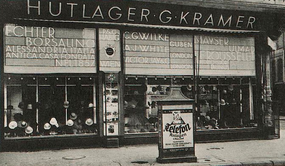
In this ‘Werkkatalog’ the designsheet of letterforms is dated 1925 on the back (according to Jourdan). The stencil typeface on the left of picture 5 is not discussed in origin, dated 1952, and made by Kramer. With the sheet to the right the discussion of the Kramer-Grotesk started but it is a different sheet than the one most publications about Kramer-Grotesk use to discuss this issue. For example in ‘Baseline’ (‘The authorship of Futura’ by Chistopher Burke) and several other publications the sheet in picture 1 is presented as the Kramer-Grotesk sheet. I think the sheet from the ‘Werkkatalog’ was credited to Kramer simply because it was found in his archive. I personally think that this is a copy or the original that Renner delivered at the building department for copying and distributing to letter sign firms and architects that worked in Frankfurt. There are some slight differences between the characters (for example the J and S) between the trial settings from 1925 of Bauer Type Foundry and the capitals on this sheet but that could be a design decision by Renner for the architectural purpose of this set. ‘Das Neue Frankfurt’ [picture 6] in january 1927 shows the typography of the fassade of the hat shop of Ferdinand Kramers parents in Frankfurt using the capitals of Futura. This design and the design of a second shop fassade on that page is credited to Renner. Also the name of the typeface (Futura-Groteske) is mentioned in the caption of the second picture. Some slight alternations to the characters can also be caused by sign makers who had to take over the letterforms from the drawings of Renner. At that time no computers, scanners or laser equipment where available to do that.
Picture 6: Behne, Adolf, ‘Kultur, Kunst und Reklame’ in: Das Neue Frankfurt 3, 1927 (digital file uni-heidelberg)
Renners design process
I think that looking at the consistence of the design process of Futura by Renner there can be no doubt that Kramer-Grotesk is a myth. The drawings on picture 1 can clearly be seen as stage three in the design process. The first step was the line ‘Die Schrift unserer Zeit’ from 1924 from which all started (not available but mentioned in Renners writings), second where the drawings in ‘Typography 7’ (picture 2) and third was to my opinion the much discussed sheet from picture 1. The crossed-out capitals on that sheet match with the earlier design of the capitals of the top drawings in picture 2. It can be seen as a logical step to the trial settings of picture 3 and 4 in 1925. The sheet found in the Kramer Archive has to be looked at as a separate design of Renner but fits in the stage of the design of Futura at that moment. For me and for most typedesigners it is also quite clear that it would almost impossible to draw ‘out of the blue’ an alphabet with such a quality and consistance between the characters, especially when you hardly have any experience in graphic design like Ferdinand Kramer had. Although Renner was also not a typedesigner by profession he was 23 years older than Kramer and had loads of experience in graphic design, had been teacher in graphic design at his own school and had already written a well-received book about typography. There is a sheet with a stencil typeface [picture 5 on the left] in the Kramer Archive that is to me clearly a typeface design of an architect. Drawn on the drawing table with rule and compass. The ‘B’ with the same top and bottom curve, the ‘S’ with a top that is too large and an ‘O’, ‘Q’ and ‘G’ that has the same vertical and horizontal line thickness. And that typeface is dated 1952, a quarter of a century later. See also picture 11 with the timeline of the alledged Kramer-Grotesk designsheet. Of course there where architects like Peter Behrens who created typefaces but mostly architects who did where more active in graphic design and typedesign than Kramer and did this with support of a very experienced design staff of a foundry. Kramer-Grotesk on the contrary is supposed to be created without that help.
Picture 7: Hahn, Peter, Ferdinand Kramer Architektur & Design, 1982
One of the publications that helped me a lot in this research was the thesis of Charles C. Leonard ‘Paul Renner and Futura: The Effects of Culture, and Social Continuity on the Design of Type for Printing’ that he published in 2005/2006. Leonard thoroughly researched the drawings shown in ‘Typography 7’ as well as the disputed design sheet from ‘Wie eine Buchdruckschrift entsteht’ (How a new printing type is made) of Bauer Type Foundry in 1958 [picture 8].
Picture 8: Bauer, Konrad F., Wie eine Buchdruckschrift entsteht, 1958
It is very interesting to see how he did a lot of work comparing designsheets of Renner (see picture 12). The ‘Kramer-Grotesk’ sheet shown in picture 5 on the right has the same cap-height and could easily be put in the comparison and would match the other two. One thing that Leonard presumes falsely is that the designsheet (picture 1) from 1958 was a reprint of the publication of Bauer from 1931 [picture 9].
Picture 9: Bauer, Konrad F., Wie eine Buchdruckschrift entsteht, 1931
This publication was completely different. Bauer Type Foundry used this first publication to promote the typeface Beton from Heinrich Jost that was new in 1931. All the illustrations and text went about that typeface. In 1958 the publication had as subject Futura that was a longrunner in sales at Bauer. So the designsheet of Futura that was published in the 1958 publication was first published in that year and never before as far as I know. So I think that this sheet was never even near Kramer as presumed by Christopher Burke in the caption of Baseline and has always been in the archive of Bauer Type Foundry (untill WW-II) being one of the designs of Renner. In the caption of the 1958 publication of Bauer the design is dated 1925 but because Renner showed first cuttings during lectures in february 1925 (see above) and Burke also writes that first trial cuts by Bauer were done in the winter of 1924/25 I think that this could also be an earlier design and maybe has to be dated before the trial cuts were made.
Recent publications
Recent publications from 2016 that publish the discussed design sheet from picture 1 are ‘Futura. Die Schrift.’ and ‘AllesNeu!’. They are a feast for the eye showing a lot of type specimen and printed matter with Futura. In ‘Alles Neu!’ some strange things are happening. The publication ‘Schrift’ by Emcke with a preliminary test (Vorprobe) of Futura is dated at 1926/27 while above in the picture the date of July 9. 1925 is even quite visible. On the same page the designsheet [picture 1] that was dedicated to Renner at first publication in 1958 is suddenly subscribed to Ferdinand Kramer. The source of the picture is not given. The article of Katherina Pennoyer with the subtitle ‘So far unknown facts and details’ (bisher unbeachtete Fakten und Details) indeed gives some more details that according to her gives Kramer a bigger role in the creation of Futura. She writes again that Kramer studied at the Städel-Schule in Frankfurt (p. 99). As written before Willberg introduced this false story in 1969 (see above). I cannot find any proof of that (see picture 8: Timeline Renner and Kramer). About the text of Paul Renner on his recollections of the design of Futura, published in 1940 and 1943, Pennoyer writes: ‘It seems that the story was written by those who earned money of it’ (Es hat den Anschein, dass die Geschichte von denen geschrieben wurde, die daran verdienten). So according to her Renner did not write the article about that important part of his life himself. But Renner never rejected the article and accusing him and Bauer Type Foundry of a story that is false is far beyond the reputation of Paul Renner and Georg Hartmann, who was beside being owner of Bauer Type Foundry also a bibliophile and patron of the arts in many ways. I think we should leave that remarkeble text to the responsibility of Pennoyer and the publishers of ‘Alles Neu!’. Her mentioning that Renner and Kramer could have met in 1919 when they both where living in Munich can nowhere be verified. Renner left Munich in 1919 and Kramer came to live there in 1919 (see timeline picture 10). Renner was also 23 years older than Kramer and could have had a totally different circle of friends. But ‘never say never’, Renner had to be sometimes in Munich for his work for the publisher Georg Müller and I would gladly like to get information about them meeting at that time and place.
Picture 10: Pohlen, Joep, ‘Timeline Renner-Kramer’, Roermond, 2017
The book ‘Futura. Die Schrift’ is thoroughly written and researched. Of course the famous sketches page [picture 1] is also present in this publication but it is left in the middle who made it actually. Interesting is however that this picture is taken from a whiteprint (Lichtpause) from the Klingspor Museum. So another source than the earlier publications (picture 11).
Picture 11: Pohlen, Joep, ‘Designsheet Paul Renner (also known as Kramer-Grotesk)’, Roermond, 2017
According to the author Petra Eisele the whiteprint is 98% of the original. And that is peculiar because whiteprints where copied in contact with the original using the diazolid (or Ozalid) process. So it should be 100% or close to it. I asked specialist Ed Kemmerling who worked for 28 years in the business of copying architectural drawings. He also thought that 98% is quite a difference. The aim is 100% because builders often use it to measure. But a difference is not impossible according to the process and machines used. I mailed with Klingspor Museum to learn how this whiteprint got in their collection but the answer is that they don’t know because they have it for a long time. But Klingspor has also proofsheets showing trials of letters with some characters glued over earlier letters. And on some sheets all the letters are glued on separately. These sheets are shown for example on page 38-41 in ‘Futura. Die Schrift.’. These must to my opinion descend from the studio of Bauer Type Foundry because there is a typical way of working to reach the final design. They are dated in the book from 1926 to 1928. The source that delivered them to Klingspor could also have delivered the sheet from picture 1 that is in their archive. But that’s speculation …
Conclusion
The thing that remains and is hard to understand is why Ferdinand Kramer did not protest against this so-called Kramer-Grotesk that was published in several important publications like the Bauhaus-Archiv publication ‘Ferdinand Kramer Architektur & Design’ in 1982 when he was alive and kicking (although he was at that time 84 years old). Kramer was an architect who had a very good reputation as product designer and architect and one could say that he did not need this credit for Kramer-Grotesk. The capitals of Futura were already developed in the definitive form in the beginning of 1925 but the lower case characters still had to go a long way to meet the final design. Maybe the development of this lower case letters were part of the discussions Renner had with Kramer and it could be that the huge transformations of these designs strengthened Kramers idea that he participated in the design of Futura. But Renner discussed it with more people. I also read somewhere that according to the wife of Jan Tschichold he also thought that he had contributed because he discussed the design with Renner. Neumann mentioned in his article in ‘Ferdinand Kramer’ from 1991 that Kramer did say (gesprächsweise) that he considered himself as one of the ‘fathers’ of Futura. This is all speculation but I can find no other reason why Kramer did not reject the publication of Kramer-Grotesk and his role in the design of Futura like stated in the caption on page 33 in the Bauhaus-Archiv publication [picture 7].
Despite the findings this story leaves an odd taste in my mouth about the role of Ferdinand Kramer. Or maybe the ones that believe they serve his legacy. With my limited knowledge I think that Kramer himself never wrote about designing Kramer-Grotesk. But maybe others can look into that and could find more about Kramers personal view about this.
Joep Pohlen, May 2017
Literature:
Bauer, Konrad F., ‘Wie eine Buchdruckschrift entsteht’, 1931, Frankfurt (DE) Bauer, Konrad F., ‘Wie eine Buchdruckschrift entsteht’, 1958, Frankfurt (DE) Behne, Adolf, ‘Kultur, Kunst und Reklame’ in: ‘Das Neue Frankfurt’ 3, 1927, Frankfurt (DE) Burke, Christopher, ‘The authorship of Futura’ in: Baseline 23, 1997, East Malling (UK) Burke, Christopher, Paul Renner, the Art of Typography, 1998, London (UK) Ehmcke, F.H., ‘Schrift, ihre Gestaltung & Entwicklung in neuerer Zeit’, 1925, Hannover (DE) Eisele, Petra, Ludwig, Annette and Naegele, Isabel, ‘Futura. Die Schrift.’, 2016, Mainz (DE) Hahn, Peter, ‘Ferdinand Kramer Architektur & Design’, 1982, Berlin (DE) Hansert, Andreas, ‘Georg Hartmann (1870-1954), Biografie eines Frankfurter Schriftgießers, Bibliophilen und Kunstmäzens’, 2009, Vienna (AT) Kemp, Klaus and Wagner, Matthias K., ‘Alles Neu!, 100 Jahre Neue Typografie und Neue Grafik in Frankfurt am Main’, Stuttgart, 2016 (DE) Leonard, Charles C., ‘Paul Renner and Futura: The Effects of Culture, and Social Continuity on the Design of Type for Printing’, 2006, Georgia State University (USA) Lichtenstein, Claude, ‘Ferdinand Kramer, der Charme des Systematischen’, 1991, Gießen (DE): the article ‘Frankfurter Typografie’ from Neumann, Eckhard, pp 32-34 Luidl, Philipp and Lange, Günter Gerhard, ‘Paul Renner (Eine Jahresgabe der Typographischen Gesellschaft)’, 1978, München (DE) Megaw, Denis, ‘20th Century Sans Serif Types’ in: ‘Typography 7’, 1938, London (UK) Renner, Paul, ‘Vom Georg-Müller-Buch bis zur Futura und Meisterschule; Erinnerungen von Paul Renner’ in: ‘Imprimatur’ 9, Ein Jahrbuch für Bücherfreunde, 1940 Renner, Paul, ‘Vom Georg-Müller-Buch bis zur Futura und Meisterschule; Erinnerungen von Paul Renner’ in: ‘Gebrauchsgraphik’, Heft 5, 1943, Berlin (DE) Stresow, Gustav, ‘Paul Renner und die Konzeption der Futura’ in: ‘Buchhandelsgeschichte’ Nr. 51, 1995, Frankfurt (DE) Willberg, Hans Peter, ‘Schrift im Bauhaus/Die Futura von Paul Renner’ in: ‘Monographien und Materialien zur Buchkunst’, Band 2, 1969, Neu-Isenburg (DE)
- 7 comments
- 25,342 views