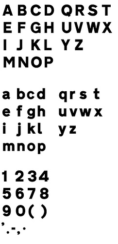
The main typeface used in Italy is called Alfabeto Normale and is a bolder version of the British Transport alphabet. From its use in Spain it is also known as Carreta Conventional or CCRIGE and it is available as Traffic Type Spain from URW++.
A slightly thinner version is available for white letters on dark backgrounds. But nonetheless both version are way too bold for today’s retroreflective road signs. It's easy to imagine how the details will get lost when those letters are viewed from a greater distance or when the sign is lit by headlights. This is also true for the condensed style called Alfabeto Stretto, which is also available for positive and negative contrast.
City names are always set in uppercase letters, but I usually didn't had trouble reading them, since Italian city names are usually short and set in large sizes.
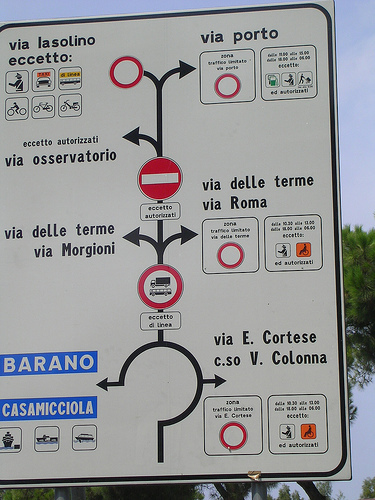
But the overall sign design has many problems. A typical mistake is not to limit the amount of information on the sign. One sign in Italy may present dozens of targets and additional information which are impossible to read even if you would slow down.
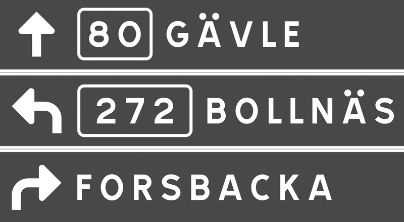
Road numbers are usually very hard to read, since they are scaled down to fit in a rectangle the size of the capital letters.
Another typical Italian problem I encountered was the missing continuity. You might follow a road (let’s say to Venice), but then hit a roundabout where this major target just isn’t listed for any of the available directions. And when it comes to Italian motorways you don’t get a chance to easily correct your direction, since they are all toll routes with very few exits. In the northern part of Italy the signs are usually set in German and Italian, but a typeface borrowed from the U.K. obviously doen’t have German letters …









Recommended Comments
There are no comments to display.
Create an account or sign in to comment
You need to be a member in order to leave a comment
Create an account
Sign up for a new account in our community. It's easy!
Register a new accountSign in
Already have an account? Sign in here.
Sign In Now