

Search the Community
Showing results for tags 'wayfinding'.
Found 20 results
-
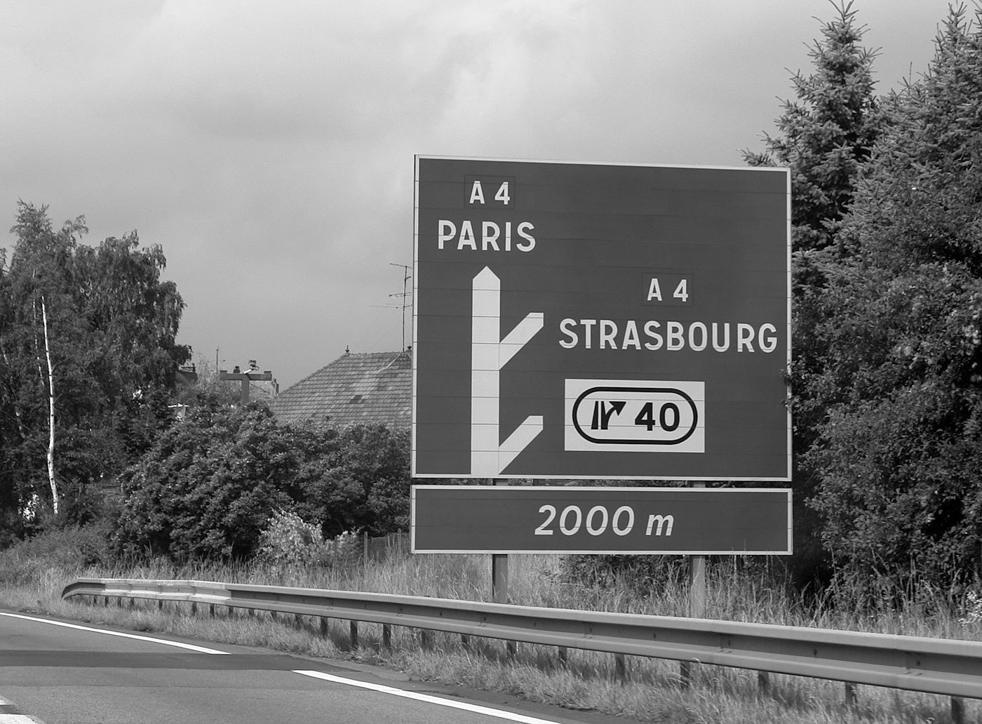 In France four fonts are currently used. The main fonts are called L1 and L2. L1 and L2 are caps-only alphabets. L1 is set in black letters on white background and is used for local targets. L2 is set in white on blue (Autoroutes) or green (Routes Nationales) background and is used for distant targets. L1 and L2 are basically the same design, but L2 is lighter and set with increased spacing to compensate for the overglow effect of white letters. The design of L1 and L2 are neither very good nor very bad. It’s a typical semi-geometric design similar to the traffic typefaces used in other European countries. A unique feature are the large counters of P and R. In general it is a good idea to have large counters for a typeface used for traffic signs, but a letter is also recognized by the white-space around it, so they might have overdone it a litte bit. Another problem might be the descenders of Q and Ç, which are designed not prominent enough. For local target and public facilities the italic font L4 is used. The uppercase letters are similar to the L2 fonts and the lowercase letters bear resemblance to Frutiger’s Univers typeface. In theory it sounds like a good idea to use different type styles to mark different kinds of targets, but when I look at the different styles and sizes in this image, the result looks rather confusing: The same is true for the overall design of the signs on which the content looks very scattered. The color coding works fine, but the separated signs and the type treatments don’t give me any clues about a clear hierarchy of the presented information: An additional font is the L5 alphabet. It seems to be derived from Frutiger and is apparently used for signs of less importance, for example the ones pointing to local points of interest. A freeware version of L1, L2 and L4 is called Caracteres and can be downloaded from here. URW++ offers a commercial digitization called Signal.
- 2 comments
-
- 1
-

-
- signage
- wayfinding
- (and 2 more)
-
 This list collects typefaces which are used for signage in subway stations around the world.
 -

Centre for Visibility Design
Riccardo Sartori posted a directory entry in Online Typography Resources
“When a typeface is illegible the reader will always notice; when a typeface is legible no one gives it any thought. We strive to produce new knowledge that can provide the tools to create the most legible typography or pictogram.” -
 Over the last couple of years I have researched the design and use of typefaces used for signage, especially road signage. While road signs in general are scientifically researched for many decades in western countries, little is known about the parameters that lead to a maximum legibility of typefaces used in signage. And therefore the range of typefaces used on road signs is pretty wide. We see geometric typefaces… …slanted serif typefaces… …and many old and modern sans-serif typefaces … But which ones are most legible? Early road sign typefaces in the beginning of the 20st century were often designed by engineers with a strict geometric or grid-based approach. Newer designs, such as the new typeface in the Netherlands (see image above), are more based on the tradition of print typefaces. But in my opinion, both approaches have their drawbacks, because typefaces used for road signs have very unique requirements. Many people I have talked to seem to believe that speed might be the most important factor for the design of such typefaces, but that is actually not the case. The speed of motorists only influences the duration in which you can read the text on the signs. But that can simply be compensated by the size of the signs. What makes road signs so different from books and magazines is the variable reading distance. So if you want to improve the legibility of a typeface used for signage, the most important task would be to increase the viewing distance. If you are about to pass a huge motorway sign that is 50 meters away, legibility is no problem at all—the letters are so large, they could be set in Comic Sans and could still be read without any trouble. Where you can make a different thru type design is the moment when the motorist is at a distance where the text is just about to become readable. A new approach After traveling all over Europe for three years to experience and document as much road signage systems as possible, I started to design my own wayfinding typeface. This was part of my diploma at the Bauhaus University in Weimar, Germany. After all my practical and theoretical research it became clear to me that the regular way of designing a typeface on paper or on screen was not really appropriate. Because designing a typeface for a large viewing distance is not only a question of type design, it is also question of the feasibility of testing. To increase the viewing distance of my design I needed to experience my typeface in this blurry state where it is just about to become readable and I needed to test it when the visibility is decreased, for example by an overglow effect thru the headlights of a car. That’s where I came up with the idea of my Legibility Tool Tool. It’s an OSX application that allows real-time simulation of different viewing conditions during the design stage. While I was working on the design of individual letters in FontLab, the tool showed me a simulated view of test words with the letters I was just working on. With this tool I could remove the guesswork and was able to optimize my design even for the worst reading conditions. Often the simulations were quite surprising. Sometimes I was tempted to design my typeface in a way I was used to from the print world, but the tool clearly showed me that the reading conditions of road signs require a unique design for maximum legibility within this context. About the design So how does the ultimate signage typeface has to look like? When I evaluated existing signage typefaces with my Legibility Test Tool it became pretty obvious that all those stylistic details that define the overall look of these typeface disappear under difficult reading conditions. What matters most is the skeleton of the letters. On one hand these letter skeletons should be very generic, so they easily match the visual patterns we have learned and seen so many times in our life. But on the other hand, they also need to be somewhat unique. The most generic letter forms do not necessarily create the most legible letters, because too generic letter shapes are harder to differentiate. So in my design I used average proportions as a starting point but I also tried to stress the individual character of each letter. The “a” is a good example of this approach. The prominent stroke ending on the right may not be necessary to recognize it, but if it is there it helps to distinguish the “a” from other characters. Below is another example: Under difficult reading conditions, details such as the usually rather small crossbars of “f” and “t” get easily lost. Making these parts more prominent can significantly improve the legibility under difficult viewing conditions. Top: German road sign font DIN 1451, Bottom: My wayfinding typeface Certain letters can easily be mixed up under difficult viewing conditions. Designing those letters in a way where they are easily distinguishable makes the typeface more legible and increases the maximum viewing distance. Here are some examples… The missing horizontal crossbar of the Dutch road signage font (orange) makes C and G harder to distinguish. In blue are C and G in my typeface. The difference between the letters is easily recognizeable. Poor differentiation of O and Q in the French road signage typeface (orange). On the right are O and Q in my typeface. Helvetica (orange) has many letters that are designed very similar, which is not really helpful when used for signage. A more unique design helps to differentiate the letters. Another typical example: capital I, lowercase l and the figure 1 should better be designed in a rather unique way. The stroke width is another important factor of a typeface used for signage. “The bigger the better” does’t work in this context—quite the opposite is true. Modern retroreflective sheeting of road signs create an overglow effect which affects the legibility. But this problem is not limited to road signs. Backlit signs in airports, hospitals and office buildings also suffer from this problem. The typeface design should compensate for this overglow effect. This can be achieved by using a thinner stroke width and by opening up the counters of the letters. Top: Road signage typeface in Spain and Italy; Middle: Transport Bold (United Kingdom); Bottom: My wayfinding typeface Figures are also crucial when a typeface is used for signage. In print typefaces the figures are mostly designed rather inconspicuously so they don’t stick out from the text. But figures in a signage typeface need to be very clear and easily distinguishable. The standard figures in my wayfinding typeface are tabular lining figures to accommodate the typical tabular use. But old-style figures (both proportional and tabular) are also available. My wayfinding typeface also comes with a large set of arrows. They perfectly match the metrics and stroke withs of the typeface and can therefore be placed along with the text without any further corrections. Moreover, the arrows can be used with some “OpenType magic“ built into the font. You can just type in certain letter combinations to automatically generate the arrows on the fly. Positive and negative contrasts are often combined on one sign. Since light text on dark background always appears bolder, this can create an unwanted differentiation. A good signage typeface should compensate for this effect by offering different stroke weights to be used for positive and negative contrast. Different stroke widths to be used for positive/negative contrast (only visible when the background is removed) When I designed this typeface I usually had road sign in mind, but the typeface is not limited to this context. I can be used for all kinds of signage projects. The typeface is not finished yet. I may extend the character set and add more styles. But designers working on wayfinding projects may contact me about a trial version of the typeface. Update March, 2012: Wayfinding Sans Pro is now available at FDI Type and MyFonts.
 -
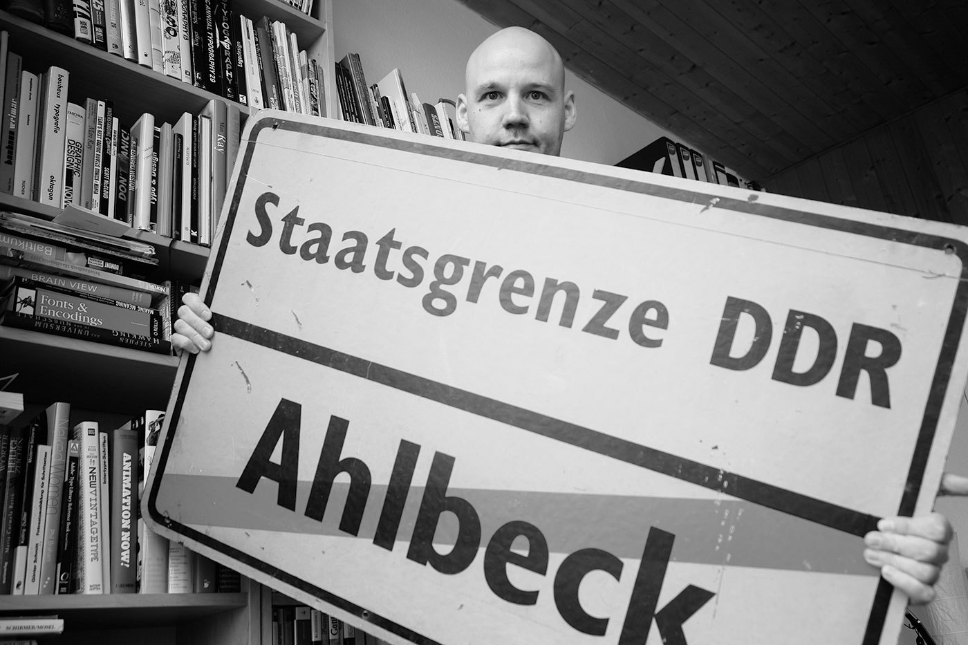 In the German Democratic Republic (GDR) the road traffic regulations were revised in the 1970s. The GDR had signed the treaty of the Vienna Convention on Road Signs and Signals (1969) and in the years 1974 till 1978 the official norm for the design and content of road signs was changed significantly. The new, quite remarkable layout also included a new typeface. In tests with a tachistoscope Gill Sans Bold Condensed supposedly performed better than DIN 1451 and so Gill Sans was used as the standard traffic typeface in East Germany. Because the old road signage typeface was usually just called DIN, the new typeface became the equally short name GIL. Source: Martin Q., Flickr. Used with permission They were certainly ahead of their time in choosing a humanistic sans-serif, but it is obvious that the spacing was way too tight for traffic signs. Here is a scan of the official norm papers (TGL 12096/91): There was just one style in use. The design is pretty close to Eric Gills original design for Monotype. The figure 1 got a hook to differentiate it from the I and the crossbar on the f seems to be wider on the right side (but still appears too short on the left side). They even took over the ridiculously small dots on the lowercase umlauts ä,ö and ü. Dear international type designers, take it from a German reader: the dots on umlauts need to look like the dots in the character i and j! So what about legibility? The GIL and DIN typeface can be easily compared. Even though the GIL typeface is actually a condensed typeface, it only uses just a little bit less space the the regular DIN 1451 (“Mittelschrift”) and the x-heights are also similar. At close range, GIL looks slightly superior. In this example, the design of a, g and r appears just more distinct. But if we simulate a greater distance, DIN 1451 actually takes the lead. Its very clear and basic design with the smaller stroke width makes it more legible under difficult viewing conditions. As you can see, the umlaut dots even disappear completely in GIL. So I find it hard to nominate a winner in this competition, but it probably safe to say that both typefaces performed rather well in those days. Other countries at the time were still using geometric designs with poor legibility that were drawn by engineers. The new design came into effect in 1977 with the new road traffic regulations. On top are signs used on regular roads and the next image shows examples of motor way (“Autobahn”) signs. Even though the new typeface was supposed to be used for all signs throughout East Germany, Autobahn signs seemed to have remained in a very old version of DIN 1451 (see next image). This was probably due to financial problems. East Germany always struggled to purchase or develop the materials they needed. That’s why most of the signs were either made from plastic or mounted on wooden plates. The majority of the signs was also retroreflective, but the GDR couldn’t effort to buy the Scotchlite materials from the USA, so they developed their own, but less effective retroreflective sheeting which was called Mikrolux. When Germany was reunited in 1990 almost all signs in GIL were quickly replaced with new signs using DIN 1451. Only some signs in rural areas remained unchanged – or ended up in my living room.
 -
 Typefaces used for national road signs.
 -
 Recommendable professional typefaces suitable for signage use. See also Road Signage Typefaces.
 -
Size Calculator is a project by Nick Sherman and Chris Lewis. It can be used to input two of the three values for viewing distance, physical size and perceived size and then the website will calculate the third value.
-
 When I first saw a digital version of the Polish traffic typeface, I though I must have gotten a really bad digitization. It had characters which were obviously cut off by mistake … But I later found out that this is the way the typeface is supposed to look like according to the official specifications: The typeface has a very simple geometric design almost without any typographic corrections. Only one style is in use. There is no condensed style available and no variations for positive/negative contrasts. The typeface was originally developed in 1975 by Marek Sigmund for the Ministry of Transportation and put into effect on April 1 of that year. It is currently used in accordance with the Ministry of Infrastructure regulation of July 3, 2003 on all types of road signs in Poland. But Poland is a good example that type design isn’t everything when it comes to the design of traffic signs. The Polish signs compensate for the poor type design by making most of the information and direction signs very large, thus still achieving a good legibility. Unfortunately, the typeface almost always fails when the type has to get smaller. See this next example on a motorway, which is supposed to be read at 110 km/h (70 MPH). There are two digital versions available: Tablica drogowa by Grzegorz Klimczewski and Drogowskaz by Emil Wojtacki. The latter is freeware and I recommend using the TrueType version. The OpenType PS font has some outline bugs.
 -

From signs to minds—Can cartographic signs be superior to regular direction signs?
Ralf Herrmann posted a journal article in Journal
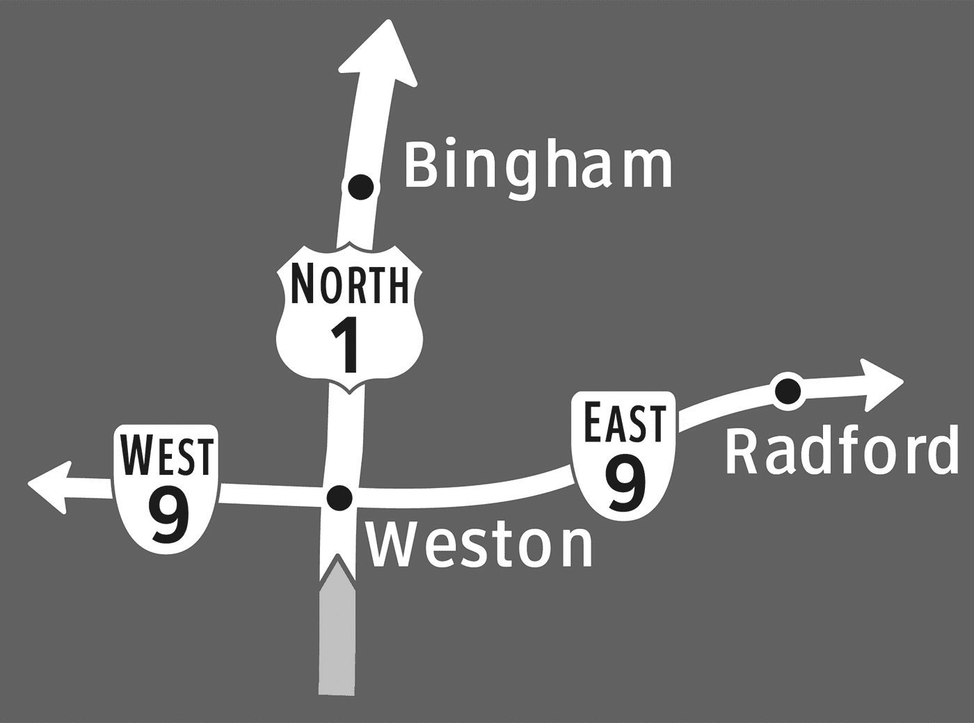 Finding your way through a new city has never been easier than it is today. There is a wide array of gadgets available to help you locate yourself and your destination, plan out a route to get there, and take the right turns along the way. But as you follow along to the voice of your navigation system, how much are you actually learning about the environment around you? Could you retrace that same route the next day? Could you draw your path on a map? There is a growing body of both anecdotal and experimental evidence suggesting that turn-by-turn navigational guidance hinders learning. Once you’ve punched in your destination, your mind goes on cruise control. Typical directional signs, like in-car navigation systems, simply point you in the right direction at each turn along your route. Following a series of these signs, you might arrive at your destination without understanding exactly how you got there – or how to get back home. In a previous post, Ralf Herrmann explained this downside of directional signs: Directional signage is purely egocentric. The signs will tell us to go left, right or straight at a decision point, without providing us information of how we move thru the environment in connection to cardinal directions or landmarks along the way. We will reach our target only if the signs work at every decision point. If one part of the way is blocked or we missed a sign, we cannot reach our target, because we have no idea where it actually is. And it will be hard to trace back our route to the starting point, because we just followed endless signs and did not built a large-scale cognitive map of the surrounding. In a recent study, I aimed to identify how directional signs could be designed to not only get people to their destination, but also help them construct a mental map of the area along the way. Drawing from research in cognitive science, I predicted that road signs featuring highly simplified maps would encourage this spatial learning by showing travelers an image of the layout of the area. Using the guidelines for U.S. highway signage as a foundation, I developed three types of signs to evaluate, shown below. The ‘separate’ type, which is the standard highway directional sign, uses arrows to indicate which way to turn to reach various destinations. Roads and towns are shown on two separate signs in order to not overload travelers with too much information at once. The ‘combined’ type shows route and town information all on one sign, and merges the simple arrows to form a schematic diagram of the intersection. This type of sign is much more common in Europe than in the U.S., and a similar sign is often used for roundabouts. The ‘cartographic’ signs display this same information in the form of a simple map, with route and town labels placed on lines that represent the roads. Perspective and mental effort in wayfinding These sign types connect to the different perspectives used to communicate or remember spatial information. The ‘separate’ and ‘combined’ types use the route perspective, while the ‘cartographic’ signs use the survey perspective. Route information, which is from a perspective within an environment, is a sequence of turns at decision-making points along a route. In contrast, survey information is from an imagined perspective above an environment, and can convey an interconnected and hierarchical network. With this more complex understanding of an area, it’s easier to identify shortcuts and alternate routes. In other words, you can communicate more complex information about the layout of an area by offering a map (survey perspective), than by providing a series of simple directional signs (route perspective). These two perspectives also differ in terms of the amount of mental effort they require for navigation. To find your way using a paper map, for example, you must locate and orient yourself, identify your destination, plan a route to get there, and translate that route into a series of turn actions. A well-designed you-are-here map would help you with self-location and orientation, but you’re still on your own to plan out your route and the turns it would require. Following signs to your destination, in contrast, may not require any understanding of the broader layout of the area, because you’re provided with turn-by-turn guidance along the way. In general, we prefer to do things the easy way when it comes to wayfinding. Most people with smartphones or in-car GPS would be unlikely to ditch them in favor of a paper map or gazetteer. But if you distilled a map down to only the absolutely essential information, could you give travelers a mental image of the layout of the area in only a few seconds? The aim of the ‘cartographic’ sign type, shown above, is to present the directional guidance offered at an intersection in the form of a simple map that can be read while driving past. By needing to interpret a map in order to make a turn decision, perhaps people will incidentally piece together a better ‘cognitive collage’ of their environment. (See: Tversky, B. (1993). ‘Cognitive maps, cognitive collages, and spatial mental models’, in Spatial Information Theory, Springer-Verlag). How much can you learn from signs? I’ll spare you the details of the experiment I developed to evaluate how well the three sign types support spatial learning, but if you have any questions or want to learn more, don’t hesitate to contact me. Basically, participants viewed a slideshow of signs as if driving through a fictional environment, and then were given an unexpected mapping task to demonstrate what they had learned from the signs. I then had the participants repeat the same sign viewing and mapping tasks, in order to see how much they could learn from the signs when they knew that they would be tested afterwards. In the first mapping task, people viewing the ‘cartographic’ signs constructed significantly more accurate maps than those viewing the other two sign types. This suggests that signs with maps do help people incidentally develop a mental map of their environment. What’s particularly interesting is that there was no significant difference between the map accuracy scores of the ‘separate’ and ‘combined’ sign groups. In other words, combining route and town information on a single sign didn’t really help people learn unless the information was presented in the form of a map (as was the case with the ‘cartographic’ signs) The second mapping task, which gauged how much people could learn intentionally, showed no significant differences between any of the sign type groups. Basically, when people knew that they would be tested on their knowledge of the area, the type of sign didn’t have a notable impact on how much they learned. In practice, however, intentional learning from directional signs is much less common than incidental learning. Would you focus on constructing a mental map of an airport as you follow signs to the baggage claim? Probably not. So while the results of the second mapping task are interesting to note, they’re less relevant to the practice of designing wayfinding signage. Beyond the lab While it may seem narrow and unrealistic to test changes to the carefully regulated signage of the U.S. highway system, it was in fact essential to start with such a restrictive wayfinding scenario. On the highway, you only have a few seconds to interpret each sign you pass by, so an overly complicated sign could be life threatening. For pedestrians, however, viewing time is much more flexible, which would allow you to include a greater complexity and quantity of information on a sign. In other contexts, the possibilities are endless. Imagine pedestrian signs with simple maps that orient you relative to a river, coastline, or another key geographic landmark that’s not always in view. Or as you enter a grocery store you’ve never been to, imagine seeing a simple map of the different departments. (I swear I thought of that before I saw the sign below, at a Fred Meyer store in Oregon!) Imagine if the typical subway directional signs, which only show the name of the last station on a line, were supplemented with a simple map of which direction the line would take you in the city. Whether you’re designing wayfinding guidance for drivers, bicyclists, pedestrians, or transit riders, the basic principle is the same: simple maps on signs can help people learn the layout of the area. The full paper was published in the Cartographic Journal, Volume 49, Number 4, November 2012 and is also available online.
 -
Empirical study about the legibility of typefaces used on signs in public space
Ralf Herrmann posted a journal article in Journal
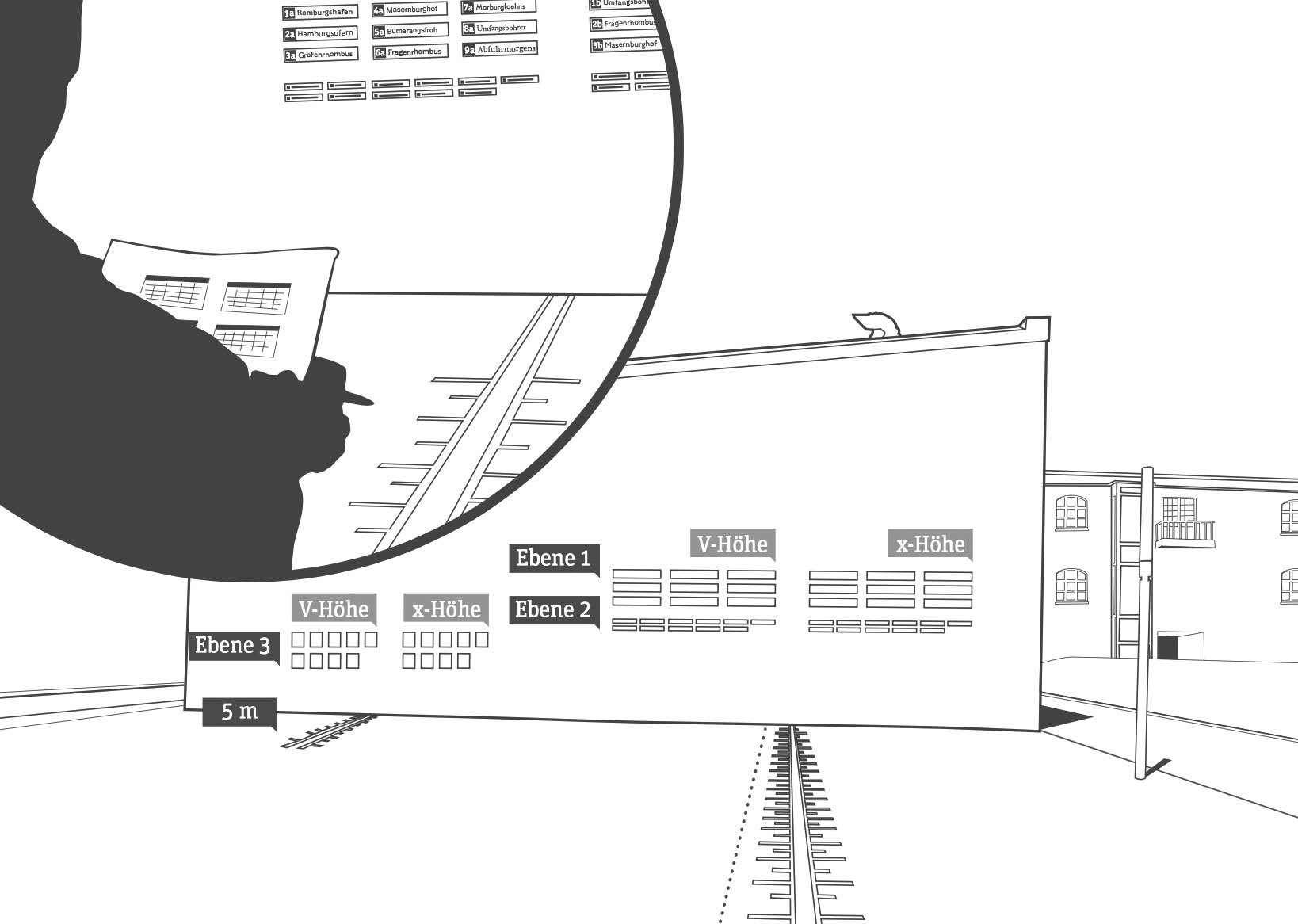 The use of type in this study was based on the recommendations of the German legibility norm DIN 1450. This ensured that the study reflected a real-world scenario and is suitable for people with normal or reduced visual acuity. 106 participants were tested. They should walk towards the signs using fixed intervals. Once they could clearly recognize the text, the distance was noted. The test included two different type sizes presenting single words and a third test using a small paragraph. In each test the capital height of each typeface was equal, as defined in the current DIN 1450 norm. But the test was also repeated with the same setup, but this time with an equal x-height of all typefaces. This x-height was defined by calculating the average x-height of all tested typefaces. As I have mentioned earlier, legibility studies often just use an equal point size for all typefaces, which does not ensure that the actual size or optical appearance of the tested fonts are equal. But fortunately, this study did’t make this error. The study also uses words and not just single letters, so it tests how information actually appear on signs in public space. The nine tested typefaces were Linotype Frutiger, P22 Johnston Underground, Wayfinding Sans, Arial, DIN1451 Mittelschrift, Franklin Gothic Medium, Futura, Garamond Premier Pro and Swift. The winner of the study is my Wayfinding Sans typeface. Sven Neumann writes in his final report that Wayfinding Sans could be read earlier than any other typeface in all test situations. It was not only more legible than DIN 1451, which is used on the German road signs, but performed even better than Linotype Frutiger, which is one of the most used signage typefaces, especially for airport signage systems. In the next digram you can see the maximum viewing distances of all typefaces. The dark green bar represents the cap height test and the light green bar the x-height test. Of course this result shouldn’t surprise me too much, because increasing the possible reading distance was my main goal all along. But I also noticed, that some people didn’t really trust my design approach which is based on real-time on-screen legibility simulations. They thought it would be too unscientific just to test bad viewing conditions without using certain values. But I know that a typeface created for the worst viewing conditions possible would also perform well under any other kinds of viewing conditions. And now here is the first empirical proof of this idea. Not surprisingly Frutiger also performs very well. When Adrian finished this typeface in the mid 1970s for the signs of the Paris-Charles de Gaulle Airport he created one of the archetypical humanistic sans-serif typefaces of our time. P22 Johnston Underground is also among the top typefaces in this test. Originally created in the early 20th century for the signs of the London Tube, it might look a bit clumsy today, but works still well in terms of legibilty. Arial, DIN 1451 und Franklin Gothic Medium achieve just avarage results. Compared to the typefaces discussed above their design is more static and the shapes are more closed, so they don’t perform as well in this legibilty test. Futura performs even worse, because of its small x-height and the geometric design. The serif typefaces Swift and Garamond Premier Pro also perform bad in the cap height test. This comes as no surprise. Their x-height is small and the details are delicate, so they can only perform well under good viewing conditions. Since the test was performed twice, once with an equal cap height and once with an equal x-height, it is especially interesting to compare the results. Wayfinding Sans® and P22 Johnston Underground with an x-height between 67 and 69 percent perform equally well in both tests. Typefaces with a smaller x-height can only be made more legible by dramatically increasing the point size. But this is often not possible in signage systems were the ascenders and descenders then would conflict with other lines or borders around the text. Rather surprising is the good performace of Futura and Garamond Premier Pro when the typefaces are scaled to the same x-height (green curve). Not surprisingly, the study also shows a relation of the possible viewing distance to the age of the participants. The group of people under the age of 15 performed the best, the group of participants over 60 performed the worst. A German PDF with all the results from the study can be downloaded from the server of the university.
 -
Guia — a wayfinding typeface for pedestrian signage
Ralf Herrmann posted a journal article in Journal
 As a designer, I am interested in how certain solutions connect to the user. It is amazing to see how different solutions can change feelings, resulting in different ways of interaction. In consequence, in the type]media master I knew I wanted to design a typeface that would bring a new experience to the user in a specific area. As I am coming from Portugal, the creation of Guia was very much influenced by my personal visual memory: It is very common to find diverse guidance systems in different Portuguese cities. They differ in material, technique and lettering. Those differences are connected with the individual cities. For example, if a city has a granite tradition, it is most probable to find street name signs made out of granite, with the letters carved into the stone. There are also signs in marble or metal, but most commonly, painted tiles can be seen, as all of Portugal has a great tile tradition. Even though, different executions can be found yet again within the technique of painted tiles. Those street plaques appear to be there since forever, and they have become part of the history of the city. I know the portuguese sign tradition from my own experience, and I was visually supported by many images on Flickr. As I did not have the possibility to make a deeper research in person, online archives of photos were of great help. Street sign made of stone in Aveiro, Portugal. Photo by Filipa Cruz, http://www.flickr.com/photos/sufragista/3230191056/ Enamel street sign in Tondela, Portugal. Photo by Filipa Cruz http://www.flickr.com/photos/sufragista/4570775315 Street sign of painted tiles in Évora, Portugal Inspiration sources for getting the feeling right were also found studying books on signage and lettering, such as Nicolete Gray’s “Lettering on Buildings” and Jock Kinner’s “Words and buildings: The art and practice of public lettering”. Their research images showed many manually-produced signs, which all had a strong appeal to me. The signs’ purpose was mostly illustrating and matching a place, rather than providing a coherent appearance, or offering greatest readability. All those impressions helped me to get into an overall mood to create a typeface which would be personal, but at the same time useful and usable. In Portugal, almost no standardizations for signage systems exist, except for the use of the typeface “Transport” for transit guidance. Today, when new pedestrian sign systems are being created, they are mostly designed using rational sans serifs, being totally out of context within the sign lettering tradition. There are no ties with the surrounding architecture or connections to the city history. I felt there was a gap between the charming lettering of old street name plaques and current signage systems for pedestrian guidance. This area I decided to work on. I do understand that the complexity of the cities nowadays is not the same as it was 100 years ago; not even 20 years ago. Hence, new solutions are required in order to guide persons around a city. What I wanted to experiment with, was to bring back some of the lettering-feel to an up-to-date wayfinding typeface. Ideally, new pedestrian signage systems could consequently transmit more of a humane feeling than they are doing right now. The different styles of Guia and their features. Guia shall provide multiple possibilities for the sign creator of today, yet retain a strong human touch, in order to make the user comfortable and welcome with the new place that he is about to discover. For this reason, Guia is based on the movement of the broad-nib pen. In my research I found out that this particular way of creating letters results in pleasant shapes and it has advantages in readability in comparison to other contrast models. Contrast-less typefaces mostly have the characteristic of being uniform; so they do not evoke a feeling of their own. Calligraphy sheet produced during the design process of Guia Many decisions were taken bearing a foreign reader in mind. If a foreigner arrives at a new place, he or she does not have the word-images of street names etc. in mind. In consequence, reading succeeds letter by letter. Therefore, the spacing of Guia is relatively wide. For the same reason, it does not have any ligatures. Persons which are not into type design or typography might just decipher a ligature as a strange character they do not know. Guia does not have ligatures. To make the typeface really fit for signage purposes, various OpenType features and additions were implemented. For instance, any word can be converted into a pointing sign, just by selecting a stylistic set. Also, different kinds of arrows exist; to work in a mixed or all-cap setting. Circled arrows provide the possibility of stand-alone usage. In many languages such as Portuguese, Spanish and French, long words are abbreviated using superscript letters. For the purpose, Guia provides the whole alphabet in a superscript feature. The arrows of Guia correspond to the cap-height, x-height and ascender/descender height. With the help of OpenType, any word can be transformed into a sign Guia contains the whole alphabet also in superior letters. In all those details, I was also focusing on the broad-nib contrast. Even the arrows are based on the construction model, just as the circles around them. Those details might be negligible for an outsider, but I think they make the whole typeface more coherent in itself. Another area I focused on concerns the recognition of the individual letters. Therefore, cap- and ascender-heights are significantly different, in order to make their distinction easier. Stem joints have been adjusted, to make the whole letter shape sharper, avoiding visual clogging. All those corrections lead to a better legibility, which I find to be essential for a signage typeface. Different height of caps and ascenders. Adjusted stem joints avoid visual clogging. Guia is composed by a Regular, Bold, Condensed, Bold Condensed and Extra Condensed style — yet this selection might not be absolute. It is still an ongoing project. I have learned a lot during its creation, and I am sure that many things will change before the typeface is ready to be released. A next step will be designing a set of pictograms and symbols; and I am curious how to get the broad nib feeling into them. I am very glad I had the space and time to do this experiment, and I thank all the type]media teachers for being open to my ideas and for all their advice and support. Tânia Raposo http://www.taniaraposo.com
-
- 1
-
-
- signage
- wayfinding
- (and 1 more)
-
Wayfinding observations: Landmarks and cardinal directions
Ralf Herrmann posted a journal article in Journal
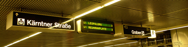
 When we come to a new city we build a cognitve map to represent this city in our minds. Unless you have photographic memory such cognitve maps work differently from topographic maps. They don’t consist of exact representations and distances, but are driven by landmarks and the paths that connect them. A landmark can be anything that clearly stands out from its environment, like a tower or a church. But one of the most important landmarks are rivers that divide a city. London is divided by the Thames, Paris by the Seine and Vienna by the Danube. Last week I visited Vienna for the first time and experienced a typical wayfinding problem that always annoys me. From my hotel I wanted to make a sightseeing trip to the city center. I went to the closest subway station, paid my ticket and looked for a map to find out where I have to go. As you can see on the map, Vienna is divided by the river Danube. Since my hotel was close to the river I had no problem finding my position on the map, even though there was no You are Here mark. Source: openstreetmap, Creative Commons, by-sa The city center was also easy to find and I can easily place it on my cognive map. It’s across the river and Southwest of my hotel. A subway line is directly connecting my position with the city center, so the only question left is which platform I need to take on this line. I know I want to go across the river, Southwest and to the city center—but none of these information is given to me. Instead I get: Do I want to go Reumannplatz or Leopoldau? Well, neither! I want to go across the river, Southwest and to the city center… So I need to check this huge and very detailed map again to find those terminal stops. From a cognitive perspective this is really a problem. Especially tourist will never visit those terminal stops, so to them they are meaningless, hard to remember and hard to place on a cognitve map. But cardinal directions and landmarks are basic tools of navigating thru the environment and would make it much easier to travel around an unknown city. What about an additional information which of those platforms leads to the Northeast and which to the Southwest? Even a simple circled SW and NW would probably suffice. But getting on the right platform is not the only problem—it continues when we want to exit the subway. I got off at my stop in the city center. It’s a large subway station and after walking thru the subway catacombs I will usually have lost my sense for the cardinal directions again. From the topographic map I looked at in the other subway station I know I want to go Northeast from the station and stroll thru the city there, but what I get is: Do you want to exit to Kärntner Straße or Graben? Well, I don’t know! I want to go to the Northeast! How should I know all these street names as a tourist? And even if I would know the right street name, without cardinal directions I wouln’t even know which direction I should take on that street. So I need to consult a topographic map again to check random street junctions which might help me determine in which direction I am currently standing. A simple compass rose on the ground would have made it much easier… It’s not a secret how cognitve maps work and how tourist move thru a city. But it seems that the signage of most public transport systems don’t really reflect that. They seem to be more driven by a strict and logic engineer’s approach, rather than how people actually use these systems. What are your experiences? Am I the only one who wants to rely on landmarks and cardinal directions when navigating thru a city? Do you know cities with a signage system that accommodates our cognitve maps in a better way? In which cities do you got lost and why?
 -
 The old Swiss traffic sign font is called SNV (“Schweizerische Normen-Vereinigung”). It is a very geometric typeface with obvious legibility problems. The SNV fonts can still be found on older Swiss traffic signs and also in Belgium where it is still the main font on road signs. Since 2003 a new font called ASTRA Frutiger is used. It is based on Frutiger 57 Condensed with slight changes. ASTRA Frutiger is used in two styles: “Standard” for normal roads and “Autobahn” for motorways. The latter uses a slightly wider spacing. Frutiger is of course a perfect choice for traffic signs. It was derived from a design by Adrian Frutiger for the signage of the Roissy Airport in France. The clean and open design of the letters make the typeface very legible and it became one of the most popular sans-serif designs in the 20th century. Nevertheless there is some room for critique. The Frutiger typeface is already available in many different widths and weights, so it would have been no problem to obtain different versions for positive and negative contrast as well as styles with different widths. Choosing a condensed style as the main font could be problematic since a condensed style will always be slightly less legible than the corresponding style in the normal width. The official norm even allows the already condensed font to be further reduced in width. This is done without any typographic correction and decreases the legibility.
 -
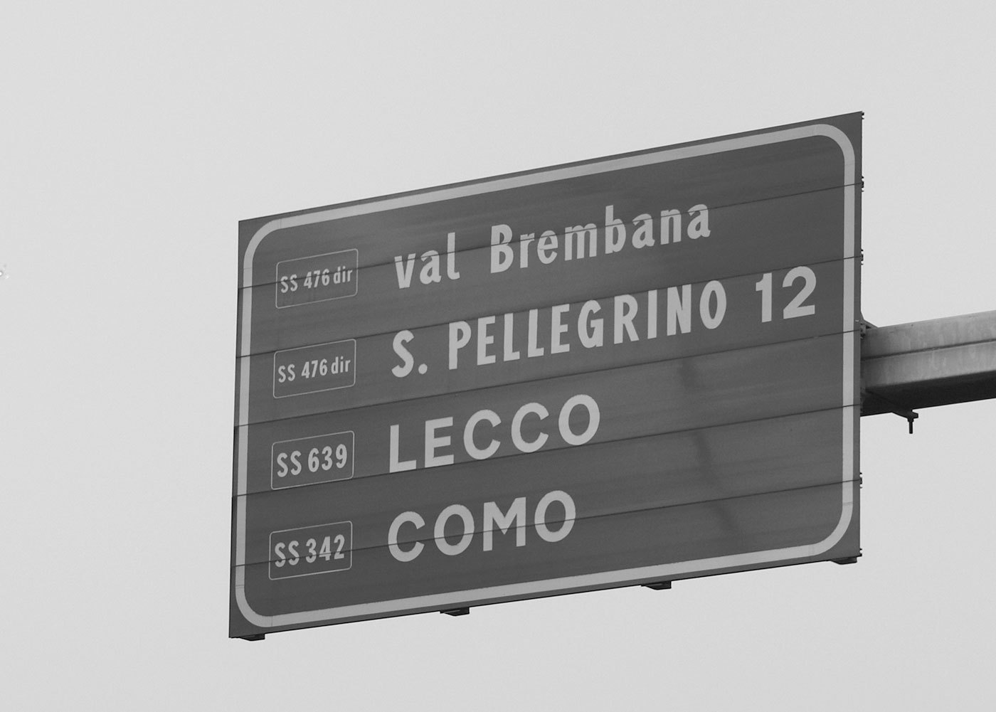 The main typeface used in Italy is called Alfabeto Normale and is a bolder version of the British Transport alphabet. From its use in Spain it is also known as Carreta Conventional or CCRIGE and it is available as Traffic Type Spain from URW++. A slightly thinner version is available for white letters on dark backgrounds. But nonetheless both version are way too bold for today’s retroreflective road signs. It's easy to imagine how the details will get lost when those letters are viewed from a greater distance or when the sign is lit by headlights. This is also true for the condensed style called Alfabeto Stretto, which is also available for positive and negative contrast. City names are always set in uppercase letters, but I usually didn't had trouble reading them, since Italian city names are usually short and set in large sizes. But the overall sign design has many problems. A typical mistake is not to limit the amount of information on the sign. One sign in Italy may present dozens of targets and additional information which are impossible to read even if you would slow down. Road numbers are usually very hard to read, since they are scaled down to fit in a rectangle the size of the capital letters. Another typical Italian problem I encountered was the missing continuity. You might follow a road (let’s say to Venice), but then hit a roundabout where this major target just isn’t listed for any of the available directions. And when it comes to Italian motorways you don’t get a chance to easily correct your direction, since they are all toll routes with very few exits. In the northern part of Italy the signs are usually set in German and Italian, but a typeface borrowed from the U.K. obviously doen’t have German letters …
 -
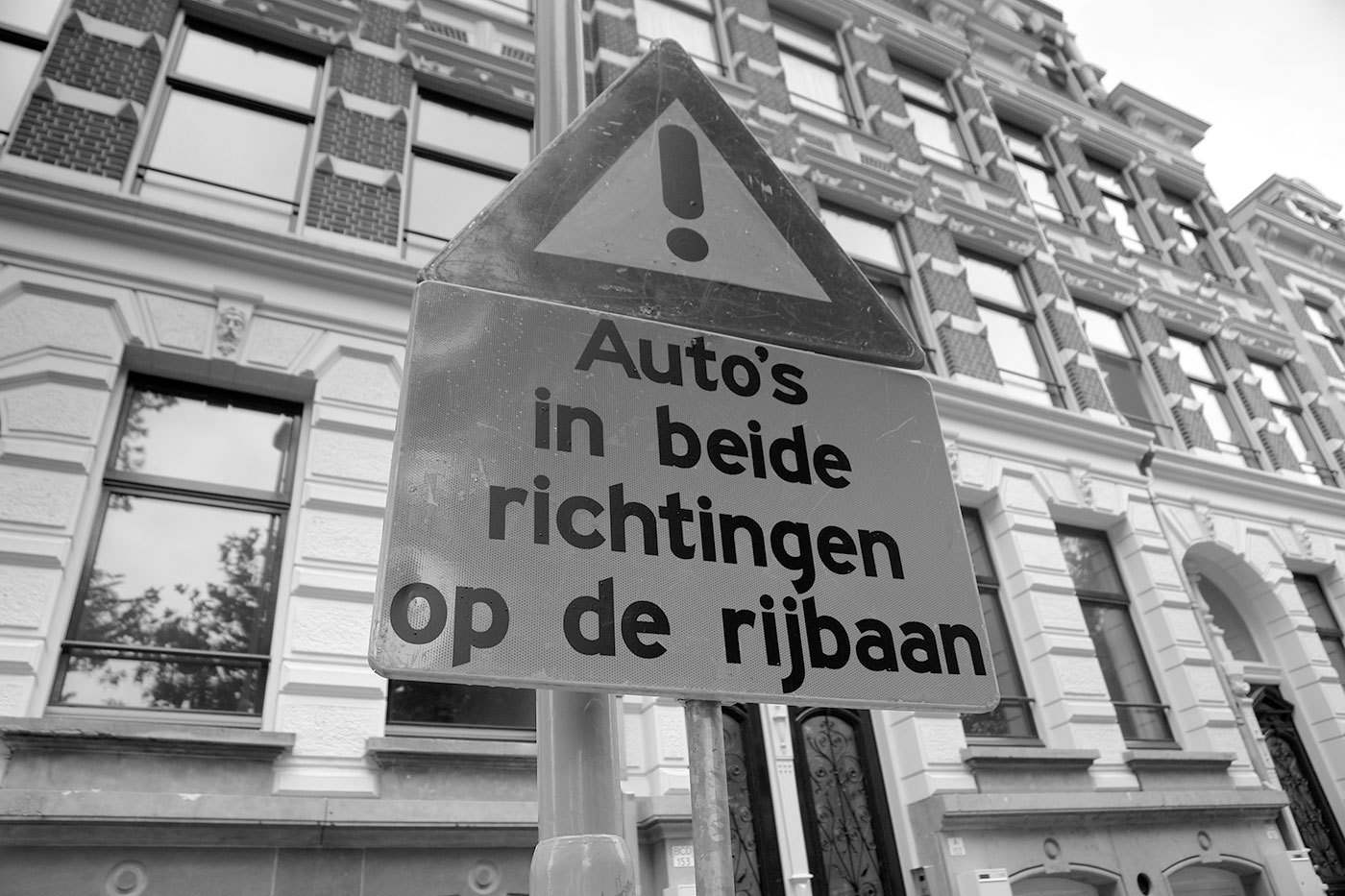 The Netherlands are a special case when it comes to traffic signs… Until recently the organization being in charge of the traffic signs was the ANWB. It was founded as a Dutch bikers(!) society (“Algemeene Nederlandsche Wielrijders Bond”) in 1883 and later became the royal tourist society. In my opinion these roots are still visible in the design of the traffic signs. On local roads you will see a lot of these sign posts, which are certainly based on the old finger-post signs, used long before the invention of the automobile. The typeface used since the 1960s is called ANWB-Ee (also RWS-Ee) and it is based on FHWA series E (Modified) from the United States. A condensed version (ANWB-Cc) is also available and it is based on the FHWA series C design. In the late 1990s Gerard Unger was commissioned to design a new typeface called ANWB-Uu. (source: designworkplan.com) Mr. Unger's task was to create a font which needs less space to fit the text on the smaller fixed-size direction signs. He achieved this goal. But in my opinion the the briefing itself was wrong. The size of a direction sign must be based on the content, not the other way around! What do you do, if you need to set Gasselterboerveenschemond on such a sign? On top of that, I found these sign posts often mounted at the most unfortunate places, for example behind traffic lights or far away and too high above the ground in the middle of a large roundabout, impossible to read. By contrast on a local direction sign in Germany the type size is based on the maximum speed of the traffic at this point and the width of the sign will grow according to the content. Recently the ANWB-Uu typeface is also appearing on the larger motorway (“autosnelwegen”) signs in the Netherlands, but using only a rather condensed typeface on large signs is usually not appropriate. It would at least need a corresponding version that is not condensed and can be used whenever there is enough space. The layout of the signs could also be improved. The signs sometimes appear way too crammed … … or simple but pretty ineffective:
 -
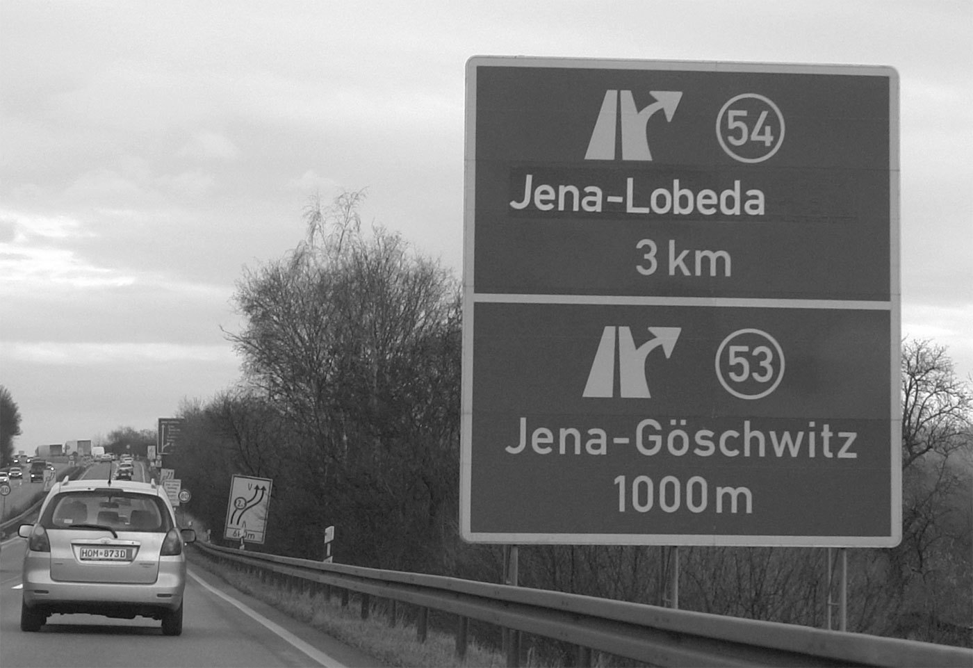 The official traffic typeface in Germany is called DIN 1451 and has a very long history. It goes back to the beginning of the 20. century when the Royal Prussian Railways (Königliche Preußische Eisenbahn) defined a new master drawing for the lettering for the description of freight cars, The typeface was later adapted for all kinds of signages of the German railways. In the 1920s major German industrial companies met to agree on all sorts of technical standardization including type standards. The result was called DIN 1451 and was based on the railway typeface. The typefaces were created on a very simple grid system and with a continuous stroke width. The type norm was published in 1936 and became a standard for traffic signs, road signs, street names, house numbers and license plates. Over the next decades the typeface also appeared on all kinds of goods and household articles, making it THE German typeface. You can read the full story of the history of the DIN typeface in a series of articles by Albert-Jan Pool (designer of FF DIN) in the issues 13, 14, 15, 17 and 18 of the encore magazine. East Germany In East Germany the use of DIN 1451 was reviewed in the 70s. In tests with a tachistoscope Gill Sans performed better than DIN 1451 and so Gill Sans was used as the stadard traffic typeface in East Germany. They were certainly ahead of their time in choosing a humanistic sans-serif, but it is obvious that the spacing was way too tight for traffic signs. (But then again, East German cars couln’t go very fast.) When Germany was reunited in 1990 all signs in Gill Sans were replaced with new signs using DIN 1451. DIN 1451 today Today two revised styles with typographic adjustments are used. DIN 1451 Mittelschrift is the main typeface: The condensed style (DIN 1451 Engschrift) should only be used when there is not enough space to use Mittelschrift. Even in this improved design it is still apparent, that these fonts were never made for traffic signs and reading at high-speed in the first place. The weight and the tight spacing is only working well at a close distance. Several foundries (e.g. FSI, Linotype Parachute) have developed font families based on DIN 1451. download at MyFonts download at MyFonts
 -
Traffic Sign Typefaces: Dansk Vejtavleskrift (Denmark)
Ralf Herrmann posted a journal article in Journal
 Denmark is very generous with colors. Road sign can be red on white, white on green, blue on white, black on yellow and white on blue. Red (usually reserved for emergency icons) is the main color, because it is the color of the national flag of Denmark. Between 1955 and 1978 a relatively light typeface with large ascenders and descenders was used (see first line in the above image). In 1978 a new typeface was approved by the Ministry of Transport (bottom line). It was taken over from the British Road Alphabet (“Transport”), designed by Jock Kinneir. The Danish letters æ,ø and å were added and a few details were adjusted. For example: the figures were made more open and the spacing was increased. The typeface decides the size of the sign. The size of the typeface (cap height: 25–480 mm) is based on the speed of the cars and technical qualities like contrast and retroreflection. Since there is no condensed style available, signs can get very wide. The Dansk Vejtavleskrift is used in two styles: “Positiv skrifttype” (for dark text on light backgrounds) and “Negativ skrifttype” (for light text on dark backgrounds). The latter has increased spacing, but no changes in weight.
 -
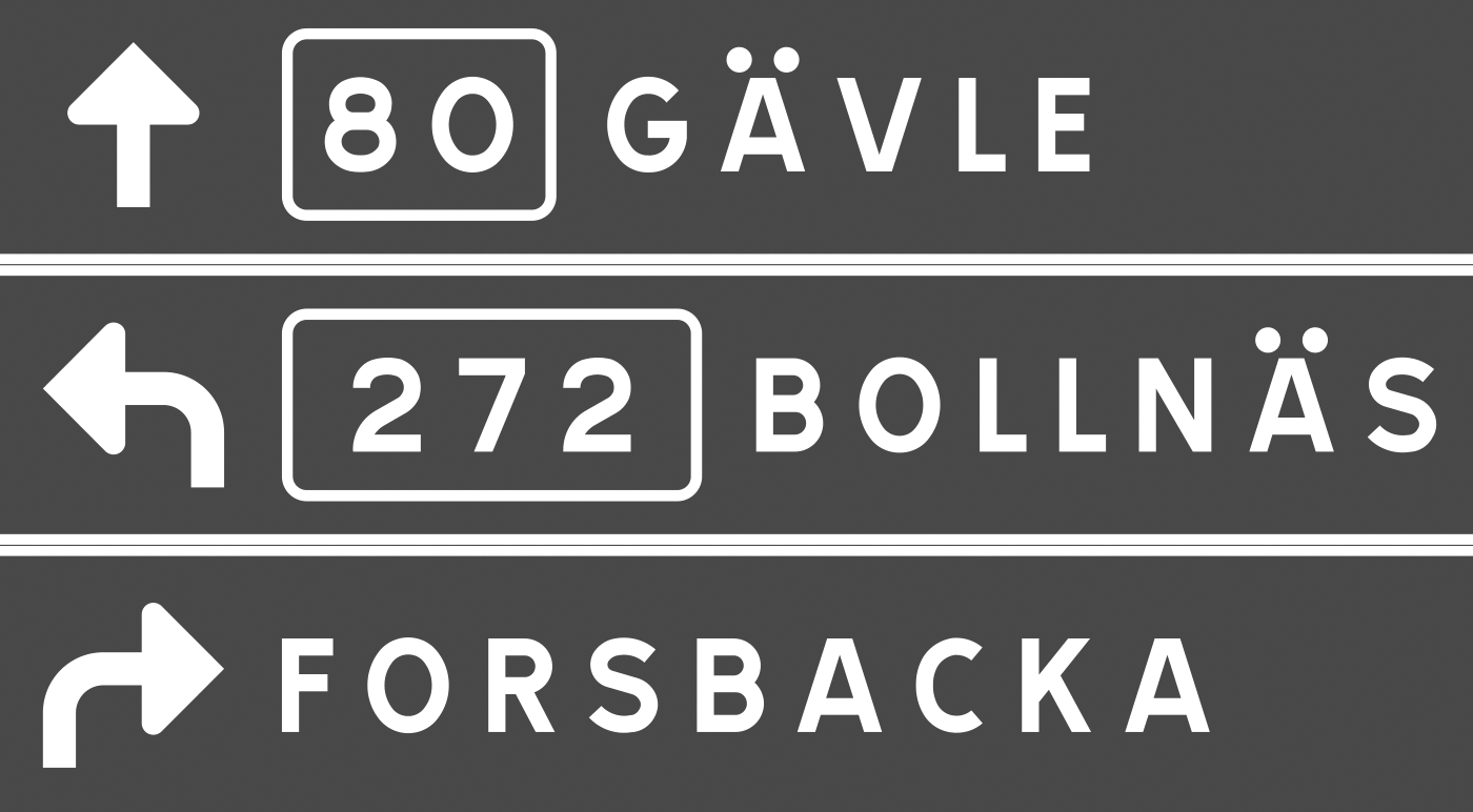 The swedish typeface for traffic signs is called Tratex and was designed by Karl-Gustav Gustafson and modified by Chester Bernsten. Tratex is available in 4 styles. The first one is called Svart (“Black”): Vit (“White”). It has an increased spacing to compensate the overglow effect. PosVersal (“Positive Caps”): NegVersal (“Negavite Caps”). Identical to PosVersal, but with increased spacing: Swedish signs are mostly set in all caps. This seems to be a common practice in all Scandinavian countries. Signs with lowercase letters seemed to be reserved for local targets and tourist information signs. You can download the Tratex fonts from here. A better commercial version is offered by URW++, but they only have one style.
 -
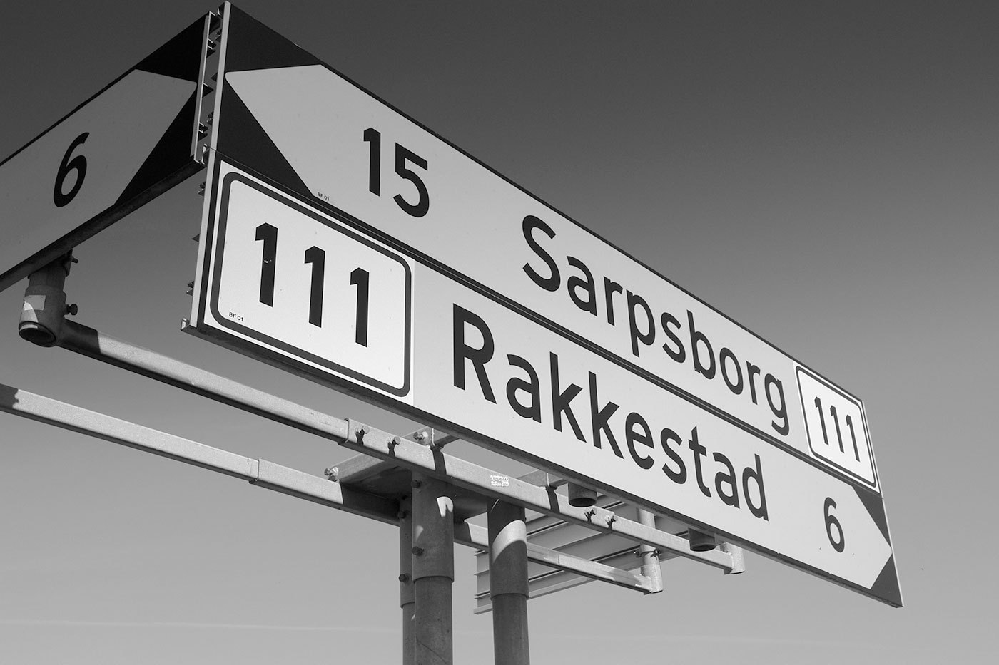 The typeface on the traffic signs of Norway is called Trafikkalfabetet and was designed in 1965 by Karl Petter Sandbæk. It bears a resemblance to the German DIN typeface, but it also has some unique features, some of them are good, some are bad. Both typefaces share a very simple geometric design and they are good examples of typefaces, that look like they were made on the drawing-board of an engineer rather than designed by a type designer. Look at these letters from Trafikkalfabetet: A type designers knows how to optically adjust geometrical shapes to make them look right. The tip of the M needs to go below the baseline and the dot of the »i« needs to be wider than the stem. But the design of the Trafikkalfabetet typeface rather aims at consistent values. As a result, the dot of the »i« is way too small, especially for a typeface that should be legible at great distance. The spacing of the typeface has the similar problems. Uniform values for left and right sidebearings cannot create uniform spacing. The counters of Trafikkalfabetet are more open (red circles) and the oval shapes are emphasized (compared to DIN). But on the other hand, important details are better executed in DIN than in the Trafikkalfabetet typeface (green circles). Trafikkalfabetet has only one style. So for longer pieces of information you can only make the type smaller or the sign longer. A digitized version by Jacob Øvergaard is available here.

