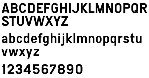
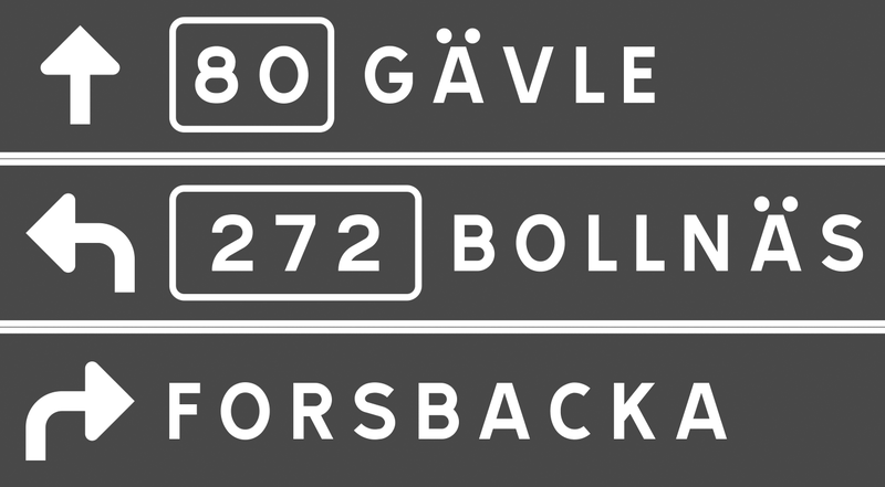
The old Swiss traffic sign font is called SNV (“Schweizerische Normen-Vereinigung”). It is a very geometric typeface with obvious legibility problems.
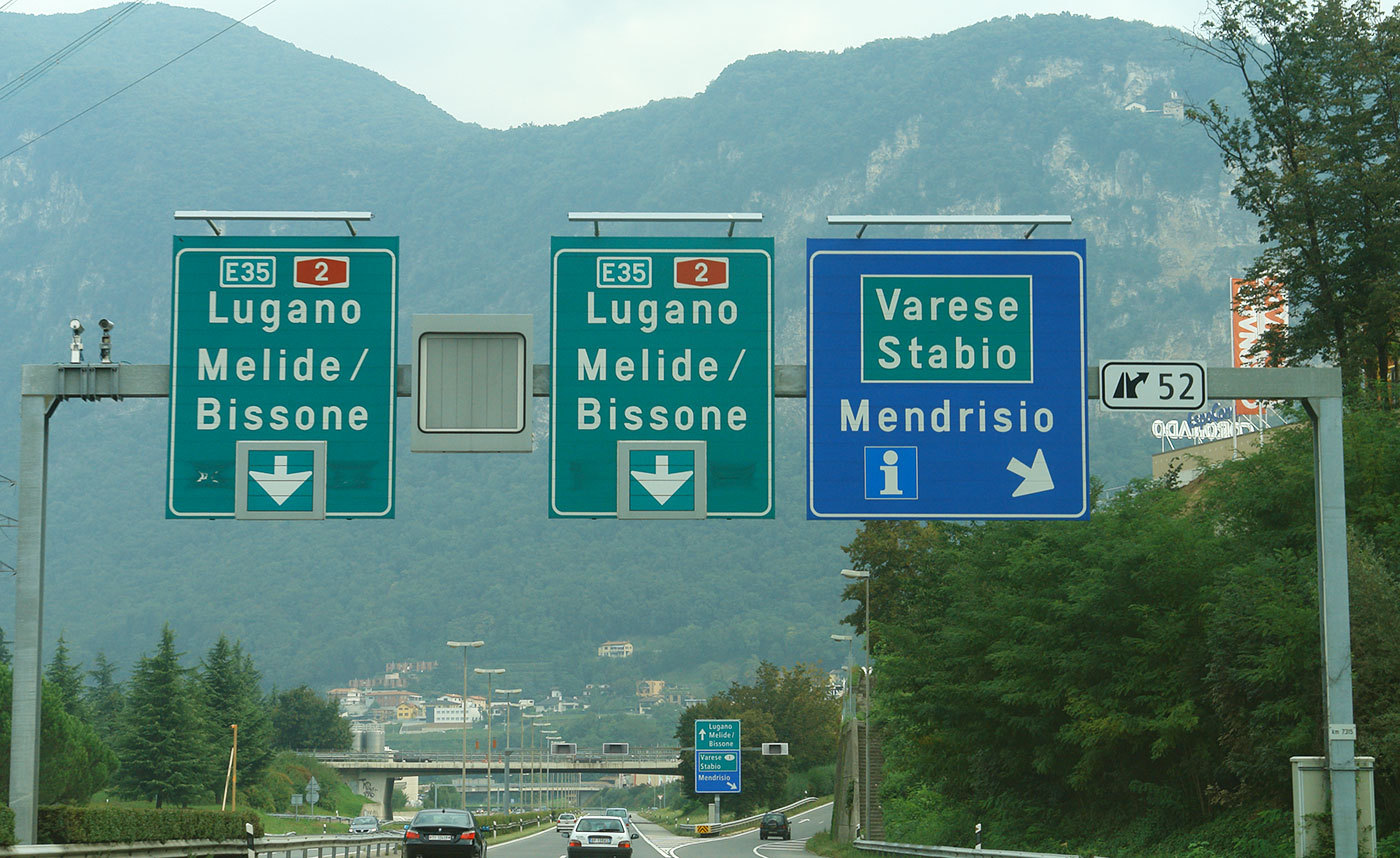
The SNV fonts can still be found on older Swiss traffic signs and also in Belgium where it is still the main font on road signs. Since 2003 a new font called ASTRA Frutiger is used. It is based on Frutiger 57 Condensed with slight changes.
ASTRA Frutiger is used in two styles: “Standard” for normal roads and “Autobahn” for motorways. The latter uses a slightly wider spacing.
Frutiger is of course a perfect choice for traffic signs. It was derived from a design by Adrian Frutiger for the signage of the Roissy Airport in France. The clean and open design of the letters make the typeface very legible and it became one of the most popular sans-serif designs in the 20th century.
Nevertheless there is some room for critique. The Frutiger typeface is already available in many different widths and weights, so it would have been no problem to obtain different versions for positive and negative contrast as well as styles with different widths. Choosing a condensed style as the main font could be problematic since a condensed style will always be slightly less legible than the corresponding style in the normal width. The official norm even allows the already condensed font to be further reduced in width. This is done without any typographic correction and decreases the legibility.











Recommended Comments
There are no comments to display.
Create an account or sign in to comment
You need to be a member in order to leave a comment
Create an account
Sign up for a new account in our community. It's easy!
Register a new accountSign in
Already have an account? Sign in here.
Sign In Now