


At first glance these questions might seem impossible to answer, because reading is a matter of habit. We read best, what we read most. For example: 100 years ago, Germany was divided between people who claimed that either blackletter or the Roman script is more legible and should be used to set German. The supporters of blackletter typefaces claimed, the simple Roman shapes would hurt the eyes and cause fatigue. The supporters of the Roman typefaces claimed that the blackletter shapes are way too complex and therefore hurt the eyes and cause fatigue … But in fact, both kinds of writing can be perfectly legible, as long as we are used to them. It is therefore perfectly natural that we consider the kind of script most legible that we are most familiar with.
So what can we say about the legibility of letters? In science there are two models of how letters could be read: as a visual template or as a combination of features. Template matching would mean that we keep an image of every letter in our mind and once we see a visual stimulus that matches this image, we recognize a certain letter. But from my point of view it is very unlikely that human reading works this way. Just think of some extravagant display typefaces or the ever changing appearance of handwritten letters. How can we keep a template of letters in our mind, that we have never seen before? It is much more likely, that a letter is read as a combination of certain features. In fact, I understand the whole process of reading as collecting and making sense of individual features. A sentence is made up of “features” (words). A word is made of features (letters). A letter is made up of features (letter parts). For every letter of the latin script we can think of a certain generic skeleton—a unique set of stems, curves and diacritical marks that, in combination, make up a letter.
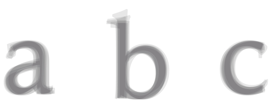
It doesn’t matter if the letter is narrow or wide, thin or bold, a serif or a sans-serif—for each letter there is a unique structural design that we know and recognize. And today it is even possible to test which letter parts are most important while reading.

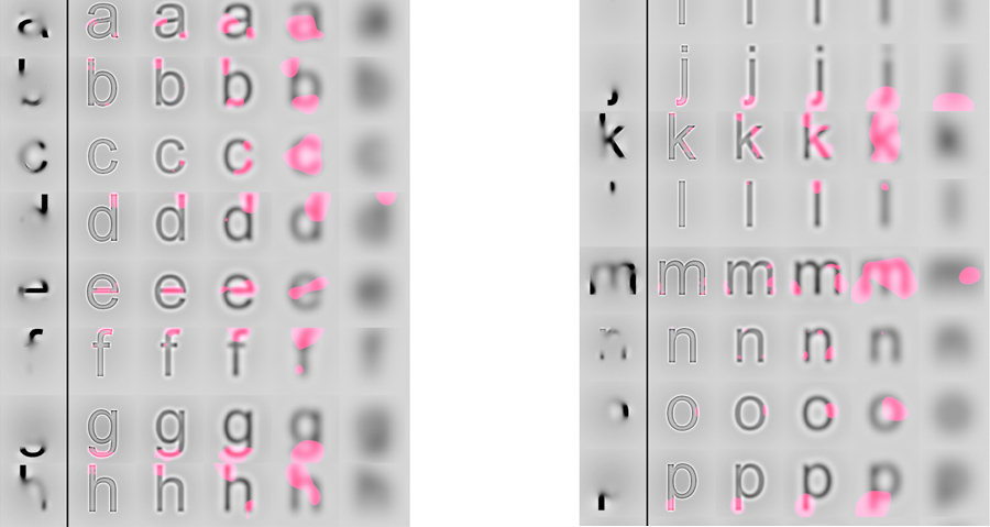
At the Department of Psychology at the University of Victoria empirical tests were made to reveal which areas of lowercase and uppercase Latin letters are most efficient for reading[1]. (The full paper is available online here)
Here is an excerpt from the results from this so-called “Bubbles test”. Look at the first column of each image to see the skeleton parts we use to discriminate letters. The authors come to the conclusion, that “line terminations” are the most important features for letter identification. While this is certainly true, I think we can learn a lot more from these images. We can clearly see, that we mostly pay attention to the features of a letter skeleton that make them unique in the Latin alphabet: the crossbar of the e, the stroke endings of the c and the existence and shape of ascenders and descenders in general (f, j, d, b, q, p …).
So these are the features a legible typeface should provide easy access to. They should be designed both in a generic and familiar way (recognizability) and also in a way that stresses letter differentiation (distinguishability). These are the two forces a type designer needs to balance out when creating a legible typeface. A larger x-height might give room for a clear design of letters such as “a”, “e” and “s”, but it would also decrease the ease to discriminate “h” and “n“.
Doing scientific studies to test which typefaces work best in this regard is almost impossible to do. For a proper test setup you would need to modify one parameter while keeping every other parameter unchanged. But setting a letter or word in different typefaces can not be considered as “changing one parameter”, because a typeface consists of dozens of relevant parameters like x-height, weight, contrast, width—just to name a few. So scientific test for typeface legibility are often full of flaws. Very often the typefaces are set at the same point size, but as every graphic designers should know, the point size does not reflect the actual size of the letters in print or on screen. So if you come across a scientific legibility study that compares typefaces set at the same point size, don’t even bother to read on! The effect of this flaw will probably have a stronger impact on the results than the parameters that are supposed to be tested. But even if such tests are done with an equal x-height or cap height, that doesn’t solve the general problem of interfering parameters. Different typefaces have different weights and widths and if the test comes to the conclusion that Arial is more legible than Clearview, than this might just be true for the two tested styles and the single characters they tested. It might be the other way around if they would have picked different letters or styles from these type families or if the tested the performance not according to type size, but to a certain width—which is for example important for signage typefaces.
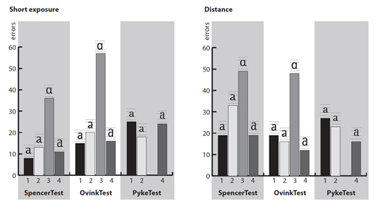
So instead of comparing different typefaces with interfering parameters it is much more revealing to look at certain aspects of letter design using one typeface. A study that was conducted in this way was done by Sofie Beier and Kevin Larson[2]. It was published in the Information Design Journal and is also available online (commercial paper). In this study Beier and Larson tested letter variations of frequently misrecognized letters (like e/c/o/a/n/u and i/j/l/t/f) while keeping the overall style of the letters. Here are a few of the interesting results, including some comments of mine.
- A strong finding is that a one-storey “a” is often misread as “o” or ”q“. A double-storey “a” performs significantly better. (see image above) The aperture of the double-storey “a” should be open, but opening the aperture more than usual could reverse the positive effect.
- The hypothesis that the legibility of “u” would improve by differentiating the letter from “n” was not confirmed. This comes as no surprise to me, but there seems to be a common misconception about letters that have a design that can be generated by flipping or rotating other letters. It is believed, that such letters (for example n/u or d/b/q/p) should have a unique design that cannot be generated by flipping or rotating the other letters. In this regard the geometric letter designs of typefaces such as Futura are considered less legible than typefaces with a humanistic design like Garamond, where letters like d/b/q/p and n/u don’t look the same when flipped or rotated. But while this might influence the reading comfort of a typeface, it is actually not important for letter recognition, because this is based on single features. We do not compare the letter designs of a typeface while reading. We detect the features of each single character and when there are two stems that are connected with a curve at the x-height, it is read as an n—no matter how the u in this typeface will look like.
- A serif on the letters “i” and “j” did improve the legibility of these characters in the distance viewing test.
- Broadening the letter design of letters such as “t” and “l” improved the legibility. Again, this comes as no surprise. These letters are dominated by a long stem, but they are discriminated by the existence of a crossbar or sometimes a tail at the bottom. So making these features more prominent by making the letters wider improves the distinguishability.
- One finding I can’t agree to is the recommendation to extend the letter designs of letters such as “a” and “s” into the ascending and descending areas, because these versions have performed better than the regular x-height designs in this test. This finding is very likely based on the fact, that this test was done using single letters only. When these letter variations reach into the ascending and descending areas, the letters were simply presented “larger” than the x-height version and therefore performed better. In a realistic word context, such structural changes of the Latin alphabet design will very likely decrease the legibility for readers who are used to see these letters within the x-height.
My own approach to research such legibility aspects of letter design was to use a real-time simulation software. While I was working on the design of individual letters in the font editor FontLab Studio, the tool showed me a simulated view of test words with the letters I was just working on. With this tool I could remove the guesswork and was able to optimize my design even for the worst reading conditions possible.
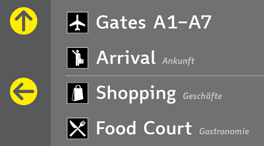
There are several advantages of this technique. First, it is not only based on single letters, but also takes their appearance within a word context into account. This is important, because the legibility of single letters can easily be measured in a scientific study, but in reality, that’s not all that matters. Certain letter combinations can be critical in terms of legibility and in single-letter tests the widest letter designs ofter perform the best. That’s why some tests even come to the conclusion that uppercase texts are more legible. But when used in a real context, like a signage project, the available space can be limited and the performance of a typeface should rather be measured according to an equal space and not to parameters such as cap height or x-height. For signage projects designers often try to solve this problem by relying on condensed typefaces. They need less space and can be set larger, and therefore appear more legible—allegedly. But the more condensed a Latin typeface appears, the more it loses its legibility because the vertical stems become more and more dominant and the features that are necessary to read the letters appear less clear. There are recent scientific studies that seem to support this idea[3]. So in certain situations it might be a better idea to set a wide typeface with a smaller point size than using a condensed typeface with a larger point size.
Concerning the legibility of letters my findings are mostly in compliance with the results of the two scientific studies introduced above. The details of a letter that are crucial for letter recognizing or differentiation are most important and can be made more prominent to support the legibility.
Footnotes
- ^ Features for identification of uppercase and lowercase letters., Fiset D, Blais C, Ethier-Majcher C, Arguin M, Bub D, Gosselin F., Psychol Sci. 2008 Nov;19(11):1161-8. http://www.mapageweb.umontreal.ca/gosselif/FISET_PSYCHSCIENCE_2008.pdf
- ^ Beier, S & Larson, K 2010, 'Design Improvements for Frequently Misrecognized Letters', Information Design Journal, vol 18, no. 2, pp. 118-137.
- ^ Waller, Robert, Comparing Typefaces for Airport Signs, Information Design Journal 15(1), 1–15


Recommended Comments
Create an account or sign in to comment