Search the Community
Showing results for tags 'research'.
Found 16 results
-

Call for Applications: Frutiger Archive research program
Ralf Herrmann posted a news entry in Typography Weekly #119
 Since 2021, the ANRT is hosting in Nancy an exceptional archive of works by Adrian Frutiger. The candidate will be responsible for the study, inventory and digitization of these documents.
 -
I was wondering if foundries do some kind of market research before selling/producing a typeface. If yes how is this done usually? e.g. if a foundry releases an Art Deco revival font, do they they have a substantiated reason to believe that there is a market for this and that it will sell? Is there a "persona" that the foundry has defined to which they think they will sell this to? Since fonts are a software product I am wondering how similar the development process is to other software products.
-
Greetings, Let me introduce myself briefly: My name is Mikhail Vasilev, a hobbyist designer and an engineer. One of my areas of interest is designing experimental alphabets aiming towards legibility optimisation, i.e. creating symbol systems that should outperform the existing ones in this regard. And also I am exploring various letter design techniquesthat affect the readabilty in general. The works have been collected to the point where I started to wonder, where most of the activity related to this topic happens? Also I was thinking about publishing some of the works. Like a short essay with images. Not for sale inherently, so it could be a web publisher with open access. So the main question: can you probably recommend a good publisher or a magazine, etc., that would be a good fit? I know I can choose any publisher I like, but probably there are some that have related focus. The topic is more technical rather than artistic, if that matters. Any tips are welcome.
-
Typographic Histories: Three Decades of Research
Ralf Herrmann posted a news entry in Typography Weekly #114
 “Our Virtual Special Issue on ‘Typographic Histories: Three Decades of Research’ is now available online! Read the introduction and 12 articles.”
 -

On Kickstarter: XX, XY : Sex, Letters and Stereotypes
Riccardo Sartori posted a news entry in Typography Weekly #112
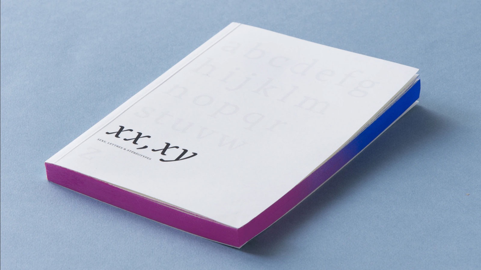 A book that investigates the relationship between gender stereotypes and letterforms, and what the design community can do about it.
 -
 “For the new paper in Memory, researchers conducted four experiments and found no evidence of memory-boosting effects.”
 -
Collection of Research on Chinese Typography
Riccardo Sartori posted a directory entry in Typography Books
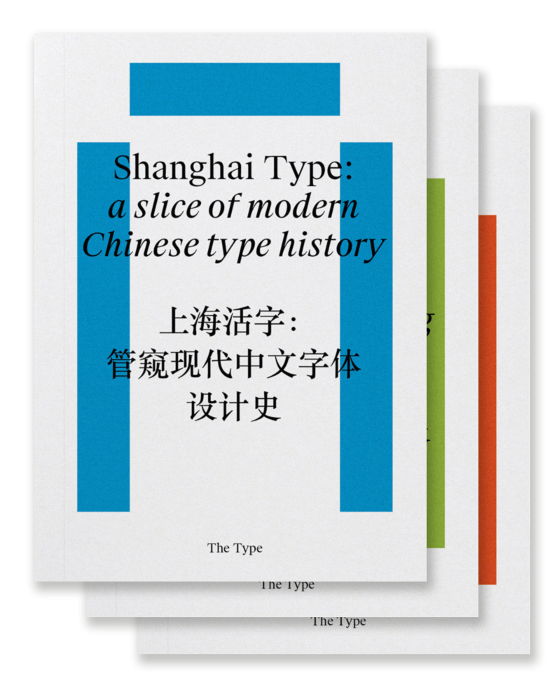 “Chinese typography is not easy to tackle, but we believe that, by more self-initiated and open research, we are able to address our challenges under a global perspective and invite more discussions and breakthroughs to the field. So here is a three-volume collection of our on-going research and dialogues about typography and design in China, including its history and development, conventions and contemporary practice, and working in transcultural contexts.” Shanghai Type: a slice of modern Chinese type history Transcultural Type Design: a dialogue from China Kǒngquè: restoring the mindset of Chinese typesetting
 -
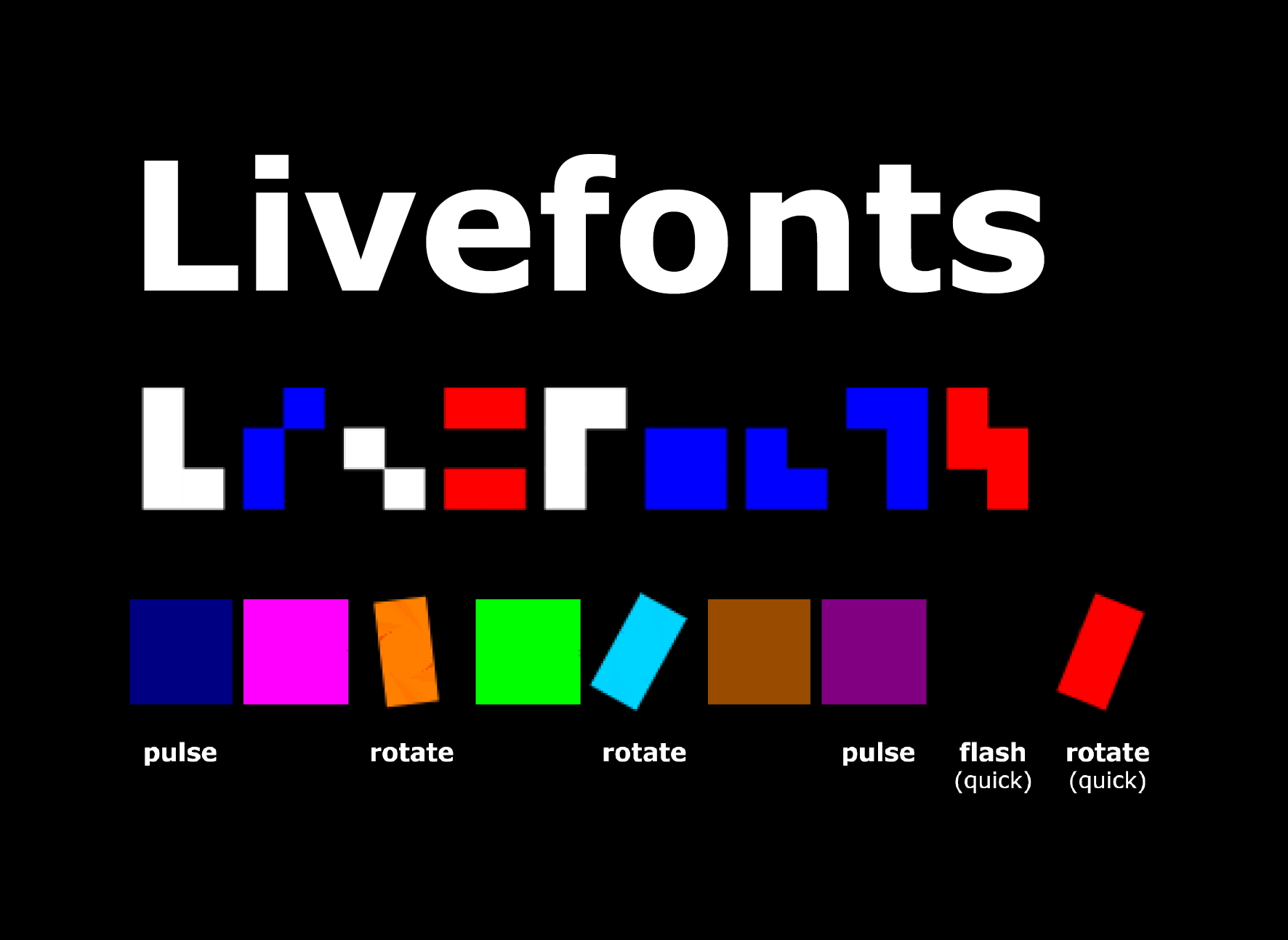 The idea is simple: instead of requiring low vision readers to enlarge the letters until they become legible, a new kind of “script” is being tested, that provides the uniqueness of each character by the means of digital screens: simple block shapes + colors + animations. The combination of these features allows a full character set without requiring the level of detail of traditional typefaces. The results look promising. According to the study, the script can be learned with similar effort than existing foreign scripts. And the legibility benefits (which means: being legible with less magnification) could be demonstrated for both readers with low and normal vision. “Increased legibility from livefonts can potentially help reduce or eliminate the magnification needed to identify letters. Sighted users can also benefit, especially people reading small text on small screens, those who wear glasses but do not always have them at hand, and people who need glasses but cannot afford them.” The study was done by Danielle Bragg (University of Washington, Seattle, WA), Shiri Azenkot (Cornell Tech, New York, NY), Kevin Larson (Microsoft, Redmond, WA), Ann Bessemans (Hasselt University/PXL-MAD School of Arts Hasselt, Belgium), Adam Tauman Kalai (Microsoft Research Cambridge, MA). You can read the full paper here: https://homes.cs.washington.edu/~dkbragg/papers/livefonts.pdf The following video provides a quick summary.
 -
![More information about "Letter and symbol misrecognition in highly legible typefaces for general, children, dyslexic, visually impaired and ageing readers [2019 fourth edition]"](https://typography.guru/uploads/monthly_2015_11/misrecognition.jpg.15bc5991b9603f388e4bc19a13d9b8e7.jpg) By Thomas Bohm 1. Introduction Incorrect recognition of a letter or symbol can occur in a number of different situations, whether it be an unclear typeface, reading a book or at long distance reading a road sign, to more serious instances, like medicine information leaflets or on a display in an aircraft. Different people (general, children, dyslexic, visually impaired, ageing) also have specific letter and symbol issues and requirements. Which letters and symbols are the most problematic and how are letters and symbols to be designed for maximum recognition clarity? The word ‘legible’ used in this paper refers to typefaces which have well defined easily recognisable letters and symbols, which can be decoded easily and quickly, which are not overly stylistic in letterform design, typically typefaces used in the context of continuous reading, not script typefaces. 2. Confusing letters and symbols for general people We define general people as aged between 13–45 years old, who do not have dyslexia or visual impairments. The following letters can be easily confused as other characters: lowercase l (el) can be read as the number 1 or a capital I (i). The capital I (i) can be read as a lowercase l (el) or as a number 1. The number 1 can be read as a lowercase l (el), capital I (i), or number 7 (Figure 1). Figure 1. Typefaces: Bucko and Sassoon Infant. Regarding the uppercase I (i), from research and testing Smuc et al. (2007) found that because of ‘a very high possibility for confusion with i, +, 1, t, l, it is advised to add serifs for distinction on top and base’. In research and testing of a typeface (Tern) for road signage Smuc et al. (2007), found that ‘a bent terminal (at the bottom of the lowercase l (el)) was of great importance to distinction.’ Beier and Larson (2010) found that ‘a tail at the bottom of the lowercase l (el) letter, more specifically a broader one, improved legibility’. Also Smuc et al. (2007) found that ‘a distinctive arm (at the top of the number 1) has a positive effect on discrimination, serifs at the lower end of stem do not seem to have an influence’. This is something I would question: that serifs at the bottom of the number 1 do not have an influence on recognition and clarity. In Chaparro et al. (2011), a number 1 with a distinctive arm at the top and a serif at the bottom scored 97% identification in testing with users, whereas a number 1 with only a distinct arm at the top and no serif at the bottom scored 43%; there is conflicting research in this area, for me the number 1 with an arm at the top and serif at the bottom defines the number 1 the most obviously (Figure 2). Figure 2. Typefaces: Mandatory, Century Gothic, Adobe Garamond, Myriad, Monaco, Verdana, Knockout, Century Gothic, DIN, Sassoon Infant Alt, and Rockwell. In a fast (extended reading) or long distance (car number plate) reading environment, the lowercase i could be read as a lowercase j (Scarrott, 1968). The capital B could be read as the number 8, and the capital D as a number 0 (zero), capital O (ow), or lowercase o (ow) (Nicholson, 2007). Other potentially confusing letters in some typefaces are the italic lowercase k (which could be confused as an italic capital R), the italic lowercase a (which could be confused as a lowercase o (ow), capital O (ow) or 0 (zero)), italic capital J (Spencer, 1969) (which could be confused as a lowercase f), the italic lowercase r (which could be an italic lowercase v or capital Y), the German Eszett (ß) (which could be confused as a capital B or number 8) and the lowercase g (Banjanin et al., 2013) (which could be a lowercase q) (Figure 3). Figure 3. Typefaces, line 1: Century Gothic, Trebuchet, line 2: Mandatory, Helvetica Neue Condensed, Georgia, line 3: Mandatory, Helvetica Neue Condensed, line 4: Georgia, line 5: Bembo, line 6: Myriad, line 7 and 8: Baskerville, line 9: Century Gothic, Adobe Garamond, Mandatory, line 10: Courier. Smuc et al. (2007) found that ‘the negative space between the stem and the dot (space between dot on i and main stroke) must be wide to allow for good distinction from characters as l, f, I, 1, [...]. The influence of a serif is to be explored in further testing’. In research and testing Beier and Larson (2010) found that ‘the hypothesis that serifs on the letter “i” improve legibility was confirmed for distance viewing. [...] it seems as if the slab serif on top of the stem helps to clarify the letterforms, although when placed at the bottom, the character becomes difficult to identify’. However, the last point, that the serif on the bottom of the i makes the character difficult to identify, is something I would question. Regarding the lowercase j, research and testing (Smuc et al., 2007) found that ‘the tail is needed to be considerably bent and wide’. Beier and Larson (2010) support this: ‘The hypothesis that broad characters improve legibility was confirmed overall for the letter “j” (larger tail, broader descender)’. The United Kingdom car number plate in Figure 4 shows a letter which is not in a normal alphabet. What does it stand for? I have been unable to find out. From comments, Riccardo Sartori suggests it is a capital L rotated 180 degrees to form the letter/number which symbolises a number 7. Figure 4. Letter on car number plate not in normal alphabet. Top typeface: English car number plate typeface ‘Mandatory’, bottom typeface: German car number plate typeface ‘FE-Schrift’. Speech marks in typefaces like Verdana, Frutiger, Syntax (“ ” , ‘ ’) can be confused and look like prime marks (″ = inches, ′ = feet) or single and double dumb quotes (' , ") (Figure 5). Figure 5. Real curly quotation marks, Verdana quotation marks, inch mark, feet mark, single and double dumb quote. There are also three types of fraction marks (see image below). The third example could be read as a division sign. Whereas the second example uses a diagonal line which implies that the number above and below is a chunk, fraction of the numbers, a horizontal line has connections with division, dividing the number above and below, this is also supported by design of the division sign (÷) (Figure 6). Figure 6. Fraction sign 1, 2 and 3. Midpoints (·) should not be used as decimal points (.). I have seen midpoints used as decimal points in real life contexts: GCSE educational textbooks (Burndred, 1997) (Figure 7). Figure 7. Midpoints and decimal points. Why are commas used as decimal points when a decimal point is specific to numerical use? You would never write 2,5 mm, but you would write 2.5 mm. You would more often see 2 thousand 500 sheets written like so: 2,500 sheets, but rarely and maybe more correctly like so: 2.500 sheets. Commas should not be used as decimal points, as frequently seen in newspapers, because a comma marks a pause in text and is not specific to numbers. However, there are two co-existing conventions worldwide. One uses decimal points, the other uses decimal commas. More countries are subscribing to decimal commas than to decimal points. A decimal comma or decimal point can also be used to separate thousands, for example: English style: 967,295.00 (nine hundred and sixty seven thousand two hundred and ninety five pounds and zero pence), German style: 967.295,000 notice how the English and German styles are reversed. We can also note that in time values, a colon is used to separate hours, minutes and seconds. Note: if you use a space in numbers, it can split the numbers up, making them look like two different numbers. Figure 8. Figure 8. Comma, decimal, and space points for numerical data (line 1). Thousands separator (lines 2 and 3), and colon for time data (line 4). Roman numerals I, II, III, IV, V, VI, VII, VIII, IX, X (1–10) are a frequent source of confusion. Few people know their meaning. One should avoid using them. Also, a multiplication sign, an italic uppercase I (i), vertical line used as a separator used incorrectly, and the letter combination TT can also be misrecognized as a mathematical pi symbol. Figure 9. Figure 9. Multiplication sign (line 1), italic uppercase I (i) vertical line and italic uppercase I (i) set in Century Gothic then Verdana (line 2), vertical line set in Helvetica (line 3), and TT and pi symbol (line 4). ‘Tightly spaced sans serif typefaces (Century Gothic, Helvetica) are more prone to confusion, because they do not have serifs which add definition to characters’ (Hudson, 2009). Other confusing letter combinations are cl, which can be read as a lowercase d; rn, which can be read as a lowercase m; vv, which can be read as a lowercase w (Albert-Jan Pool, 2009); lowercase o (ow), capital O (ow), and 0 (zero), which can be read as each other. In OpenType typefaces, a defined (slashed or dotted) zero can be built into the typeface and selected from the typeface/software using the slashed zero option. The capital S could be read as 5, Z could be read as 2, LJ (capital el and jay) could be read as an uppercase U (as is noticeable in the professional dart player’s name MENSUR SULJOVIĆ). There is also the case of possibly needing to clarify the numbers 6 and 9 by adding an underline to them to mark where the baseline of the number is, in order to tell what number it is and if it has been turned around, like you see when lottery balls are being extracted from a tumbler on TV or on pool balls. There is also the case that a helicopter could need to identify the number on the top of a car’s roof on an official vehicle or ambulance. ce (when tracked/letterspaced tightly) can be seen as a œ (diphthong). Dmytro Perepølkin a data scientist from Norway contacted me via email in 2018. He raised an interesting issue regarding letter and symbol misrecognition used for phishing and spoofing purposes. Phishing is creating a fake lookalike page of a specific page. Spoofing can be defined as duplicating a domain name/phone number/email address/IP and using it for wrong purposes. See Figure 10 for an example of what he was suggesting. Even though characters in domain names between the www. and .extension are closely standardized, it is still a possibility that problems from letter and symbol misrecognition in domain names and URLs could be used for illegal purposes. Figure 10 and 11. Figure 10. Easily misrecognised letter combinations for general people. Typefaces: Century Gothic, Cambria and Myriad. Figure 11. Typefaces: Trebuchet, Monaco, Andale Mono and FE-Schrift. Situations in which the previously described letters and symbols could get misrecognised are as follows: III or Ill: Academic book. Number 1 or 7: Medicine information leaflet, road signage, financial data. i or j, B or 8, D, O or 0: Text (book), long distance (car number plate). Apostrophe/speech marks: Text, mathematical work. Fraction sign: Academic/educational textbook. Decimal point (.)/midpoint (·): Academic/educational textbook. Decimal point (. or ,): No major confusion, but possibly in financial data, a newspaper or academic text. Multiplication sign: Academic/educational textbook. Letter combinations: Text or signage. Number 0 (zero), lowercase o (ow), capital O (ow): username and passwords for online accounts, international zip/postal codes (Chaparro, et al., 2006), aircraft monitors (BBC News, 2002), credit card number or speed cameras. 3. Confusing letters and symbols in condensed typefaces and superscripts/subscripts Some condensed weight typefaces work and read as good as regular weight typefaces. However, in highly legible condensed typefaces, the condensed nature and form of letters does not give the letters the normal horizontal width they need, which creates specific problems, especially when they are used either very small, less than an x-height of 1.5mm (around 8pt) or less, or at long distance on signage or car number plates. Also if you look at the default superscript and subscript for the number 1 in a typeface like Calibre, unfortunately the typeface does not offer an alternate design to the default number 1 used specifically for superscripts or subscripts. The default number 1 style for superscripts and subscripts has an arm on the top, but no stroke on the bottom. You cannot input the default number 1 style used for the number 1 in general body text (which does by default have an arm at the top and stroke on the bottom of the number 1). The result of this is that, the number 1 in the superscript or subscript without a stroke on the bottom, could be seen as a small number 7. Why might the typeface designer have not provided an alternative number 1 style for superscripts and subscripts in Calibre? Maybe the typeface designer feels a stroke on the bottom, at the typically small size superscripts and subscripts are, would hamper legibility. What do non expert typographic people think of this, is it unclear or does it create confusion for general readers and the public? (Figure 12). Figure 12. Examples showing condensed weight issues, and the superscript and subscript number 1 designs in the typeface: Calibri. The number 1 design for superscripts and subscripts is unchangeable and does not match the default number 1 design. Typefaces: Helvetica Neue Condensed, Silom and Calibre. 4. Confusing letters and symbols for children We define children as aged between 4–12 years old. Figure 13. Population of people who are children. Infant characters, a, g, l, q, y, I, J, 1, 4, 7, 9, are characters specifically designed for people around 6 years old. In research and testing (Walker, 2005), ‘a possible reason for using infant characters is to make the characters more like handwritten forms’. Infant characters are what a child aged around 6 years old would write (by hand) and would be taught to write; subsequently, infant characters might more clearly reflect what they do and are taught. When children are a few years older and have learned to read and write fairly confidently, there is less need to use infant characters as a clarification. However, in the results from testing (Walker, 2005), infant characters did ‘not affect their reading performance in our tests’ and the children were able to point out ‘[an infant a] is what we write, [a normal a] is what we read’. In research and testing (likely to be adult people), Beier and Larson (2010) found that ‘the infant a resulted in bad performance and misreadings’. Although as Sassoon (2001) points out, ‘recognition is a dominant factor when learning to read; the fact that the one-storey (infant) a, references to the letter shape that most children learn to write, has a positive influence on the inexperienced reader’. What can be noted is that the tail (stroke to the bottom right of the character of the infant a) in the typeface Sassoon Infant is far greater and defined than the infant a in a typeface like Century Gothic and many others. Infant a’s are also used in italic and cursive typefaces; they present the same misrecognition problems as normal infant a’s. In contemporary advertising/graphic communication typography in the United Kingdom, the infant a character is increasingly becoming popular (Age UK, Churchill Insurance, Facebook, Mastercard, Royal National Institute for the Blind, Vodafone, Waitrose, Waterstones, Yellow Pages), although the obvious problem is that it looks very similar to the lowercase o (ow) or a (0) zero or an uppercase O (ow) or even a lowercase sans serif Greek Alpha letter in an academic context [serif lowercase Greek Alpha letters seem to be in general more defined/distinguished than sans serif versions], a similarity which is increased further in a continuous reading context, [what is Mostercord?]. This increase in the popularity of the infant a is a typeface design fashion around the year 2011 (Figure 14 and 15). Figure 14. Infant a’s in contemporary logo designs. Figure 15. Infant a, lowercase o (ow), 0 (zero), captial O (ow) italic a, and lowercase Greek Alpha letter (sans serif), and lowercase Greek Alpha letter (serif, in brackets). Typefaces: Century Gothic, Georgia Italic, Myriad and Georgia. Characteristics of infant characters are a: single story, g: single descender without loop, l: tail at bottom, q: diagonal line on descender, y: more curved descender, I: stroke on top and bottom, J: stroke on top, 1: diagonal stroke on top, 4: unjoined top, 7: crossbar on stroke, and 9: straight stem (Figure 16). Figure 16. Top: Infant characters, bottom: normal characters. Typefaces: Above: Sassoon Infant, Below: Helvetica Neue, Trebuchet, Mandatory. 5. Confusing letters and symbols for people with dyslexia Figure 17. Population of people with dyslexia. Dyslexia is a neurologically-based, often familial disorder which interferes with the acquisition and processing of language. Varying in degrees of severity, it is manifested by difficulties in receptive and expressive language, including phonological processing, in reading, writing, spelling, handwriting, and sometimes arithmetic (Bright Solutions for Dyslexia, 2010). However, ‘the condition covers as many difficulties with the spoken and written word as it does definitions’ (Hillier, 2006). From research and user testing (Hillier, 2006), ‘dyslexic users encounter identification problems with the following characters: lowercase l, numerical 1, exclamation mark !, lowercase o; uppercase O, p q, b d, j g, m n, m w, g h t, J L, L I. Character confusion difficulties are experienced with the following characters: b/d, p/q, a/e, b/k, u/v and the numerals. All of these difficulties are related to the similarity in design of the character forms, resulting (in the examples of b/d, p/q and 6/9) in letter reversals. Vowel letters (in the example of a/e) may also be a factor in dyslexic character confusion’. Hillier (2006) from research and testing found that people with dyslexia prefer the following: Handwritten style letters. Uppercase (Sylexiad) forms rather than lowercase forms. Long ascenders and descenders. [Height of the letters which go above and below, for instance, a lowercase x]. Distinctive and well-defined letters. [Not typefaces such as Arial, Century Gothic, Futura, Helvetica, which have very similar, undefined, geometric rounded forms]. Uniform stroke widths. [Not a typeface such as Times New Roman, which has varying stroke widths]. Perpendicular design. [At an angle of 90° to a line or surface, upright, vertical]. Familiarity of form. Sylexiad Serif (as a typeface family) (Figure 18). Figure 18. Robert Hillier, typeface: Sylexiad Serif Medium Regular and Italic weights (sans serif version also available). In 2008, Christian Boer (Boer, 2008) designed a typeface called Dyslexie to increase the accuracy and readability of texts for dyslexics so that the errors by switching letters are reduced. Renske de Leeuw (de Leeuw, 2010) researched and tested the typeface. They found that Dyslexie resulted in fewer reading errors, although mainly in the specific area of dyslexics switching, flipping, mirroring and turning letters, such as the p and d (de Leeuw, 2010). Their main implemented design features considered to be of benefit to dyslexic readers are: Keeping the focus on the letters at the bottom. Enlarging the openings (counters) of the letters. Making some letters a bit italic. Defining characters which look quite similar. Making the sticks (ascenders and descenders) of some letters longer. Making the capitals and the punctuation bold at the beginning and the end of the sentence. Making similar looking letters different heights, each with its own features. Using wider letterspacing than is normal (Figure 19). Figure 19. Christian Boer, typeface: Dyslexie Regular and Italic. 6. Confusing letters and symbols for people with visual impairments Figure 20. Population of people with visual impairments. The 2 million people with a sight problem in the United Kingdom have varying degrees of sight loss, ranging from those who have no light perception at all (total blindness), to those who have a sight loss which is uncorrectable by aids such as glasses and who have difficulty reading small print as well as text at a distance. The many different eye conditions affect people in different ways. Three common eye conditions are glaucoma, diabetic retinopathy, and macular degeneration (Figure 21). Glaucoma can result in tunnel vision, where all side vision is lost and only central vision remains. Diabetic retinopathy can cause blurred and patchy vision. Macular degeneration can lead to a loss of central vision while side vision remains. But everyone is affected in different ways, and it is important not to assume that you know what someone can see simply because you know which eye condition she/he has (RNIB, 2006). The vast majority of people with sight problems are aged 65 and over (Tiresias, 2009). Another common term which gets used also within the area of visual impairments is low vision, low vision is defined as visual impairments that are not correctable through surgery, pharmaceuticals, glasses or contact lenses (The Vision Council, 2015). Figure 21. Three common eye conditions. Photo credit: Action for Blind People. People with visual impairments are likely, due to similarity of form, to find the following letters hard to recognise and confusing due to lack of visual clarity. The number 1, capital I (i) or lowercase l (el) or exclamation mark; the capital U or capital V; the lowercase u or v; number 5 or capital S; capital B and number 8; lowercase (infant) a or lowercase o (ow) or number 0 (zero) or uppercase O (ow); capital D or number 0 (zero) or uppercase O (ow) or lowercase o (ow); lowercase i and j; cl or d; rn or m; vv or w; capital Z or number 2; capital C or G; capital Q or uppercase O (ow); capital I S and O (ow) or number 150; word go or number 90 (using oldstyle figures). The letter combinations: LJ (capital el and lowercase jay), IJ (capital i and jay) LI (capital el and i) Ll (capital el and lowercase el) L1 (capital el and number 1) could be seen as an uppercase U. The letter combinations: LU (capital el and u), LLI (capital el el and i), LILI (capital el i el and i), and UU (capital u) could be seen as an uppercase W [other problematic characters which could be substituted into this previous series are the lowercase l (el) and number 1]. The following letter combinations: LU, LLI, UU could be read as an uppercase W, and LILI as UU [other problematic characters which could be substituted into this previous series are the lowercase l (el) and number 1]. The letter combinations: CI (capital c and i) can be seen as an uppercase O (ow) or number 0 (zero) [other problematic characters which could be substituted into this previous series are the lowercase l (el) and number 1]. There are also issues to do with letter design and punctuation/symbol combinations: <J (less than symbol with an uppercase jay) can combine to look like a <l (lowercase el) or <I (uppercase i). A lowercase or uppercase j to the right of a starting bracket/parentheses: (J (j could possibly look like an uppercase U, Peter Glaab (Glaab, 2017) has mentioned that a small white space character or extra kerning is manually necessary. Another similar problematic letter combination is: (T (which can look like a uppercase N). Figure 22. Figure 22. Easily misrecognised letter combinations for people with visual impairments [and people with ageing eyesight, see heading number 7 later on in this paper]. Typefaces: Century Gothic, Myriad. Line 20 (last): Calibri, Lucida Sans, Avenir. A recent example of one of the previous issues becoming a real-life problem was from an article by Ewout van Lambalgen (van Lambalgen, 2017). Ewout and a friend of his (both did not even have any visual impairments) booked their flight and then tried to check-in for their flight via an app on their mobile phone. The app kept on giving errors without being specific about what was going wrong. He then moved from a mobile app to a website, where he got an error message telling him that he apparently entered his friend’s passport document number incorrectly. The issue was all down to bad typography. The passport number was written like so: S35P7EC8 using capital letters and oldstyle figures. Because she was not paying enough attention and does not have a lot of knowledge about typography, she did not notice that the B in her document number (she misrecognised the last number eight as a capital B) was actually an 8 (number eight) due to the number eight aligning/sitting on the baseline and not dropping below the baseline (Figure 22.2). Figure 22.2. Typeface: Calibri. Additional guidelines (Perera, 2001) regarding letter design for people with visual impairments are as follows: Anything in italics is very difficult for partially sighted people to read. Sans serif or bracketed serif was preferred over serif. It appears that a slight degree of serif which accentuates the characters ends without distracting from the simple form actually increased legibility. Normal or enlarged spacing. [This refers to spaces between characters (tracking/letterspacing)]. Darkest weight/bold letters. Punctuation marks should be made bigger, but not to the point where they distract from the content (Figure 23). Figure 23. Tiresias LPfont: Regular and Italic weights (Perera, 2001). Illustration (right) slight degree of serif on characters in LPfont (LPfont stands for Large Print font). 7. Confusing letters and symbols for people who are ageing Ageing people are aged 45+ years old and may have started to develop impaired vision. Figure 24. Population of people who are ageing. The population of the UK is ageing, the percentage of the population aged 65 and over increased from 15% in 1984 to 16% in 2009, an increase of 1.7 million people. This trend is projected to continue. By 2034, 23% of the UK population is projected to be aged 65 and over (Office for National Statistics, 2010). 28% of the world’s population between the years of 2000–2025 will be aged 45 and older (World Health Organisation, 2001). Brad Pettengill outlines 3 common conditions of ageing eyesight (Pettengill, 2014): Loss of light: advancing age causes the pupils to shrink, less light enters the eye, causing vision problems in low-light environments. Inability to focus: the eye’s lens loses elasticity, becomes less able to focus while reading. Vision field loss: age-related eye diseases include macular degeneration, glaucoma, cataracts and diabetic retinopathy. Due to lack of visual clarity (blurred, dark), which can also be known as presbyopia (Funcke, 2002), people who are ageing are likely to experience problems with the same letters and symbols described under heading: 6. Confusing letters and symbols for people with visual impairments mentioned earlier in this paper. Additional guidelines (Nini, 2006) are as follows: Consistent stroke widths [not typefaces like Bodoni or Times New Roman]. Open counter forms. Pronounced ascenders and descenders. Wider horizontal proportions. More distinct forms for each character (such as tails on the lowercase letters ‘t’ and ‘j’). Extended horizontal strokes for certain letterforms (such as the arm of the lowercase letter ‘r’ or the crossbar of the lowercase letter ‘t’). 8. How do we and should we test typefaces? We can research and theorise all we like, but a good evaluation is surely by finding out if our intentions are experienced by people, and even to learn about new problems and what is or is not working. What can we test in regard to a typeface? Alex Poole (Poole, 2012) suggests these measures of legibility or readability: Speed of reading. Speed of perception. Fatigue in reading. Backtracking and other eye movements. Perceptibility at a distance. Perceptibility in peripheral vision. Other measures to add to the mix could be: Personal preference. Ideal and best maximum optimized performance for a certain user type and use task. Appeal. Recall: quality of comprehension understanding of the text. Motivation. Read aloud/back. Quality of rendering on screen and hinting issues (technical). I am sure the lists above do not list all possibilities. It is worth noting that some of these testing options will get you weak information (like personal preference) and some will get you stronger information. Ruth Shrensky and David Sless (Shrensky & Sless, 2007) mention the following in regard to testing: ‘[...] The first is that inexperienced, untrained, or misguided information designers ask the wrong questions: What do people think of my designs? Which of my designs do they prefer? What must my artifact look like? What information must my artifact contain? The second reason is that asking the wrong questions about the design leads inevitably to certain ways of asking questions – methods of testing which give inadequate answers. [...]’. David Sless also raises the problems with: attitude and opinion surveys, preference tests, expert opinion and content-based design. ‘[...] A far more useful question to ask before you design a new information artifact or redesign an existing one is, what do I want people to be able to do with this artifact? [...]’. So we can observe that not all data or information gained is necessarily useful. Ralf Herrmann mentions (Herrmann, 2011) in regard to testing typefaces generally: ‘Doing scientific studies to test which typefaces work best in this regard is almost impossible to do. For a proper test setup you would need to modify one parameter while keeping every other parameter unchanged. But setting a letter or word in different typefaces can not be considered as ‘changing one parameter’, because a typeface consists of dozens of relevant parameters like x-height, weight, contrast, width – just to name a few. So scientific test for typeface legibility are often full of flaws. Very often the typefaces are set at the same point size, but as every graphic designer should know, the point size does not reflect the actual size of the letters in print or on screen. So if you come across a scientific legibility study that compares typefaces set at the same point size, don’t even bother to read on!’. 9. Concluding observations For general people, quite a few letters and symbols in highly legible typefaces are usually not defined enough, resulting in letter or symbol misrecognition, word confusion, and possibly fatal incidents. The context the letter/s or symbol/s is in, is also important, if the confusing letter or symbol is within a word you can probably work out what it is by looking at the whole word, if the confusing letter or symbol is isolated, on its own or within a password, it can be difficult to tell what it is. I came across quite a bit of research stating that, for instance, the lowercase y could be confused with the lowercase z (Grissinger, 2017) and the capital H and N could be confused with each other (Russell-Minda et al., 2007) and so on, which I was not convinced about. I cannot see how, if using a highly legible typeface for these characters, that they would ever get confused, so this information was not discussed further in this paper. I have noticed in 2019 that a version of Neue Frutiger called Neue Frutiger 1450 was released by Linotype in 2013 which tries to adhere and tackle issues raised in this paper and conform to DIN (Deutsches Institut für Normung) legibility standard 1450:2013-04 (DIN, 2013) which I have been unable to read because it is not in a language I am fluent in. It seems to make good commercial sense, as Frutiger is used a lot for signage and signs in airports. There is also the very real and present issue of webfonts, we have come to the point where basically any typeface designed recently or that is available in a digital format will most likely be use and can be used as a webfont. If a typeface is used as a webfont, the requirements and uses of the webfont, in regards to the information it will be required to handle, is strictly unpredictable and diverse. Finally, I noticed this billboard for a local historic attraction, see Figure 25, notice what they have done at the bottom of the billboard in the website address (all the typography for the billboard is capital letters), the website address should have been written like this: WWW.KRIII.COM but was written like this: WWW.KRiii.COM, I think this just reinforces that there is a genuine problem in this area in regard to typeface design. Figure 25. An interesting issue is highlighted in the website address at the bottom of the billboard. For children, the infant a is the most problematic character. It is easily misrecognised and, for some reason, has always been considered beneficial. This is not the case though. Research and testing reviewed in this paper has shown that even adults misrecognise the infant a. If the infant a character is used for children around 6 years old, it should be much better defined (like in the Sassoon Infant typeface) and used with caution. The infant a should not be used for competent, teenage, or adult readers. Where does this variation of standard recognizable letter shapes end? Also, infant a’s commonly used in italic or cursive typefaces should be well defined or distinct, or one should use a slanted form of the regular upright lowercase a. Is a reason for the rise in infant a’s because typefaces designers and designers want the text and typography to feel more friendly and informal? Do people even notice this change? It is worth noting that children today more readily encounter a wide range and vast variety of different letter designs, whether it be in the environment, on TV, using a computer, or through mobile devices. They encounter much more varied letterforms than in previous years. Reviewed research has shown that people with dyslexia, in terms of the amount of problems, are the most problematic user group. Highly defined letters and symbols are desirable, to minimize misrecognition, misreading and mirroring of letters, symbols, and words. There are also other issues not specifically in regard to letter and symbol misrecognition which people with dyslexia experience such as: a wash-out effect, a river effect and a swirl effect (Irlen, 1991). All these effects cause the text to blur and jump, which results in visual confusion for the dyslexic reader (Evans, 2004). If you look in books or on the internet you can find examples of what it is like for people with dyslexia who experience these issues. Do specifically designed typefaces for people with dyslexia actually work?, one study by Chuck Bigelow (Bigelow, 2014) concludes that after surveying more than fifty scientific papers and books about dyslexia, he found no evidence that special dyslexia fonts confer statistically significant improvements in reading speed compared to standard, run-of-the-mill fonts. There seems to be conflicting views in this area, some say specific dyslexic typefaces make a difference and some say not. There seems to be conflicting views in this area, some say specific dyslexic typefaces make a difference and some say not, some have positive testing results, some not. Unfortunately there is an increasing amount of fonts/typefaces claimed to be designed specifically for people with dyslexia which are not convincing and do not supply any or an insufficient amount of: research references, problems faced or tried to tackle, and no information about testing procedures or results with people who have dyslexia. Dyslexic typefaces not included in this paper are: OpenDyslexic, EasyReading, Read Regular, Riona Moore’s dyslexia typeface and DysLex (which seems to be a similar typeface to Dyslexie). As of 2019, some new typefaces have appeared which tackle issues of vision impairment and dyslexia: Lexie Readable and Andika. These typefaces claim they tackle issues, but offer no research, original research or references to support the design or claims, and offer no feedback or testing information with people, this is a bit disappointing. For people with visual impairments, lack of visual clarity means that letters and symbols of similar form need to be well defined. More research and testing is needed into the problems people with visual impairments encounter when reading text. For people who are ageing, a blurry and dark vision means that letters and symbols of similar form need to be well defined. More research and testing is needed into the problems people who are ageing encounter when reading text. For graphic communication/information designers, interesting typeface examples in relation to this research are as follows: Avance, Copperplate Gothic, Info Display, Lola, OCR-A, Rockwell, Unit and Zine Slab. For typeface designers, implementing the research and guidelines into typeface designs can be seen as part of the creative challenge of designing a typeface and it is not an intention to make your job any harder. With the invention of OpenType, alternate letters and symbols to a defined version of the typeface can be built into and selected through the typeface/software using ‘stylistic sets’ option. Regarding testing of typefaces with people, we need to better setup and compare typeface material when testing, and also get better (stronger) information/data when testing with people. Sofie Beier (Beier, 2016) touches upon the different issues and constraints designers and academics have faced in the past ‘To produce findings that are relevant for the practicing designer, scientists benefit from consulting designers in the development of the experiments. While designers can contribute with design skills, they cannot always contribute with scientific rigor. Hence, researchers will profit from adopting a methodological approach that ensures both control of critical typographical variables and scientific validation. An interdisciplinary collaboration where scientists provide valid test methods and analysis and designers identify relevant research questions and develop test materials, will enable a project to reach more informed findings than what the two fields would be able to produce in isolation’. To recap, designers have tended to, in the past, produce information lacking scientific rigour. Scientists produce information which is hard to understand, contains equations and lacks practical application. In regard to all our user groups in this paper, Ralf Herrmann raises the point of ‘when a typeface is read in difficult reading conditions, [...] all those stylistic details that define the overall look of these typeface disappear under difficult reading conditions. What matters most is the skeleton of the letters. On one hand these letter skeletons should be very generic, so they easily match the visual patterns we have learned and seen so many times in our life. But on the other hand, they also need to be somewhat unique. The most generic letter forms do not necessarily create the most legible letters, because too generic letter shapes are harder to differentiate (Hermann, 2009). It is worth noting that generally, letters have become more generic and reliant on a letter’s base skeleton over time (early 1400s blackletter, late 1400s humanist, early 1500s old style, mid 1700s transitional, late 1700s modern, mid 1800s slab serif, and early 1900s sans serif). Figure 25. From (Hermann, 2009). Top typeface: German road sign font DIN 1451, bottom typeface: Wayfinding Sans Pro. Regarding the ‘a’, the prominent stroke ending on the right may not be necessary to recognize it, but if it is there it helps to distinguish the ‘a’ from other characters. To the right: under difficult reading conditions, details such as the usually rather small crossbars of ‘f’ and ‘t’ get easily lost. Making these parts more prominent can significantly improve the legibility under difficult viewing conditions. Adhering to the research and guidelines in this paper has clear benefits for the clarity and recognition of letters and symbols in graphic communication. It is positive how designers and researchers are tackling these issues more and more. By including different people’s needs, other than the clients’ and your own, your design will better support the wide range of people who will use your design and ultimately be better. About the author Thomas Bohm studied graphic communication design at college (BTEC, Leicester College, UK) and university (BA, Norwich University of the Arts, UK), now works for book publishers and businesses, and continues to run User Design, Illustration and Typesetting a graphic communication design, illustration and production service. Writes, researches and occasionally publishes. Published Punctuation..? (2nd edition, User Design, 2012) a fun and fully illustrated book on punctuation. Has been published in Information Design Journal, Baseline, Slanted, Boxes and Arrows and is a member of the Association of Illustrators and the International Institute for Information Design. References Access Economics. (2009). Future Sight Loss UK 1: Economic Impact of Partial Sight and Blindness in the UK adult population. London: Royal National Institute for the Blind. Albert-Jan, P. (14 April, 2009). Re: [ATypI] confusable letter combinations. ATypI member email discussion list, http://www.atypi.org. BBC News. (May 23, 2002). Screens blamed for ‘air blunders’. Retrieved May 2010, from http://news.bbc.co.uk/1/hi/uk/2003701.stm. Banjanin, B.; Nedeljković, U.; Pinćjer, I. & Puškarević, I. (2013). Legibility based on differentiation of characters: A review of empirical findings fundamental for the type design practice. Journal of Graphic Engineering and Design, Volume 4 (1). Retrieved October 2015, from http://www.grid.uns.ac.rs/jged/download.php?fid=132. Beier, S. (2016). Letterform Research: An Academic Orphan. Visible Language 50(2). Retrieved September 2016, from http://visiblelanguagejournal.com/issue/202/article/1372. Beier, S, & Larson, K. (2010). Design Improvements for Frequently Misrecognized Letters. Information Design Journal 18(2). Amsterdam: John Benjamins. Website: https://benjamins.com/catalog/idj.18.2.03bei. Bigelow, C. (2014). Typography & Dyslexia. Retrieved October 2015, from http://bigelowandholmes.typepad.com/bigelow-holmes/2014/11/typography-dyslexia.html. Boer, C. (2008). Dyslexie. Website: http://www.dyslexiefont.com. Bright Solutions for Dyslexia. (2010). What is dyslexia? Retrieved October 2010, from https://www.dys-add.com/dyslexia.html. Bupa. (March, 2009). Dyslexia. Retrieved October 2010, from http://hcd2.bupa.co.uk/fact_sheets/html/dyslexia.html. Burndred, S. (1997). GCSE Mathematics: Intermediate Tier. Cambridge: Pearson Publishing. Chaparro, B; Shaikh, A & Chaparro, A. (February, 2006). Examining the Legibility of Two New ClearType Fonts. Vol. 8, Issue 1. Retrieved Oct 2015, from http://www.usabilitynews.org/examining-the-legibility-of-two-new-cleartype-fonts/. Chaparro, B. S.; Merkle, E. D.; Fox, D. E. & Chaparro, A. (2011). Examination of the legibility of isolated characters of onscreen typefaces. Information Design Journal 19(1). Amsterdam: John Benjamins. Website: https://benjamins.com/?embed=1#catalog/journals/idj.19.1/toc. de Leeuwen, R. (2010). Special font for dyslexia? Master’s thesis, University of Twente, The Netherlands. Retrieved June 2011, from http://www.ilo.gw.utwente.nl/ilo/attachments/032_Masterthesis_Leeuw.pdf. DIN. (2013). DIN 1450:2013-04. Retrieved May 2019, from https://www.beuth.de/de/norm/din-1450/170093157. Evans, B. J. W. (2004). Visual Factors in Dyslexia. In Turner, M. and Rack, J. (Eds) (2004). The Study of Dyslexia. New York: Kluwer Academic/Plenum. Funcke, J. (2002). Excluded by typography? A paper on layout design and presbyopia. MBA Design management assignment. London: University of Westminster. Glaab, P. (2017). On quotation marks and other puzzeling punctuation. Retrieved February 2018, from https://www.fontshop.com/content/gansefusschen. Grissinger, M. (2017). Misidentification of Alphanumeric Symbols Plays a Role in Errors. Pharmacy and Theraputics. 42(10). Retrieved May 2019, from https://www.ncbi.nlm.nih.gov/pmc/articles/PMC5614409/. Herrmann, R. (2009). Designing the ultimate wayfinding typeface. Retrieved September 2016, from https://typography.guru/journal/designing-the-ultimate-wayfinding-typeface-r30/. Herrmann, R. (2011). What makes letters legible? Retrieved September 2016, from https://typography.guru/journal/what-makes-letters-legible-r37/. Hillier, R. (2006). A typeface for the adult dyslexic reader. PhD thesis, Anglia Ruskin University, UK. Retrieved June 2011, from http://www.robsfonts.com/img/uploads/docs/thesis.pdf. Hudson, J. (14 April, 2009). Re: [ATypI] confusable letter combinations. ATypI member email discussion list, http://www.atypi.org. van Lambalgen, E. (2017). How bad typography (almost) ruined my holiday. Retrieved February 2018, from https://medium.com/@ewoudt/how-bad-typography-almost-ruined-my-holiday-763359569673. Nicholson, W. (2007). License Plate Fonts of the Western World: History, Samples, and Download Info. Retrieved May 2010, from http://www.leewardpro.com/articles/licplatefonts/licplate-fonts-eur-2.html. Irlen, H. (1991). Reading by the Colours. Overcoming dyslexia and other reading disabilities through the Irlen method. New York: Garden City Park/Avery Pub Group. Nini, P. (2006). Typography and the Aging Eye: Typeface Legibility for Older Viewers with Vision Problems. Retrieved October 2010, from http://www.aiga.org/typography-and-the-aging-eye/. Office for National Statistics. (2010). Ageing. Retrieved October 2010, from http://www.statistics.gov.uk/cci/nugget.asp?id=949. Pennington, B. F. (1991). Diagnosing learning disorders: A neuropsychological framework. New York: Guilford Press. Perera, S. (2001). LPfont – An Investigation into the Legibility of Large Print Typefaces. Retrieved August 2016, from http://www.johngilltech.com/reports/lpfont report/. Pettengill, B. (2014). Vision Changes: Typography for Aging Audiences. Retrieved September 2016, from http://conversations.marketing-partners.com/2014/11/changing-visiotypography-for-aging-audiences/. Poole, A. (2012). Fighting bad typography research. Retrieved September 2016, from http://alexpoole.info/blog/fighting-bad-typography-research/. RNIB. (2006). See it Right: Making information accessible for people with sight problems. London: Royal National Institute for the Blind. RNIB. (2012). From an email (mixed sources used for the statistic). London: Royal National Institute for the Blind. Russell-Minda, E; Jutai, J; Strong, G; Campbell, K; Gold, D; Pretty, L, and Wilmot, L. (2007). The Legibility of Typefaces for Readers with Low Vision: A Research Review. Journal of Visual Impairment & Blindness, 101(7). Retrieved May 2019, from https://eric.ed.gov/?id=EJ772089. Sassoon, R. (2001). Through the eyes of a child: perception and type design. In: Jury, D. (ed). Typographic Writing. International Society of Typographic Designers. Scarrott, G. (1968). A general purpose type fount suitable for use with optical reading equipment. Penrose Annual, 61. Retrieved May 2010, from http://www.telegraphics.com.au/doc/scarrott_ocrb.pdf. Smuc, M.; Windhager, F.; Siebenhandl, K. & Egger, S. (2007). In-Safety: Impaired Visibility Typeface Testing Report. Tern typeface. International Institute for Information Design/European Commission. Retrieved October 2015, from http://luc.devroye.org/IIID-Tern-Study-2009.pdf. Shrensky, R. & Sless, D. (2007). Choosing the right method for testing. Retrieved October 2010, from http://www.communication.org.au. Spencer, H. (1969). The visible word: problems of legibility. London: Lund Humphries. Text Matters. (2001). Typography for visually impaired people. Retrieved October 2010, from http://www.textmatters.com/resources/pdfs/visImpd_typogTM.pdf. The Lighthouse Inc. (1995). The Lighthouse National Survey on Vision Loss: The Experience, Attitudes, and Knowledge of Middle-Aged and Older Americans. New York: The Lighthouse Inc. The Vision Council. (2015). Vision Loss in America: Aging and Low Vision. 2015 low vision report. Retrieved September 2016, from https://www.thevisioncouncil.org/sites/default/files/VC_LowVision_Report2015.pdf. Tiresias. (2009). Visual Impairment. Retrieved August 2016, from http://www.johngilltech.com/guidelines/visual.htm. U.S. Census Bureau. (2008). http://www.census.gov/ipc/www/worldhis.html. Washington, US. U.S. Census Bureau. (2012). http://www.census.gov. Washington, US. Walker, S. (2005). The songs letters sing: typography and children’s reading. National Centre for Language and Literacy. Reading, UK. World Health Organisation (WHO). (2001). Table 4 in: WHO World Standard Population Distribution (%), based on world average population between 2000–2025. In: Age Standardization of Rates: A New Who Standard. GPE Discussion Paper Series: No. 31.2. Retrieved October 2015, from http://www.who.int/healthinfo/paper31.pdf. World Health Organisation (WHO). (2011). What are the public health implications of global ageing? Online Q&A, 29 September 2011. Retrieved October 2015, from http://www.who.int/features/qa/42/en/index.html.
By Thomas Bohm 1. Introduction Incorrect recognition of a letter or symbol can occur in a number of different situations, whether it be an unclear typeface, reading a book or at long distance reading a road sign, to more serious instances, like medicine information leaflets or on a display in an aircraft. Different people (general, children, dyslexic, visually impaired, ageing) also have specific letter and symbol issues and requirements. Which letters and symbols are the most problematic and how are letters and symbols to be designed for maximum recognition clarity? The word ‘legible’ used in this paper refers to typefaces which have well defined easily recognisable letters and symbols, which can be decoded easily and quickly, which are not overly stylistic in letterform design, typically typefaces used in the context of continuous reading, not script typefaces. 2. Confusing letters and symbols for general people We define general people as aged between 13–45 years old, who do not have dyslexia or visual impairments. The following letters can be easily confused as other characters: lowercase l (el) can be read as the number 1 or a capital I (i). The capital I (i) can be read as a lowercase l (el) or as a number 1. The number 1 can be read as a lowercase l (el), capital I (i), or number 7 (Figure 1). Figure 1. Typefaces: Bucko and Sassoon Infant. Regarding the uppercase I (i), from research and testing Smuc et al. (2007) found that because of ‘a very high possibility for confusion with i, +, 1, t, l, it is advised to add serifs for distinction on top and base’. In research and testing of a typeface (Tern) for road signage Smuc et al. (2007), found that ‘a bent terminal (at the bottom of the lowercase l (el)) was of great importance to distinction.’ Beier and Larson (2010) found that ‘a tail at the bottom of the lowercase l (el) letter, more specifically a broader one, improved legibility’. Also Smuc et al. (2007) found that ‘a distinctive arm (at the top of the number 1) has a positive effect on discrimination, serifs at the lower end of stem do not seem to have an influence’. This is something I would question: that serifs at the bottom of the number 1 do not have an influence on recognition and clarity. In Chaparro et al. (2011), a number 1 with a distinctive arm at the top and a serif at the bottom scored 97% identification in testing with users, whereas a number 1 with only a distinct arm at the top and no serif at the bottom scored 43%; there is conflicting research in this area, for me the number 1 with an arm at the top and serif at the bottom defines the number 1 the most obviously (Figure 2). Figure 2. Typefaces: Mandatory, Century Gothic, Adobe Garamond, Myriad, Monaco, Verdana, Knockout, Century Gothic, DIN, Sassoon Infant Alt, and Rockwell. In a fast (extended reading) or long distance (car number plate) reading environment, the lowercase i could be read as a lowercase j (Scarrott, 1968). The capital B could be read as the number 8, and the capital D as a number 0 (zero), capital O (ow), or lowercase o (ow) (Nicholson, 2007). Other potentially confusing letters in some typefaces are the italic lowercase k (which could be confused as an italic capital R), the italic lowercase a (which could be confused as a lowercase o (ow), capital O (ow) or 0 (zero)), italic capital J (Spencer, 1969) (which could be confused as a lowercase f), the italic lowercase r (which could be an italic lowercase v or capital Y), the German Eszett (ß) (which could be confused as a capital B or number 8) and the lowercase g (Banjanin et al., 2013) (which could be a lowercase q) (Figure 3). Figure 3. Typefaces, line 1: Century Gothic, Trebuchet, line 2: Mandatory, Helvetica Neue Condensed, Georgia, line 3: Mandatory, Helvetica Neue Condensed, line 4: Georgia, line 5: Bembo, line 6: Myriad, line 7 and 8: Baskerville, line 9: Century Gothic, Adobe Garamond, Mandatory, line 10: Courier. Smuc et al. (2007) found that ‘the negative space between the stem and the dot (space between dot on i and main stroke) must be wide to allow for good distinction from characters as l, f, I, 1, [...]. The influence of a serif is to be explored in further testing’. In research and testing Beier and Larson (2010) found that ‘the hypothesis that serifs on the letter “i” improve legibility was confirmed for distance viewing. [...] it seems as if the slab serif on top of the stem helps to clarify the letterforms, although when placed at the bottom, the character becomes difficult to identify’. However, the last point, that the serif on the bottom of the i makes the character difficult to identify, is something I would question. Regarding the lowercase j, research and testing (Smuc et al., 2007) found that ‘the tail is needed to be considerably bent and wide’. Beier and Larson (2010) support this: ‘The hypothesis that broad characters improve legibility was confirmed overall for the letter “j” (larger tail, broader descender)’. The United Kingdom car number plate in Figure 4 shows a letter which is not in a normal alphabet. What does it stand for? I have been unable to find out. From comments, Riccardo Sartori suggests it is a capital L rotated 180 degrees to form the letter/number which symbolises a number 7. Figure 4. Letter on car number plate not in normal alphabet. Top typeface: English car number plate typeface ‘Mandatory’, bottom typeface: German car number plate typeface ‘FE-Schrift’. Speech marks in typefaces like Verdana, Frutiger, Syntax (“ ” , ‘ ’) can be confused and look like prime marks (″ = inches, ′ = feet) or single and double dumb quotes (' , ") (Figure 5). Figure 5. Real curly quotation marks, Verdana quotation marks, inch mark, feet mark, single and double dumb quote. There are also three types of fraction marks (see image below). The third example could be read as a division sign. Whereas the second example uses a diagonal line which implies that the number above and below is a chunk, fraction of the numbers, a horizontal line has connections with division, dividing the number above and below, this is also supported by design of the division sign (÷) (Figure 6). Figure 6. Fraction sign 1, 2 and 3. Midpoints (·) should not be used as decimal points (.). I have seen midpoints used as decimal points in real life contexts: GCSE educational textbooks (Burndred, 1997) (Figure 7). Figure 7. Midpoints and decimal points. Why are commas used as decimal points when a decimal point is specific to numerical use? You would never write 2,5 mm, but you would write 2.5 mm. You would more often see 2 thousand 500 sheets written like so: 2,500 sheets, but rarely and maybe more correctly like so: 2.500 sheets. Commas should not be used as decimal points, as frequently seen in newspapers, because a comma marks a pause in text and is not specific to numbers. However, there are two co-existing conventions worldwide. One uses decimal points, the other uses decimal commas. More countries are subscribing to decimal commas than to decimal points. A decimal comma or decimal point can also be used to separate thousands, for example: English style: 967,295.00 (nine hundred and sixty seven thousand two hundred and ninety five pounds and zero pence), German style: 967.295,000 notice how the English and German styles are reversed. We can also note that in time values, a colon is used to separate hours, minutes and seconds. Note: if you use a space in numbers, it can split the numbers up, making them look like two different numbers. Figure 8. Figure 8. Comma, decimal, and space points for numerical data (line 1). Thousands separator (lines 2 and 3), and colon for time data (line 4). Roman numerals I, II, III, IV, V, VI, VII, VIII, IX, X (1–10) are a frequent source of confusion. Few people know their meaning. One should avoid using them. Also, a multiplication sign, an italic uppercase I (i), vertical line used as a separator used incorrectly, and the letter combination TT can also be misrecognized as a mathematical pi symbol. Figure 9. Figure 9. Multiplication sign (line 1), italic uppercase I (i) vertical line and italic uppercase I (i) set in Century Gothic then Verdana (line 2), vertical line set in Helvetica (line 3), and TT and pi symbol (line 4). ‘Tightly spaced sans serif typefaces (Century Gothic, Helvetica) are more prone to confusion, because they do not have serifs which add definition to characters’ (Hudson, 2009). Other confusing letter combinations are cl, which can be read as a lowercase d; rn, which can be read as a lowercase m; vv, which can be read as a lowercase w (Albert-Jan Pool, 2009); lowercase o (ow), capital O (ow), and 0 (zero), which can be read as each other. In OpenType typefaces, a defined (slashed or dotted) zero can be built into the typeface and selected from the typeface/software using the slashed zero option. The capital S could be read as 5, Z could be read as 2, LJ (capital el and jay) could be read as an uppercase U (as is noticeable in the professional dart player’s name MENSUR SULJOVIĆ). There is also the case of possibly needing to clarify the numbers 6 and 9 by adding an underline to them to mark where the baseline of the number is, in order to tell what number it is and if it has been turned around, like you see when lottery balls are being extracted from a tumbler on TV or on pool balls. There is also the case that a helicopter could need to identify the number on the top of a car’s roof on an official vehicle or ambulance. ce (when tracked/letterspaced tightly) can be seen as a œ (diphthong). Dmytro Perepølkin a data scientist from Norway contacted me via email in 2018. He raised an interesting issue regarding letter and symbol misrecognition used for phishing and spoofing purposes. Phishing is creating a fake lookalike page of a specific page. Spoofing can be defined as duplicating a domain name/phone number/email address/IP and using it for wrong purposes. See Figure 10 for an example of what he was suggesting. Even though characters in domain names between the www. and .extension are closely standardized, it is still a possibility that problems from letter and symbol misrecognition in domain names and URLs could be used for illegal purposes. Figure 10 and 11. Figure 10. Easily misrecognised letter combinations for general people. Typefaces: Century Gothic, Cambria and Myriad. Figure 11. Typefaces: Trebuchet, Monaco, Andale Mono and FE-Schrift. Situations in which the previously described letters and symbols could get misrecognised are as follows: III or Ill: Academic book. Number 1 or 7: Medicine information leaflet, road signage, financial data. i or j, B or 8, D, O or 0: Text (book), long distance (car number plate). Apostrophe/speech marks: Text, mathematical work. Fraction sign: Academic/educational textbook. Decimal point (.)/midpoint (·): Academic/educational textbook. Decimal point (. or ,): No major confusion, but possibly in financial data, a newspaper or academic text. Multiplication sign: Academic/educational textbook. Letter combinations: Text or signage. Number 0 (zero), lowercase o (ow), capital O (ow): username and passwords for online accounts, international zip/postal codes (Chaparro, et al., 2006), aircraft monitors (BBC News, 2002), credit card number or speed cameras. 3. Confusing letters and symbols in condensed typefaces and superscripts/subscripts Some condensed weight typefaces work and read as good as regular weight typefaces. However, in highly legible condensed typefaces, the condensed nature and form of letters does not give the letters the normal horizontal width they need, which creates specific problems, especially when they are used either very small, less than an x-height of 1.5mm (around 8pt) or less, or at long distance on signage or car number plates. Also if you look at the default superscript and subscript for the number 1 in a typeface like Calibre, unfortunately the typeface does not offer an alternate design to the default number 1 used specifically for superscripts or subscripts. The default number 1 style for superscripts and subscripts has an arm on the top, but no stroke on the bottom. You cannot input the default number 1 style used for the number 1 in general body text (which does by default have an arm at the top and stroke on the bottom of the number 1). The result of this is that, the number 1 in the superscript or subscript without a stroke on the bottom, could be seen as a small number 7. Why might the typeface designer have not provided an alternative number 1 style for superscripts and subscripts in Calibre? Maybe the typeface designer feels a stroke on the bottom, at the typically small size superscripts and subscripts are, would hamper legibility. What do non expert typographic people think of this, is it unclear or does it create confusion for general readers and the public? (Figure 12). Figure 12. Examples showing condensed weight issues, and the superscript and subscript number 1 designs in the typeface: Calibri. The number 1 design for superscripts and subscripts is unchangeable and does not match the default number 1 design. Typefaces: Helvetica Neue Condensed, Silom and Calibre. 4. Confusing letters and symbols for children We define children as aged between 4–12 years old. Figure 13. Population of people who are children. Infant characters, a, g, l, q, y, I, J, 1, 4, 7, 9, are characters specifically designed for people around 6 years old. In research and testing (Walker, 2005), ‘a possible reason for using infant characters is to make the characters more like handwritten forms’. Infant characters are what a child aged around 6 years old would write (by hand) and would be taught to write; subsequently, infant characters might more clearly reflect what they do and are taught. When children are a few years older and have learned to read and write fairly confidently, there is less need to use infant characters as a clarification. However, in the results from testing (Walker, 2005), infant characters did ‘not affect their reading performance in our tests’ and the children were able to point out ‘[an infant a] is what we write, [a normal a] is what we read’. In research and testing (likely to be adult people), Beier and Larson (2010) found that ‘the infant a resulted in bad performance and misreadings’. Although as Sassoon (2001) points out, ‘recognition is a dominant factor when learning to read; the fact that the one-storey (infant) a, references to the letter shape that most children learn to write, has a positive influence on the inexperienced reader’. What can be noted is that the tail (stroke to the bottom right of the character of the infant a) in the typeface Sassoon Infant is far greater and defined than the infant a in a typeface like Century Gothic and many others. Infant a’s are also used in italic and cursive typefaces; they present the same misrecognition problems as normal infant a’s. In contemporary advertising/graphic communication typography in the United Kingdom, the infant a character is increasingly becoming popular (Age UK, Churchill Insurance, Facebook, Mastercard, Royal National Institute for the Blind, Vodafone, Waitrose, Waterstones, Yellow Pages), although the obvious problem is that it looks very similar to the lowercase o (ow) or a (0) zero or an uppercase O (ow) or even a lowercase sans serif Greek Alpha letter in an academic context [serif lowercase Greek Alpha letters seem to be in general more defined/distinguished than sans serif versions], a similarity which is increased further in a continuous reading context, [what is Mostercord?]. This increase in the popularity of the infant a is a typeface design fashion around the year 2011 (Figure 14 and 15). Figure 14. Infant a’s in contemporary logo designs. Figure 15. Infant a, lowercase o (ow), 0 (zero), captial O (ow) italic a, and lowercase Greek Alpha letter (sans serif), and lowercase Greek Alpha letter (serif, in brackets). Typefaces: Century Gothic, Georgia Italic, Myriad and Georgia. Characteristics of infant characters are a: single story, g: single descender without loop, l: tail at bottom, q: diagonal line on descender, y: more curved descender, I: stroke on top and bottom, J: stroke on top, 1: diagonal stroke on top, 4: unjoined top, 7: crossbar on stroke, and 9: straight stem (Figure 16). Figure 16. Top: Infant characters, bottom: normal characters. Typefaces: Above: Sassoon Infant, Below: Helvetica Neue, Trebuchet, Mandatory. 5. Confusing letters and symbols for people with dyslexia Figure 17. Population of people with dyslexia. Dyslexia is a neurologically-based, often familial disorder which interferes with the acquisition and processing of language. Varying in degrees of severity, it is manifested by difficulties in receptive and expressive language, including phonological processing, in reading, writing, spelling, handwriting, and sometimes arithmetic (Bright Solutions for Dyslexia, 2010). However, ‘the condition covers as many difficulties with the spoken and written word as it does definitions’ (Hillier, 2006). From research and user testing (Hillier, 2006), ‘dyslexic users encounter identification problems with the following characters: lowercase l, numerical 1, exclamation mark !, lowercase o; uppercase O, p q, b d, j g, m n, m w, g h t, J L, L I. Character confusion difficulties are experienced with the following characters: b/d, p/q, a/e, b/k, u/v and the numerals. All of these difficulties are related to the similarity in design of the character forms, resulting (in the examples of b/d, p/q and 6/9) in letter reversals. Vowel letters (in the example of a/e) may also be a factor in dyslexic character confusion’. Hillier (2006) from research and testing found that people with dyslexia prefer the following: Handwritten style letters. Uppercase (Sylexiad) forms rather than lowercase forms. Long ascenders and descenders. [Height of the letters which go above and below, for instance, a lowercase x]. Distinctive and well-defined letters. [Not typefaces such as Arial, Century Gothic, Futura, Helvetica, which have very similar, undefined, geometric rounded forms]. Uniform stroke widths. [Not a typeface such as Times New Roman, which has varying stroke widths]. Perpendicular design. [At an angle of 90° to a line or surface, upright, vertical]. Familiarity of form. Sylexiad Serif (as a typeface family) (Figure 18). Figure 18. Robert Hillier, typeface: Sylexiad Serif Medium Regular and Italic weights (sans serif version also available). In 2008, Christian Boer (Boer, 2008) designed a typeface called Dyslexie to increase the accuracy and readability of texts for dyslexics so that the errors by switching letters are reduced. Renske de Leeuw (de Leeuw, 2010) researched and tested the typeface. They found that Dyslexie resulted in fewer reading errors, although mainly in the specific area of dyslexics switching, flipping, mirroring and turning letters, such as the p and d (de Leeuw, 2010). Their main implemented design features considered to be of benefit to dyslexic readers are: Keeping the focus on the letters at the bottom. Enlarging the openings (counters) of the letters. Making some letters a bit italic. Defining characters which look quite similar. Making the sticks (ascenders and descenders) of some letters longer. Making the capitals and the punctuation bold at the beginning and the end of the sentence. Making similar looking letters different heights, each with its own features. Using wider letterspacing than is normal (Figure 19). Figure 19. Christian Boer, typeface: Dyslexie Regular and Italic. 6. Confusing letters and symbols for people with visual impairments Figure 20. Population of people with visual impairments. The 2 million people with a sight problem in the United Kingdom have varying degrees of sight loss, ranging from those who have no light perception at all (total blindness), to those who have a sight loss which is uncorrectable by aids such as glasses and who have difficulty reading small print as well as text at a distance. The many different eye conditions affect people in different ways. Three common eye conditions are glaucoma, diabetic retinopathy, and macular degeneration (Figure 21). Glaucoma can result in tunnel vision, where all side vision is lost and only central vision remains. Diabetic retinopathy can cause blurred and patchy vision. Macular degeneration can lead to a loss of central vision while side vision remains. But everyone is affected in different ways, and it is important not to assume that you know what someone can see simply because you know which eye condition she/he has (RNIB, 2006). The vast majority of people with sight problems are aged 65 and over (Tiresias, 2009). Another common term which gets used also within the area of visual impairments is low vision, low vision is defined as visual impairments that are not correctable through surgery, pharmaceuticals, glasses or contact lenses (The Vision Council, 2015). Figure 21. Three common eye conditions. Photo credit: Action for Blind People. People with visual impairments are likely, due to similarity of form, to find the following letters hard to recognise and confusing due to lack of visual clarity. The number 1, capital I (i) or lowercase l (el) or exclamation mark; the capital U or capital V; the lowercase u or v; number 5 or capital S; capital B and number 8; lowercase (infant) a or lowercase o (ow) or number 0 (zero) or uppercase O (ow); capital D or number 0 (zero) or uppercase O (ow) or lowercase o (ow); lowercase i and j; cl or d; rn or m; vv or w; capital Z or number 2; capital C or G; capital Q or uppercase O (ow); capital I S and O (ow) or number 150; word go or number 90 (using oldstyle figures). The letter combinations: LJ (capital el and lowercase jay), IJ (capital i and jay) LI (capital el and i) Ll (capital el and lowercase el) L1 (capital el and number 1) could be seen as an uppercase U. The letter combinations: LU (capital el and u), LLI (capital el el and i), LILI (capital el i el and i), and UU (capital u) could be seen as an uppercase W [other problematic characters which could be substituted into this previous series are the lowercase l (el) and number 1]. The following letter combinations: LU, LLI, UU could be read as an uppercase W, and LILI as UU [other problematic characters which could be substituted into this previous series are the lowercase l (el) and number 1]. The letter combinations: CI (capital c and i) can be seen as an uppercase O (ow) or number 0 (zero) [other problematic characters which could be substituted into this previous series are the lowercase l (el) and number 1]. There are also issues to do with letter design and punctuation/symbol combinations: <J (less than symbol with an uppercase jay) can combine to look like a <l (lowercase el) or <I (uppercase i). A lowercase or uppercase j to the right of a starting bracket/parentheses: (J (j could possibly look like an uppercase U, Peter Glaab (Glaab, 2017) has mentioned that a small white space character or extra kerning is manually necessary. Another similar problematic letter combination is: (T (which can look like a uppercase N). Figure 22. Figure 22. Easily misrecognised letter combinations for people with visual impairments [and people with ageing eyesight, see heading number 7 later on in this paper]. Typefaces: Century Gothic, Myriad. Line 20 (last): Calibri, Lucida Sans, Avenir. A recent example of one of the previous issues becoming a real-life problem was from an article by Ewout van Lambalgen (van Lambalgen, 2017). Ewout and a friend of his (both did not even have any visual impairments) booked their flight and then tried to check-in for their flight via an app on their mobile phone. The app kept on giving errors without being specific about what was going wrong. He then moved from a mobile app to a website, where he got an error message telling him that he apparently entered his friend’s passport document number incorrectly. The issue was all down to bad typography. The passport number was written like so: S35P7EC8 using capital letters and oldstyle figures. Because she was not paying enough attention and does not have a lot of knowledge about typography, she did not notice that the B in her document number (she misrecognised the last number eight as a capital B) was actually an 8 (number eight) due to the number eight aligning/sitting on the baseline and not dropping below the baseline (Figure 22.2). Figure 22.2. Typeface: Calibri. Additional guidelines (Perera, 2001) regarding letter design for people with visual impairments are as follows: Anything in italics is very difficult for partially sighted people to read. Sans serif or bracketed serif was preferred over serif. It appears that a slight degree of serif which accentuates the characters ends without distracting from the simple form actually increased legibility. Normal or enlarged spacing. [This refers to spaces between characters (tracking/letterspacing)]. Darkest weight/bold letters. Punctuation marks should be made bigger, but not to the point where they distract from the content (Figure 23). Figure 23. Tiresias LPfont: Regular and Italic weights (Perera, 2001). Illustration (right) slight degree of serif on characters in LPfont (LPfont stands for Large Print font). 7. Confusing letters and symbols for people who are ageing Ageing people are aged 45+ years old and may have started to develop impaired vision. Figure 24. Population of people who are ageing. The population of the UK is ageing, the percentage of the population aged 65 and over increased from 15% in 1984 to 16% in 2009, an increase of 1.7 million people. This trend is projected to continue. By 2034, 23% of the UK population is projected to be aged 65 and over (Office for National Statistics, 2010). 28% of the world’s population between the years of 2000–2025 will be aged 45 and older (World Health Organisation, 2001). Brad Pettengill outlines 3 common conditions of ageing eyesight (Pettengill, 2014): Loss of light: advancing age causes the pupils to shrink, less light enters the eye, causing vision problems in low-light environments. Inability to focus: the eye’s lens loses elasticity, becomes less able to focus while reading. Vision field loss: age-related eye diseases include macular degeneration, glaucoma, cataracts and diabetic retinopathy. Due to lack of visual clarity (blurred, dark), which can also be known as presbyopia (Funcke, 2002), people who are ageing are likely to experience problems with the same letters and symbols described under heading: 6. Confusing letters and symbols for people with visual impairments mentioned earlier in this paper. Additional guidelines (Nini, 2006) are as follows: Consistent stroke widths [not typefaces like Bodoni or Times New Roman]. Open counter forms. Pronounced ascenders and descenders. Wider horizontal proportions. More distinct forms for each character (such as tails on the lowercase letters ‘t’ and ‘j’). Extended horizontal strokes for certain letterforms (such as the arm of the lowercase letter ‘r’ or the crossbar of the lowercase letter ‘t’). 8. How do we and should we test typefaces? We can research and theorise all we like, but a good evaluation is surely by finding out if our intentions are experienced by people, and even to learn about new problems and what is or is not working. What can we test in regard to a typeface? Alex Poole (Poole, 2012) suggests these measures of legibility or readability: Speed of reading. Speed of perception. Fatigue in reading. Backtracking and other eye movements. Perceptibility at a distance. Perceptibility in peripheral vision. Other measures to add to the mix could be: Personal preference. Ideal and best maximum optimized performance for a certain user type and use task. Appeal. Recall: quality of comprehension understanding of the text. Motivation. Read aloud/back. Quality of rendering on screen and hinting issues (technical). I am sure the lists above do not list all possibilities. It is worth noting that some of these testing options will get you weak information (like personal preference) and some will get you stronger information. Ruth Shrensky and David Sless (Shrensky & Sless, 2007) mention the following in regard to testing: ‘[...] The first is that inexperienced, untrained, or misguided information designers ask the wrong questions: What do people think of my designs? Which of my designs do they prefer? What must my artifact look like? What information must my artifact contain? The second reason is that asking the wrong questions about the design leads inevitably to certain ways of asking questions – methods of testing which give inadequate answers. [...]’. David Sless also raises the problems with: attitude and opinion surveys, preference tests, expert opinion and content-based design. ‘[...] A far more useful question to ask before you design a new information artifact or redesign an existing one is, what do I want people to be able to do with this artifact? [...]’. So we can observe that not all data or information gained is necessarily useful. Ralf Herrmann mentions (Herrmann, 2011) in regard to testing typefaces generally: ‘Doing scientific studies to test which typefaces work best in this regard is almost impossible to do. For a proper test setup you would need to modify one parameter while keeping every other parameter unchanged. But setting a letter or word in different typefaces can not be considered as ‘changing one parameter’, because a typeface consists of dozens of relevant parameters like x-height, weight, contrast, width – just to name a few. So scientific test for typeface legibility are often full of flaws. Very often the typefaces are set at the same point size, but as every graphic designer should know, the point size does not reflect the actual size of the letters in print or on screen. So if you come across a scientific legibility study that compares typefaces set at the same point size, don’t even bother to read on!’. 9. Concluding observations For general people, quite a few letters and symbols in highly legible typefaces are usually not defined enough, resulting in letter or symbol misrecognition, word confusion, and possibly fatal incidents. The context the letter/s or symbol/s is in, is also important, if the confusing letter or symbol is within a word you can probably work out what it is by looking at the whole word, if the confusing letter or symbol is isolated, on its own or within a password, it can be difficult to tell what it is. I came across quite a bit of research stating that, for instance, the lowercase y could be confused with the lowercase z (Grissinger, 2017) and the capital H and N could be confused with each other (Russell-Minda et al., 2007) and so on, which I was not convinced about. I cannot see how, if using a highly legible typeface for these characters, that they would ever get confused, so this information was not discussed further in this paper. I have noticed in 2019 that a version of Neue Frutiger called Neue Frutiger 1450 was released by Linotype in 2013 which tries to adhere and tackle issues raised in this paper and conform to DIN (Deutsches Institut für Normung) legibility standard 1450:2013-04 (DIN, 2013) which I have been unable to read because it is not in a language I am fluent in. It seems to make good commercial sense, as Frutiger is used a lot for signage and signs in airports. There is also the very real and present issue of webfonts, we have come to the point where basically any typeface designed recently or that is available in a digital format will most likely be use and can be used as a webfont. If a typeface is used as a webfont, the requirements and uses of the webfont, in regards to the information it will be required to handle, is strictly unpredictable and diverse. Finally, I noticed this billboard for a local historic attraction, see Figure 25, notice what they have done at the bottom of the billboard in the website address (all the typography for the billboard is capital letters), the website address should have been written like this: WWW.KRIII.COM but was written like this: WWW.KRiii.COM, I think this just reinforces that there is a genuine problem in this area in regard to typeface design. Figure 25. An interesting issue is highlighted in the website address at the bottom of the billboard. For children, the infant a is the most problematic character. It is easily misrecognised and, for some reason, has always been considered beneficial. This is not the case though. Research and testing reviewed in this paper has shown that even adults misrecognise the infant a. If the infant a character is used for children around 6 years old, it should be much better defined (like in the Sassoon Infant typeface) and used with caution. The infant a should not be used for competent, teenage, or adult readers. Where does this variation of standard recognizable letter shapes end? Also, infant a’s commonly used in italic or cursive typefaces should be well defined or distinct, or one should use a slanted form of the regular upright lowercase a. Is a reason for the rise in infant a’s because typefaces designers and designers want the text and typography to feel more friendly and informal? Do people even notice this change? It is worth noting that children today more readily encounter a wide range and vast variety of different letter designs, whether it be in the environment, on TV, using a computer, or through mobile devices. They encounter much more varied letterforms than in previous years. Reviewed research has shown that people with dyslexia, in terms of the amount of problems, are the most problematic user group. Highly defined letters and symbols are desirable, to minimize misrecognition, misreading and mirroring of letters, symbols, and words. There are also other issues not specifically in regard to letter and symbol misrecognition which people with dyslexia experience such as: a wash-out effect, a river effect and a swirl effect (Irlen, 1991). All these effects cause the text to blur and jump, which results in visual confusion for the dyslexic reader (Evans, 2004). If you look in books or on the internet you can find examples of what it is like for people with dyslexia who experience these issues. Do specifically designed typefaces for people with dyslexia actually work?, one study by Chuck Bigelow (Bigelow, 2014) concludes that after surveying more than fifty scientific papers and books about dyslexia, he found no evidence that special dyslexia fonts confer statistically significant improvements in reading speed compared to standard, run-of-the-mill fonts. There seems to be conflicting views in this area, some say specific dyslexic typefaces make a difference and some say not. There seems to be conflicting views in this area, some say specific dyslexic typefaces make a difference and some say not, some have positive testing results, some not. Unfortunately there is an increasing amount of fonts/typefaces claimed to be designed specifically for people with dyslexia which are not convincing and do not supply any or an insufficient amount of: research references, problems faced or tried to tackle, and no information about testing procedures or results with people who have dyslexia. Dyslexic typefaces not included in this paper are: OpenDyslexic, EasyReading, Read Regular, Riona Moore’s dyslexia typeface and DysLex (which seems to be a similar typeface to Dyslexie). As of 2019, some new typefaces have appeared which tackle issues of vision impairment and dyslexia: Lexie Readable and Andika. These typefaces claim they tackle issues, but offer no research, original research or references to support the design or claims, and offer no feedback or testing information with people, this is a bit disappointing. For people with visual impairments, lack of visual clarity means that letters and symbols of similar form need to be well defined. More research and testing is needed into the problems people with visual impairments encounter when reading text. For people who are ageing, a blurry and dark vision means that letters and symbols of similar form need to be well defined. More research and testing is needed into the problems people who are ageing encounter when reading text. For graphic communication/information designers, interesting typeface examples in relation to this research are as follows: Avance, Copperplate Gothic, Info Display, Lola, OCR-A, Rockwell, Unit and Zine Slab. For typeface designers, implementing the research and guidelines into typeface designs can be seen as part of the creative challenge of designing a typeface and it is not an intention to make your job any harder. With the invention of OpenType, alternate letters and symbols to a defined version of the typeface can be built into and selected through the typeface/software using ‘stylistic sets’ option. Regarding testing of typefaces with people, we need to better setup and compare typeface material when testing, and also get better (stronger) information/data when testing with people. Sofie Beier (Beier, 2016) touches upon the different issues and constraints designers and academics have faced in the past ‘To produce findings that are relevant for the practicing designer, scientists benefit from consulting designers in the development of the experiments. While designers can contribute with design skills, they cannot always contribute with scientific rigor. Hence, researchers will profit from adopting a methodological approach that ensures both control of critical typographical variables and scientific validation. An interdisciplinary collaboration where scientists provide valid test methods and analysis and designers identify relevant research questions and develop test materials, will enable a project to reach more informed findings than what the two fields would be able to produce in isolation’. To recap, designers have tended to, in the past, produce information lacking scientific rigour. Scientists produce information which is hard to understand, contains equations and lacks practical application. In regard to all our user groups in this paper, Ralf Herrmann raises the point of ‘when a typeface is read in difficult reading conditions, [...] all those stylistic details that define the overall look of these typeface disappear under difficult reading conditions. What matters most is the skeleton of the letters. On one hand these letter skeletons should be very generic, so they easily match the visual patterns we have learned and seen so many times in our life. But on the other hand, they also need to be somewhat unique. The most generic letter forms do not necessarily create the most legible letters, because too generic letter shapes are harder to differentiate (Hermann, 2009). It is worth noting that generally, letters have become more generic and reliant on a letter’s base skeleton over time (early 1400s blackletter, late 1400s humanist, early 1500s old style, mid 1700s transitional, late 1700s modern, mid 1800s slab serif, and early 1900s sans serif). Figure 25. From (Hermann, 2009). Top typeface: German road sign font DIN 1451, bottom typeface: Wayfinding Sans Pro. Regarding the ‘a’, the prominent stroke ending on the right may not be necessary to recognize it, but if it is there it helps to distinguish the ‘a’ from other characters. To the right: under difficult reading conditions, details such as the usually rather small crossbars of ‘f’ and ‘t’ get easily lost. Making these parts more prominent can significantly improve the legibility under difficult viewing conditions. Adhering to the research and guidelines in this paper has clear benefits for the clarity and recognition of letters and symbols in graphic communication. It is positive how designers and researchers are tackling these issues more and more. By including different people’s needs, other than the clients’ and your own, your design will better support the wide range of people who will use your design and ultimately be better. About the author Thomas Bohm studied graphic communication design at college (BTEC, Leicester College, UK) and university (BA, Norwich University of the Arts, UK), now works for book publishers and businesses, and continues to run User Design, Illustration and Typesetting a graphic communication design, illustration and production service. Writes, researches and occasionally publishes. Published Punctuation..? (2nd edition, User Design, 2012) a fun and fully illustrated book on punctuation. Has been published in Information Design Journal, Baseline, Slanted, Boxes and Arrows and is a member of the Association of Illustrators and the International Institute for Information Design. References Access Economics. (2009). Future Sight Loss UK 1: Economic Impact of Partial Sight and Blindness in the UK adult population. London: Royal National Institute for the Blind. Albert-Jan, P. (14 April, 2009). Re: [ATypI] confusable letter combinations. ATypI member email discussion list, http://www.atypi.org. BBC News. (May 23, 2002). Screens blamed for ‘air blunders’. Retrieved May 2010, from http://news.bbc.co.uk/1/hi/uk/2003701.stm. Banjanin, B.; Nedeljković, U.; Pinćjer, I. & Puškarević, I. (2013). Legibility based on differentiation of characters: A review of empirical findings fundamental for the type design practice. Journal of Graphic Engineering and Design, Volume 4 (1). Retrieved October 2015, from http://www.grid.uns.ac.rs/jged/download.php?fid=132. Beier, S. (2016). Letterform Research: An Academic Orphan. Visible Language 50(2). Retrieved September 2016, from http://visiblelanguagejournal.com/issue/202/article/1372. Beier, S, & Larson, K. (2010). Design Improvements for Frequently Misrecognized Letters. Information Design Journal 18(2). Amsterdam: John Benjamins. Website: https://benjamins.com/catalog/idj.18.2.03bei. Bigelow, C. (2014). Typography & Dyslexia. Retrieved October 2015, from http://bigelowandholmes.typepad.com/bigelow-holmes/2014/11/typography-dyslexia.html. Boer, C. (2008). Dyslexie. Website: http://www.dyslexiefont.com. Bright Solutions for Dyslexia. (2010). What is dyslexia? Retrieved October 2010, from https://www.dys-add.com/dyslexia.html. Bupa. (March, 2009). Dyslexia. Retrieved October 2010, from http://hcd2.bupa.co.uk/fact_sheets/html/dyslexia.html. Burndred, S. (1997). GCSE Mathematics: Intermediate Tier. Cambridge: Pearson Publishing. Chaparro, B; Shaikh, A & Chaparro, A. (February, 2006). Examining the Legibility of Two New ClearType Fonts. Vol. 8, Issue 1. Retrieved Oct 2015, from http://www.usabilitynews.org/examining-the-legibility-of-two-new-cleartype-fonts/. Chaparro, B. S.; Merkle, E. D.; Fox, D. E. & Chaparro, A. (2011). Examination of the legibility of isolated characters of onscreen typefaces. Information Design Journal 19(1). Amsterdam: John Benjamins. Website: https://benjamins.com/?embed=1#catalog/journals/idj.19.1/toc. de Leeuwen, R. (2010). Special font for dyslexia? Master’s thesis, University of Twente, The Netherlands. Retrieved June 2011, from http://www.ilo.gw.utwente.nl/ilo/attachments/032_Masterthesis_Leeuw.pdf. DIN. (2013). DIN 1450:2013-04. Retrieved May 2019, from https://www.beuth.de/de/norm/din-1450/170093157. Evans, B. J. W. (2004). Visual Factors in Dyslexia. In Turner, M. and Rack, J. (Eds) (2004). The Study of Dyslexia. New York: Kluwer Academic/Plenum. Funcke, J. (2002). Excluded by typography? A paper on layout design and presbyopia. MBA Design management assignment. London: University of Westminster. Glaab, P. (2017). On quotation marks and other puzzeling punctuation. Retrieved February 2018, from https://www.fontshop.com/content/gansefusschen. Grissinger, M. (2017). Misidentification of Alphanumeric Symbols Plays a Role in Errors. Pharmacy and Theraputics. 42(10). Retrieved May 2019, from https://www.ncbi.nlm.nih.gov/pmc/articles/PMC5614409/. Herrmann, R. (2009). Designing the ultimate wayfinding typeface. Retrieved September 2016, from https://typography.guru/journal/designing-the-ultimate-wayfinding-typeface-r30/. Herrmann, R. (2011). What makes letters legible? Retrieved September 2016, from https://typography.guru/journal/what-makes-letters-legible-r37/. Hillier, R. (2006). A typeface for the adult dyslexic reader. PhD thesis, Anglia Ruskin University, UK. Retrieved June 2011, from http://www.robsfonts.com/img/uploads/docs/thesis.pdf. Hudson, J. (14 April, 2009). Re: [ATypI] confusable letter combinations. ATypI member email discussion list, http://www.atypi.org. van Lambalgen, E. (2017). How bad typography (almost) ruined my holiday. Retrieved February 2018, from https://medium.com/@ewoudt/how-bad-typography-almost-ruined-my-holiday-763359569673. Nicholson, W. (2007). License Plate Fonts of the Western World: History, Samples, and Download Info. Retrieved May 2010, from http://www.leewardpro.com/articles/licplatefonts/licplate-fonts-eur-2.html. Irlen, H. (1991). Reading by the Colours. Overcoming dyslexia and other reading disabilities through the Irlen method. New York: Garden City Park/Avery Pub Group. Nini, P. (2006). Typography and the Aging Eye: Typeface Legibility for Older Viewers with Vision Problems. Retrieved October 2010, from http://www.aiga.org/typography-and-the-aging-eye/. Office for National Statistics. (2010). Ageing. Retrieved October 2010, from http://www.statistics.gov.uk/cci/nugget.asp?id=949. Pennington, B. F. (1991). Diagnosing learning disorders: A neuropsychological framework. New York: Guilford Press. Perera, S. (2001). LPfont – An Investigation into the Legibility of Large Print Typefaces. Retrieved August 2016, from http://www.johngilltech.com/reports/lpfont report/. Pettengill, B. (2014). Vision Changes: Typography for Aging Audiences. Retrieved September 2016, from http://conversations.marketing-partners.com/2014/11/changing-visiotypography-for-aging-audiences/. Poole, A. (2012). Fighting bad typography research. Retrieved September 2016, from http://alexpoole.info/blog/fighting-bad-typography-research/. RNIB. (2006). See it Right: Making information accessible for people with sight problems. London: Royal National Institute for the Blind. RNIB. (2012). From an email (mixed sources used for the statistic). London: Royal National Institute for the Blind. Russell-Minda, E; Jutai, J; Strong, G; Campbell, K; Gold, D; Pretty, L, and Wilmot, L. (2007). The Legibility of Typefaces for Readers with Low Vision: A Research Review. Journal of Visual Impairment & Blindness, 101(7). Retrieved May 2019, from https://eric.ed.gov/?id=EJ772089. Sassoon, R. (2001). Through the eyes of a child: perception and type design. In: Jury, D. (ed). Typographic Writing. International Society of Typographic Designers. Scarrott, G. (1968). A general purpose type fount suitable for use with optical reading equipment. Penrose Annual, 61. Retrieved May 2010, from http://www.telegraphics.com.au/doc/scarrott_ocrb.pdf. Smuc, M.; Windhager, F.; Siebenhandl, K. & Egger, S. (2007). In-Safety: Impaired Visibility Typeface Testing Report. Tern typeface. International Institute for Information Design/European Commission. Retrieved October 2015, from http://luc.devroye.org/IIID-Tern-Study-2009.pdf. Shrensky, R. & Sless, D. (2007). Choosing the right method for testing. Retrieved October 2010, from http://www.communication.org.au. Spencer, H. (1969). The visible word: problems of legibility. London: Lund Humphries. Text Matters. (2001). Typography for visually impaired people. Retrieved October 2010, from http://www.textmatters.com/resources/pdfs/visImpd_typogTM.pdf. The Lighthouse Inc. (1995). The Lighthouse National Survey on Vision Loss: The Experience, Attitudes, and Knowledge of Middle-Aged and Older Americans. New York: The Lighthouse Inc. The Vision Council. (2015). Vision Loss in America: Aging and Low Vision. 2015 low vision report. Retrieved September 2016, from https://www.thevisioncouncil.org/sites/default/files/VC_LowVision_Report2015.pdf. Tiresias. (2009). Visual Impairment. Retrieved August 2016, from http://www.johngilltech.com/guidelines/visual.htm. U.S. Census Bureau. (2008). http://www.census.gov/ipc/www/worldhis.html. Washington, US. U.S. Census Bureau. (2012). http://www.census.gov. Washington, US. Walker, S. (2005). The songs letters sing: typography and children’s reading. National Centre for Language and Literacy. Reading, UK. World Health Organisation (WHO). (2001). Table 4 in: WHO World Standard Population Distribution (%), based on world average population between 2000–2025. In: Age Standardization of Rates: A New Who Standard. GPE Discussion Paper Series: No. 31.2. Retrieved October 2015, from http://www.who.int/healthinfo/paper31.pdf. World Health Organisation (WHO). (2011). What are the public health implications of global ageing? Online Q&A, 29 September 2011. Retrieved October 2015, from http://www.who.int/features/qa/42/en/index.html.- 5 comments
-
- 5
-

-
- legibility
- research
- (and 1 more)
-
 The book is a collection of invited chapters by renowned experts and is part of a series on Language Processing, Pattern Recognition, and Intelligent Systems. The content is wide-ranging, encompassing perspectives from computer science to social science to design and reflecting the considerable experience of researchers, teachers and practitioners. This diversity offers rigorous approaches to the topic of Digital fonts and reading, organised in four sections: vision and reading; scientific approaches to reading; perspectives on type design practice; and using type. The heavily illustrated text includes original research, case studies, reviews, and practical advice, serving as a useful handbook or reference to inform design for reading. Traditionally, there has been a separation between researchers and practitioners, with different agendas. This book bridges the gap between scientific testing and design experience and considers the reader's perspective. The collection aims to resonate with academics and students, experienced or novice typographic or interface designers and software engineers, and engage with anyone who has an interest in type and reading. Contents: Vision and Reading: The Effect of Type Design and Typesetting on Visually Impaired Readers (Eleni Beveratou) Matilda: A Typeface for Children with Low Vision (Ann Bessemans) Scientific Approaches to Reading: Sitka: A Collaboration Between Type Design and Science (Kevin Larson and Matthew Carter) Eye Movements: From Psycholinguistics to Font Design (Timothy J Slattery) Designing Legible Fonts for Distance Reading (Sofie Beier) Effects of Interword Spacing on Chinese Children's Reading Abilities (Hsiu-Feng Wang) Perspectives on Type Design Practice: Elements of Chinese Typeface Design (Xiaoqing Lu and Ting Tang) Optimizing Type for Use in Specific Media (Eben Sorkin) 'Harmonised Type Design' Revisited (Titus Nemeth) Using Pattern Languages in Typographic Design (Rob Mckaughan) Using Type: How Does Expertise Contribute to the Recognition of Latin and Chinese Characters? (Mary C Dyson, Keith Tam, Clare Leake, Brian Kwok) Newspaper Text (Lucie Lacava) Perception of Fonts: Perceived Personality Traits and Appropriate Uses (A Dawn Shaikh and Barbara Chaparro) Legibility and Readability of Arabic Fonts on Personal Digital Assistants PDAs (Mrouj Almuhajri and Ching Y Suen)
 -
Legibility Research: Type Design for Children with Low Vision
Ralf Herrmann posted a journal article in Journal
 My PhD research ‘Type Design for Children with Low Vision’ is certainly the work I’m most proud of. For 6 years I studied the influence of design parameters in type design (serif and sans serif) aiming to improve the reading skills of children with low vision. Additionally I provided insights into the sensoric aspect when reading. Type design always was the central point throughout my research. Notice that I am a graphic designer and that I studied design in my higher education, but for my PhD I came across other scientific fields which were of huge interest to me. As a design researcher I developed a strong interest in legibility. In some ways it is nice to challenge yourself by integrating different points of view into design research, and to not just become a complacent designer. Staying critical in the creative process seems to be my approach to design. My doctoral dissertation is a design study that examines legibility and carries out a legibility research in the interests of children with a visual impairment. More specifically, this research aims at finding a meaningful sense of legibility within the context of low vision children and seeks to examine which typographical design parameters can influence the legibility for beginning readers with low vision. Finally the question is raised whether the findings, regarding legibility for visually impaired children and the possible influence of typography, can be used in the aesthetic design of a new font for this target group. Reading is done without consciously recognizing letters[1]. Nevertheless letters constitute an important aspect of determining legibility[2]. Letters need to be decoded in order to obtain meaning. Reading is a complex, cognitive and fast process. Children having serious problems with reading are at an increased risk to end up in a cycle of failure[3]. When reading is a slow and cumbersome process, it will have consequences for the cognitive behaviour and motivation. A person whose reading process is impeded is less able to develop both intellectually and socially. Because most of the process of learning to read is finished after the age of 9 it is important that children who encounter difficulties are supported in the initial stages of this process[4]. Due to the low quality level of visual input they receive in the form of printed text, beginning visually impaired readers are at a disadvantage in comparison to their peers. The reading process is disturbed due to a reduction in visual input[5]. Children with a visual impairment have problems with the decoding of words, the deciphering of visual patterns and the recognition of letters. Because their decoding is hampered, the reading speed is lower, which eventually can lead to cognitive problems. To improve the visual input, a lot of attention goes to optical reading aids or the use of large print. Large print is often seen as a quick fix to show that efforts have been made for the visually impaired. Research has shown that large print books are not so effective for the technical reading process for most of the children with low vision[6]. research and design In the past, typography has often been looked upon as a useful instrument to improve the legibility of the printed reading material that is being offered to children with low vision. However, the legibility research efforts that were at the base of this conception were not always of good quality. For the cognitive scientists this is all too often caused by inadequate domain knowledge of typography. For the designers, this is due to a merely intuitive way of approaching legibility research[7]. Many legibility studies focusing on the influence of design, both within cognitive science and within the design world, lack internal and/or external validity. This internal and external validity should be a prerequisite. Internal and external validity means that the testing material allows for isolating the effect of different design parameters on legibility (internal validity) and that the testing material allows for discussing the result with regard to printed matter used in daily life (external validity). Moreover, most legibility research focused on people with low vision in general, ignoring the fact that visually impaired children constitute a very particular group with specific issues. Both the fact that their reading process has just started, as well as the fact that their visual impairment is not caused by ageing, make it difficult or even impossible to simply transfer results. Another problem within the existing legibility research is the confusion regarding the term legibility. Many different groups of people (e.g. typographers, linguists, educationalists, ergonomics, psychologists, etc.) use the term and give it a personal related meaning without explicitly explaining it. The explanation is of importance to make legibility studies comparable. Within my PhD dissertation legibility is the ease with which visual symbols are decoded. This definition arose from the description of reading. Reading means: transposing visual symbols and converting them into linguistic meanings. To concisely define the term legibility attention goes to the two global and successive steps that occur when reading. Decoding and the acquisition of meaning, or the sensoric and the cognitive aspect of reading. Decoding or the sensoric aspect in reading is the conversion of the purely visual representation of words (which are not yet related to the meaning of these words). The definition used in this study is clearly related to this first sensoric aspect of reading. Comprehensive legibility research takes into account a clear definition and both scientific methods and typographic practice. A designer-researcher is able to combine these two and thus guarantee the internal and external validity of the test material. The methodology of the design research is systematically constructed. The design is the point of focus throughout the research. The methodology starts with the context which is shaped by theoretical research (consisting both of scientific and typographic matter) and practical work from other designers (mainly typefaces). This context will lead to an initial design that ultimately results in testfonts. During the process of designing the test typefaces the focus was on parameter designs. Departing from two existing typefaces (serif [DTL Documenta] and sans-serif [Frutiger]) a number of derived typefaces (five different parameters) was designed: variable x-height, conventional contrast, unconventional contrast, direction and rhythm. The five parameters were used to examine the balance homogeneous-heterogeneous in both form and rhythm. Using the concepts of homogeneity and heterogeneity we can say that in general sans serif typefaces are homogeneous within their letter forms and heterogeneous within their rhythm. With serif typefaces it is the other way around (certainly for serif typefaces based on the 20th century model): they are heterogeneous within their letter forms and homogeneous within their rhythm. Theoretical and practical insights concerning legibility in low vision children pointed in the direction of more heterogeneity. Notice that we never tested very extreme forms of heterogeneity. Experimental test The typefaces were tested by means of experimental (quantitative evaluation) and subjective (qualitative evaluation) legibility research. Both children with good eyesight and low eyesight were selected in order to study the reading skills and reading experiences in visually impaired children. For the experimental part a psychophysical method was applied, presenting the children with pseudowords in the test typefaces for a short time on a computer screen, registering the number of errors. Taking into account the legibility definition used in this study, it were mainly the decoding skills of the children with low vision that were needed for the execution of this task. Moreover, pseudowords were used because these specific nonexistent words are the perfect carriers of the basic fonts and their derived fonts since phonological rules and convention within letterforms remain, while semantic knowledge and the influence of the context are excluded. In the subjective part of the project reading experiences of children who were confronted with the test typefaces were examined. The children were asked to rank the test material, 12 fonts, by the legibility of the fonts. In het meanwhile it was examined which factors played a role in their subjective judgement by means of dialogue. Through the subjective legibility research, I was intensely involved with my target group before I started with the development of a final design. The feedback and the interaction with the children were of great importance for the design of the final typeface. The type designer very rarely gets immediate feedback from his readers. Type designers have always been very far behind the frontline when it comes to contact with the readers. The graphic designers, typographers, editors and publishers stand as a filter between the type designer and his readers. The legibility research results showed a rather early conditioning with daily reading material in beginning readers. Children associated sans serifs with school and considered them to be writable; serifs they associated with literature (e.g. books and newspapers) and they considered them to be difficult to reproduce themselves. The non-visually impaired children generally perceived the most conventional typeface as being the most easily legible one. Amongst the visually impaired children this was not always the case. Some of the children experienced social pressure to choose a normal letter. A remarkable finding is that children with normal vision read significantly better when the serif typeface DTL Documenta was used, instead of the sans serif Frutiger. This result is somewhat surprising because children (especially beginning readers) are mainly confronted in primary school with a sans serif. Zuzano Licko’s (1990) known quote: ‘…the readers read the best what they read most’ is thus jeopardized, certainly for beginning readers in the age group of 5-10 years. The teachers’ belief that letters for beginning readers should look as simple as possible and should reflect handwriting is falsified by this study. In visually impaired children the difference between both typefaces is less pronounced. During the reading (decoding) process non-visually impaired children appear not to be hampered by a homogeneous rhythm, but rather by a homogeneous form. The children with low vision however, seemed to be hampered more and even in particular by a homogeneous rhythm. Within the DTL Documenta font set (the basic font with a homogeneous rhythm) the design parameters – rhythm and direction – that made the rhythm the most heterogeneous, had the most positive effect on legibility (in terms of decoding). It appears that for visually impaired children a more irregular rhythm is beneficial for their reading. Also it may be so that a certain degree of formal heterogeneity offers support (as we saw with the normally sighted children). Matilda typeface Starting from these findings, together with my own understanding, knowledge, intuition and ideas as an design researcher, a typeface called Matilda was designed that is able to provide support for the target group of visually impaired children in the first stages of the reading process. The new typeface is similar to the basic fonts DTL Documenta and Frutiger in terms of letter width and text colour. Matilda is based on a serif typeface, in order to reduce the gap between the reading material for non-visually impaired children and those with low vision. Furthermore design parameters within the DTL Documenta font set had the most positive effect on the decoding skills for children with low vision. Matilda is in full development and a growing type family (also ready to test within new legibility research). The typeface includes a serif, an italic, a bold, a sans serif. Matilda is also extended by the design parameters that were most helpful to improve the decoding process of children with low vision. These are mainly the parameters rhythm and direction. More research will be done because it would be interesting to know in which a lesser degree is still helpful. Also the outcome of interaction effects would give more insight in legible fonts for children with low vision (and human perception). The main characteristics of Matilda are wide, open and round letters which have a friendly feeling. The letters are dynamic and solid, constructed and organic. The letters are built on a rather stable and vertical axis. The curves are open, the serifs are asymmetric, convex and concave. There are ball terminals to emphasize the letter terminations to augment its individuality and distinctiveness. The low contrast in the letters is necessary to easily enlarge or reduce text. If children with low vision are reading in different contrasts/colours (they often do by computers) the letters need to remain very clear. Matilda doesn’t have a very large x-height. The ascenders and descenders provide enough room for diacritics. Future research Typography is a crossing of several academic disciplines. Reading has been thoroughly studied in terms of how language is processed by the brain (e.g. psychology, neurology, pedagogy, linguistics) but reading scientists care mainly about what happens cognitively. When people see fonts and words, they are barely aware of the sensory aspects (perception and transformation of the visual stimuli). Although the latter is extremely valuable for the investigation of better reading materials, the number of theories devoted to the visual perception during the reading process[8] is limited. My new legibility project wants to shed a light on the degree of rhythm heterogeneity that is needed for reaching optimal legibility. The new research will also relate spatial frequencies to the rhythm within type. Whereas it has been proved that spatial frequencies – which play a central role in many theories on (letter) recognition[9] – are used when we read, no one has ever empirically shown the value of even typographic colour and good rhythm. You could reasonably argue that spatial frequency channels (or a periodic stripe pattern) within typefaces suggest that they should be valuable for normal readers (no impairment), but there is no data to support that thesis. In contrast to the previous there is data, including my own doctoral research, that proves that (some) stripe patterns within words slow down reading for specific groups of people[10]. My future aim is to gain more insight in the legibility of printed matter by studying stripe patterns (and spatial frequencies) within words during reading, link these to spatial frequencies when reading and translate this information into practical type designs. In other words, this research wants to investigate to what extent the rhythm and spatial frequency within a typeface can improve/declare legibility for normal and poor readers (e.g. low vision readers). This is in line with the findings of my doctoral dissertation where disturbed stripe patterns within words resulted in better decoding skills (and thus legibility) for those with a less developed perceptual system. Bibliography Bessemans, A. (2012). Letterontwerp voor kinderen met een visuele functiebeperking. (Dissertation, Leiden University & Hasselt University) Bessemans, A. (2012). Research in Typography. Typo 47, 60-63. Corn, A., et al. (2002). An Initial Study of Reading and Comprehension Rates for Students Who Received Optical Devices. Journal of Visual Impairment & Blindness May, 322-334. Dyson, M. C. (1999). Typography through the eyes of a psychologist. Hyphen, 2 (1), 5-13. Gompel, M. (2005). Literacy Skills of Children with Low Vision. (Dissertation, Radboud University Nijmegen) Gompel, M., et al. (2003). Visual input and Orhtographic Knowledge in Word Reading of Children with Low Vision. Journal of Visual impairment and Blindness May, 273-284 Hughes, L. E., & Wilkins, A. J. (2000). Typography in children’s reading schemes may be suboptimal: evidence from measures of reading rate. Journal of Research in Reading, 23 (3), 314-324. Jainta, S, Jaschinski, W., & Wilkins, A. J. (2010). Periodic letter strokes within a word affect fixation disparity during reading. Journal of Vision 10 (13), 1-11. Licko, Z. (1990). Do you read me? Emigre 15, 1-36 Lovie-Kitchin, J., et al. (2001). Reading performance in children with low vision. Clinical and Experimental Optometry 84(3), 148-154. Lund, O. (1999). Knowledge construction in typography: the case of legibility research and the legibility of sans serif typefaces. (Dissertation, The University of Reading) Majaj, N. J., et al. (2002). The role of spatial frequency channels in letter identification. Vision Research, 42, 1165-1184. Marquet, R., et al (2006). Slecht leren begint met slecht zien. Klasse 163, 10-13 O’Hare, L., & Hibbard, P. B. (2011). Spatial frequency and visual discomfort. Vision Research 51, 1767-1777 Rayner, K., & Pollatsek, A. (1989). The Psychology of Reading. New Jersey: Prentice Hall. Snowling, M. J., & Hulme, C. (2005). The Science of Reading: A handbook. Oxford: Blackwell Publishing. Solomon, J. A., & Pelli, D. G. (1994) The visual filter mediating letter identification. Nature 369, 395-397. Stanovich, K. (1986). Matthew effects in reading: Some con- sequences of individual differences in the acquisition of literacy. Reading Research Quarterly XXI/4, 360-407. Unger, G. (2007). Typografie als voertuig van de wetenschap. Amsterdam: De Buitenkant. Warde, B. (1956). The Crystal Goblet. Sixteen Essays on Typography. Cleveland: The world publishing company. Wilkins, A. J. (1995). Visual Stress. London: Oxford University Press. Wilkins, A. J., et al. (2007). Stripes within words affect reading. Perception, 36, 1788-1803. Wolf, M. (2007). Proust and the Squid. The Story and Science of the Reading Brain. New York: HarperCollins Footnotes ^ Warde 1956, Unger 2007 ^ Rayner & Pollatsek 1998 ^ Stanovich 1986, Wolf 2007 ^ Stanovich 1986, Marquet et al. 2006 ^ Gompel et al. 2003, Gompel 2005 ^ Lovie-Kitchin et al. 2001, Corn et al 2002 ^ Dyson 1999, Lund 1999, Bessemans 2012 ^ e.g. Snowling & Hulme 2005 ^ e.g. Solomon & Pelli 1994; Majaj et al. 2002; O’Hare & Hibbard 2011 ^ Wilkins et al.1995, 2007; Hughes & Wilkins 2000; Jainta et al. 2010
-
- 5
-
-

-
- belgium
- legibility
- (and 2 more)
-
From signs to minds—Can cartographic signs be superior to regular direction signs?
Ralf Herrmann posted a journal article in Journal
 Finding your way through a new city has never been easier than it is today. There is a wide array of gadgets available to help you locate yourself and your destination, plan out a route to get there, and take the right turns along the way. But as you follow along to the voice of your navigation system, how much are you actually learning about the environment around you? Could you retrace that same route the next day? Could you draw your path on a map? There is a growing body of both anecdotal and experimental evidence suggesting that turn-by-turn navigational guidance hinders learning. Once you’ve punched in your destination, your mind goes on cruise control. Typical directional signs, like in-car navigation systems, simply point you in the right direction at each turn along your route. Following a series of these signs, you might arrive at your destination without understanding exactly how you got there – or how to get back home. In a previous post, Ralf Herrmann explained this downside of directional signs: Directional signage is purely egocentric. The signs will tell us to go left, right or straight at a decision point, without providing us information of how we move thru the environment in connection to cardinal directions or landmarks along the way. We will reach our target only if the signs work at every decision point. If one part of the way is blocked or we missed a sign, we cannot reach our target, because we have no idea where it actually is. And it will be hard to trace back our route to the starting point, because we just followed endless signs and did not built a large-scale cognitive map of the surrounding. In a recent study, I aimed to identify how directional signs could be designed to not only get people to their destination, but also help them construct a mental map of the area along the way. Drawing from research in cognitive science, I predicted that road signs featuring highly simplified maps would encourage this spatial learning by showing travelers an image of the layout of the area. Using the guidelines for U.S. highway signage as a foundation, I developed three types of signs to evaluate, shown below. The ‘separate’ type, which is the standard highway directional sign, uses arrows to indicate which way to turn to reach various destinations. Roads and towns are shown on two separate signs in order to not overload travelers with too much information at once. The ‘combined’ type shows route and town information all on one sign, and merges the simple arrows to form a schematic diagram of the intersection. This type of sign is much more common in Europe than in the U.S., and a similar sign is often used for roundabouts. The ‘cartographic’ signs display this same information in the form of a simple map, with route and town labels placed on lines that represent the roads. Perspective and mental effort in wayfinding These sign types connect to the different perspectives used to communicate or remember spatial information. The ‘separate’ and ‘combined’ types use the route perspective, while the ‘cartographic’ signs use the survey perspective. Route information, which is from a perspective within an environment, is a sequence of turns at decision-making points along a route. In contrast, survey information is from an imagined perspective above an environment, and can convey an interconnected and hierarchical network. With this more complex understanding of an area, it’s easier to identify shortcuts and alternate routes. In other words, you can communicate more complex information about the layout of an area by offering a map (survey perspective), than by providing a series of simple directional signs (route perspective). These two perspectives also differ in terms of the amount of mental effort they require for navigation. To find your way using a paper map, for example, you must locate and orient yourself, identify your destination, plan a route to get there, and translate that route into a series of turn actions. A well-designed you-are-here map would help you with self-location and orientation, but you’re still on your own to plan out your route and the turns it would require. Following signs to your destination, in contrast, may not require any understanding of the broader layout of the area, because you’re provided with turn-by-turn guidance along the way. In general, we prefer to do things the easy way when it comes to wayfinding. Most people with smartphones or in-car GPS would be unlikely to ditch them in favor of a paper map or gazetteer. But if you distilled a map down to only the absolutely essential information, could you give travelers a mental image of the layout of the area in only a few seconds? The aim of the ‘cartographic’ sign type, shown above, is to present the directional guidance offered at an intersection in the form of a simple map that can be read while driving past. By needing to interpret a map in order to make a turn decision, perhaps people will incidentally piece together a better ‘cognitive collage’ of their environment. (See: Tversky, B. (1993). ‘Cognitive maps, cognitive collages, and spatial mental models’, in Spatial Information Theory, Springer-Verlag). How much can you learn from signs? I’ll spare you the details of the experiment I developed to evaluate how well the three sign types support spatial learning, but if you have any questions or want to learn more, don’t hesitate to contact me. Basically, participants viewed a slideshow of signs as if driving through a fictional environment, and then were given an unexpected mapping task to demonstrate what they had learned from the signs. I then had the participants repeat the same sign viewing and mapping tasks, in order to see how much they could learn from the signs when they knew that they would be tested afterwards. In the first mapping task, people viewing the ‘cartographic’ signs constructed significantly more accurate maps than those viewing the other two sign types. This suggests that signs with maps do help people incidentally develop a mental map of their environment. What’s particularly interesting is that there was no significant difference between the map accuracy scores of the ‘separate’ and ‘combined’ sign groups. In other words, combining route and town information on a single sign didn’t really help people learn unless the information was presented in the form of a map (as was the case with the ‘cartographic’ signs) The second mapping task, which gauged how much people could learn intentionally, showed no significant differences between any of the sign type groups. Basically, when people knew that they would be tested on their knowledge of the area, the type of sign didn’t have a notable impact on how much they learned. In practice, however, intentional learning from directional signs is much less common than incidental learning. Would you focus on constructing a mental map of an airport as you follow signs to the baggage claim? Probably not. So while the results of the second mapping task are interesting to note, they’re less relevant to the practice of designing wayfinding signage. Beyond the lab While it may seem narrow and unrealistic to test changes to the carefully regulated signage of the U.S. highway system, it was in fact essential to start with such a restrictive wayfinding scenario. On the highway, you only have a few seconds to interpret each sign you pass by, so an overly complicated sign could be life threatening. For pedestrians, however, viewing time is much more flexible, which would allow you to include a greater complexity and quantity of information on a sign. In other contexts, the possibilities are endless. Imagine pedestrian signs with simple maps that orient you relative to a river, coastline, or another key geographic landmark that’s not always in view. Or as you enter a grocery store you’ve never been to, imagine seeing a simple map of the different departments. (I swear I thought of that before I saw the sign below, at a Fred Meyer store in Oregon!) Imagine if the typical subway directional signs, which only show the name of the last station on a line, were supplemented with a simple map of which direction the line would take you in the city. Whether you’re designing wayfinding guidance for drivers, bicyclists, pedestrians, or transit riders, the basic principle is the same: simple maps on signs can help people learn the layout of the area. The full paper was published in the Cartographic Journal, Volume 49, Number 4, November 2012 and is also available online.
 -
 Here are Bernhard Modern (left) and Adobe Garamond (right) set at the same cap height: Adobe Garamond is certainly more legible, isn’t it? And this is even more important for signage. So here is the old FHWA E-modified font (left) and Clearview HWY (right) in comparison set at the same cap height. (Sample made using the free Roadgeek versions) It’s pretty obvious how the larger x-height increases the legibility, right? So case closed? Well, I don’t think so. There are several problem with such comparisons. First: comparing fonts set at the same cap height will only tell you how fonts perform when set at the same cap height. But who says that fonts should be compared this way? In mixed case setting most of the characters will be lowercase and one could also argue, that the size of the lowercase characters should be the basis for legibility comparisons. So in our first example, Bernhard Modern might not be less legible, it might just be set too small—because the letters that matter are simply displayed larger in Adobe Garamond. When both typefaces are set at the same x-height, the legibility difference might disappear. The only difference is, that Bernhard Modern would probably need more vertical space to achieve the same legibility. But that doesn’t mean that it is less legible per se, does it? But there is more. It is easy to construct examples like “Hase” where an increased x-height gives the appearance of increased legibility. This is based on the fact, that the lowercase letters in this example are enclosed within the base-line and the x-height and that they have three horizontal strokes within that area. So increasing the x-height will open the counters and apertures and therefore reveal a more legible letter. But is that really a fair comparison? We need to look at all the letters in the alphabet of the language we are setting. Those three letters are special because they have three horizontal strokes within the x-height. If there are two horizontal strokes (like in o, z, b, d, q, p) an increased x-height will not necessarily mean a significant improvement. And for certain character pairs an increased x-height will even decrease the distinguishability and therefore also decrease the legibility. Just look at this comparison: The letters h and n can only be differentiated by the existence and height of the ascender. But the more one increases the x-height, the more this differentiation will disappear. And recent legibility studies also stress the importance of such letter parts in the process of reading. So there is an ideal value somewhere, but as soon as we increase the x-height any further, the legibility can also decrease again. And don’t forget that in many countries using the Latin script we also need the space above the x-height for placing diacritical marks. The smaller this space gets, the less legible these marks will appear. So I actually consider it a myth, that a large x-height means better legibility per se. The x-height doesn’t have to be large—it has to appropriate. But what does that mean? In terms of regular print typefaces there is certainly a wide range of possibilities. But when it comes to signage typefaces this aspect can certainly become crucial. I believe the best approach is to understand the stroke width and the x-height as two connected parameters which should be chosen together to create the best legibility. The x-height needs to be large enough so the crucial characters like a, e, and s appear clear and distinct when set in boldest style of the type family. On the other hand, the ascenders and descenders need to be large enough to make letters like b, d, q, p, y, and j as legible as possible. This also gives room for diacritical marks and forms characteristic word shapes, which makes mixed-case text more pleasant to read. So it’s all about balancing out the crucial parameters. As an example, here is a test word using Wayfinding Sans Pro set in the boldest available version. Making it bolder would not increase the legibility. Instead, letters such as a and e would become less legible, because the strokes would get too close together and the letter skeletons would be harder to recognize. But since there is no bolder style than this one, increasing the x-height further is neither necessary nor recommendable. In contrast, here is the the road signage typeface used in Spain and Italy. It’s way too bold for the chosen x-height—especially when used with today’s retroflective sign sheetings, which cause halation effects when lit by the headlights of cars. So, what are typical values for a perfectly balanced cap height to x-height ratio? In a recent legibility study different typefaces where tested, one time scaled to the same cap height and once scaled to the same x-height. (Click on the image to see a larger version. The green line shows the maximum reading distance in the test with the same x-height, the pink line shows the results using the same cap height.) When set at the same cap height, Wayfinding Sans Pro won the test, followed by Frutiger Roman and Johnston Underground. When all typefaces where scaled to the same x-height—surprisingly—Futura performed very well, but of course only by taking up very much more horizontal and vertical space than all other typefaces. The most efficient typefaces with the best ratio of x-height and cap height seem to be Wayfinding Sans Pro and Johnston Underground with an x-height between 67 to 69 percent of the cap height. Using typefaces with a significantly higher x-height will probably not increase the legibility any further. Typefaces with a significantly smaller x-height should not be considered less legible. They can perform equally well, but they might need much more space to achieve this.
-
- 1
-
-
- x-height
- legibility
- (and 2 more)
-
Empirical study about the legibility of typefaces used on signs in public space
Ralf Herrmann posted a journal article in Journal
 The use of type in this study was based on the recommendations of the German legibility norm DIN 1450. This ensured that the study reflected a real-world scenario and is suitable for people with normal or reduced visual acuity. 106 participants were tested. They should walk towards the signs using fixed intervals. Once they could clearly recognize the text, the distance was noted. The test included two different type sizes presenting single words and a third test using a small paragraph. In each test the capital height of each typeface was equal, as defined in the current DIN 1450 norm. But the test was also repeated with the same setup, but this time with an equal x-height of all typefaces. This x-height was defined by calculating the average x-height of all tested typefaces. As I have mentioned earlier, legibility studies often just use an equal point size for all typefaces, which does not ensure that the actual size or optical appearance of the tested fonts are equal. But fortunately, this study did’t make this error. The study also uses words and not just single letters, so it tests how information actually appear on signs in public space. The nine tested typefaces were Linotype Frutiger, P22 Johnston Underground, Wayfinding Sans, Arial, DIN1451 Mittelschrift, Franklin Gothic Medium, Futura, Garamond Premier Pro and Swift. The winner of the study is my Wayfinding Sans typeface. Sven Neumann writes in his final report that Wayfinding Sans could be read earlier than any other typeface in all test situations. It was not only more legible than DIN 1451, which is used on the German road signs, but performed even better than Linotype Frutiger, which is one of the most used signage typefaces, especially for airport signage systems. In the next digram you can see the maximum viewing distances of all typefaces. The dark green bar represents the cap height test and the light green bar the x-height test. Of course this result shouldn’t surprise me too much, because increasing the possible reading distance was my main goal all along. But I also noticed, that some people didn’t really trust my design approach which is based on real-time on-screen legibility simulations. They thought it would be too unscientific just to test bad viewing conditions without using certain values. But I know that a typeface created for the worst viewing conditions possible would also perform well under any other kinds of viewing conditions. And now here is the first empirical proof of this idea. Not surprisingly Frutiger also performs very well. When Adrian finished this typeface in the mid 1970s for the signs of the Paris-Charles de Gaulle Airport he created one of the archetypical humanistic sans-serif typefaces of our time. P22 Johnston Underground is also among the top typefaces in this test. Originally created in the early 20th century for the signs of the London Tube, it might look a bit clumsy today, but works still well in terms of legibilty. Arial, DIN 1451 und Franklin Gothic Medium achieve just avarage results. Compared to the typefaces discussed above their design is more static and the shapes are more closed, so they don’t perform as well in this legibilty test. Futura performs even worse, because of its small x-height and the geometric design. The serif typefaces Swift and Garamond Premier Pro also perform bad in the cap height test. This comes as no surprise. Their x-height is small and the details are delicate, so they can only perform well under good viewing conditions. Since the test was performed twice, once with an equal cap height and once with an equal x-height, it is especially interesting to compare the results. Wayfinding Sans® and P22 Johnston Underground with an x-height between 67 and 69 percent perform equally well in both tests. Typefaces with a smaller x-height can only be made more legible by dramatically increasing the point size. But this is often not possible in signage systems were the ascenders and descenders then would conflict with other lines or borders around the text. Rather surprising is the good performace of Futura and Garamond Premier Pro when the typefaces are scaled to the same x-height (green curve). Not surprisingly, the study also shows a relation of the possible viewing distance to the age of the participants. The group of people under the age of 15 performed the best, the group of participants over 60 performed the worst. A German PDF with all the results from the study can be downloaded from the server of the university.
 -
 At first glance these questions might seem impossible to answer, because reading is a matter of habit. We read best, what we read most. For example: 100 years ago, Germany was divided between people who claimed that either blackletter or the Roman script is more legible and should be used to set German. The supporters of blackletter typefaces claimed, the simple Roman shapes would hurt the eyes and cause fatigue. The supporters of the Roman typefaces claimed that the blackletter shapes are way too complex and therefore hurt the eyes and cause fatigue … But in fact, both kinds of writing can be perfectly legible, as long as we are used to them. It is therefore perfectly natural that we consider the kind of script most legible that we are most familiar with. So what can we say about the legibility of letters? In science there are two models of how letters could be read: as a visual template or as a combination of features. Template matching would mean that we keep an image of every letter in our mind and once we see a visual stimulus that matches this image, we recognize a certain letter. But from my point of view it is very unlikely that human reading works this way. Just think of some extravagant display typefaces or the ever changing appearance of handwritten letters. How can we keep a template of letters in our mind, that we have never seen before? It is much more likely, that a letter is read as a combination of certain features. In fact, I understand the whole process of reading as collecting and making sense of individual features. A sentence is made up of “features” (words). A word is made of features (letters). A letter is made up of features (letter parts). For every letter of the latin script we can think of a certain generic skeleton—a unique set of stems, curves and diacritical marks that, in combination, make up a letter. It doesn’t matter if the letter is narrow or wide, thin or bold, a serif or a sans-serif—for each letter there is a unique structural design that we know and recognize. And today it is even possible to test which letter parts are most important while reading. At the Department of Psychology at the University of Victoria empirical tests were made to reveal which areas of lowercase and uppercase Latin letters are most efficient for reading[1]. (The full paper is available online here) Here is an excerpt from the results from this so-called “Bubbles test”. Look at the first column of each image to see the skeleton parts we use to discriminate letters. The authors come to the conclusion, that “line terminations” are the most important features for letter identification. While this is certainly true, I think we can learn a lot more from these images. We can clearly see, that we mostly pay attention to the features of a letter skeleton that make them unique in the Latin alphabet: the crossbar of the e, the stroke endings of the c and the existence and shape of ascenders and descenders in general (f, j, d, b, q, p …). So these are the features a legible typeface should provide easy access to. They should be designed both in a generic and familiar way (recognizability) and also in a way that stresses letter differentiation (distinguishability). These are the two forces a type designer needs to balance out when creating a legible typeface. A larger x-height might give room for a clear design of letters such as “a”, “e” and “s”, but it would also decrease the ease to discriminate “h” and “n“. Doing scientific studies to test which typefaces work best in this regard is almost impossible to do. For a proper test setup you would need to modify one parameter while keeping every other parameter unchanged. But setting a letter or word in different typefaces can not be considered as “changing one parameter”, because a typeface consists of dozens of relevant parameters like x-height, weight, contrast, width—just to name a few. So scientific test for typeface legibility are often full of flaws. Very often the typefaces are set at the same point size, but as every graphic designers should know, the point size does not reflect the actual size of the letters in print or on screen. So if you come across a scientific legibility study that compares typefaces set at the same point size, don’t even bother to read on! The effect of this flaw will probably have a stronger impact on the results than the parameters that are supposed to be tested. But even if such tests are done with an equal x-height or cap height, that doesn’t solve the general problem of interfering parameters. Different typefaces have different weights and widths and if the test comes to the conclusion that Arial is more legible than Clearview, than this might just be true for the two tested styles and the single characters they tested. It might be the other way around if they would have picked different letters or styles from these type families or if the tested the performance not according to type size, but to a certain width—which is for example important for signage typefaces. So instead of comparing different typefaces with interfering parameters it is much more revealing to look at certain aspects of letter design using one typeface. A study that was conducted in this way was done by Sofie Beier and Kevin Larson[2]. It was published in the Information Design Journal and is also available online (commercial paper). In this study Beier and Larson tested letter variations of frequently misrecognized letters (like e/c/o/a/n/u and i/j/l/t/f) while keeping the overall style of the letters. Here are a few of the interesting results, including some comments of mine. A strong finding is that a one-storey “a” is often misread as “o” or ”q“. A double-storey “a” performs significantly better. (see image above) The aperture of the double-storey “a” should be open, but opening the aperture more than usual could reverse the positive effect. The hypothesis that the legibility of “u” would improve by differentiating the letter from “n” was not confirmed. This comes as no surprise to me, but there seems to be a common misconception about letters that have a design that can be generated by flipping or rotating other letters. It is believed, that such letters (for example n/u or d/b/q/p) should have a unique design that cannot be generated by flipping or rotating the other letters. In this regard the geometric letter designs of typefaces such as Futura are considered less legible than typefaces with a humanistic design like Garamond, where letters like d/b/q/p and n/u don’t look the same when flipped or rotated. But while this might influence the reading comfort of a typeface, it is actually not important for letter recognition, because this is based on single features. We do not compare the letter designs of a typeface while reading. We detect the features of each single character and when there are two stems that are connected with a curve at the x-height, it is read as an n—no matter how the u in this typeface will look like. A serif on the letters “i” and “j” did improve the legibility of these characters in the distance viewing test. Broadening the letter design of letters such as “t” and “l” improved the legibility. Again, this comes as no surprise. These letters are dominated by a long stem, but they are discriminated by the existence of a crossbar or sometimes a tail at the bottom. So making these features more prominent by making the letters wider improves the distinguishability. One finding I can’t agree to is the recommendation to extend the letter designs of letters such as “a” and “s” into the ascending and descending areas, because these versions have performed better than the regular x-height designs in this test. This finding is very likely based on the fact, that this test was done using single letters only. When these letter variations reach into the ascending and descending areas, the letters were simply presented “larger” than the x-height version and therefore performed better. In a realistic word context, such structural changes of the Latin alphabet design will very likely decrease the legibility for readers who are used to see these letters within the x-height. My own approach to research such legibility aspects of letter design was to use a real-time simulation software. While I was working on the design of individual letters in the font editor FontLab Studio, the tool showed me a simulated view of test words with the letters I was just working on. With this tool I could remove the guesswork and was able to optimize my design even for the worst reading conditions possible. There are several advantages of this technique. First, it is not only based on single letters, but also takes their appearance within a word context into account. This is important, because the legibility of single letters can easily be measured in a scientific study, but in reality, that’s not all that matters. Certain letter combinations can be critical in terms of legibility and in single-letter tests the widest letter designs ofter perform the best. That’s why some tests even come to the conclusion that uppercase texts are more legible. But when used in a real context, like a signage project, the available space can be limited and the performance of a typeface should rather be measured according to an equal space and not to parameters such as cap height or x-height. For signage projects designers often try to solve this problem by relying on condensed typefaces. They need less space and can be set larger, and therefore appear more legible—allegedly. But the more condensed a Latin typeface appears, the more it loses its legibility because the vertical stems become more and more dominant and the features that are necessary to read the letters appear less clear. There are recent scientific studies that seem to support this idea[3]. So in certain situations it might be a better idea to set a wide typeface with a smaller point size than using a condensed typeface with a larger point size. Concerning the legibility of letters my findings are mostly in compliance with the results of the two scientific studies introduced above. The details of a letter that are crucial for letter recognizing or differentiation are most important and can be made more prominent to support the legibility. Footnotes ^ Features for identification of uppercase and lowercase letters., Fiset D, Blais C, Ethier-Majcher C, Arguin M, Bub D, Gosselin F., Psychol Sci. 2008 Nov;19(11):1161-8. http://www.mapageweb.umontreal.ca/gosselif/FISET_PSYCHSCIENCE_2008.pdf ^ Beier, S & Larson, K 2010, 'Design Improvements for Frequently Misrecognized Letters', Information Design Journal, vol 18, no. 2, pp. 118-137. ^ Waller, Robert, Comparing Typefaces for Airport Signs, Information Design Journal 15(1), 1–15
 -
 As you probably know, our eyes don’t move continuously along a line of text. Instead we perform so-called saccades, fast eye movements from one word or phrase to the next. This is caused by the fact, that only the fovea—the central part of our retina—allows a sharp and detailed visual perception. In a typical reading situation just four to five letters around the fixation point are seen with 100% acuity. Still, an experienced reader will also gather information in advance from outside the fovea. This is called peripheral vision and while reading this can include up to 15 letters, which unfortunately are too blurred and distorted to be read in a true sense. The Word Shape or “Bouma” Within the field of typography there is still a strong belief that words can be recognized as a whole. According to this idea, words form a certain shape—referred to as so-called bouma (shape)—and we can recognize (and therefore read) this shape or outline if we have seen it over and over again. Even though this has never been proved nor explained in detail, it has been widely accepted as common knowledge in the fields of graphic design and typography. But evidence from the last 20 years of work in cognitive psychology indicate that we use the letters within a word to recognize a word.[1] For a detailed review of scientific studies in this area check out the paper of psychologist Kevin Larson, which is available online and was printed in issue 13 of Typo magazine. Here I am just quoting his conclusion: “Word shape is no longer a viable model of word recognition. The bulk of scientific evidence says that we recognize a word’s component letters, then use that visual information to recognize a word.” Case closed? Not quite! The discussion around word shapes is also a discussion around the question whether or not mixed-case type setting is superior to uppercase type setting. And this is still a controversial topic. Mixed case vs. uppercase So let’s look again at the theory of word shapes. Even the supporters of this theory hardly offer any detailed descriptions or models how reading words through word shapes should actually work. I could think of two scenarios: the existence of ascenders and descenders makes words readable on their own a detailed envelope around the letters makes words readable on their own In the first scenario, the existence of ascenders and descenders forms one of three basic shapes. The distribution of theses three shapes could make words readable. So, does it work? I guess not. Or to quote Paul Arthur[2]: “The average English word is five or six characters long and to think that each of these tens of thousands of five- or six-letter words has its own distinctive shape is nonsense.“ Way too many words have the same distribution of characters with ascenders, descenders and characters without neither of those. And almost all uppercase characters don’t have any ascenders or descenders at all. So how are they even readably if word shape is so important? In fact, in a study Miles Tinker[3] found mixed-case text just 12 % percent more efficient (quicker to read) than uppercase text. That’s a pretty weak result for anyone believing that word shapes are a fundamental concept of legibility. Or think of typing errors or scrambled letters like in this famous example: “Aoccdrnig to a rscheearch at Cmabrigde Uinervtisy …” The known word shapes are complete destroyed but an experienced reader can still read such texts without much problems. In the second scenario we could try to lay the outline closer around the characters … Doesn’t help much either, does it? We could put it closer and closer around the characters until we reach a point, where we might actually have chance to guess the letters. But then we would end up with a detailed image of our word shape. We might actually learn this image and recognize it again later. But such a detailed image can easily be broken and become unrecognizable if we just changed the tracking a little bit or switched to a different typeface. But the power of human reading is based on the fact, that is not based on detailed images but combined features. Just think of handwriting: Even the same character looks different every time it is written and so would detailed word shapes. Therefore if abstract word shapes are not readable (scenario 1) and detailed word shapes as images that appear over and over again in the same way are just not realistic (scenario 2), we can only come to the conclusion, that word shapes cannot be a fundamental principle of reading. Now you might tend a little bit more to the (parallel) letter recognition model that scientist propose, but you might still think, that word shapes somehow support reading. (At least that’s the usual response I get, when I talk about this topic.) But that’s like the catholic church saying to science “Well, now that you found all these proofs of evolution, let’s agree there is probably evolution and creation.” If we read single letters instead of whole words there seems to be no room for anything that we should gain from word shapes. In fact, we might even argue, that mixed-case text might not be in any way better than uppercase text. So not surprisingly, Kevin Larson explains the fact that uppercase text is read slightly slower this way: “This is entirely a practice effect. Most readers spend the bulk of their time reading lowercase text and are therefore more proficient at it. When readers are forced to read large quantities of uppercase text, their reading speed will eventually increase to the rate of lowercase text.” But why is there not a single novel written in uppercase text, when mixed-case and uppercase text setting are supposed to be so similar? Why has the practice of writing mixed-case even evolved, considering uppercase writing was there first? Why are even small paragraphs of uppercase texts so unpleasant to read? Why is it that graphic designers and typographers insist that mixed-case is more legible than uppercase? The value of mixed-case typesetting To answer the above questions we need to consider the context we are talking about. So let’s look at my Onion-Layer Model of Legibility again: The upper half (grey background) deals with single letters and words. Here it is all about a legible text setting and the recognizability and distinguishability of letters. In this area uppercase letters can perform indeed very well. They have a very simple and distinguishable letter skeleton, without leaving much room ambiguity. Lowercase letters might be more troublesome in this regard. Just think of the similar outer shapes of e, o and one-storey a, which differences can easily blur together under bad viewing conditions. But in return, uppercase letters need much more space, and this is often ignored in scientific studies that just compare the legibility of single letters flashed on a computer screen. If the space is limited, for example on a sign, the uppercase text would need to be set smaller and the legibility would therefore be decreased. But when we talk about short pieces of information like headlines in a magazine or on a billboard, there is actually nothing wrong with uppercase text. Both uppercase and letters have their pros and cons and I consider it a myth to say that mixed-case setting is more legible per se. But if we look at the lower half of our model (white background) the rules do change. Here it is all about the reading comfort of longer texts and this is an area where uppercase text will fail. It is no coincidence, that mixed-case typesetting, word spacing and modern punctuation all emerged from setting long texts (usually in books), because they all aid the reading comfort. When reading longer texts it not just about recognizing single letters one by one. Peripheral vision becomes an important factor and with it the vague and blurred information we can gather from it. Just look at the following simulation. The same paragraph (Georgia, standard tracking) is set in mixed-case and in uppercase and the latter was scaled down so it takes up roughly as much space as the mixed-case text. From which text can you pick up more information? The mixed-case text clearly offers much more information. Even though the single letters are not clearly recognizable we can guess pretty much all the words of the whole paragraph. It is also obvious that ascenders and descenders play an important role in this regard. Just look at the word typography/TYPOGRAPHY in the first line of each paragraph. In the first paragraph the letters that only use the space between the baseline and the x-height (o, a and r) are not clearly visible but the letters with ascenders or descenders leave no doubt, that it actually says “typography”. So does this mean we have recognized a stored image of the word shape of the word “typography”? No. It means that ascenders and descenders helped us to guess these single letters and consequently guess the whole word correctly. (Or to be more precise: Both things happen rather simultaneously and support each other.) I would love to see a scientific study which analyzes the role of ascenders and descenders in mixed-case reading, for example by simply varying the amount of ascenders in a reading test. The uppercase paragraph on the other hand doesn’t provide much information. Guessing the words is much harder or even impossible and the only thing we can clearly see, is the space between the words, even though it is also obvious that the single words appear much more clearly and separated in the mixed-case paragraph. And that’s what makes uppercase text so unpleasant to read. There is less information to pick up from outside the fovea and this makes reading more strenuous. So we should admit that science has smashed our lovely idea of reading words as a whole. But still, that does not mean that we need to abandon our typographic principles that have evolved over centuries. It don’t think it is true, that uppercase letters are intrinsically less legible—quite the contrary! But there are many situations where mixed-case text is still the better choice. For example, for longer texts where peripheral vision is important and also when text is supposed to be read under difficult viewing conditions like signage, where the text is supposed to read from a distance, might be lit or reflective and so on. In such situations, ascenders and descenders will support reading, even though not in the sense of whole word shapes, but in the sense of single letter recognition. Footnotes ^ Kevin Larson, 2004, The Science of Word Recognition ^ Arthur & Passini; 1992; Wayfinding, People, Signs, and Architecture, McGraw-Hill Book Company ^ Tinker, Miles; 1963; Legibility in Print. Ames, Iowa: Iowa State University Press
-
- 1
-
-
- legibility
- typography
- (and 2 more)