Jump to content
The type specimens of the world in one database …

Search the Community

Showing results for tags 'geometric'.

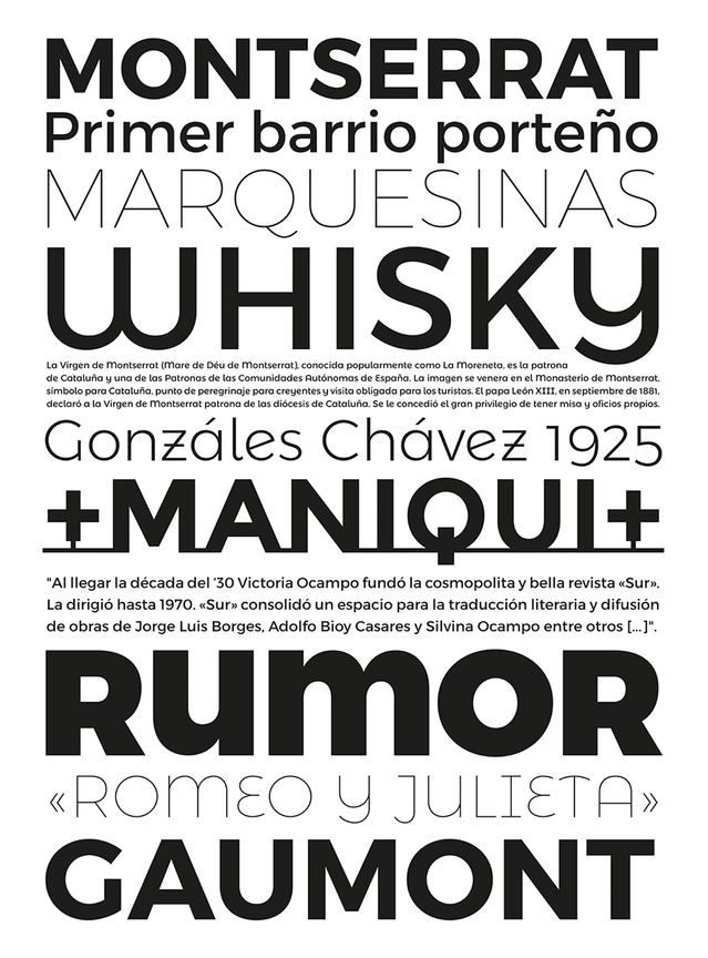
  • Search By Tags

    Type tags separated by commas.
  • Search By Author

Content Type


The Typography.Guru Forums

  • Public Typography Forums
    • Talk
    • Font Identification
    • Font Downloads
  • Exclusive to Members
    • Type Design Forum
    • Letterpress Forum
    • Calligraphy/Lettering Forum
    • Show
    • Internal
    • Coffee Shop

Categories

  • Journal

Categories

  • Artisanal workshops & studios
  • Museums & Libraries
  • Apps
  • Education
  • Organizations
  • Online Typography Resources
  • Educational Video Channels
  • Typography Books
  • Magazines
  • Publishers

Categories

  • Link suggestions
  • Newsletter Archive (1-99)
    • Typography Weekly #1
    • Typography Weekly #2
    • Typography Weekly #3
    • Typography Weekly #4
    • Typography Weekly #5
    • Typography Weekly #6
    • Typography Weekly #7
    • Typography Weekly #8
    • Typography Weekly #9
    • Typography Weekly #10
    • Typography Weekly #11
    • Typography Weekly #12
    • Typography Weekly #13
    • Typography Weekly #14
    • Typography Weekly #15
    • Typography Weekly #16
    • Typography Weekly #17
    • Typography Weekly #18
    • Typography Weekly #19
    • Typography Weekly #20
    • Typography Weekly #21
    • Typography Weekly #22
    • Typography Weekly #23
    • Typography Weekly #24
    • Typography Weekly #25
    • Typography Weekly #26
    • Typography Weekly #27
    • Typography Weekly #28
    • Typography Weekly #29
    • Typography Weekly #30
    • Typography Weekly #31
    • Typography Weekly #32
    • Typography Weekly #33
    • Typography Weekly #34
    • Typography Weekly #35
    • Typography Weekly #36
    • Typography Weekly #37
    • Typography Weekly #38
    • Typography Weekly #39
    • Typography Weekly #40
    • Typography Weekly #41
    • Typography Weekly #42
    • Typography Weekly #43
    • Typography Weekly #44
    • Typography Weekly #45
    • Typography Weekly #46
    • Typography Weekly #47
    • Typography Weekly #48
    • Typography Weekly #49
    • Typography Weekly #50
    • Typography Weekly #51
    • Typography Weekly #52
    • Typography Weekly #53
    • Typography Weekly #54
    • Typography Weekly #55
    • Typography Weekly #56
    • Typography Weekly #57
    • Typography Weekly #58
    • Typography Weekly #59
    • Typography Weekly #60
    • Typography Weekly #61
    • Typography Weekly #62
    • Typography Weekly #63
    • Typography Weekly #64
    • Typography Weekly #65
    • Typography Weekly #66
    • Typography Weekly #67
    • Typography Weekly #68
    • Typography Weekly #69
    • Typography Weekly #70
    • Typography Weekly #71
    • Typography Weekly #72
    • Typography Weekly #73
    • Typography Weekly #74
    • Typography Weekly #75
    • Typography Weekly #76
    • Typography Weekly #77
    • Typography Weekly #78
    • Typography Weekly #79
    • Typography Weekly #80
    • Typography Weekly #81
    • Typography Weekly #82
    • Typography Weekly #83
    • Typography Weekly #84
    • Typography Weekly #85
    • Typography Weekly #86
    • Typography Weekly #87
    • Typography Weekly #88
    • Typography Weekly #89
    • Typography Weekly #90
    • Typography Weekly #91
    • Typography Weekly #92
    • Typography Weekly #93
    • Typography Weekly #94
    • Typography Weekly #95
    • Typography Weekly #96
    • Typography Weekly #97
    • Typography Weekly #98
    • Typography Weekly #99
  • Newsletter Archive (100-199)
    • Typography Weekly #100
    • Typography Weekly #101
    • Typography Weekly #102
    • Typography Weekly #103
    • Typography Weekly #104
    • Typography Weekly #105
    • Typography Weekly #106
    • Typography Weekly #107
    • Typography Weekly #108
    • Typography Weekly #109
    • Typography Weekly #110
    • Typography Weekly #111
    • Typography Weekly #112
    • Typography Weekly #113
    • Typography Weekly #114
    • Typography Weekly #115
    • Typography Weekly #116
    • Typography Weekly #117
    • Typography Weekly #118
    • Typography Weekly #119
    • Typography Weekly #120
    • Typography Weekly #121
    • Typography Weekly #122
    • Typography Weekly #123
    • Typography Weekly #124
    • Typography Weekly #125
    • Typography Weekly #126
    • Typography Weekly #127
    • Typography Weekly #128
    • Typography Weekly #129
    • Typography Weekly #130
    • Typography Weekly #131
    • Typography Weekly #132
    • Typography Weekly #133
    • Typography Weekly #134
    • Typography Weekly #135

Categories

  • Typography Quotes

Categories

  • Typography Videos

Categories

  • Free Font Lists
  • Font alternatives
  • Fonts by topic/style
  • Fonts by region
  • Signage Fonts
  • Fonts by User

Categories

  • Typography Terms Glossary

Categories

  • How to choose and pair fonts
  • Understanding Kerning & Tracking
  • How to use OpenType in InDesign
  • Font Licensing 101
  • How to use color fonts
  • Variable fonts for graphic and web designers
  • Typography on Apple devices

Categories

  • Font List entries

Categories

  • Hall of Fame
    • 2023
    • 2022
    • 2021
    • 2020
    • 2019

Categories

  • Exclusive Content

Calendars

  • Typography Events

Product Groups

  • Community support options

Find results in...

Find results that contain...


Date Created

  • Start

    End


Last Updated

  • Start

    End


Filter by number of...

Joined

  • Start

    End


Group


Job


Location

Found 5 results

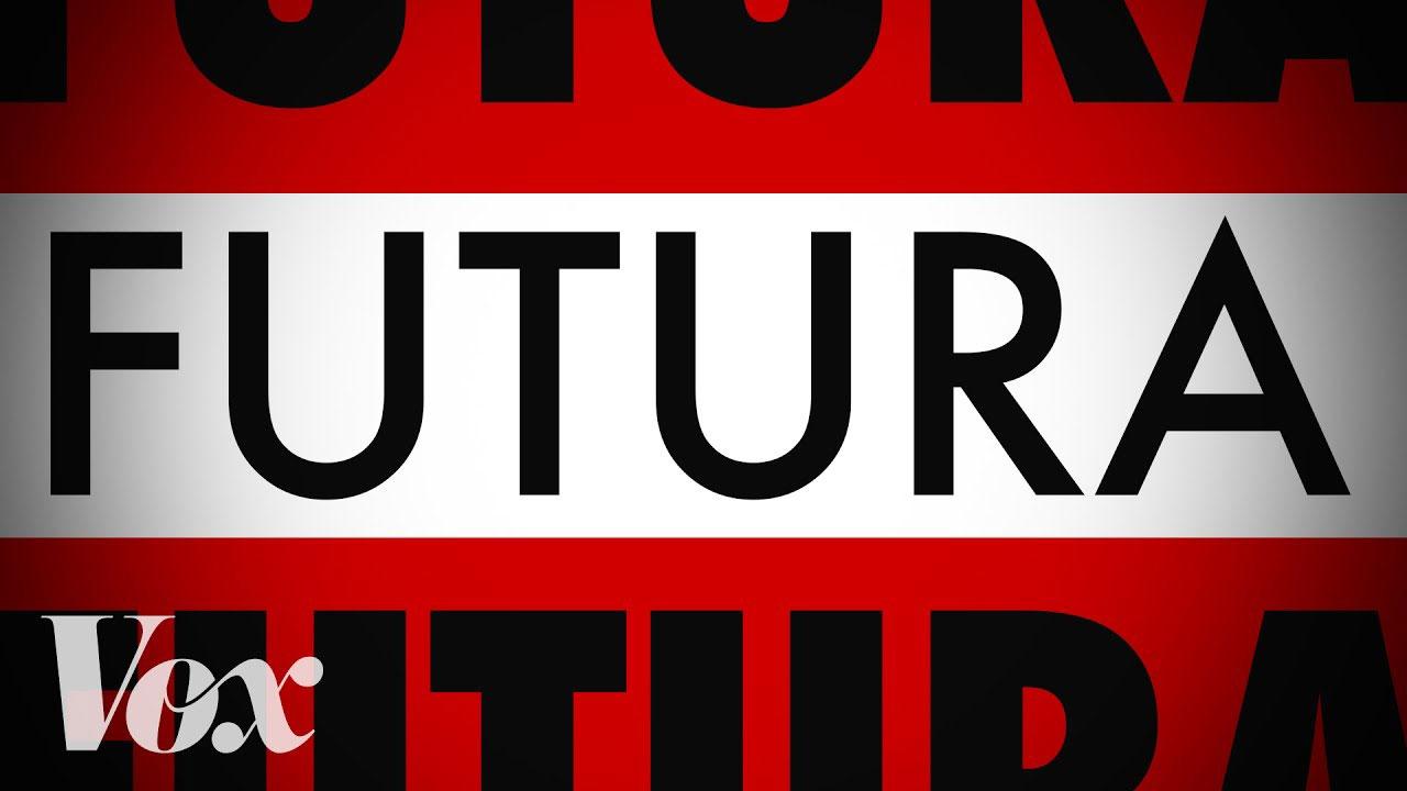
  1. “Futura is familiar. But its journey from avant-garde German type to hipster favorite is unusual.”
  2. Greetings, I'm looking for a font for use of its capital lettering. I have fairly detailed specifications, and I'm beginning to wonder if a font that meets them actually exists. It probably does, but there are so many to sift through I'm starting to lose it. The easiest way I can describe the font, is as being identical to Proba Pro except that all crossbars should be on the same plane. For example, in Proba Pro, the "A" crossbar does not sit at the same elevation as the "B" "R" or "P" crossbar. All other elements of the font are as desired. There are several fonts that meet the crossbar requirement, such as ITC Avant Garde Gothic but the "C" letter does not posses angled ends (they parallel the horizontal, which I do not want). I've found a couple of others that also meet the crossbar requirement, but they have pointed ends, such as a pointed apex in their "A." I received assistance in identifying a font here but it turned out that all crossbars were not on the same horizontal, which was not evident until the font was identified and I was able to inspect additional lettering. I'm thankful for any assistance. Edit: Some additional specifications: Should be geometric, no rounded edges anywhere The "G" should not have a drop-bar at the end. The presence of a drop bar causes the "G" to resemble an arrow, which can be distracting, so this arrow effect must be avoided The lower right leg on the "R" should be straight, and should rest flat on the lower plane The "G" should have an inner bar The font should have a "feminine" feel (this is subjective and will depend heavily on font weight, but I thought I would throw it out there) If there are any other specification questions that you need answered in order to assist, please post them and I'll answer. I'll update this list as things pop into my head. I'm still sifting through fonts, going cross-eyed, etc. Thanks.
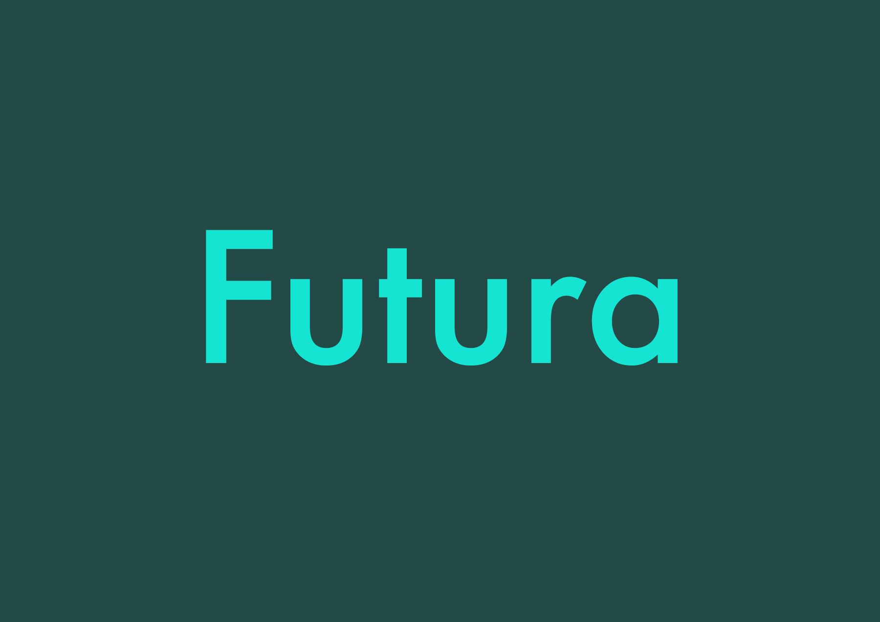
  3. Recommendable typefaces as alternatives to Futura. The typefaces presented here can be seen as belonging to the same classification category as Futua (“geometric sans serif”), but each have their own look, aren’t overused (yet) and are chosen because of their overall quality.
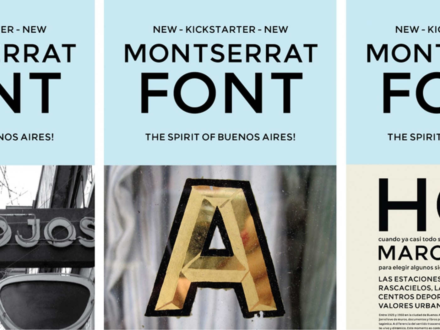
  4. Montserrat is a “libre sans text typeface for the web, inspired by the signage found in a historical neighborhood of Buenos Aires” designed by Julieta Ulanovsky in 2011 thanks to a successful Kickstarter campaign. Montserrat enjoyed a certain success as a Google webfont (due, in part, to the superficial resemblance to Gotham of its uppercase) and, while the original design was limited in scope, in time it grew fairly extensive in styles and weights. For this last reason, and as suggested by @Ralf Herrmann, I wanted to add it to my list of good free display type families. However, when it came to insert a link that could offer an overview of all the different options, I was unable to find anything suitable. The official website hasn’t proved very helpful in this regard either, so I will list here all the styles and weights of Montserrat available to download and/or as webfonts. On Google Fonts: Montserrat Normal 400 and Bold 700 Montserrat Alternates Normal 400 and Bold 700 Montserrat Subrayada Normal 400 and Bold 700 (an architectural “underlined” caps only variant) On Fontsquirrell: Montserrat, eight weights, from Hairline to Black (the Ultralight, Semi Bold, and Extra Bold contain the Alternates as proper OpenType feature, none of the weights include the Subrayada variant) On Brick (webfonts only): Montserrat, nine weights, from 100 to 900 (it’s sometimes difficult to see a difference between the closest weights) Furthermore, there are some non-free styles and weights, featuring an extended Latin coverage, available directly from the designer upon request.
  5. Typefaces such as ITC Bauhaus, Blippo or Pump are geometric, but they are not really related to the Bauhaus school. This lists collects typefaces, which are actually connected to the Bauhaus, either because they were used there (such as Scheltersche Grotesk/FF Bau) or are modern interpretations based on work done at the Bauhaus.
Iwan Reschniev: a typeface based drawings by Jan Tschichold
×
×
  • Create New...

Important Information

We are placing functional cookies on your device to help make this website better.