Search the Community
Showing results for tags 'list'.
Found 20 results
-
The website wants to be a resource for designers and typographers. It has started as a list of type foundries, but aims to provide more typographic resources.
-
 Thousand of freeware fonts are available today. Here are some which are actually recommendable in the category “serif”. They have a sufficient number of styles, a sufficient (Latin) character set and an acceptable stylistic and technical quality.
 -
 Thousand of freeware fonts are available today. Here are some which are actually recommendable in the category “sans serif”. They have a sufficient number of styles, a sufficient (Latin) character set and an acceptable stylistic and technical quality.
- 7 comments
-
- 2
-

-
- download
- opensource
- (and 2 more)
-
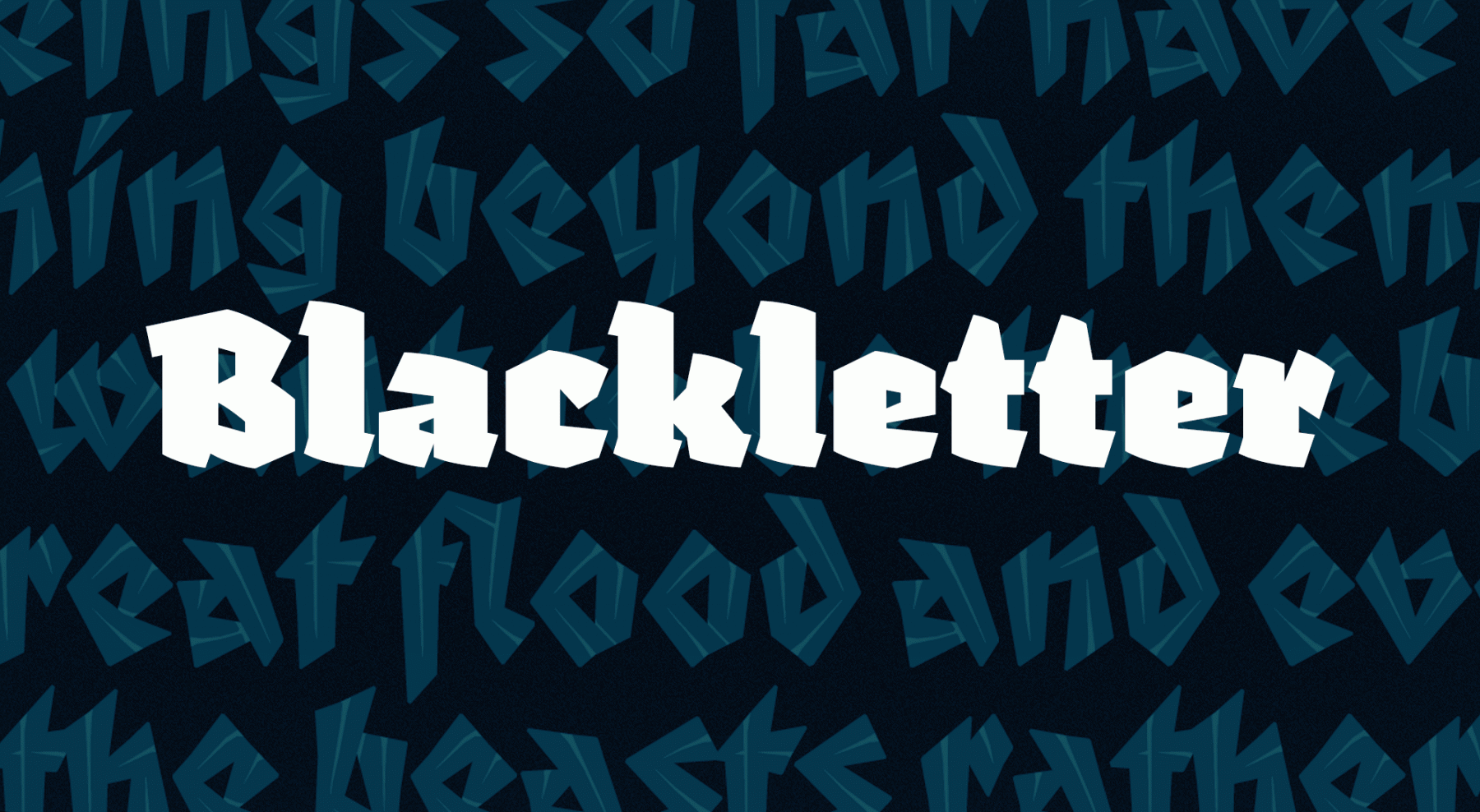 Modern blackletter typefaces or reinterpretations with a contemporary feel.
- 4 comments
-
- 1
-

-
- list
- blackletter
- (and 2 more)
-
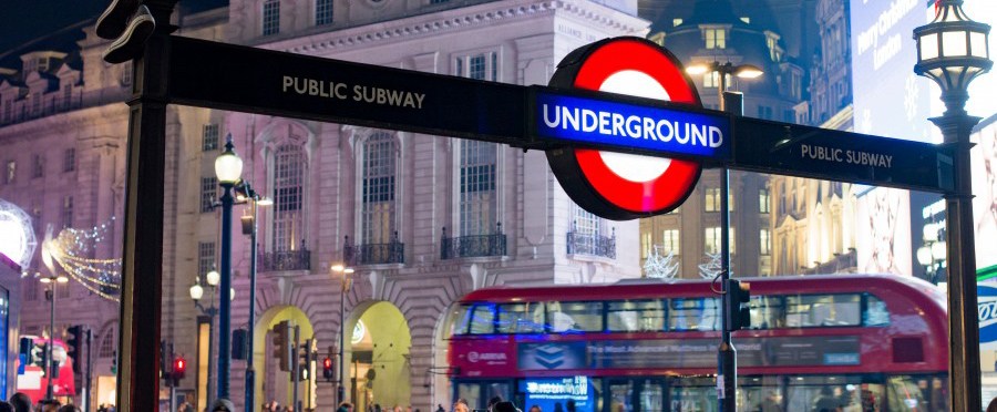 A selection of fonts usually connected with Great Britain.
 -
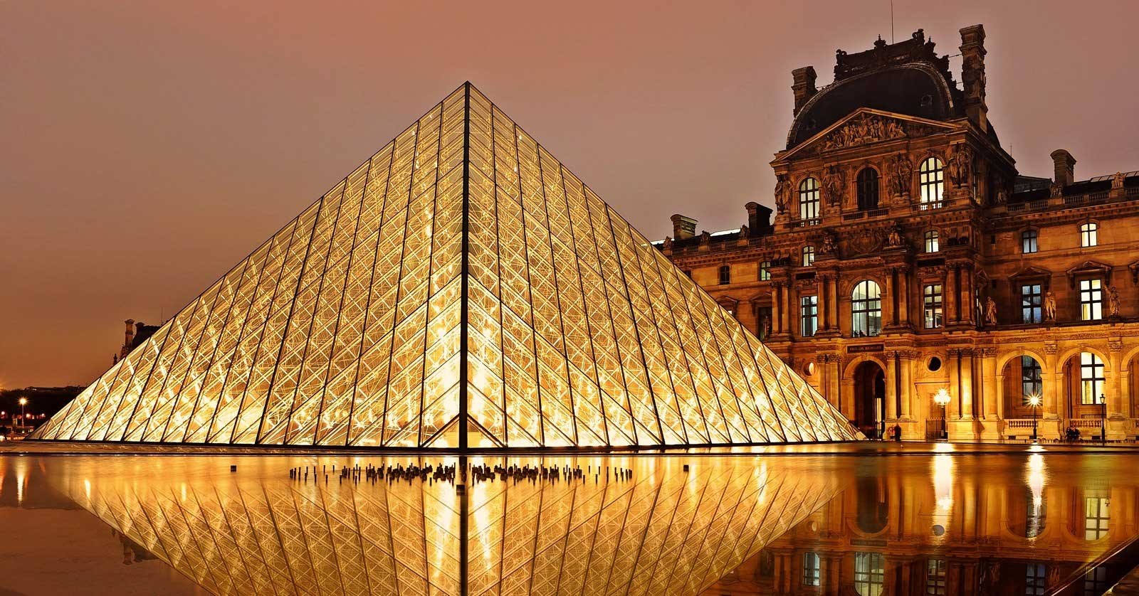 A list of well-known type designs with a connection to France.
 -
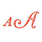
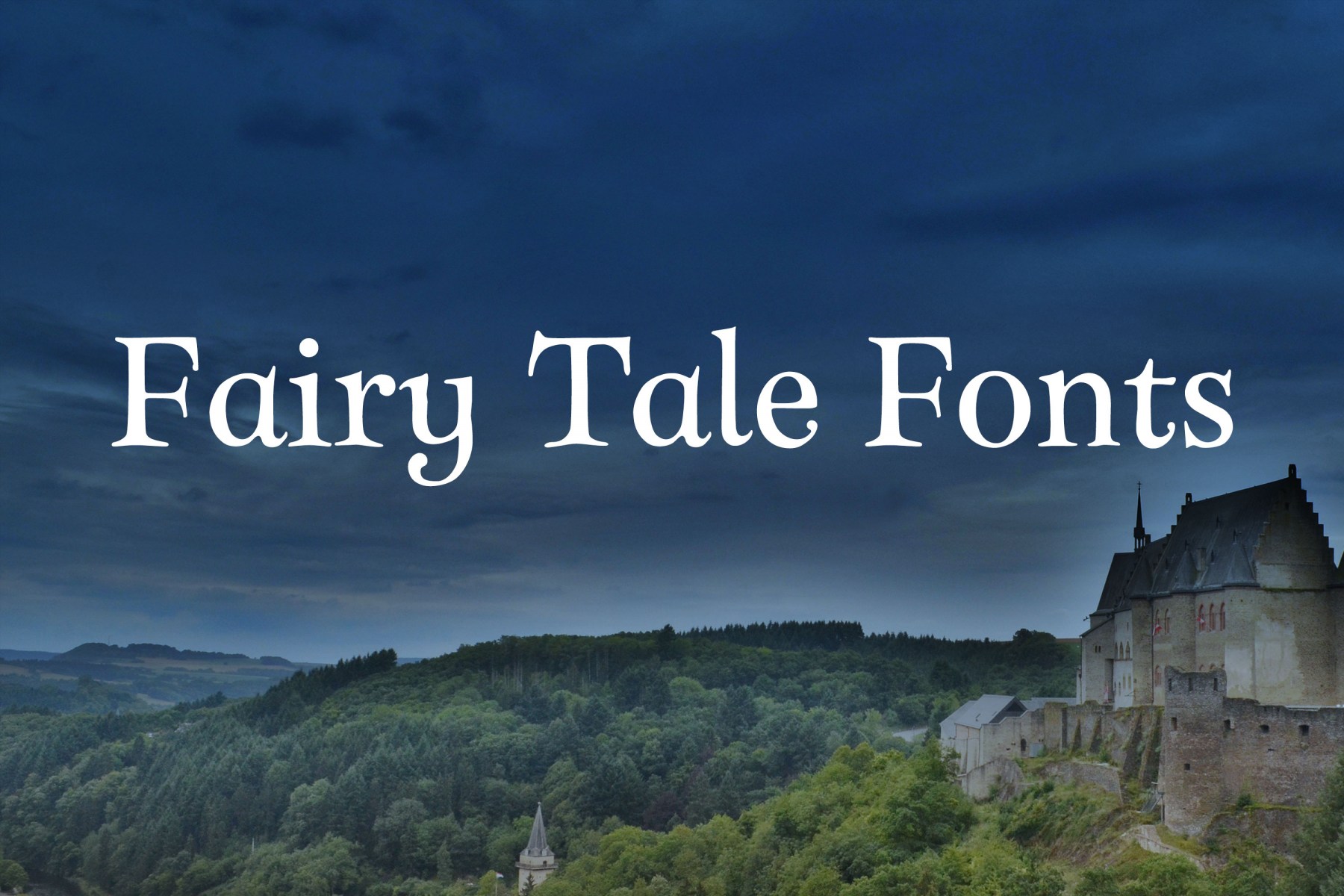 A selection recommendable decorative fonts suitable for things like fairytale book covers.
 -
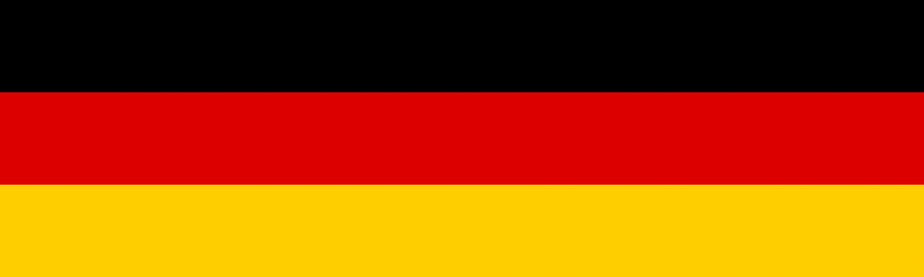 A collection of recommendable typeface with a connection to Germany.
 -
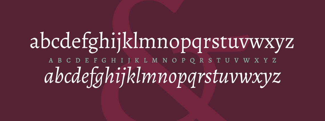
 Recommendable free slab-serif type families.
 -
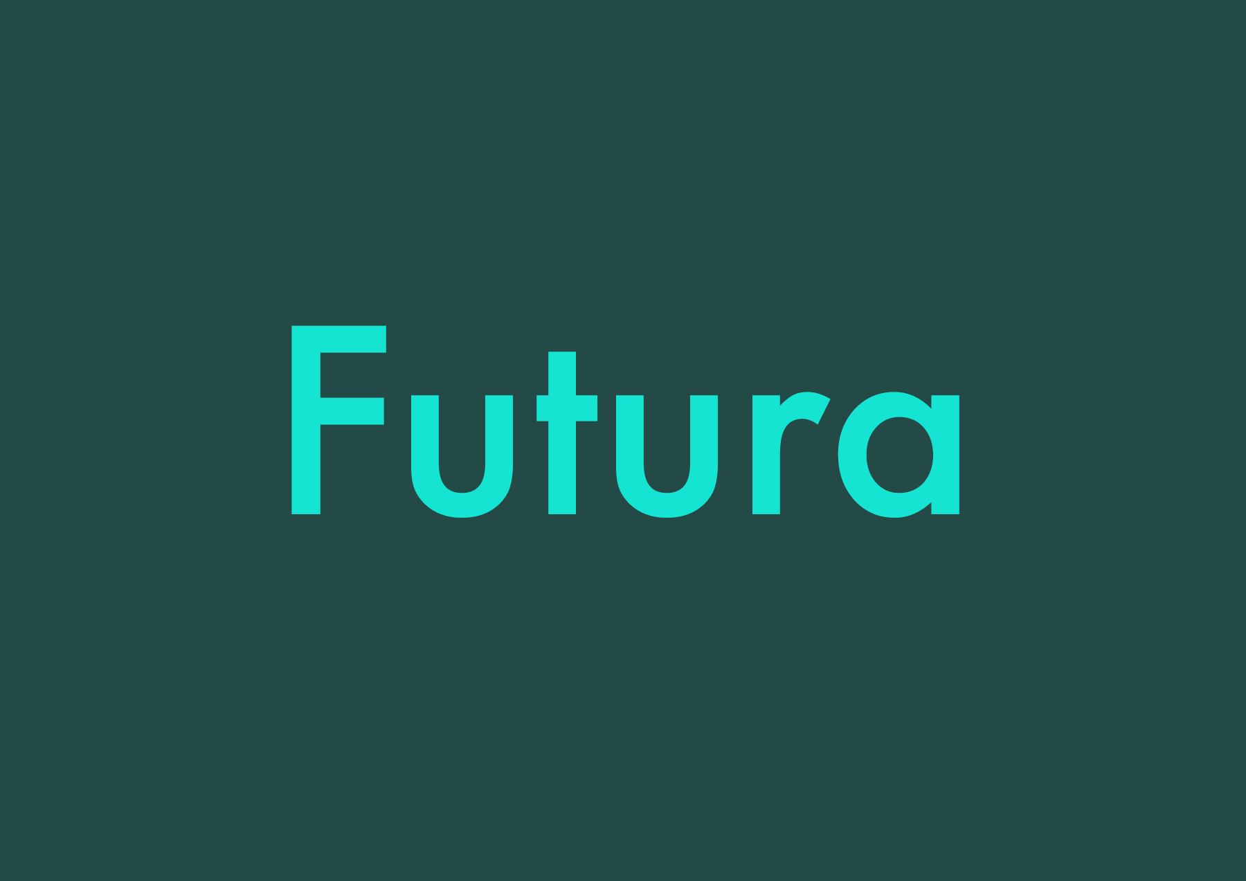 Recommendable typefaces as alternatives to Futura. The typefaces presented here can be seen as belonging to the same classification category as Futua (“geometric sans serif”), but each have their own look, aren’t overused (yet) and are chosen because of their overall quality.
 -
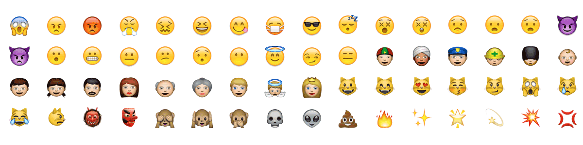 Unicode-encoded fonts with support for typical Emoji characters.
 -
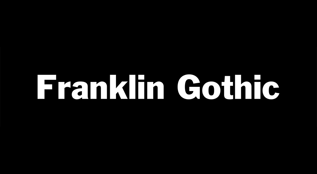 Recommendable typefaces as alternatives to Franklin Gothic—designed by Morris Fuller Benton. The typefaces presented here can be seen as belonging to the same classification category as Franklin Gothic (“grotesque sans serif”), but each have their own look, aren’t overused (yet) and are chosen because of their overall quality.
- 4 comments
-
- 2
-
-
- list
- franklin gothic
- (and 2 more)
-
 Recommendable typefaces as alternatives to Gill Sans—designed by Eric Gill. The typefaces presented here can be seen as belonging to the same classification category as Gill Sans (“humanist sans serif”), but each have their own look, aren’t overused (yet) and are chosen because of their overall quality.
 -
 Recommendable typefaces with the appearance of rough brush lettering.
 -
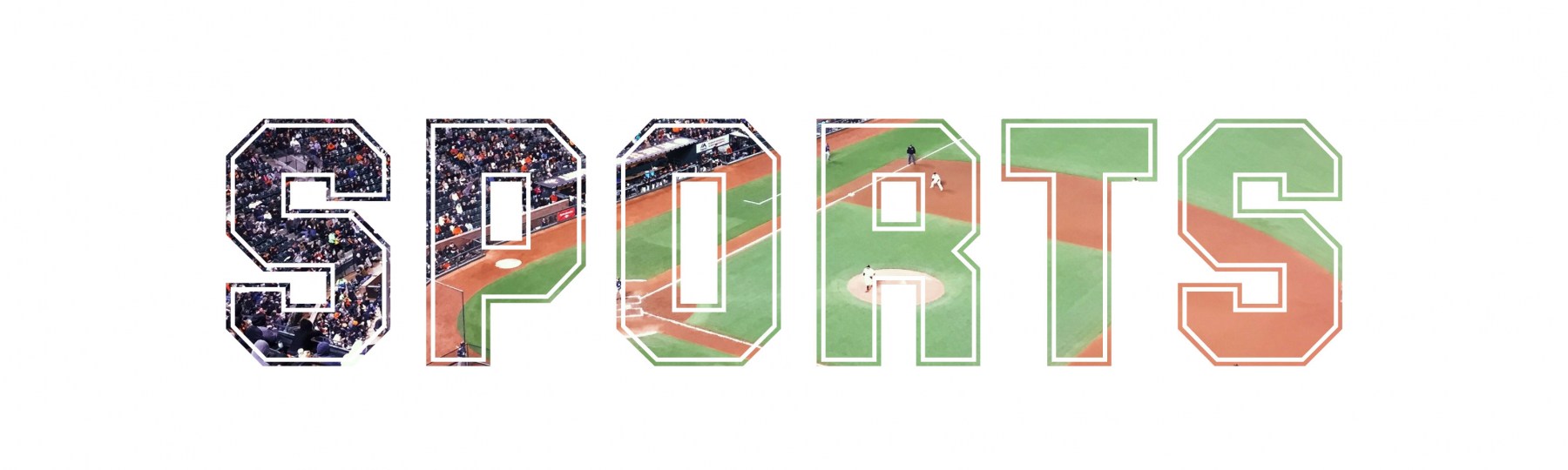 Fonts with a chunky, masculine appearance, which can be used for sports teams, college t-shirts and things like that.
 -
 Typefaces which are equipped with multiple layer fonts to be stacked on top of each other to create a multi-color effect.
 -
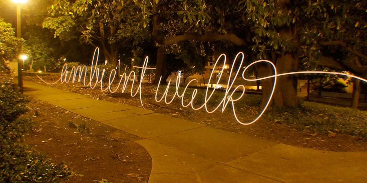 Ten recommendable script typefaces with a monolinear look.
 -
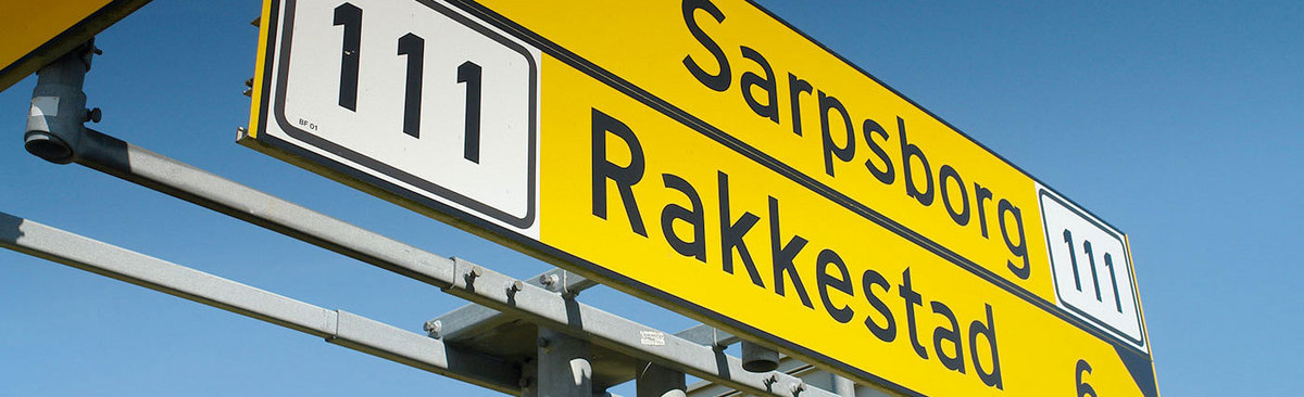 Typefaces used for national road signs.
 -
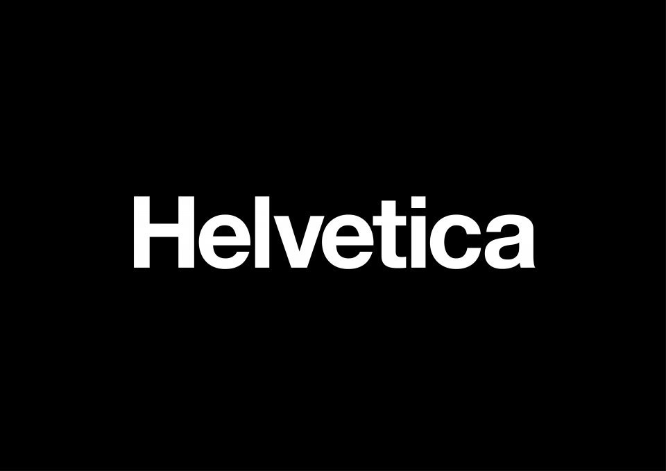 Recommendable typefaces as alternatives to the overused Helvetica. The typefaces presented here can be seen as belonging to the same classification category as Helvetica (“static sans serif”), but each have their own look and are chosen because of their overall quality (design, number of styles, glyphs and so on). Fonts which are directly related to Helvetica (e.g. Nimbus Sans, Neue Haas Grotesk) or are very similar in their design are deliberately left off the list. It’s about alternatives, not look-alikes.
 -
 Typefaces such as ITC Bauhaus, Blippo or Pump are geometric, but they are not really related to the Bauhaus school. This lists collects typefaces, which are actually connected to the Bauhaus, either because they were used there (such as Scheltersche Grotesk/FF Bau) or are modern interpretations based on work done at the Bauhaus.