Jump to content
A monospaced type family with an editorial state of mind.

Search the Community

Showing results for tags 'italic'.

  • Search By Tags

    Type tags separated by commas.
  • Search By Author

Content Type


The Typography.Guru Forums

  • Public Typography Forums
    • Talk
    • Font Identification
    • Font Downloads
  • Exclusive to Members
    • Type Design Forum
    • Letterpress Forum
    • Calligraphy/Lettering Forum
    • Show
    • Internal
    • Coffee Shop

Categories

  • Artisanal workshops & studios
  • Museums & Libraries
  • Apps
  • Education
  • Organizations
  • Online Typography Resources
  • Educational Video Channels
  • Typography Books
  • Magazines
  • Publishers

Categories

  • Link suggestions
  • Newsletter Archive (1-99)
    • Typography Weekly #1
    • Typography Weekly #2
    • Typography Weekly #3
    • Typography Weekly #4
    • Typography Weekly #5
    • Typography Weekly #6
    • Typography Weekly #7
    • Typography Weekly #8
    • Typography Weekly #9
    • Typography Weekly #10
    • Typography Weekly #11
    • Typography Weekly #12
    • Typography Weekly #13
    • Typography Weekly #14
    • Typography Weekly #15
    • Typography Weekly #16
    • Typography Weekly #17
    • Typography Weekly #18
    • Typography Weekly #19
    • Typography Weekly #20
    • Typography Weekly #21
    • Typography Weekly #22
    • Typography Weekly #23
    • Typography Weekly #24
    • Typography Weekly #25
    • Typography Weekly #26
    • Typography Weekly #27
    • Typography Weekly #28
    • Typography Weekly #29
    • Typography Weekly #30
    • Typography Weekly #31
    • Typography Weekly #32
    • Typography Weekly #33
    • Typography Weekly #34
    • Typography Weekly #35
    • Typography Weekly #36
    • Typography Weekly #37
    • Typography Weekly #38
    • Typography Weekly #39
    • Typography Weekly #40
    • Typography Weekly #41
    • Typography Weekly #42
    • Typography Weekly #43
    • Typography Weekly #44
    • Typography Weekly #45
    • Typography Weekly #46
    • Typography Weekly #47
    • Typography Weekly #48
    • Typography Weekly #49
    • Typography Weekly #50
    • Typography Weekly #51
    • Typography Weekly #52
    • Typography Weekly #53
    • Typography Weekly #54
    • Typography Weekly #55
    • Typography Weekly #56
    • Typography Weekly #57
    • Typography Weekly #58
    • Typography Weekly #59
    • Typography Weekly #60
    • Typography Weekly #61
    • Typography Weekly #62
    • Typography Weekly #63
    • Typography Weekly #64
    • Typography Weekly #65
    • Typography Weekly #66
    • Typography Weekly #67
    • Typography Weekly #68
    • Typography Weekly #69
    • Typography Weekly #70
    • Typography Weekly #71
    • Typography Weekly #72
    • Typography Weekly #73
    • Typography Weekly #74
    • Typography Weekly #75
    • Typography Weekly #76
    • Typography Weekly #77
    • Typography Weekly #78
    • Typography Weekly #79
    • Typography Weekly #80
    • Typography Weekly #81
    • Typography Weekly #82
    • Typography Weekly #83
    • Typography Weekly #84
    • Typography Weekly #85
    • Typography Weekly #86
    • Typography Weekly #87
    • Typography Weekly #88
    • Typography Weekly #89
    • Typography Weekly #90
    • Typography Weekly #91
    • Typography Weekly #92
    • Typography Weekly #93
    • Typography Weekly #94
    • Typography Weekly #95
    • Typography Weekly #96
    • Typography Weekly #97
    • Typography Weekly #98
    • Typography Weekly #99
  • Newsletter Archive (100-199)
    • Typography Weekly #100
    • Typography Weekly #101
    • Typography Weekly #102
    • Typography Weekly #103
    • Typography Weekly #104
    • Typography Weekly #105
    • Typography Weekly #106
    • Typography Weekly #107
    • Typography Weekly #108
    • Typography Weekly #109
    • Typography Weekly #110
    • Typography Weekly #111
    • Typography Weekly #112
    • Typography Weekly #113
    • Typography Weekly #114
    • Typography Weekly #115
    • Typography Weekly #116
    • Typography Weekly #117
    • Typography Weekly #118
    • Typography Weekly #119
    • Typography Weekly #120
    • Typography Weekly #121
    • Typography Weekly #122
    • Typography Weekly #123
    • Typography Weekly #124
    • Typography Weekly #125
    • Typography Weekly #126
    • Typography Weekly #127
    • Typography Weekly #128
    • Typography Weekly #129
    • Typography Weekly #130
    • Typography Weekly #131
    • Typography Weekly #132
    • Typography Weekly #133
    • Typography Weekly #134
    • Typography Weekly #135
    • Typography Weekly #136

Categories

  • Free Font Lists
  • Font alternatives
  • Fonts by topic/style
  • Fonts by region
  • Signage Fonts
  • Fonts by User

Categories

  • How to choose and pair fonts
  • Understanding Kerning & Tracking
  • How to use OpenType in InDesign
  • Font Licensing 101
  • How to use color fonts
  • Variable fonts for graphic and web designers
  • Typography on Apple devices

Categories

  • Hall of Fame
    • 2023
    • 2022
    • 2021
    • 2020
    • 2019

Find results in...

Find results that contain...


Date Created

  • Start

    End


Last Updated

  • Start

    End


Filter by number of...

Joined

  • Start

    End


Group


Job


Location

Found 2 results

  1. I've recently published PART 2 of the instructional study dedicated to Serbian Cyrillic. It deals with true italic forms and completes the topic, which started with PART 1 (upright forms): https://nostalgicdolphin.com/blog-post-3/ If you find it useful, please share it on your type-focused web channels, to reach as many of our colleagues as possible. Cheers! —I
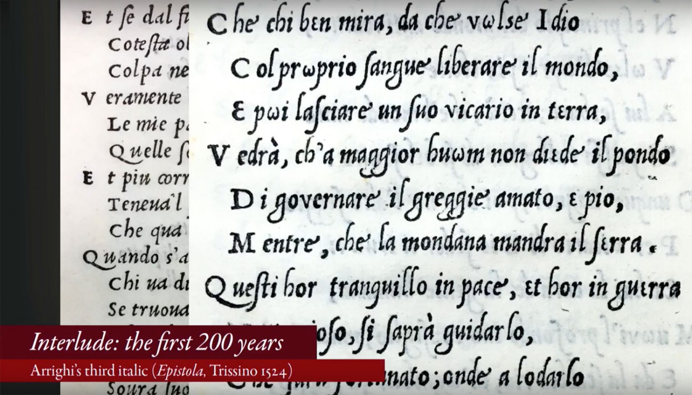
  2. Soon after the invention of upright roman type, an interloper entered the arena—italic. Rather than displacing roman, it wound its way into our typographic culture, becoming an essential part of languages that use the Latin script. Our written communication depends on it, yet in all the books that have been written about type design there are often only a handful of pages about this essential style. This talk will explore the roles italic plays in our typographic culture: as a language feature, a typographic element, a historical marker, a design object, and a business product. These roles have shaped the design of italic and inspired innovation and creativity. But they have also often forced italic into a subservient position. What is the essence of italic? Has that identity survived its use as a secondary complement to roman? Is it possible that this servitude has given italic the freedom to flourish? This is the story of how italic established itself as part of our typographic language, was transformed as it was relegated to secondary roles, and yet remains a strong and essential part of typeface design.
Download the blackletter font FDI Wiking for free …
×
×
  • Create New...

Important Information

We are placing functional cookies on your device to help make this website better.