Search the Community
Showing results for tags 'video'.
-

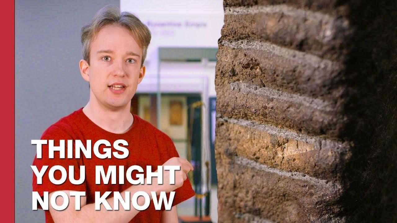
Hiding in Plain Sight: The Story Behind the Mysterious ¤ Symbol
Ralf Herrmann posted a news entry in Typography Weekly #131
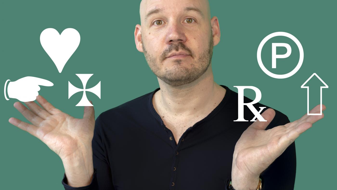
 It’s in almost every font, but hardly any font user knows what it is used for. Explaining the ¤ symbol.
 -
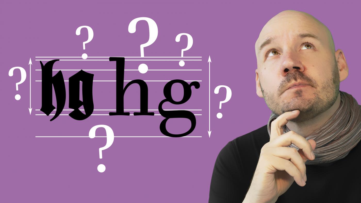
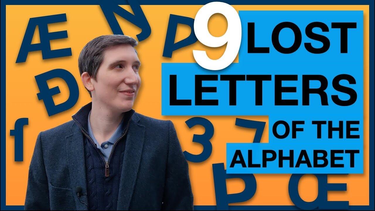 “Thorn, eth, yogh, wynn, ash, ethel, eng, long S & the Tironian et. This video takes you on a tour of the letters we don't use anymore.”
 -
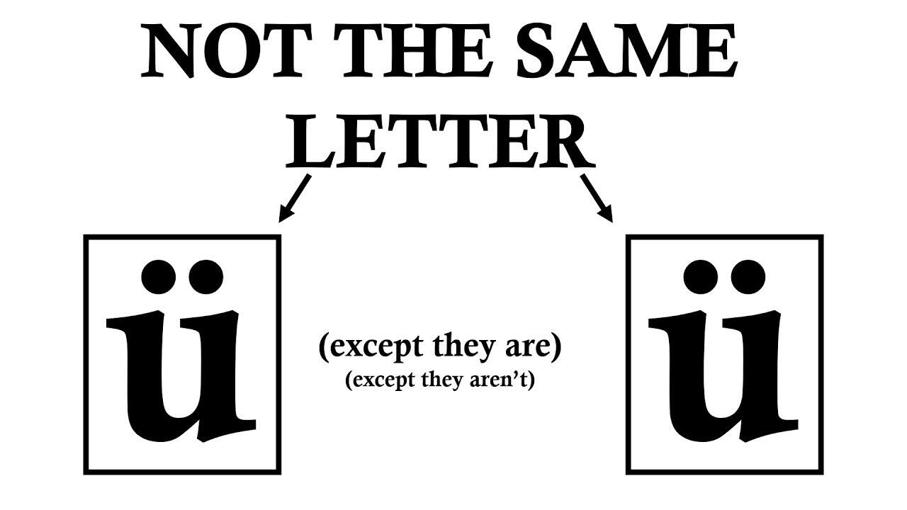 A vowel with two dots above it can have two completely independent meanings. This video explains why.
 -

 An interesting, if limited, look “from outside”.
 -
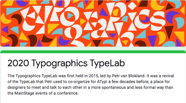 “This year's Typographics TypeLab will be held online and run June 18, 19, 20 around the clock, with designers from around the world participating. We'll be using Zoom and livestream most sessions by YouTube. There will be parallel tracks to allow for more people to present. The organizing team would like to invite you to consider joining in by presenting on a topic related to Type.”
 -
Video series by Lynne Yun on the History of the Latin Alphabet
Ralf Herrmann posted a news entry in Typography Weekly #101
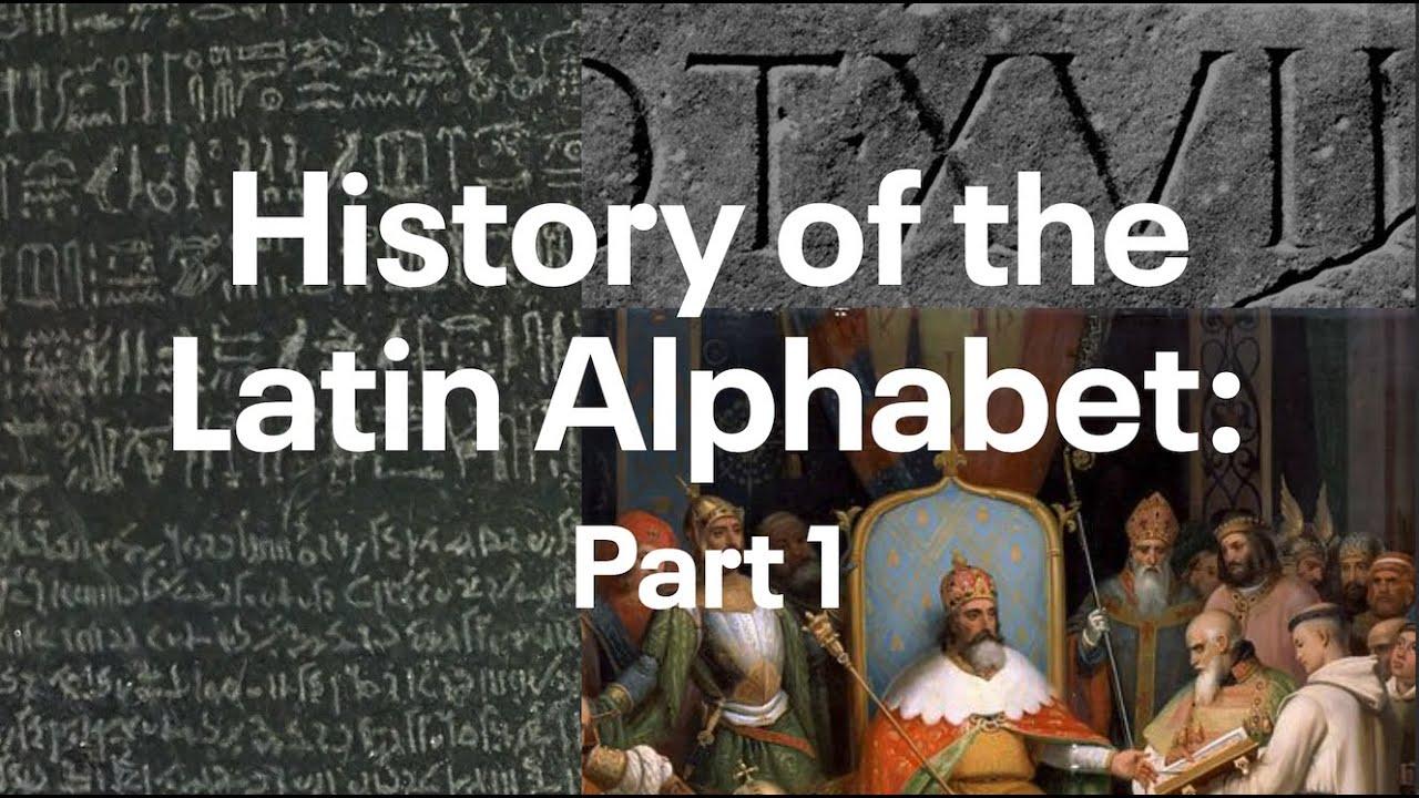 Lynne Yun is a NYC-based type designer and educator who specializes in typography, hand lettering, and calligraphy. On her YouTube channel she published a six-part series about the Latin script.
 -
 In this episode we explore the meaning and the roots of “font size” or “type size”.
 -
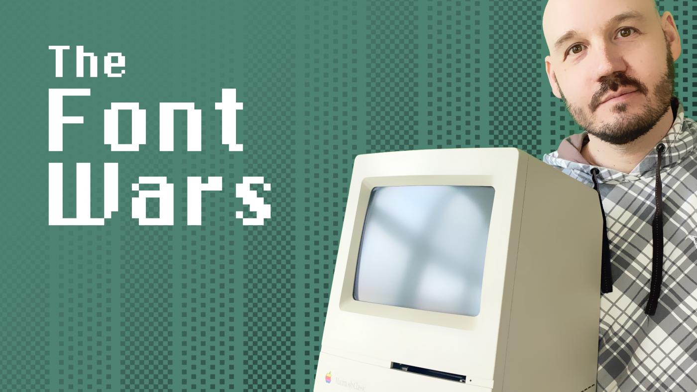 A look back at the 1980s and 1990s when a new computer-based design industry was built around the Macintosh and companies like Adobe, Apple and Microsoft moved from bitmap to vector fonts.
 -
How to find fonts that include specific characters
Ralf Herrmann posted a video in Typography Videos
 When you work with text on a computer, you can easily get into the situation, that you need to use a certain character, but you don’t know which of your fonts support this character. So what do you do? Just try out every font one by one? Well, let’s look at a few ways to do this a little bit more efficiently. From the Typography.Guru YouTube Channel ☞ https://www.youtube.com/c/typographyguru
 -
Jessica Hische is a letterer and illustrator working in San Francisco. She is teaching online classes and workshops on Skillshare, for example: Logotype Masterclass with Jessica Hische Lettering for Designers: One Drop Cap Letterform at a Time Illustrated Lettering: Design a Book Cover with Jessica Hische
-
The Type Directors Club is an international membership organization welcoming everyone who is devoted to excellence in typography. It holds an annual typography and design competition and provides scholarships to encourage the next generation of type designers. The TDC YouTube channels contains recordings of talks of interviews.
-
Typography.Guru YouTube channel
Ralf Herrmann posted a directory entry in Educational Video Channels
The Typography.Guru YouTube channel is a side project of this community website, where the owner of Typography.Guru publishes (usually short) educational typography videos. -
The ATypI or Association Typographique Internationale (the International Typography Association) is an international non-profit organisation dedicated to typography and type design. The primary activity of the association is an annual fall conference, held in a different global city each year. Recordings of interviews and the conference talks are regularly posted on YouTube.
-
The Continuing Education Department of The Cooper Union, in conjunction with the Type Directors Club, offers a Postgraduate Certificate in Typeface Design. Industry professionals lead a highly focused and comprehensive study of key typeface design principles: technique, technology, aesthetics, expression, history, and theory. A series of guest lectures round out the curriculum, allowing students deeper insight into specific relevant topics. Type@Cooper’s Vimeo channel presents recordings of these lectures as well as conference talks from the Typographics conference.
-
I noticed that the number of institutions, conferences, and individuals that regularly produce type-related video content has increased lately. I don’t know if it deserves a spot in the directory, or a subsection of the video listing, but I think it would be handy having a list of typography related video channels. These are mostly on Youtube, but some are also on Vimeo or other platforms. Here is a first batch, feel free to add your findings: Typography.Guru, irregular short educational content. ATypI, videos of the talks from the annual conferences of the Association Typographique Internationale. Type Directors Club, various videos related to TDC’s activity. Type@Cooper, historical and educational videos. Typographics, videos from the newish New York City type festival. Thomas Jockin, in depth analysis of various typefaces. Typographische Gesellschaft München, various videos from tgm’s events (many in German as well as English).
-
 ᚛ᚈᚑᚋ ᚄᚉᚑᚈᚈ᚜ and ᚛ᚑᚌᚐᚋ᚜ Ogham is an old Irish script made by carving notches into stones. It fell out of use more than a millennium ago—but it's an interesting exception to a linguistics and computer-science rule that I'd never even realised existed. Let's talk about the Ogham Space Mark.
 -
Originally recommended by @Riccardo Sartori, here is a version without geo-blocking. Not sure how long it will stay online though.
-
 This talk took place on April 3, 2018 in the Rose Auditorium at The Cooper Union as part of Type@Cooper's Herb Lubalin Lecture Series. We are grateful to Hoefler & Co. for their generous support to archive this lecture series. The world of German typefaces in the first half of the 20th century was incomparably rich, though not as widely known as it deserves. Most of the focus has been on the work of Rudolf Koch and the raft of geometric sans serifs that proliferated in the 1920s in the wake of the Bauhaus. Of the many schriftkunstlers—Georg Belwe, F.H. Ehmcke, F.W. Kleukens, Walter Tiemann, and E.R. Weiss—whose work dominated German typography and book design at the time, the one most deserving of rediscovery is F.H. Ernst Schneidler (1882–1956). Schneidler studied architecture at the Kunstgewerbeschule Düsseldorf under Peter Behrens and was later a student of Ehmcke’s. From 1920 until 1949 he was the director of the Department of Graphic Arts and Book Design at the Württembergische Staatliche Kunstgewerbeschule in Stuttgart. The program that he created provided an alternative to the crafts expressionism of Koch’s Offenbacher Werkstatt and the modernism of the Bauhaus, emphasizing a broad experimentation that encompassed calligraphy, typography, title page design, monogram and logo design, and book illustration. A sampling of the work that Schneidler and his students did between 1922 and 1935 was gathered into a four-volume portfolio entitled Der Wassermann (1945). His teaching was influential with a number of his students going on to become noted calligraphers and/or type designers in their own right, chief among them Georg Trump, Imre Reiner, Walter Brudi and Albert Kapr. Schneidler’s output as a type designer is not only varied, but fascinating for its reinterpretation of traditional forms. His twenty-one typefaces include a range of blackletters as well as several romans, a script and some designs that are hard to classify. His most famous design is undoubtedly Legende, though Schneidler Initials and Schneidler Mediaeval have had their adherents. This talk will survey all of Schneidler’s type designs, both issued and unissued, in the context of their time.
 -
 This talk took place in the Rose Auditorium at The Cooper Union on November 27, 2017 as part of Type@Cooper's Herb Lubalin Lecture Series. This recording is made possible with generous support from Hoefler & Company. The invention of printing with movable types took place in the mid-fifteenth century, and from the very beginning the challenge was not just producing multiples of texts, but to do so in an attractive and convincing manner. How did the early printers accomplish this so successfully, and in what ways did the process evolve? Letterpress remained a dominant printing process through much of the 1970s and is undergoing a renaissance today. In what ways did 'modern' technology affect the manufacture of metal printing type, and will such types continue to be developed and produced? Raymond 'Stan' Nelson is a practicing punchcutter, typefounder, and letterpress printer who had the great good fortune to work in the Graphic Arts Collection at the Smithsonian's National Museum of American History from 1972 to 2003, and continues to serve there as a Museum Specialist Emeritus. Stan's extensive knowledge of printing and typefounding history, as well as over forty years of practical experience with the oldest technologies for making printing types, gives him a unique perspective when examining the tools and methods connected with the production of metal letter. Stan can be seen making type in videos available on YouTube, as well as in the BBC production The Machine that Made Us, hosted by Stephen Fry.
 -
 The proliferation of 19th (and 20th) century wood type and its impact on typographic norms, with David Shields Throughout the nineteenth (and early twentieth) century the proliferation of wood type played an integral role in the creation of American visual culture. With the introduction in 1827 of innovative production techniques, affording low cost and the proliferation of a wide range of styles and sizes, wood type gave tremendous impetus to job printing and mass advertising. David Shields is an Associate Professor and Chair of the Department of Graphic Design at Virginia Commonwealth University in Richmond. David is currently focusing his research on 19th century typographic form and visual culture arising from investigations of Rob Roy Kelly’s American Wood Type Collection. He keeps a slow blog of his research at Wood Type Research.
 -
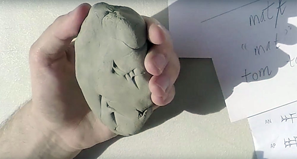 Dr Irving Finkel of the British Museum shows Matt and Tom how to write cuneiform on a clay tablet.
 -
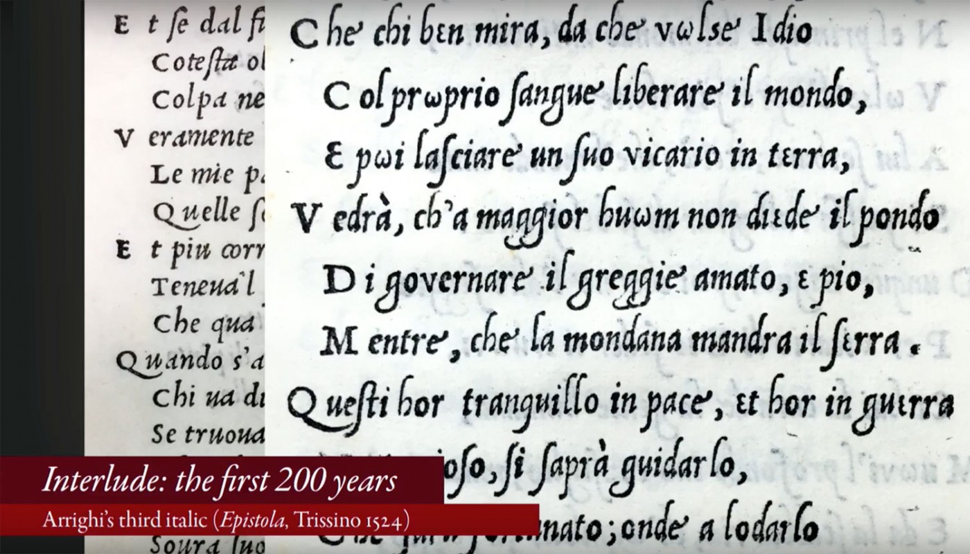 Soon after the invention of upright roman type, an interloper entered the arena—italic. Rather than displacing roman, it wound its way into our typographic culture, becoming an essential part of languages that use the Latin script. Our written communication depends on it, yet in all the books that have been written about type design there are often only a handful of pages about this essential style. This talk will explore the roles italic plays in our typographic culture: as a language feature, a typographic element, a historical marker, a design object, and a business product. These roles have shaped the design of italic and inspired innovation and creativity. But they have also often forced italic into a subservient position. What is the essence of italic? Has that identity survived its use as a secondary complement to roman? Is it possible that this servitude has given italic the freedom to flourish? This is the story of how italic established itself as part of our typographic language, was transformed as it was relegated to secondary roles, and yet remains a strong and essential part of typeface design.
 -
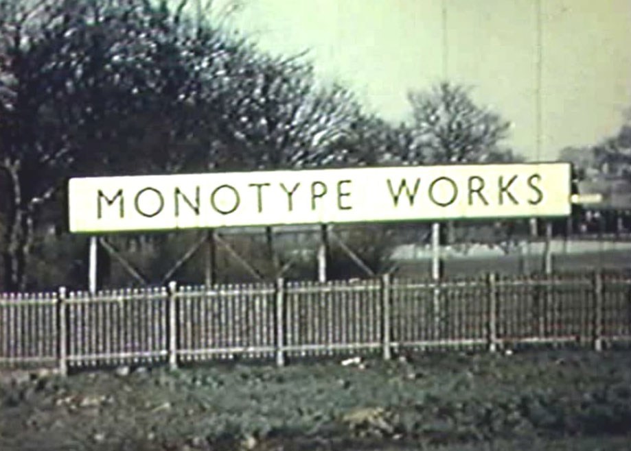 The Monotype is a wonder of mechanics and engineering and in this film you will see the process of manufacturing the Monotype from beginning to end. The film starts by showing the Salfords, UK train station and entrance into the Monotype factory, then shows all of the milling, drilling, cutting, and casting required to make the casting machine. After that, we see the keyboard and paper-punch apparatus being constructed. The film ends with footage of testing and calibrating the machine and images of the Monotypes being shipped all over the world.
 -
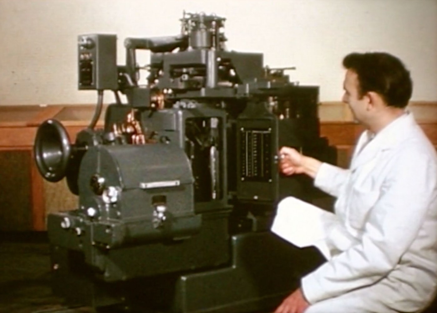 Learn all about the ‘Monophoto’ Filmsetter from Monotype. This machine attempts to bridge the gap in typesetting from the hot metal machines to the “new and exciting” world of photo typesetting. The Monophoto machine is a casting machine that uses a photographic process to set type instead of the old, hot-metal process from the past. Using light-sensitive paper, a photographic lens, and photo type matrices, the Monotype casts type that can be used for offset printing.
 -
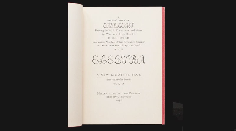 This talk took place on June 20, 2017 at the Koret Auditorium at the San Francisco Public Library as part of Type@Cooper West's Letterform Lecture Series W. A. Dwiggins and Linotype’s Chauncey Griffith developed an affectionate and productive partnership that lasted for nearly thirty years. Dwiggins first drew the sans-serif Metro (1929), intended to be Linotype's answer to Futura, Gill Sans, and Kabel; Metro faded from the scene here in the U.S. but continued to be used in U.K. newspaper into the 1970s. Spurred by his deep interest in book design, Dwiggins next produced the tour de force text types Electra (1935) and Caledonia (1939), which have been used to produce countless thousands of books up to the present day. As his next assignments Dwiggins — the virtuoso user of stencils for illustration and decoration — created an elaborate suite of decorative units called Caravan, which could be used as single glyphs or combined in myriad ways to create lines and fields of decoration. (Prior to its commercial release, this design had the working title, “Chinese Spinach”!) Returning once again to text types, Dwiggins drew Eldorado (1953) and Falcon (released postumously in 1962). Beyond his five designs for Linotype, Dwiggins also imagined four alphabets of decorated initials for the Plimpton Press (1936) which saw widespread use in the books Plimpton printed for Alfred A. Knopf; these will also be given attention in the presentation. Book designer, photographer, and teacher Bruce Kennett lives in rural New England. After earning a B.A. in humanities and working as an architect and printer, he moved to Austria to study calligraphy and book design with Friedrich Neugebauer, and later translated Neugebauer’s The Mystic Art of Written Forms. During the 1980s, he was the managing director of Maine’s renowned Anthoensen Press, and since then has maintained his own studio with clients that have ranged from the Folger Shakespeare Library, Boston College Law School, and the Grolier Club to L.L. Bean and the Mount Washington Observatory. In the peaceful surroundings of his country studio, Bruce designs illustrated books and exhibition graphics, and makes large-scale murals of his photographs. Bruce has collected the work of W. A. Dwiggins since 1972, and has been writing and lecturing about him since 1980. His comprehensive biography, W. A. Dwiggins: A Life in Design (Letterform Archive, 2017), captures the inspiring accomplishments and wit of this amazing artist.