Jump to content
A monospaced type family with an editorial state of mind.

Search the Community

Showing results for tags 'letraset'.

  • Search By Tags

    Type tags separated by commas.
  • Search By Author

Content Type


The Typography.Guru Forums

  • Public Typography Forums
    • Talk
    • Font Identification
    • Font Downloads
  • Exclusive to Members
    • Type Design Forum
    • Letterpress Forum
    • Calligraphy/Lettering Forum
    • Show
    • Internal
    • Coffee Shop

Categories

  • Artisanal workshops & studios
  • Museums & Libraries
  • Apps
  • Education
  • Organizations
  • Online Typography Resources
  • Educational Video Channels
  • Typography Books
  • Magazines
  • Publishers

Categories

  • Link suggestions
  • Newsletter Archive (1-99)
    • Typography Weekly #1
    • Typography Weekly #2
    • Typography Weekly #3
    • Typography Weekly #4
    • Typography Weekly #5
    • Typography Weekly #6
    • Typography Weekly #7
    • Typography Weekly #8
    • Typography Weekly #9
    • Typography Weekly #10
    • Typography Weekly #11
    • Typography Weekly #12
    • Typography Weekly #13
    • Typography Weekly #14
    • Typography Weekly #15
    • Typography Weekly #16
    • Typography Weekly #17
    • Typography Weekly #18
    • Typography Weekly #19
    • Typography Weekly #20
    • Typography Weekly #21
    • Typography Weekly #22
    • Typography Weekly #23
    • Typography Weekly #24
    • Typography Weekly #25
    • Typography Weekly #26
    • Typography Weekly #27
    • Typography Weekly #28
    • Typography Weekly #29
    • Typography Weekly #30
    • Typography Weekly #31
    • Typography Weekly #32
    • Typography Weekly #33
    • Typography Weekly #34
    • Typography Weekly #35
    • Typography Weekly #36
    • Typography Weekly #37
    • Typography Weekly #38
    • Typography Weekly #39
    • Typography Weekly #40
    • Typography Weekly #41
    • Typography Weekly #42
    • Typography Weekly #43
    • Typography Weekly #44
    • Typography Weekly #45
    • Typography Weekly #46
    • Typography Weekly #47
    • Typography Weekly #48
    • Typography Weekly #49
    • Typography Weekly #50
    • Typography Weekly #51
    • Typography Weekly #52
    • Typography Weekly #53
    • Typography Weekly #54
    • Typography Weekly #55
    • Typography Weekly #56
    • Typography Weekly #57
    • Typography Weekly #58
    • Typography Weekly #59
    • Typography Weekly #60
    • Typography Weekly #61
    • Typography Weekly #62
    • Typography Weekly #63
    • Typography Weekly #64
    • Typography Weekly #65
    • Typography Weekly #66
    • Typography Weekly #67
    • Typography Weekly #68
    • Typography Weekly #69
    • Typography Weekly #70
    • Typography Weekly #71
    • Typography Weekly #72
    • Typography Weekly #73
    • Typography Weekly #74
    • Typography Weekly #75
    • Typography Weekly #76
    • Typography Weekly #77
    • Typography Weekly #78
    • Typography Weekly #79
    • Typography Weekly #80
    • Typography Weekly #81
    • Typography Weekly #82
    • Typography Weekly #83
    • Typography Weekly #84
    • Typography Weekly #85
    • Typography Weekly #86
    • Typography Weekly #87
    • Typography Weekly #88
    • Typography Weekly #89
    • Typography Weekly #90
    • Typography Weekly #91
    • Typography Weekly #92
    • Typography Weekly #93
    • Typography Weekly #94
    • Typography Weekly #95
    • Typography Weekly #96
    • Typography Weekly #97
    • Typography Weekly #98
    • Typography Weekly #99
  • Newsletter Archive (100-199)
    • Typography Weekly #100
    • Typography Weekly #101
    • Typography Weekly #102
    • Typography Weekly #103
    • Typography Weekly #104
    • Typography Weekly #105
    • Typography Weekly #106
    • Typography Weekly #107
    • Typography Weekly #108
    • Typography Weekly #109
    • Typography Weekly #110
    • Typography Weekly #111
    • Typography Weekly #112
    • Typography Weekly #113
    • Typography Weekly #114
    • Typography Weekly #115
    • Typography Weekly #116
    • Typography Weekly #117
    • Typography Weekly #118
    • Typography Weekly #119
    • Typography Weekly #120
    • Typography Weekly #121
    • Typography Weekly #122
    • Typography Weekly #123
    • Typography Weekly #124
    • Typography Weekly #125
    • Typography Weekly #126
    • Typography Weekly #127
    • Typography Weekly #128
    • Typography Weekly #129
    • Typography Weekly #130
    • Typography Weekly #131
    • Typography Weekly #132
    • Typography Weekly #133
    • Typography Weekly #134
    • Typography Weekly #135
    • Typography Weekly #136

Categories

  • Free Font Lists
  • Font alternatives
  • Fonts by topic/style
  • Fonts by region
  • Signage Fonts
  • Fonts by User

Categories

  • How to choose and pair fonts
  • Understanding Kerning & Tracking
  • How to use OpenType in InDesign
  • Font Licensing 101
  • How to use color fonts
  • Variable fonts for graphic and web designers
  • Typography on Apple devices

Categories

  • Hall of Fame
    • 2023
    • 2022
    • 2021
    • 2020
    • 2019

Find results in...

Find results that contain...


Date Created

  • Start

    End


Last Updated

  • Start

    End


Filter by number of...

Joined

  • Start

    End


Group


Job


Location

Found 2 results

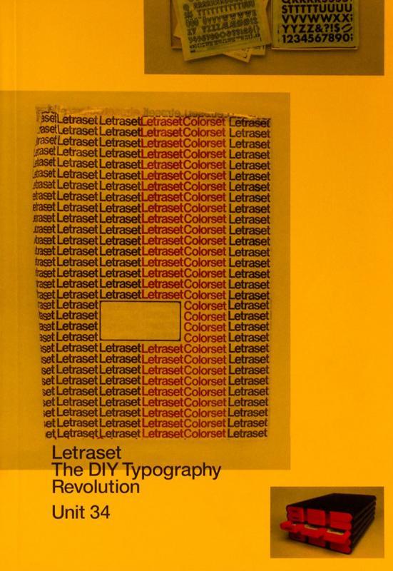
  1. Letraset: The DIY Typography Revolution is the first comprehensive history of Letraset, the rubdown lettering system that revolutionised typographic expression. The book tells the Letraset story from its early days as a difficult-to-use wet system, to its glory years as the first truly democratic alternative to professional typesetting. The book also looks at Letraset’s present-day revival amongst a new set of admirers who recognise the typographic excellence of the system’s typefaces. The book comes with a gatefold Letraset timeline. It has an introduction by Malcolm Garrett, and features in-depth interviews with Mr Bingo, Erik Brandt, Aaron Marcus, David Quay, Dan Rhatigan, Freda Sack, Andy Stevens and Jon Wozencroft. Essays by Colin Brignall, Dave Farey and Mike Daines – all key members of the Letraset team – provide expert insight into the rise of Letraset as a typographic and commercial powerhouse. A central essay by Adrian Shaughnessy examines the typographic and cultural impact of the system. The book’s design is by the Spin team of Tony Brook and Claudia Klat. It uses many rare specimens from Letraset’s past – catalogues, press ads, mailers, storage units, and of course, sheets of classic Letraset typefaces.
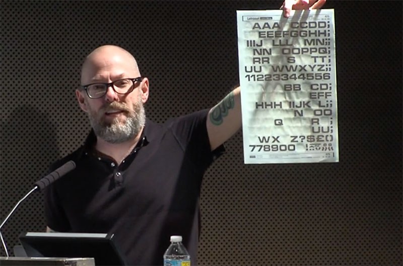
  2. “Letraset and other brands of rub-down type literally put typography in the hands of the people. Rub-down type made it possible for students, professionals, and everyone else to design with real typefaces, without needing professional typesetting services. A cheap and easy way to experiment with typography and other graphic elements, Letraset put a lot of care into making type easy to use well, but it also resulted in a lot of ways to use type badly, but with interesting results. With some care and attention, however, it was a great way to develop an eye for typography.”
The latest typography links delivered straight to your inbox.
×
×
  • Create New...

Important Information

We are placing functional cookies on your device to help make this website better.