Jump to content
Join our community of friends of typography!

Search the Community

Showing results for tags 'lots'.

  • Search By Tags

    Type tags separated by commas.
  • Search By Author

Content Type


The Typography.Guru Forums

  • Public Typography Forums
    • Talk
    • Font Identification
    • Font Downloads
  • Exclusive to Members
    • Type Design Forum
    • Letterpress Forum
    • Calligraphy/Lettering Forum
    • Show
    • Internal
    • Coffee Shop

Categories

  • Artisanal workshops & studios
  • Museums & Libraries
  • Apps
  • Education
  • Organizations
  • Online Typography Resources
  • Educational Video Channels
  • Typography Books
  • Magazines
  • Publishers

Categories

  • Link suggestions
  • Newsletter Archive (1-99)
    • Typography Weekly #1
    • Typography Weekly #2
    • Typography Weekly #3
    • Typography Weekly #4
    • Typography Weekly #5
    • Typography Weekly #6
    • Typography Weekly #7
    • Typography Weekly #8
    • Typography Weekly #9
    • Typography Weekly #10
    • Typography Weekly #11
    • Typography Weekly #12
    • Typography Weekly #13
    • Typography Weekly #14
    • Typography Weekly #15
    • Typography Weekly #16
    • Typography Weekly #17
    • Typography Weekly #18
    • Typography Weekly #19
    • Typography Weekly #20
    • Typography Weekly #21
    • Typography Weekly #22
    • Typography Weekly #23
    • Typography Weekly #24
    • Typography Weekly #25
    • Typography Weekly #26
    • Typography Weekly #27
    • Typography Weekly #28
    • Typography Weekly #29
    • Typography Weekly #30
    • Typography Weekly #31
    • Typography Weekly #32
    • Typography Weekly #33
    • Typography Weekly #34
    • Typography Weekly #35
    • Typography Weekly #36
    • Typography Weekly #37
    • Typography Weekly #38
    • Typography Weekly #39
    • Typography Weekly #40
    • Typography Weekly #41
    • Typography Weekly #42
    • Typography Weekly #43
    • Typography Weekly #44
    • Typography Weekly #45
    • Typography Weekly #46
    • Typography Weekly #47
    • Typography Weekly #48
    • Typography Weekly #49
    • Typography Weekly #50
    • Typography Weekly #51
    • Typography Weekly #52
    • Typography Weekly #53
    • Typography Weekly #54
    • Typography Weekly #55
    • Typography Weekly #56
    • Typography Weekly #57
    • Typography Weekly #58
    • Typography Weekly #59
    • Typography Weekly #60
    • Typography Weekly #61
    • Typography Weekly #62
    • Typography Weekly #63
    • Typography Weekly #64
    • Typography Weekly #65
    • Typography Weekly #66
    • Typography Weekly #67
    • Typography Weekly #68
    • Typography Weekly #69
    • Typography Weekly #70
    • Typography Weekly #71
    • Typography Weekly #72
    • Typography Weekly #73
    • Typography Weekly #74
    • Typography Weekly #75
    • Typography Weekly #76
    • Typography Weekly #77
    • Typography Weekly #78
    • Typography Weekly #79
    • Typography Weekly #80
    • Typography Weekly #81
    • Typography Weekly #82
    • Typography Weekly #83
    • Typography Weekly #84
    • Typography Weekly #85
    • Typography Weekly #86
    • Typography Weekly #87
    • Typography Weekly #88
    • Typography Weekly #89
    • Typography Weekly #90
    • Typography Weekly #91
    • Typography Weekly #92
    • Typography Weekly #93
    • Typography Weekly #94
    • Typography Weekly #95
    • Typography Weekly #96
    • Typography Weekly #97
    • Typography Weekly #98
    • Typography Weekly #99
  • Newsletter Archive (100-199)
    • Typography Weekly #100
    • Typography Weekly #101
    • Typography Weekly #102
    • Typography Weekly #103
    • Typography Weekly #104
    • Typography Weekly #105
    • Typography Weekly #106
    • Typography Weekly #107
    • Typography Weekly #108
    • Typography Weekly #109
    • Typography Weekly #110
    • Typography Weekly #111
    • Typography Weekly #112
    • Typography Weekly #113
    • Typography Weekly #114
    • Typography Weekly #115
    • Typography Weekly #116
    • Typography Weekly #117
    • Typography Weekly #118
    • Typography Weekly #119
    • Typography Weekly #120
    • Typography Weekly #121
    • Typography Weekly #122
    • Typography Weekly #123
    • Typography Weekly #124
    • Typography Weekly #125
    • Typography Weekly #126
    • Typography Weekly #127
    • Typography Weekly #128
    • Typography Weekly #129
    • Typography Weekly #130
    • Typography Weekly #131
    • Typography Weekly #132

Categories

  • Free Font Lists
  • Font alternatives
  • Fonts by topic/style
  • Fonts by region
  • Signage Fonts
  • Fonts by User

Categories

  • How to choose and pair fonts
  • Understanding Kerning & Tracking
  • How to use OpenType in InDesign
  • Font Licensing 101
  • How to use color fonts
  • Variable fonts for graphic and web designers
  • Typography on Apple devices

Categories

  • Hall of Fame
    • 2023
    • 2022
    • 2021
    • 2020
    • 2019

Find results in...

Find results that contain...


Date Created

  • Start

    End


Last Updated

  • Start

    End


Filter by number of...

Found 2 results

  1. Ralf Herrmann

    Starting an online archive of type specimens

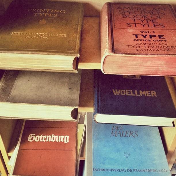
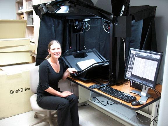
    Type specimen scans can be found scattered over the internet—on Flickr, the Internet Archive or some private websites for example. But there is no central place where information, let alone hi-res scans, are collected and can be browsed and used in an easy way—may it be for scientific research, for font digitalization or simply as a tool for type specimen collectors. For some time I have been thinking about building such a place, and with Typography.Guru as new place for global discussions around the field of typography and a dedicated type specimen forum I would like to start a discussion about this now. I am hoping to discuss ideas around this concept and find people interested to take part in such a project. Here is the concept so far: The site: Based on my experience with running typography sites for some time now, I am willing to set up a dedicated site for a global type specimen archive and maintain it with the help of other volunteers. It would be a non-profit project run by people who are interested in type and type specimens. But money would of course be an issue. Since it’s meant to accept hi-res scans of tens of thousands of pages, the web space costs would rise quickly and it would need a reliable concept to finance this for years to come. I would be interested in discussing this. Fees for contributors and/or users? Ads? Sponsors? Partnerships? Donations? What could work? The database would be designed around the specific topic. So the catalogue could then be easily filtered by time, region, foundry, keywords and so on. Users could easily create new entries, discuss them, add information, get in contact with other collectors and so on. Local partners: The more common type specimen sheets and brochures can easily be scanned and uploaded by type enthusiasts from all over the world. But that has limits. Some specimens are very rare and expensive. And large hard cover type specimen books can hardly be put on a regular flatbed scanner and just holding a camera above the double-spread pages leads to low-quality images with a distorted display of the pages. Proper book scanning equipment would be needed. So the site could team up with local institution like museums and libraries who have type specimens and probably even professional equipment to scan them. And if they don’t have it yet, there could be crowdfunding campaigns within the typographic community to pay for the needed equipment and labor. What do you think about it?
  2. Ralf Herrmann

    Library of Type: Structure and fields

    There are already some helpful comments in the other topic. I am starting another one for discussing the database structure only. I just set up a test installation to play around with the categories and fields, but there are still many questions. Which data would you want to collect and be able to use as filter in an online archive of type specimens? There are obvious and easy things like “year of release”, “title” and things like that. But would you need “type of publication”, e.g. book/booklet/leporello/sheet/poster? What about specimen size? Scan resolution? Page count? …What else? Some things are useful, but tricky, for example “country”. In 500 years of printing borders have shifted and names of countries have changed. For filters one would need to offer strict and fixed choices. When the country field is just a text field it’s easier to put something in but difficult to get good filter results. Same problems exists for foundry names. That’s one of the most important fields for such a database. But again, names have changed often and that tears apart entries which would belong together and users might expect to appear together. Maybe @Lars has some recommendations about this? He is experienced in dealing with font data from a developer perspective.
The latest typography links delivered straight to your inbox.
×
×
  • Create New...

Important Information

We are placing functional cookies on your device to help make this website better.