Jump to content
The type specimens of the world in one database …

Search the Community

Showing results for tags 'naming conventions'.

  • Search By Tags

    Type tags separated by commas.
  • Search By Author

Content Type


The Typography.Guru Forums

  • Public Typography Forums
    • Talk
    • Font Identification
    • Font Downloads
  • Exclusive to Members
    • Type Design Forum
    • Letterpress Forum
    • Calligraphy/Lettering Forum
    • Show
    • Internal
    • Coffee Shop

Categories

  • Journal

Categories

  • Artisanal workshops & studios
  • Museums & Libraries
  • Apps
  • Education
  • Organizations
  • Online Typography Resources
  • Educational Video Channels
  • Typography Books
  • Magazines
  • Publishers

Categories

  • Link suggestions
  • Newsletter Archive (1-99)
    • Typography Weekly #1
    • Typography Weekly #2
    • Typography Weekly #3
    • Typography Weekly #4
    • Typography Weekly #5
    • Typography Weekly #6
    • Typography Weekly #7
    • Typography Weekly #8
    • Typography Weekly #9
    • Typography Weekly #10
    • Typography Weekly #11
    • Typography Weekly #12
    • Typography Weekly #13
    • Typography Weekly #14
    • Typography Weekly #15
    • Typography Weekly #16
    • Typography Weekly #17
    • Typography Weekly #18
    • Typography Weekly #19
    • Typography Weekly #20
    • Typography Weekly #21
    • Typography Weekly #22
    • Typography Weekly #23
    • Typography Weekly #24
    • Typography Weekly #25
    • Typography Weekly #26
    • Typography Weekly #27
    • Typography Weekly #28
    • Typography Weekly #29
    • Typography Weekly #30
    • Typography Weekly #31
    • Typography Weekly #32
    • Typography Weekly #33
    • Typography Weekly #34
    • Typography Weekly #35
    • Typography Weekly #36
    • Typography Weekly #37
    • Typography Weekly #38
    • Typography Weekly #39
    • Typography Weekly #40
    • Typography Weekly #41
    • Typography Weekly #42
    • Typography Weekly #43
    • Typography Weekly #44
    • Typography Weekly #45
    • Typography Weekly #46
    • Typography Weekly #47
    • Typography Weekly #48
    • Typography Weekly #49
    • Typography Weekly #50
    • Typography Weekly #51
    • Typography Weekly #52
    • Typography Weekly #53
    • Typography Weekly #54
    • Typography Weekly #55
    • Typography Weekly #56
    • Typography Weekly #57
    • Typography Weekly #58
    • Typography Weekly #59
    • Typography Weekly #60
    • Typography Weekly #61
    • Typography Weekly #62
    • Typography Weekly #63
    • Typography Weekly #64
    • Typography Weekly #65
    • Typography Weekly #66
    • Typography Weekly #67
    • Typography Weekly #68
    • Typography Weekly #69
    • Typography Weekly #70
    • Typography Weekly #71
    • Typography Weekly #72
    • Typography Weekly #73
    • Typography Weekly #74
    • Typography Weekly #75
    • Typography Weekly #76
    • Typography Weekly #77
    • Typography Weekly #78
    • Typography Weekly #79
    • Typography Weekly #80
    • Typography Weekly #81
    • Typography Weekly #82
    • Typography Weekly #83
    • Typography Weekly #84
    • Typography Weekly #85
    • Typography Weekly #86
    • Typography Weekly #87
    • Typography Weekly #88
    • Typography Weekly #89
    • Typography Weekly #90
    • Typography Weekly #91
    • Typography Weekly #92
    • Typography Weekly #93
    • Typography Weekly #94
    • Typography Weekly #95
    • Typography Weekly #96
    • Typography Weekly #97
    • Typography Weekly #98
    • Typography Weekly #99
  • Newsletter Archive (100-199)
    • Typography Weekly #100
    • Typography Weekly #101
    • Typography Weekly #102
    • Typography Weekly #103
    • Typography Weekly #104
    • Typography Weekly #105
    • Typography Weekly #106
    • Typography Weekly #107
    • Typography Weekly #108
    • Typography Weekly #109
    • Typography Weekly #110
    • Typography Weekly #111
    • Typography Weekly #112
    • Typography Weekly #113
    • Typography Weekly #114
    • Typography Weekly #115
    • Typography Weekly #116
    • Typography Weekly #117
    • Typography Weekly #118
    • Typography Weekly #119
    • Typography Weekly #120
    • Typography Weekly #121
    • Typography Weekly #122
    • Typography Weekly #123
    • Typography Weekly #124
    • Typography Weekly #125
    • Typography Weekly #126
    • Typography Weekly #127
    • Typography Weekly #128
    • Typography Weekly #129
    • Typography Weekly #130
    • Typography Weekly #131
    • Typography Weekly #132

Categories

  • Typography Quotes

Categories

  • Typography Videos

Categories

  • Free Font Lists
  • Font alternatives
  • Fonts by topic/style
  • Fonts by region
  • Signage Fonts
  • Fonts by User

Categories

  • Typography Terms Glossary

Categories

  • How to choose and pair fonts
  • Understanding Kerning & Tracking
  • How to use OpenType in InDesign
  • Font Licensing 101
  • How to use color fonts
  • Variable fonts for graphic and web designers
  • Typography on Apple devices

Categories

  • Font List entries

Categories

  • Hall of Fame
    • 2023
    • 2022
    • 2021
    • 2020
    • 2019

Categories

  • Exclusive Content

Calendars

  • Typography Events

Product Groups

  • Community support options

Find results in...

Find results that contain...


Date Created

  • Start

    End


Last Updated

  • Start

    End


Filter by number of...

Found 2 results

  1. Emoji Information ℹ️

    Translations for typographical terms in CLDR

    Did you know that the Unicode Common Locale Data Repository (CLDR) collects, among many other things, typographical terms – mostly axises and styles for variable fonts – in many languages, in order to display them appropriately in localized user interfaces? Many companies rely (often blindly) on this data, few contribute to it (with varying expertise for specialist jargon). If you think the translation for the languages you know could be improved, it’s possible to register an account for the Survey Tool and contribute while it’s open to submissions, but it’s usually simpler to raise an issue at Unicode’s Jira. Axis and Styles `ital`: italic `ital-1`: cursive `opsz`: optical size (in points) `opsz-8`: caption `opsz-12`: text `opsz-18`: titling `opsz-72`: display `opsz-144`: poster `slnt`: slant (in degrees) `slnt--12`: backslanted `slnt-0`: upright `slnt-12`: slanted `slnt-24`: extra-slanted `wdth`: width (percentages), expansion or compression `wdth-50`: ultracondensed `wdth-50-compressed`: ultracompressed `wdth-50-narrow`: ultranarrow `wdth-62.5`: extra-condensed `wdth-62.5-compressed`: extra-compressed `wdth-62.5-narrow`: extra-narrow `wdth-75`: condensed `wdth-75-compressed`: compressed `wdth-75-narrow`: compressed `wdth-87.5`: semicondensed `wdth-87.5-compressed`: semicompressed `wdth-87.5-narrow`: seminarrow `wdth-100`: normal `wdth-112.5`: semiexpanded `wdth-112.5-extended`: semiextended `wdth-112.5-wide`: semiwide `wdth-125`: expanded `wdth-125-extended`: extended `wdth-125-wide`: wide `wdth-150`: extra-expanded `wdth-150-extended`: extra-extended `wdth-150-wide`: extra-wide `wdth-200`: ultraexpanded `wdth-200-extended`: ultraextended `wdth-200-wide`: ultrawide `wght`: weight “boldness” `wght-100`: thin `wght-200`: extra-light `wght-200-ultra`: ultralight `wght-300`: light `wght-350`: semilight `wght-380`: book `wght-400`: regular `wght-500`: medium `wght-600`: semibold `wght-600-demi`: demibold `wght-700`: bold `wght-800`: extra-bold `wght-900`: black `wght-900-heavy`: heavy `wght-950`: extra-black `wght-950-ultrablack`: ultrablack `wght-950-ultraheavy`: ultraheavy Features `afrc`: vertical fractions `cpsp`: capital spacing `dlig`: optional ligatures `frac`: diagonal fractions `lnum`: lining numbers `onum`: old-style figures `ordn`: ordinals `pnum`: proportional numbers `smcp`: small capitals `tnum`: tabular numbers `zero`: slashed zero
  2. Riccardo Sartori

    The curious case of Verdana Pro Condensed

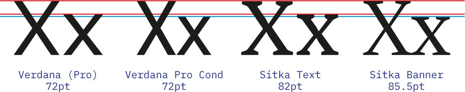
    Recently I was looking for a complementary typeface to pair with Sitka, the somewhat obscure serif designed by Matthew Carter for Microsoft. It is a lovely typeface, designed with an emphasis on legibility that offers many optical sizes to boot. Searching for a complementary contrasting sans, I started to look for typefaces from the same designer, as I most often do. It turns out, there are not many Matthew Carter designed sans serifs. However, his most famous one, Verdana, seems to accompany well with Sitka (in fact, the eponymous Carter Sans could almost be seen as an interpolation between Sitka and Verdana). So I start looking for ways to make Verdana work despite its general overuse and avoiding web y2k vibes. First, I discover that at least the latest versions of non-Pro Verdana bundled with Windows include a stylistic set with a non-seriffed |I| (that is what I call a good start). Second, even better, I find out that Verdana Pro is available, together with several other typefaces, as an optional download for Windows (nothing comparable with what is available on mac OS, but still). This give me access to several additional weights and a condensed width, right? Not exactly. You see, Verdana already had a semi-condensed and condensed styles, they are called Tahoma and Nina, respectively. It is right in the promotional material! So, while, for example, Georgia Pro Condensed, as the name implies, is just a condensed version of Georgia, Verdana Pro Condensed is not (just) a condensed Verdana. Let me illustrate: What is going on? It took me a bit to find an explanation, then I think I figured it out. Verdana has the same ratio between caps-height and x-height as Sitka Text has. While that ratio in Verdana Pro Condensed is inbetween those of Sitka Display and Sitka Banner. So, in conclusion, speaking of standardising font names, I think that Verdana Pro Condensed should really be called Verdana Pro Display, because it is not so much a width variation, but rather an oprical size. Oh, I also would not mind seeing all the aforementioned typefaces (Verdana, Tahoma, Nina, Carter Sans, and Sitka) all grouped together as a big “Carter Superfamily”.
Wayfinding Sans Symbols: the pictogram font for signs
×
×
  • Create New...

Important Information

We are placing functional cookies on your device to help make this website better.